ClimateGate Scientists Buried Study that
Failed to Show Desired Result
Leading climate scientists were tasked to
produce a diagram that showed an "obvious"
picture of "unprecedented warming," but
the result did not show this.
By James D. Agresti
February 6, 2012
The Intergovernmental Panel on Climate Change (IPCC) is the leading international body for the assessment of climate change, and its work provides the basis of numerous climate policies in the U.S. and throughout the world. Once every 5 to 7 years, the organization publishes a major report about global warming, the latest of which was in 2007. An examination of the ClimateGate documents by Just Facts has revealed that a key study conducted for this report never saw the light of day.
In a previously overlooked email exchange buried among the thousands of ClimateGate files, Keith Briffa, an IPCC lead author, distributed the results of a study assigned to him during a meeting with an IPCC co-chair. Briffa wrote that he and another IPCC scientist (Tim Osborn) were "asked to try to produce a 'cloud' diagram … to see if it provided an 'obvious' picture of the unprecedented warming over the last millennium or so."
This request to conduct a study with the aim of finding such a result accords with another ClimateGate email dated years earlier in which Briffa complained that there was "pressure to present a nice tidy story" of "apparent unprecedented warming" over the past thousand years.
However, when Briffa sent the results of this new study to other IPCC scientists for review, he wrote, "What we worry very much about, however, is that we should not produce a Figure that then conflicts with … the main Chapter Figure" in the IPCC report. In reply, Jonathan Overpeck, an IPCC coordinating lead author, wrote, "ABSOLUTELY RIGHT - CAN'T HAVE CONFLICT."
Briffa also expressed concern that the diagram might "dilute the message about the strength of 20th century mean warming," but he noted that there "seems to be a consensus" that this type of diagram should be included in the IPCC report. However, no such diagram appeared in the ensuing report.
The email exchange regarding the diagram ended with Overpeck writing, "LETS SAY THE JURY IS STILL OUT ON THIS FIGURE UNTIL WE ALL ARE COMFORTABLE WITH WHAT IT LOOKS LIKE IN THE END."
One of the emails states that the figure under discussion was attached, but efforts to locate it among the ClimateGate files have thus far proved unsuccessful.
The context and technical elements of these
emails concern
proxy studies, which are used
to reconstruct temperatures in the era
before instrumental measurements were made
on a global scale, which is roughly 150
years ago. In these studies, scientists use
proxies that respond to changes in climate
(such as the widths of tree rings) to
estimate temperature variations in the past.
The IPCC has emphasized that proxy studies
are "essential" to "determine whether 20th
century warming is unusual" by placing it
"in the context of longer-term climate
variability," but such studies have been
mired in controversy since the
hockey stick
graph, which appeared four times in the 2001 IPCC report. Among many criticisms of this
graph, one of the most indicting is that its
creators used a statistical operation to
generate the graph that did not yield a
simple average of the proxy data but
emphasized any data with a hockey stick
shape, placing up to
390 times more weight
on some data than others.
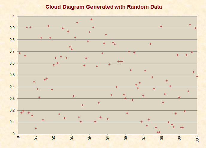
The benefit of a "cloud diagram" is that it
displays each individual piece of data
instead of averaging the data into a curve.
Briffa wrote that this type of diagram would
be the "best" way to show the "scatter" of
the data. An example of a cloud diagram is
shown here.
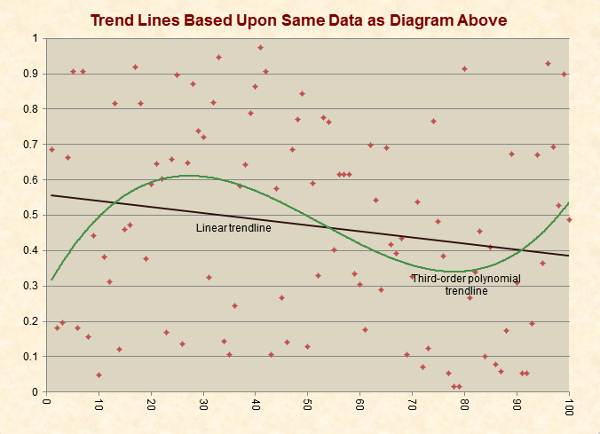
Contrastingly, these same data can be
represented by any number of trend lines
such as a linear, third-order polynomial,
moving average, etc. The issue is that such
trend lines can sometimes look significantly
different from one another, even when they
are based upon the same data. They can also
fail to show how scattered or sparse the
data may be:
Briffa and Osborn's figure appears to have
been pure cloud diagram without trend lines
and without "temperature scaled add ons," as
Briffa called them. These add-ons refer to
modern instrument-measured temperatures,
which are often integrated with proxy
studies. Such integration was a lightning
rod for criticism of the hockey stick graph
and was also the subject of the infamous
"hide the decline" ClimateGate email. Thus,
it appears that the cloud diagram study was
conceived to address criticisms of earlier
proxy studies.
When Briffa sent this cloud diagram to IPCC
reviewer Tom Crowley, who had produced a
"similar" figure that had trend lines and
temperature scaled add-ons, Crowley peppered
Briffa with questions. Briffa responded to
these questions, and, at Crowley's request,
forwarded the email to two other IPCC
scientists while making additional comments
and seeking their opinions on the matter.
Among these comments, Briffa explained that
he and Osborn were "in no way trying to
produce a different Figure for the sake of
producing a different Figure," and "I am
very happy to go with Tom's [Crowley's]
Figure. We did ours because we were asked
to." However, Briffa insisted that the
temperature scaled add-ons and a curve that
fused the results of all the proxy studies
be removed from Crowley's figure. In the
end, the figure that appeared in the IPCC
report matches the emails' description of
Crowley's figure with Briffa's suggested
changes (page 468).
In recounting the meeting in which Briffa
and Osborn were tasked to produce the figure
that they did, Briffa wrote that it occurred
during a "group chat" in Beijing with Susan
Solomon, an IPCC co-chair. In other
Climategate emails, Briffa wrote that he was
"railroaded" by Solomon and warned another
scientist not to let Solomon "push you (us)
beyond where we know is right."
For reference, the full text of the
email exchange is shown below with the correspondents'
addresses and phone numbers blacked out. Key
acronyms/abbreviations used in the emails
include:
CA - Contributing author for the IPCC
report
CLA - Coordinating lead author for the IPCC report
Quelc. - The Quelccaya glacier in Peru
SH – Southern Hemisphere
J and E – Jonathan Overpeck and Eystein
Jansen (coordinating lead authors of the
chapter about proxies in the 2007 IPCC
report)
MWP – Medieval Warm Period
C.E. – Common Era (also known as A.D.)
From: Keith Briffa <xxxxx@xxxxxx>
To: Tim Osborn <xxxxx@xxxxxx>
Subject: Fwd: Re: thoughts and Figure for
MWP box
Date: Wed Jul 20 10:18:03 2005
Date: Tue, 19 Jul 2005 15:38:31 +0100
To: Tom Crowley <xxxxx@xxxxxx>, Jonathan
Overpeck <xxxxx@xxxxxx>
From: Keith Briffa <xxxxx@xxxxxx>
Subject: Re: thoughts and Figure for MWP box
Cc: Eystein Jansen <xxxxx@xxxxxx>
Tom et al
thanks for remarks - in response to Tom's
questions
At 18:23 18/07/2005, Tom Crowley wrote:
a few comments -
1) are you trying to choose between my way
of presenting things and your way - ie, w
w/out composite?
Yes
2) with your data, do they all go through
from beginning to end?
pretty much - and have been standardised
over the maximum period for each (not
necessarily the best way?)
3) why include chesapeake, which is likely a
salinity record?
Because Moberg used it in their latest
reconstruction - I agree that I would not
use it
because of the dubious temperature signal
(salinity effect and no local replication)
and
poor dating control (and I do not like the
way the Moberg method effectively over
weights the low-frequency predictor series
in their analysis).
4) some of your data are from virtually the
same site - Mangazeja and yamal are both w.
siberia - I composited data available from
multiple sites to produce one time series,
which is equally counted against the other
regions, which might (greenland, w.U.S., e.
Asia) or might not have multiple records in
them
Just to reiterate - I understood after the
group chat with Susan S. in Beijing , that
we
were being asked to try to produce a "cloud"
diagram including as many of "original"
predictor series ,from all the
reconstructions, to see if it provided an
"obvious"
picture of the unprecedented warming over
the last millennium or so. Tim and I are in
no
way trying t produce a different Figure for
the sake of producing a different Figure .
In practice this is hard to do (because some
records are sensible "local" composites
already, and how far do you go in showing
all input data? The problem of what and how
to
composite is tricky - and no obviously
"correct" way is apparent.
Having said this , Tom's way is fine with me
(provided the composites are robust) and we
get general agreement. Am happy to go with
Tom's Figure , or version that incorporates
as many records as possible - but as we have
said - without the composite or temperature
scaled add ons.
5) I am not sure whether it is wise to add
me to the CA list, just because the reviewer
is supposed to be impartial and a CA loses
that appearance of impartiality if he has
now
been included as a CA - may want to check
with Susan S. on this one to be sure - still
happy to provide advice
My own position on this is that you are an
"unofficial" referee, who has (and still is)
making a significant contribution - I see no
conflict
6) I am happy to go in either direction -
include or not include my figure - all I
need
are specific directions as to what to do, as
CLAs you people need to decide, and then
just tell me what or what not to do
Agree - CLAs please rule on the individual
record/composite question - I am very happy
to go with Tom's Figure. We did ours because
we were asked to.
7) I am a little unhappy with the emphasis
on hemispheric warmth - lets face it, almost
all of the long records are from 30-90N -
the question is: how representative is
30-90N
to the rest of the world? for the 20th c.
one can do correlations with the
instrumental
record, but co2 has almost certainly
increased the correlation scale beyond what
it was
preanthropogenic.
Absolutely agree , and hope this comes over
in text (and bullets) - if not needs
strengthening (note David R's comments).
you could correlate with quelcaya - not sure
how many other records there are that are
annual resolution - in the tropics I have
produced a tropical composite (corals +
Quelc.) but it only goes back to ~1780 -
corals just don't live v long - in that
interval at least the agreement is
satisfactory with the mid latitude
reconstruction but
there is only 100 years extra of independent
information beyond the instrumental
record..
We have gone round in circles over this ,
but understand consensus to be that Quelc.
not
a clean temperature record. Agree corals
would be better longer (the new coral-based
reconstruction by Rob Wilson et al
goes back to 1700 and shows unprecedented
tropical warming . Along with the text from
Julie we can not go much further, but the
importance of extending the tropical (and SH
records needs to be very clear)
.THIS MAY NEED TO BE ADDRESSEDAS A GENERAL
ISSUE SOMEWHERE (SHORTLY) IN YOUR DOC
Really hope it is already - but advise if
you think not
tom
Thanks for this - lets take lead from J and
E now (also can you advise on state of play
with the Hegerl et al manuscript?)
thanks
Keith
Jonathan Overpeck wrote:
Hi Keith, Eystein and Tom: See below (BOLD)
for my comments. Thanks for moving this
forward and making sure we do it right
(i.e., without any bias, or perception of
bias).
Dear Peck, Eystein and Tom
At this point we thought it was important to
review where we think we are with the MWP
Figure.
First, we have no objection to a Figure .
Our only concerns have been that we should
1/… be clear what we wish this Figure to
illustrate (in the specific context of the
MWP box) - note that this is very different
from trying to produce a Figure in such a
way as to bias what it says (I am not
suggesting that we are, but we have to guard
against any later charge that we did this).
We say this because there are intonations in
some of Peck's previous messages that he
wishes to "nail" the MWP - i.e. this could
be
interpreted as trying to say there was no
such thing, and
SORRY TO SCARE YOU. I **ABSOLUTELY** AGREE
THAT WE MUST AVOID ANY BIAS OR PERCEPTION OF
BIAS. MY COMMENT ON "NAILING" WAS MADE TO
MEAN THAT ININFORMED PEOPLE KEEPING COMING
BACK TO THE MWP, AND DESCRIBING IT FOR WHAT
I BELIEVE IT WASN'T. OUR JOB IS TO MAKE IT
CLEAR WHAT IT WAS WITHIN THE LIMITS OF THE
DATA. IF THE DATA ARE NOT CLEAR, THEN WE
HAVE
TO BE NOT CLEAR. THAT SAID, I THINK TOM'S
FIGURE CAPTURED WHAT I HAVE SENSED IS THE
MWP
FOR A LONG TIME, AND BASED ON OTHER SOURCES
OF INFO - INCLUDING KEITH'S PROSE. THE IDEA
OF A FIGURE, IS THAT FIGURES CAN BE MORE
COMPELLING AND CONNECT BETTER THAN TEXT.
ALSO,
THERE ARE MANY WAYS TO LOOK AT THE MWP, AND
AS LONG AS WE DON'T INTRODUCE BIAS OR
ANYTHING ELSE THAT WILL DILUTE THE MESSAGE
IN THE END, THE IDEA IS TO SHOW THE MWP IN
MORE WAYS THAN TWO (THAT IS, THE EXISTING
FIGS IN THE TEXT THAT KEITH AND TIM MADE).
2/ …agree that we have done this in the
best way.
The truth is that there IS a period of
relative warmth around the end of the 1st
and
start of the 2nd millennium C.E. , but that
there are much fewer data to base this
conclusion on (and hence the uncertainty
around even our multiple calibrated
multi-proxy
reconstructions are wide). The geographical
spread of data also impart a northern (and
land) bias in our early proxy data.
NEED TO BE CLEAR ABOUT THIS BIAS IN THE
CAPTION AND BOX TEXT
My understanding of Tom's rationale with the
Figure is that we should show how, because
the timing of maximum pre-20th century
warmth is different in different records,
the
magnitude of the warmest period (for the
Hemisphere , or globe, as a whole) is less
than
the recently observed warmth.
YES, BUT IN A WAY THAT SAYS "LOOK, HERE ARE
THE ACTUAL REGIONAL CURVES - CHECK IT OUT
FOR YOURSELF" INSTEAD OF JUST SAYING (IN A
SCIENTIFICALLY MORE STANDARD MANNER - HERE
ARE THE VARIOUS, MOST ROBUST, LARGE AREA
RECONSTRUCTIONS. IN MY MIND, THE LATTER
(KEITH/TIM FIGS IN THE MAIN TEXT) WILL BE
THE MOST APPEALING/CONVINCING TO
PALEOCLIMATE
SCIENTISTS, BUT TOM'S MIGHT HELP THERE, AND
CERTAINLY WITH NON-PALEO SCIENTISTS AND
POLICY FOLKS. MIGHT HELP… IF IT DOESN'T
NOTHING LOST, BUT IF IT COULD HURT CONVEYING
UNDERSTANDING, THEN ITS BAD TO USE THE NEW
FIGURE.
The reconstructions we plot in Chapter 6
already express the mean Hemispheric warmth
(after various selection and scaling of
data), and so the additional information
that
the MWP box figure should show must relate
to the scatter of the proxy data. There
seems
to be a consensus that this is best done by
showing individual records , and we are
happy to agree.
What we worry very much about, however, is
that we should not produce a Figure that
then
conflicts with the picture of proxy evidence
for Hemispheric mean warmth as a
whole,shown in the main Chapter Figure. By
showing a composite (as Tom has done) and
scaling against another (30-90degrees N)
temperature record - this is just what is
done.
ABSOLUTELY RIGHT - CAN'T HAVE CONFLICT.
As we promised, Tim has produced a similar
Figure, using the same series plus a few
extras, but omitting the composite mean and
the scaling against instrumental
temperatures. The idea was to include as
many of the original input series (to the
various reconstructions) as we could -
though avoiding conflicting use of different
versions of the same data. The precise
selection of records will have to be agreed
and,
presumably, based on some clear, objective
criteria that we would need to justify (this
will not be straight forward). This, along
with Tom's plot (forwarded by Peck) is in
the
attachment.
We would like to get your opinion now, and
especially Tom's, on the points regarding
the
composite and scaling. We would be in favour
of just showing the series - but do they
make the point (and emphasise the message of
the text in the box)? Or does the scatter
of the various series as plotted, dilute the
message about the strength of 20th century
mean warming (note the apparently greater
scatter in the 20th century in our figure
than
in Tom's)? Can you all chip in here please.
best wishes
WHAT ABOUT THE IDEA THAT WE ONLY SHOW THE
SERIES FOR THE MWP, SINCE THE COMPARISON TO
THE 20TH CENTURY IS DONE WELL (AND BEST?) IN
THE TEXT FIGS (WHICH I'M ATTACHING JUST IN
CASE TOM DOESN'T HAVE, ALONG WITH THE TEXT -
IF YOU HAVE TIME, TOM, PLEASE READ COMMENT
ON ANYTHING YOU WISH, BUT CERTAINLY THE LAST
2000 YEARS BIT - ASSUME YOU'LL BE DOING
THIS AT THE REVIEW STAGE ANYHOW…)
ANOTHER THING THAT IS A REAL ISSUE IS
SHOWING SOME OF THE TREE-RING DATA FOR THE
PERIOD
AFTER 1950. BASED ON THE LITERATURE, WE KNOW
THESE ARE BIASED - RIGHT? SO SHOULD WE SAY
THAT'S THE REASON THEY ARE NOT SHOWN? OF
COURSE, IF WE ONLY PLOT THE FIG FROM CA 800
TO
1400 AD, IT WOULD DO WHAT WE WANT, FOCUS ON
THE MWP ONLY - THE TOPIC OF THE BOX - AND
SHOW THAT THERE WERE NOT ANY PERIODS WHEN
ALL THE RECORDS ALL SHOWED WARMTH - I.E., OF
THE KIND WE'RE EXPERIENCING NOW.
TWO CENTS WORTH
Keith and Tim
P.S. We agreed in Beijing that we should
definitely ask Tom to be a CA .
TRUE - BUT HAS ANYONE CONFIRMED W/ TOM. TOM,
YOU OK W/ THIS?
THANKS - A GREAT DISCUSSION, AND LETS SAY
THE JURY IS STILL OUT ON THIS FIGURE UNTIL
WE
ALL ARE COMFORTABLE WITH WHAT IT LOOKS LIKE
IN THE END.
BEST, PECK
--
Professor Keith Briffa,
Climatic Research Unit
University of East Anglia
xxxxxxxxxx
Phone: +xxxxxxxxxx
Fax: +xxxxxxxxxx
Attachment converted: Macintosh
HD:mwpbox_figures.pdf (PDF /«IC») (0008A8AE)
--
Professor Keith Briffa,
Climatic Research Unit
University of East Anglia
xxxxxxxxxx.
Phone: + xxxxxxxxxx
Fax: + xxxxxxxxxx
[1]http://www.cru.uea.ac.uk/cru/people/briffa/
--
Professor Keith Briffa,
Climatic Research Unit
University of East Anglia
xxxxxxxxxx
Phone: + xxxxxxxxxx
Fax: + xxxxxxxxxx
[2]http://www.cru.uea.ac.uk/cru/people/briffa/
References
1.
http://www.cru.uea.ac.uk/cru/people/briffa/
2.
http://www.cru.uea.ac.uk/cru/people/briffa/