Please wait as we load hundreds of rigorously documented facts for you.
Please wait as we load hundreds of rigorously documented facts for you.
For example:

* Pollution is defined by the American Heritage Science Dictionary as the:
* A small amount of a given pollutant confined to a small area may cause harm, while a far larger amount of the same pollutant dispersed over a large area can be harmless.[2] A “fundamental principle” of toxicology is “the dose makes the poison.”[3]
* Per the academic book Chemical Exposure and Toxic Responses:
* Per the textbook Understanding Environmental Pollution:
* In addition to a substance’s chemical structure and dosage, other factors that affect its toxicity include (but are not limited to) the duration of exposure, the route of exposure (e.g., skin contact, inhalation, ingestion), and the physiology of the exposed organisms.[7] [8] [9]
* Per a teaching guide published by the American Society for Microbiology:
* Applied to humans, the results of the above study indicate that:
* A survey of about 5,600 people from eight countries published in 2019 by the journal Nature Chemistry found that 76% of European consumers believe that exposure to a “toxic synthetic chemical substance is always dangerous,” no matter what the level of exposure.[19]
* A scientific, nationally representative survey commissioned in 2020 by Just Facts found that 65% of U.S. voters believe that “contact with a toxic chemical is always dangerous, no matter what the level of exposure.”[20] [21] [22]
* The United States Environmental Protection Agency (EPA) monitors the outdoor (ambient) concentrations of six major air pollutants on a nationwide basis. These are called “criteria pollutants.”[28] [29] [30]
* Under federal law, criteria pollutants are those that are deemed by the administrator of the EPA to be widespread and to “cause or contribute to air pollution which may reasonably be anticipated to endanger public health or welfare….”[31] [32] [33]
* The six criteria pollutants are carbon monoxide, ground-level ozone, lead, nitrogen dioxide, particulate matter, and sulfur dioxide.[34]
* The EPA administrator is required by law to establish “primary” air quality standards for criteria pollutants that are “requisite to protect the public health” with “an adequate margin of safety….”[35] [36]
* The EPA administrator is also required to establish “secondary” air quality standards “requisite to protect the public welfare,” a term that includes “animals, crops, vegetation, and buildings.”[37] [38]
* For some criteria pollutants, EPA has established a single criterion as the primary and secondary air quality standard. In other cases, EPA has established up to two different criteria as primary air quality standards and up to two different criteria as secondary air quality standards.[39]
* Per an EPA summary of laws and court decisions relevant to the process of setting air quality standards:
* The administrator of the EPA is appointed by the president, contingent upon the approval of a majority vote in the Senate.[42] [43]
* According to primary EPA measures of criteria pollutants, the average U.S. ambient levels of:
* A scientific, nationally representative survey commissioned in 2019 by Just Facts found that 40% of voters believe the air in the United States is now more polluted than it was in the 1980s.[51] [52] [53]
* Per the American Heritage Dictionary of Science, carbon monoxide (CO) is:
* According to the EPA, the main sources of CO emissions in the U.S. are:
* Regarding the accuracy of EPA’s CO emissions data over time:
* Ambient CO concentrations typically peak near roadways and during the times of the day when commuting is heaviest.[64]
* The population most susceptible to elevated CO levels are those with coronary artery disease.[65] Coronary artery disease is typically caused by the build-up of cholesterol-containing deposits in major arteries.[66]
* The primary study used by the EPA to set clean air standards for CO was conducted on subjects with moderate to severe coronary artery disease, more than half of whom previously had heart attacks. To establish a baseline, participants engaged in mild exercise on a treadmill while measurements were made of the time it took to develop chest pain and a specific electrocardiogram signal that indicates insufficient oxygen supply to the heart. Subjects repeated this test after resting for about an hour while being exposed to elevated CO levels ranging from 42 to 202 parts per million (mean of 117). After exposure, the amount of time spent exercising before the onset of chest pain decreased by 4.2%, and the amount of time spent exercising before this specific electrocardiogram signal emerged decreased by 5.1%.[67] [68]
* An EPA primary clean air standard for carbon monoxide is an 8-hour average of 9 parts per million (ppm), not to be exceeded more than once per year.[69] [70] From 1980 to 2022, the average U.S. ambient carbon monoxide level decreased by 88% as measured by this standard:
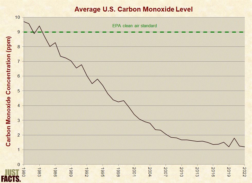
* All of the U.S. population live in counties that meet EPA’s clean air standard for carbon monoxide.[73] [74] [75] Per the EPA, a “large proportion” of monitoring sites have CO levels that are below the limit that conventional instruments can detect (1 ppm).[76]
* Per the EPA, ground-level ozone (O3):
* According to the EPA, the main sources of NOx emissions in the U.S. are:
* According to the EPA, the main sources of VOC emissions in the U.S. are:
* Regarding the accuracy of EPA’s VOC emissions data over time:
* The populations most susceptible to elevated ozone levels are children, the elderly, people with lung disease, and people who are active outdoors.[89] [90]
* Ambient ozone concentrations typically peak on hot sunny days in urban areas.[91] Per the EPA:
* EPA’s primary and secondary clean air standard for ozone is 0.070 parts per million (ppm) as measured by a 3-year average of the fourth-highest daily maximum 8-hour concentration per year.[93] [94] From 1980 to 2022, the average U.S. ambient ozone level decreased by 29% as measured by this standard:
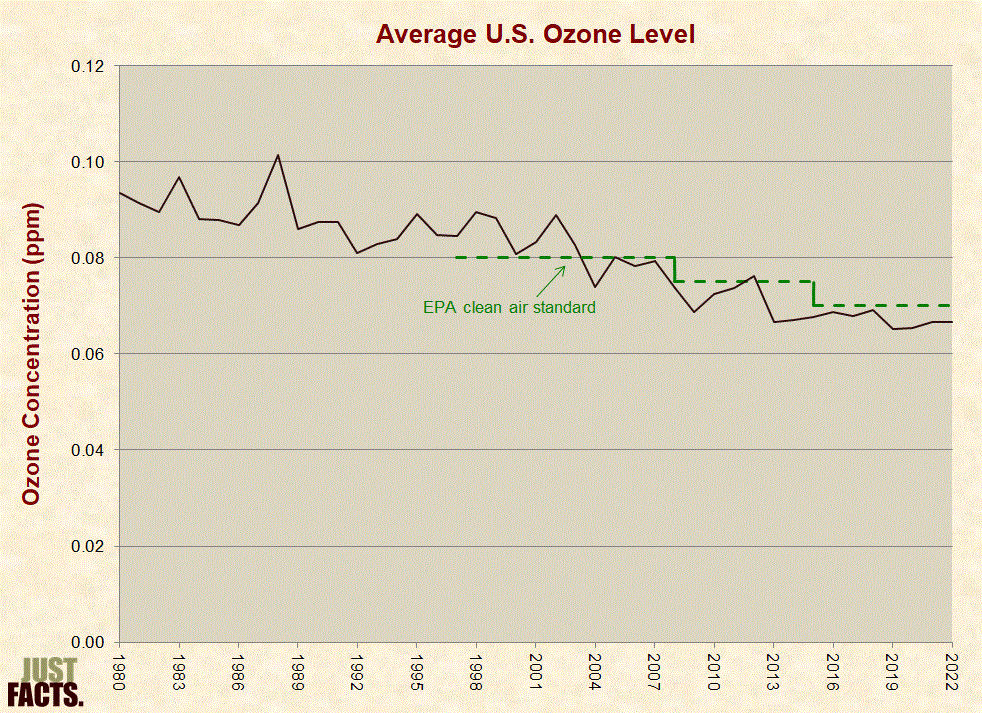
* According to EPA data, as of 2024, 37% of the U.S. population lives in counties that do not meet EPA’s clean air standard for ozone.[97]
* Before the EPA made the clean air standard for ozone stricter in 2015,[98] the EPA estimated in 2014 that:
* Lead (Pb) is a metallic element that can be released as particles into the air. These airborne particles can be directly inhaled, or they can settle out of the air into water and food supplies, and thus be ingested orally.[101] Lead can accumulate in the human body over extended periods, resulting in a condition known as “cumulative poisoning.” This can impair cognitive ability and cause conditions such as high blood pressure and kidney dysfunction.[102] [103]
* According to the EPA, the main sources of lead emissions in the U.S. are:
* Ambient lead concentrations typically peak near mines, busy roadways, and factories that melt or fuse lead.[107]
* The population most susceptible to elevated lead concentrations is children. Effects can include behavioral disorders, learning deficits, and lowered IQ.[108] [109] The EPA set the clean air standard for lead with the goal of precluding a mean IQ loss of more than one or two points among children exposed to this threshold.[110]
* EPA’s primary and secondary clean air standard for lead is a rolling 3-month average of 0.15 micrograms per meter (μg/m3).[111] From 1980 through 2018, the average U.S. ambient lead level decreased by 99% as measured at six sites by this standard. From 2010 to 2022, the average U.S. ambient lead level decreased by 88% as measured at more than 80 sites by this standard:
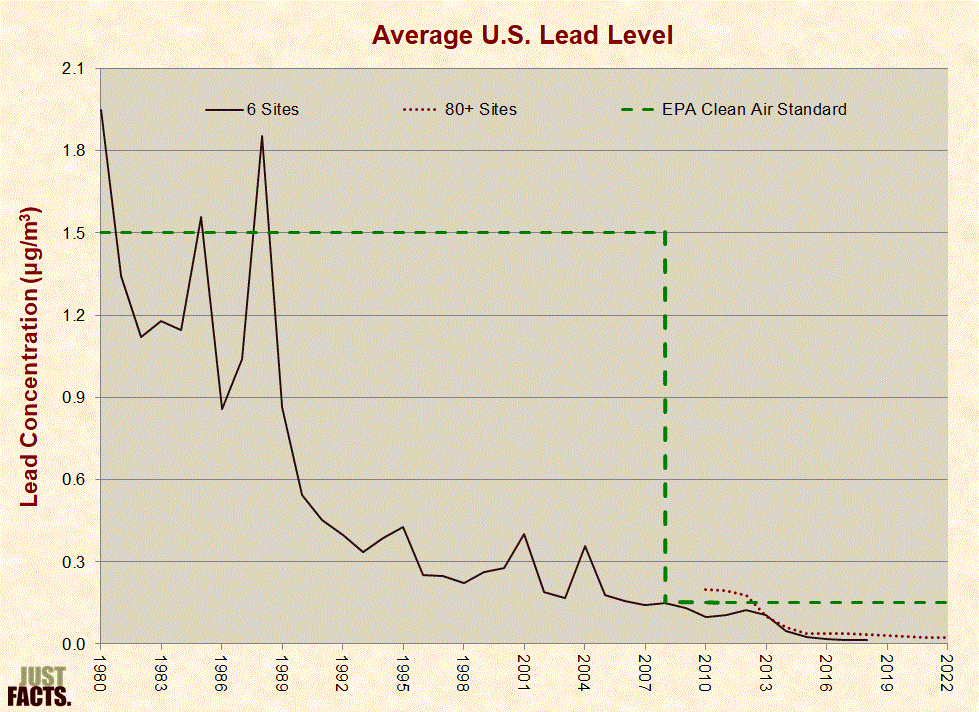
* According to EPA data:
* Nitrogen dioxide (NO2) is a highly reactive gas that can cause respiration problems.[116] [117]
* According to the EPA, the main sources of NO2 emissions in the U.S. are:
* Ambient NO2 concentrations typically peak near roadways. Per the EPA, NO2 monitors are “not sited to measure peak roadway-associated NO2 concentrations,” and thus, “individuals who spend time on and/or near major roadways could experience NO2 concentrations” that are 30% to 100% higher than monitors in that general area indicate.[121]
* The populations most susceptible to elevated NO2 levels are asthmatics and children.[122]
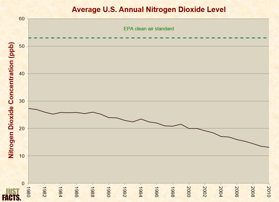
* An EPA primary and secondary clean air standard for nitrogen dioxide is an annual average of 53 parts per billion (ppb).[123] From 1980 through 2010, the average U.S. ambient nitrogen dioxide level decreased by 52% as measured by this standard:
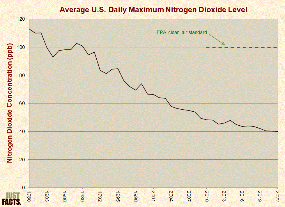
* In 2010, the EPA created a new primary NO2 standard that supplements the preexisting standard. It is intended to provide increased protection against health effects associated with short-term exposures, as opposed to the preexisting standard, which is based on the average annual exposure. This newer standard is 100 parts per billion based on the 98th percentile of 1-hour daily maximum concentrations, averaged over 3 years.[126] [127] From 1980 through 2022, the average U.S. ambient nitrogen dioxide decreased by 65% as measured by this standard:
* According to the EPA, as of 2024, all of the U.S. population live in counties that meet EPA’s clean air standard for nitrogen dioxide.[130] [131]
* Per the EPA, particulate matter (PM):
* The EPA monitors the ambient concentrations of two major categories of particulate matter:
* The EPA has itemized numerous methods to control PM emissions including paving unpaved roads, swapping out wood-burning stoves for propane logs, and installing particle filters/collection devices on engines and factories.[136] [137] [138]
* The populations most susceptible to elevated PM levels are individuals with heart and lung diseases, the elderly, and children.[139]
* According to the EPA, the main sources of PM10 emissions in the U.S. are:
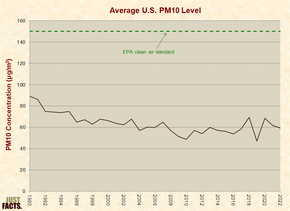
* EPA’s primary and secondary clean air standard for PM10 is a 24-hour mean of 150 micrograms per cubic meter (μg/m3), not to be exceeded more than once per year on average over 3 years.[145] From 1990 through 2022, the average U.S. ambient PM10 level decreased by 34% as measured by this standard:
* According to EPA data, as of 2024, 2% of the U.S. population live in counties that do not meet EPA’s clean air standard for PM10.[148]
* According to the EPA, the main sources of PM2.5 emissions in the U.S. are:
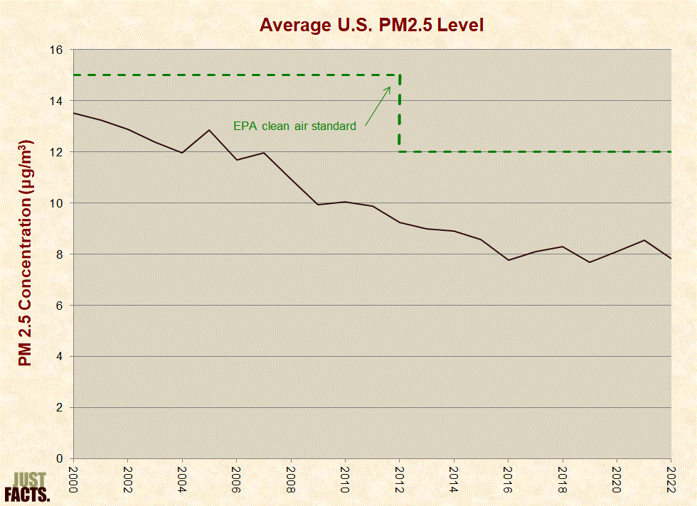
* An EPA primary clean air standard for PM2.5 is an annual mean of 12 micrograms per cubic meter (μg/m3), averaged over 3 years.[154] From 2000 through 2022, the average U.S. ambient PM2.5 level decreased by 42% as measured by this standard:
* According to EPA data, as of 2024, 7% of the U.S. population live in counties that do not meet EPA’s above-cited clean air standard for PM2.5.[157]
* In 2010, before the EPA made the above-cited clean air standard for PM2.5 stricter, the EPA estimated that 6% of the U.S. population lived in counties that did not meet this standard.[158]
* Sulfur dioxide (SO2) is a highly reactive gas that can cause respiration problems.[159] [160]
* According to the EPA, the main sources of SO2 emissions in the U.S. are:
* The population most susceptible to elevated SO2 levels is asthmatics. Among healthy non-asthmatics, SO2 does not typically affect lung function until concentrations exceed 1,000 parts per billion (ppb). Among asthmatics engaged in exercise, exposure to SO2 concentrations ranging from 200–300 ppb for 5–10 minutes have been shown to decrease lung function in 5–30% of these individuals.[166]
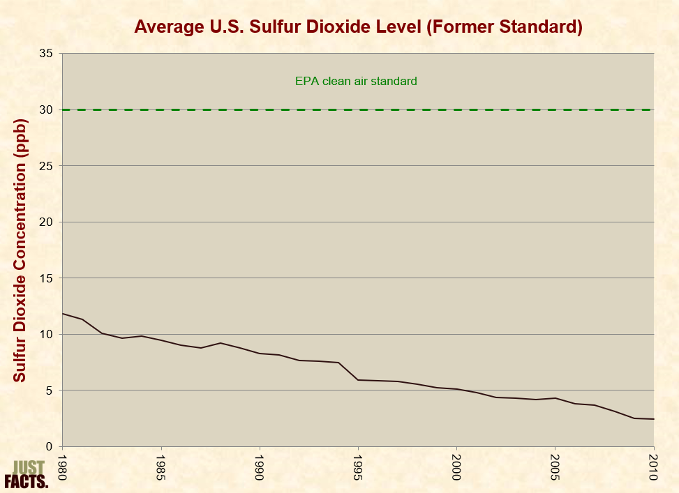
* Until 2010, EPA’s primary clean air standard for sulfur dioxide was an annual mean of 30 ppb.[167] From 1980 through 2010, the average U.S. ambient sulfur dioxide level decreased by 79% as measured by this standard:
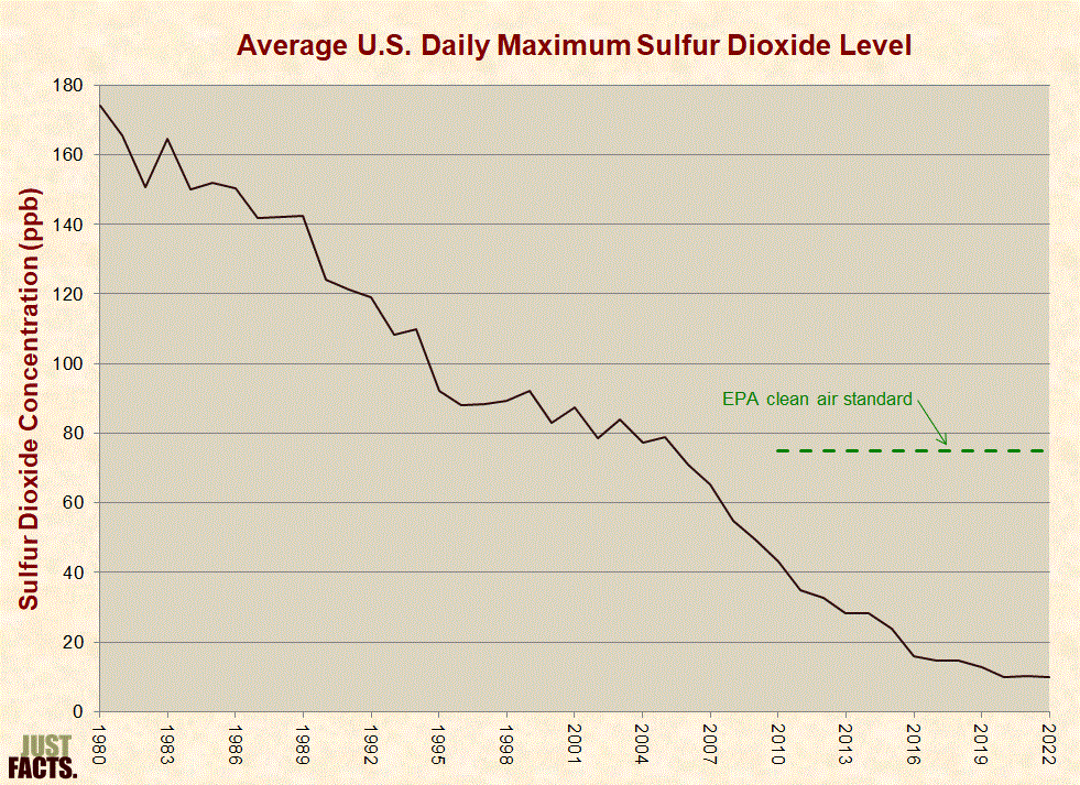
* In 2010, the EPA changed the primary SO2 standard to 75 ppb, as measured by a 3-year average of the 99th percentile of 1-hour daily maximum concentrations. This standard is “substantially more stringent than the previous standards” and is intended to provide increased protection against health effects associated with short-term exposures.[171] [172] From 1980 through 2022, the average U.S. ambient sulfur dioxide level decreased by 94% as measured by this standard:
* According to EPA data, in 2024, less than 1% of the U.S. population live in counties that did not meet EPA’s primary clean air standard for sulfur dioxide.[175]
* After tobacco smoke, the second leading cause of lung cancer in the United States is radon, a gas that arises from the decay of natural uranium, which is common in rocks and soils.[176]
* The EPA estimates that 13% of lung cancer deaths in the U.S. are related to radon.[177] [178]
* Radon typically seeps up from the ground into houses via floors and walls. In houses with radon levels at or above 4 picocuries per liter of air (pCi/L), the EPA recommends taking mitigation actions.[179]
* As of 2017 in the United States:
* Water has a pH of 7 (neutral on the pH scale), but various natural and manmade substances in the atmosphere can combine with water to change its pH level. When rainwater has a pH lower than 5.0–5.6, it is considered acid rain.[182] [183]
* Acid rain can harm lakes, streams, aquatic life, buildings, crops, and forests.[184] [185]
* The Encyclopædia Britannica states that the:
* Like the Encyclopædia Britannica, EPA’s “Plain English Guide to the Clean Air Act” states that “sulfur dioxide (SO2) and nitrogen oxides (NOx) are the principal pollutants that cause acid precipitation” and attributes these emissions strictly to manmade sources.[187]
* According to the EPA, biogenic sources like trees and vegetation produce 12% of all NOx emissions in the U.S. and 0% of all SO2 emissions.[188] [189]
* A study published in the journal Nature in 2003 found that certain types of trees, which were thought to absorb more NOx than they emitted, actually emit more NOx than they absorb. Previous studies had underestimated these natural NOx emissions because scientists failed to replicate natural conditions by exposing the trees to ultraviolet light. Based upon the results of a study conducted under natural conditions, the study’s authors estimated that coniferous trees (such as spruce, fir, and pine) in the northern hemisphere may emit “comparable” amounts of NOx to “those produced by worldwide industrial and traffic sources.”[190] [191] [192]
* A 1989 paper in the journal Hydrobiologia faults “human activities” for the fact that “annual precipitation averages less than pH 4.5 over large areas of the Northern Temperate Zone, and not infrequently, individual rainstorms and cloud or fog-water events have pH values less than 3.”[193]
* Formic acid, an organic compound emitted by natural processes and human activities, can contribute to the acidity of rain, but it is not associated with the harmful effects of acid rain because it rapidly decomposes.[194] [195] [196]
* An academic text published in 2002 asserts that formic acid contributes “slightly” to rainwater acidity.[197]
* Based upon satellite measurements and computer models, a 2011 paper published in Nature Geoscience estimated that:
* Volatile organic compounds (VOCs) and nitrogen oxides (NOx) are the two primary precursors of ozone.[200] [201]
* According to the EPA, biogenic sources, like trees and vegetation, produce 64% of all VOC emissions and 12% of all NOx emissions in the U.S.[202] [203]
* A 2003 study published in the journal Nature estimates that coniferous forests in the northern hemisphere may emit “comparable” amounts of NOx to “those produced by worldwide industrial and traffic sources.”[204] [205] [206]
* From 2008 to 2015, EPA’s primary and secondary clean air standard for ozone was 0.075 parts per million (ppm) as measured by a 3-year average of the fourth-highest daily maximum 8-hour concentration per year.[207] [208] In 2015, the EPA lowered this to 0.070 ppm.[209] [210]
* Ozone concentrations in relatively remote U.S. wilderness areas often reach 0.050 ppm to 0.060 ppm, particularly at high-altitude locations. The EPA states that it is “impossible to determine” the causes of these elevated ozone levels using currently available data, but based upon computer models, the EPA attributes them to a combination of:
* The EPA estimates that natural ground-level ozone concentrations in the continental U.S. are roughly 0.015 ppm to 0.035 ppm and are typically less than 0.025 ppm “under conditions conducive to high O3 episodes.” Five other studies have produced results ranging from 0.020 ppm to 0.045 ppm.[212] The range of results from these six studies corresponds to natural ozone background levels that vary from 21% to 64% of EPA’s clean air standard.[213]
* For a study published in the journal Nature in 2003, scientists compared the growth of trees in New York City to genetically identical trees in surrounding suburban and rural areas.[214] Contrary to expectations, the trees in the city grew about twice as fast as those in the rural areas. The study’s lead author stated:
* Experiments performed for this same study showed that higher ozone levels in the rural areas negatively impacted the trees’ growth rates. Although the city had higher peak ozone levels than the rural areas, the rural areas had higher long-term average levels than the city. The study’s authors attributed these higher rural ozone levels to manmade ozone precursors blowing in from the city and to a “scavenging reaction” that limits ozone levels in urban areas. The authors did not address the prospect that the higher ozone levels in rural areas were related to natural sources.[216] [217]
* According to the EPA, wildfires and prescribed burns (to prevent wildfires and dispose of agricultural vegetative residue) produce:[218] [219] [220]
* Between 2008 and 2014 (based on respective studies conducted in 2012 and 2018), EPA’s emission estimates from wildfires and prescribed burns changed as follows:
* Over the same period (2008–2014), the number of acres burned through wildfires and prescribed burns decreased by 9%.[226]
* On average, Americans spend 87% of their time indoors, 8% outdoors, and 6% in vehicles.[227]
* Indoor levels of ozone are typically one-tenth that of outdoor levels. This is because ozone is removed from the air by interactions with surfaces such as walls, carpeting, and furnishings.[228] [229]
* Lead exposure can often be higher in homes than outdoors, and even greater lead exposures can occur in office buildings, older homes with lead paint, and homes of smokers.[230]
* Carbon monoxide levels are typically 2–5 times higher in vehicles than outdoors. These levels generally decline as traffic volume declines and as speed increases.[231]
* Carbon monoxide levels are generally higher in homes than outdoors, and even greater levels of CO have been measured in rooms where people are smoking, indoor ice rinks (from ice resurfacing machines), homes with attached garages in which cars are idled, and indoor arenas where motocross races and tractor pulls are held.[232]
* In nations where modern energy is unavailable or prohibitively expensive, people tend to burn more wood, animal dung, crop waste, and coal in open fires and simple home stoves. This produces elevated levels of toxic indoor pollutants, because the fuels are not burned efficiently.[233] [234] [235] [236]
* In addition to criteria pollutants, the EPA is required by law to regulate the emissions of substances that:
* These substances are called “hazardous” or “toxic” air pollutants.[239]
* Unlike criteria pollutants, the law requires the EPA to consider the costs of enacting regulations to control the emissions of hazardous air pollutants.[240] [241]
* Unlike criteria pollutants, the EPA does not monitor the national ambient levels of hazardous air pollutants.[242] [243] Instead, the EPA estimates annual emissions of these pollutants.[244]
* Based on EPA emission estimates and ambient air measurements of “a subset of air toxics concentrations in a few locations,” the EPA creates computer models to approximate ambient levels of air toxics across the U.S. and some of their impacts on human health.[245] [246] [247]
* Based on EPA’s computer models, air toxics from outdoor sources increase the average risk of cancer over the first 70 years of life by 0.003 percentage points.[248] [249] For comparison, the average risk of developing cancer by the age of 70 is 20%.[250]
* EPA’s estimates of cancer risk from air toxics:
* The EPA currently regulates 188 hazardous air pollutants and has singled out:
* Between a baseline period of 1990–1993 and 2014,[264] EPA’s estimates for the combined annual emissions of all hazardous air pollutants decreased by 58%.[265] This 58% decrease includes:
* Between a baseline period of 1990–1993 and 2014,[267] EPA’s annual emission estimates for the seven hazardous air pollutants believed to account for the greatest health risks changed by the following amounts:
|
Hazardous Air Pollutant |
Change |
|
acetaldehyde |
40% |
|
acrolein |
–7% |
|
benzene |
–58% |
|
1,3-butadiene |
–45% |
|
carbon tetrachloride |
–98% |
|
formaldehyde |
6% |
|
tetrachloroethylene |
–97% |
* Major categories of water bodies in the United States include:
* The amount of fresh water that resides under the surface of the earth is roughly 30 times greater than the world’s fresh surface waters. Such ground water feeds natural springs and streams and is used by humans for drinking, cleaning, agriculture, and industry.[277]
* Federal law requires that public water systems be tested for various contaminants and treated (if needed) to meet these standards. In 2019, 92% of public water system customers were served by facilities that had no reported violations of EPA’s health-based drinking water standards.[278] A caveat of this finding is that violations are reported by states, and the EPA has found cases in which violations were not reported.[279]
* Per a 2006 EPA report, “very little” lead in drinking water comes from water utilities. Instead, it primarily comes from indoor plumbing in public schools, apartments, and houses.[280] [281]
* Private wells are not regulated under federal law and, in most cases, they are not regulated under state law. During 1991–2004, the U.S. Geological Survey (USGS) measured contamination levels in 2,167 private wells used for household drinking water. The wells were tested for 214 manmade and natural contaminants such as pesticides, radon, fecal bacteria, and nitrate. The results were as follows:
* In agricultural areas, about 1% of private wells have pesticide levels that exceed human health benchmarks.[283]
* Some pollutants accumulate within living organisms in greater concentrations than in their surrounding environments. This is called bioaccumulation, and it occurs because certain pollutants are not easily excreted or metabolized.[284]
* Bioaccumulative substances are often passed upwards through aquatic food chains, and thus, concentrations of such chemicals tend to be higher in creatures near the top of these food chains, such as salmon and trout.[285] [286]
* A group of bioaccumulative chemicals called PCBs were banned from production in the U.S. in 1979. Due to bioaccumulation, the concentrations of PCBs in fish can range from 2,000 to more than 1,000,000 times higher than the ambient concentrations in waters that the fish inhabit.[287]
* Dioxins are a group of highly toxic bioaccumulative chemicals that are sometimes released through incineration, combustion, and other processes. Due to bioaccumulation, the concentrations of dioxins in fish can range from hundreds to thousands of times higher than the ambient concentrations in waters that the fish inhabit.[288]
* During 2000–2003, the EPA conducted a random survey of fish contamination levels in 500 of the 147,000 lakes and reservoirs in the continental United States. The EPA tested bottom-dwelling and predator fish for 268 chemicals that bioaccumulate. The study found that:
|
Chemical |
EPA’s Limit for Four 8-Ounce Fish Meals Per Month (parts per billion) |
Portion of Water Bodies with Fish Exceeding This Limit |
|
mercury |
300 |
48.8% |
|
PCBs |
12 |
16.8% |
|
dioxins |
0.15 |
7.6% |
|
DDT |
69 |
1.7% |
|
chlordane |
67 |
0.3% |
* During 2003–2006, the EPA conducted a random survey of fish contamination levels at 1,623 locations in coastal waters throughout the continental United States, Southeastern Alaska, American Samoa, and Guam. The EPA tested bottom-dwelling and slower-moving fish (such as shrimp, lobsters, and finfish) for 16 chemical contaminants such as inorganic arsenic, cadmium, and PCBs. The study found that fish did not exceed EPA’s four-meal-per-month contamination limits for any of these chemicals:
* An analysis of 17 studies published by the International Journal of Environmental Research and Public Health in 2018 found that:
* Roughly 13% of U.S. surface waters do not meet state fecal bacteria limits for various uses such as recreation and public water supplies. A technology called microbial source tracking (MST) allows scientists to trace the sources of fecal bacteria.[300] A 2005 EPA report summarizes eight studies conducted in various localities with elevated levels of fecal bacteria.[301] [302] Using MST, it found that the dominant sources were:
* “Acidity” is a measure of a liquid’s ability to chemically alter a substance in a way that can lead to corrosion.[312] [313] [314]
* The acidity of liquids is measured on a scale called pH, which ranges from 0 to 14. Lower pH values indicate higher acidity:[315]
pH Scale
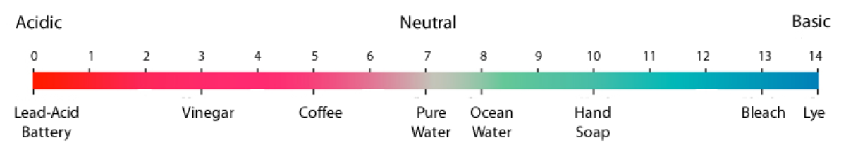
* The pH scale is logarithmic, so a one point change in pH represents a ten-fold change in acidity. [317]
* Acidification is a decrease in pH over time. It does not necessarily mean that a liquid has become an acid (pH < 7).[318] [319] [320]
* Ocean acidification is the term used to describe a decrease in ocean pH as a result of man-made carbon dioxide emissions. When water absorbs carbon dioxide, it becomes more acidic, which decreases its pH.[321] A large decrease in ocean pH could harm certain sea creatures like shellfish and corals, which are foundational to marine ecosystems.[322]
* Carbon dioxide is a generally “colorless, odorless, non-toxic, non-combustible gas.”[323] [324] [325] It is also:
* Since the outset of the Industrial Revolution in the late 1700s,[331] the portion of the earth’s atmosphere that is comprised of carbon dioxide has increased from 0.028% to 0.041%, or by about 48%.[332]
* The mass of the world’s oceans is 270 times greater than that of its atmosphere.[333] The ability of substances to affect or pollute one another is related to their masses. Larger masses are generally less affected because they dilute other substances.[334] [335] [336]
* The National Oceanic and Atmospheric Administration (NOAA) is an agency of the United States Department of Commerce that produces oceanic and atmospheric research.[337]
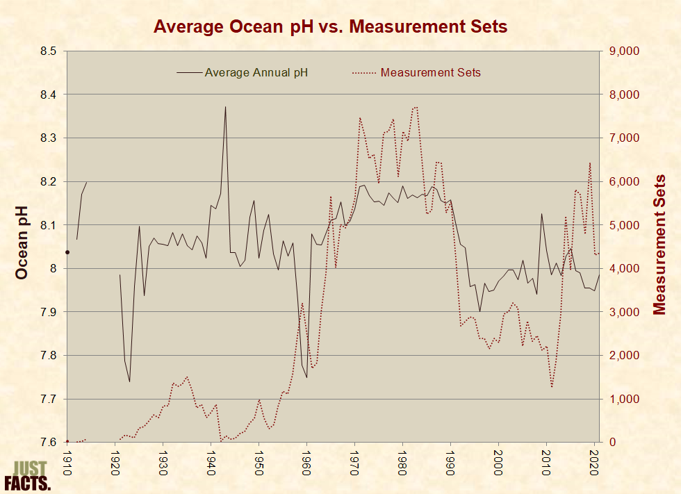
* Data from the NOAA World Ocean Database shows that the ocean’s average pH has varied as follows since 1910:
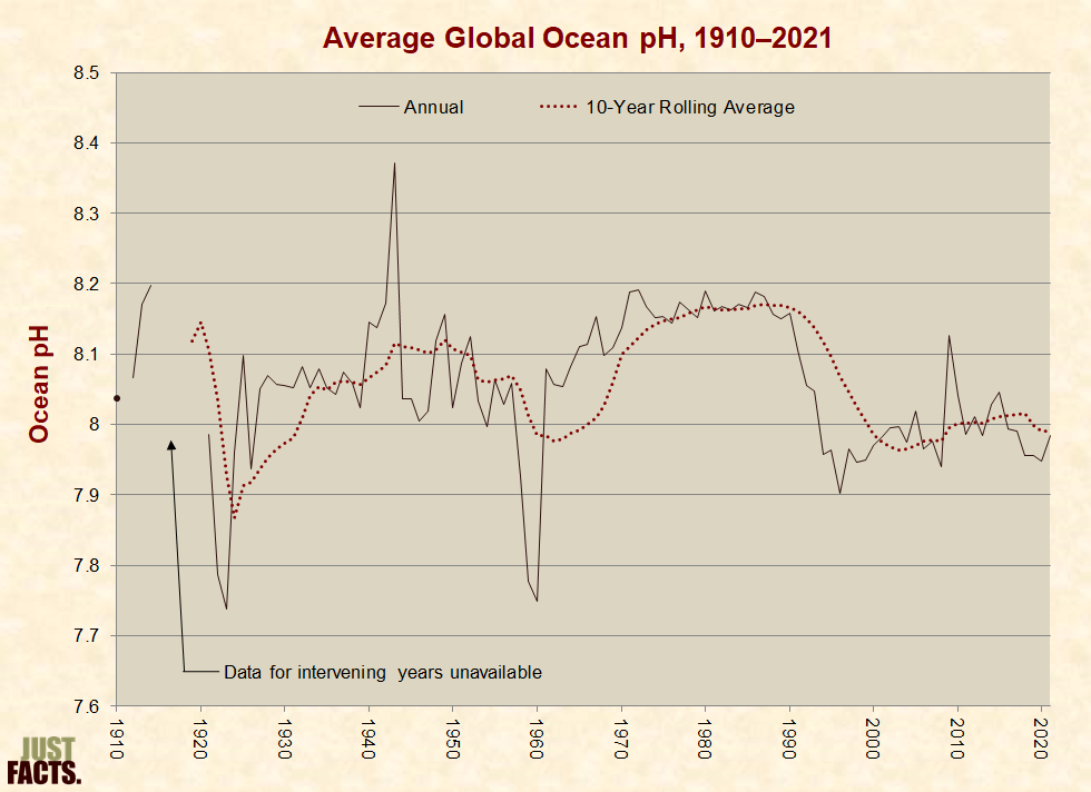
* A NOAA webpage states ocean pH measurements prior to 1989 are:
* Within NOAA, some scientists oppose the notion that NOAA’s pre-1989 ocean pH measurements are uninformative. Hernan Garcia—a NOAA oceanographer, director of World Data Service for Oceanography, and U.S. data manager for the International Oceanographic Data and Information Exchange—stated that:
it is too broad to characterize all the older historical pH data as questionable without the benefit of a more in depth analysis. … These historical data are scientifically valuable and cannot be recreated.[340]
* With regard to the accuracy of historical data, global ocean pH averages are generally more consistent during time periods when more measurements are taken:
* Ph.D. oceanographers Richard Feely and Christopher Sabine are University of Washington professors who work for the National Oceanic and Atmospheric Administration (NOAA). They were part of a team of scientists that co-shared the 2007 Nobel Peace Prize with Al Gore for educating people about climate change.[342] [343] [344]
* In 2010, Richard Feely received a Heinz award of $100,000 for his vital role in identifying ocean acidification as global warming’s “evil twin.”[345]
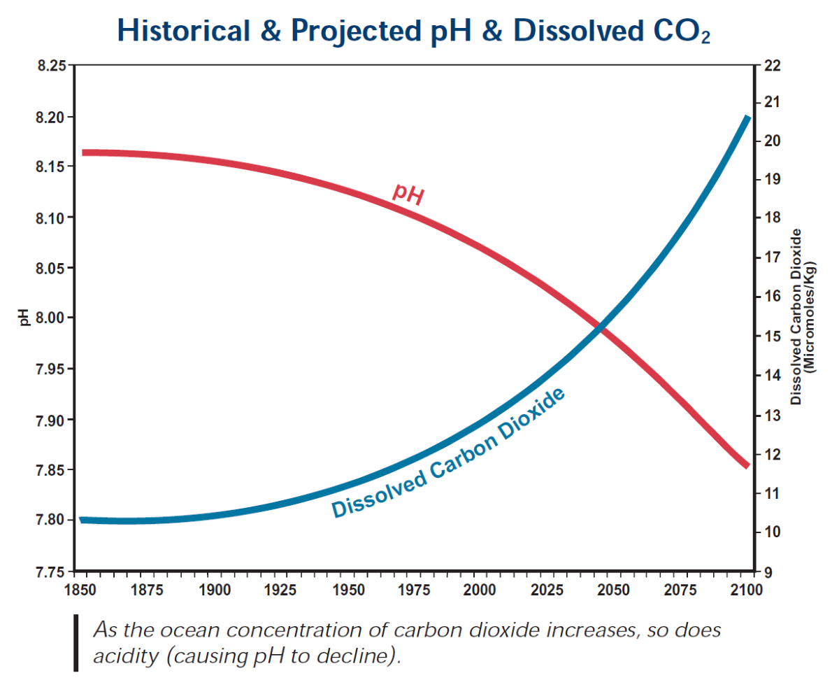
* Feely and Sabine have created computer models to predict ocean pH in the future. They project that ocean acidification will accelerate “to an extent and at rates that have not occurred for tens of millions of years,” which could cause irreversible damage to marine life during this century.[346]
* Per the academic text Flood Geomorphology:
* In 2006, Feely and Sabine published the following chart, which estimates “Historical & Projected” ocean pH using computer models:
* Plotted with NOAA’s historical data, Feely and Sabine’s computer model looks like this:
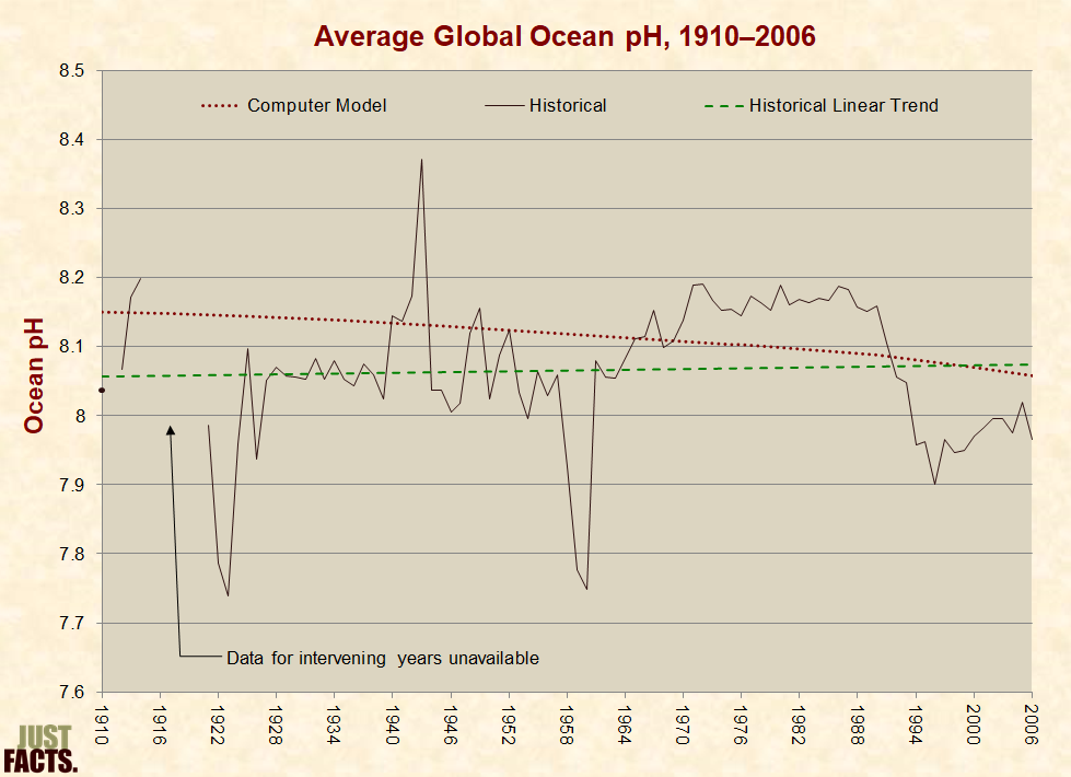
* In 2013, a hydrologist named Michael Wallace emailed Feely and Sabine about the discrepancies between the historical data and their model. He then filed a Freedom of Information Act request for their underlying data.[350] [351] [352] During this correspondence:
* Per an academic work about data analysis and the “importance of transparency”:
* Per the serial work Implementing Reproducible Research:
* James Cook University in Australia is regarded as “a leader in teaching and research that addresses the critical challenges facing the Tropics.”[364] The Centre of Excellence for Coral Reef Studies—headquartered at this university—is a government-funded research program formed to study coral reef sustainability.[365]
* Scientists from this center conducted several experiments in which they exposed fish to chemically altered water to simulate ocean acidification. These studies report many observations of behavioral impairments, such as attraction to the scents of predators.[366] [367] [368] [369] [370] [371]
* A separate international team of scientists launched a three-year replication study to investigate these results. After analyzing over 900 fishes of six different species, they concluded that findings of behavioral impairment are “not reproducible.” Their paper, published in the journal Nature, states that:
* In reply to the above paper, the scientist who led many of the original studies stated, “you can hardly say you’ve repeated something if you’ve gone and done it in a different way.”[373] He argued that disparate results were because the authors of the replication study failed to:
* With regard to the claims above, the authors of the replication study reported that:
* With further regard to the effects of pollutants on the ability of fish to detect predators:
* In 2019, a scientist named Peter Ridd was awarded $1.2 million in a lawsuit against James Cook University because he was fired after publicly stating that his colleagues’ research “can no longer be trusted.” The ruling was set aside by another court, and Ridd lost an appeal to the High Court of Australia.[390] [391] [392] [393] [394] [395]
* Coral reefs are large rock structures that are home to a vast variety of marine species in shallow, tropical seas. Commonly called the “rainforests of the sea,” these ecosystems sustain a quarter of marine species yet cover less than 1% of the ocean floor.[396] [397] [398]
* Hard corals, or “reef-builders,” are immobile seafloor animals that produce rocky skeletons for structure and protection. These skeletons slowly accumulate beneath them and create massive reefs over time.[399] [400] [401]
* In more acidic water, coral reefs are less dense and therefore more prone to corrosion and structural damage.[402]
* Plant-like organisms called algae live within corals, giving them color and providing them with vital energy.[403] [404] When subjected to severe environmental stress, such as El Nino heat waves, corals will often expel their algae. As a result, reefs sometimes become white.[405] [406] This phenomenon is called “coral bleaching.”[407] [408] [409] [410]
* Coral bleaching raises the risk of mortality but does not mean the coral is dead, as bleached reefs recover when environmental stress is not too severe.[411] [412]
* In 2008, the Center of Excellence for Coral Reef Studies in Australia published a high-profile study that asserted ocean acidification triggered by manmade carbon dioxide emissions causes coral bleaching.[413] [414] The experiment involved placing three common species of corals and algae into tanks flowing with chemically altered water to simulate ocean acidification. The study found that:
* The Australian Institute of Marine Science deems field research more reliable than laboratory experiments for observing the impact of ocean acidification on coral reefs and states:
* In Papua New Guinea, volcanic cracks in the seafloor constantly release carbon dioxide, causing certain reef habitats to exist in perpetually acidified waters. This creates a “natural laboratory” for field research on ocean acidification. The water’s pH value near these cracks can be as low as 7.28,[418] or roughly five times more acidic than the global average over the past decade.[419] A webpage of the Australian Institute of Marine Science that summarizes the results of field research at these sites does not report coral bleaching but mentions:
* “Coral cover” refers to the portion of a reef that is covered with living coral.[423] This is a key measure of coral reef health, much like tree coverage in a tropical forest.[424]
* Major environmental disturbances can cause reefs to lose much of their coral coverage, but they often recover in about ten to thirty years. Newly recovered reefs typically have different combinations of coral species than before they were damaged because some species grow more quickly than others.[425] [426]
* To obtain the longest-term datasets on coral cover, Just Facts wrote to the IPCC’s coral reef specialists, and they provided the following sources:[434]
* In 2021—nine years after the prediction above—the Australian Institute of Marine Science reported that coral cover on the Great Barrier Reef was:
* Per the U.S. Department of Agriculture:
* In 2014, the IPCC published a report that expressed “low confidence” in the theory that human-caused ocean acidification is reducing coral growth rates.[444]
* The Red List of Threatened Species—published by the International Union for Conservation of Nature (IUCN)—is “the world’s most comprehensive information source on the global extinction risk status of animal, fungus and plant species.”[445]
* According to IUCN guidelines, a species can be considered threatened if population size is “projected, inferred, or suspected” to decrease by 30% over a period of ten to 100 years. With regard to data quality, the IUCN Red List criteria:
* In 2008, the journal Science published a high-profile study that used IUCN criteria to assess the extinction risk of 845 reef-building coral species. It stated that about 33% of these species were threatened with extinction, though the estimates “suffer from lack of” long-term data.[447] [448] As of 2022, the IUCN Red List asserts that 33% of reef-building corals are threatened with extinction.[449] [450]
* In 2021, the journal Nature Ecology & Evolution published the first global study of coral population counts. Based on coral abundance data from 1999–2002 and coral cover data from 1997–2006, the study found that:
* Municipal solid waste, also known as trash or garbage, consists of nonhazardous items that are thrown away, such as newspapers, cans, bottles, packaging, clothes, furniture, food scraps, and grass clippings.[453] [454] Municipal solid waste does not include industrial, hazardous, or construction waste.[455]
* The most common types of municipal solid waste (by weight) are paper (23%), food scraps (22%), yard trimmings (12%), plastics (12%), rubber, leather and textiles (9%), metals (9%), wood (6%), glass (4%), and other materials (3%).[456]
* In 2010, roughly 55% to 65% of municipal solid waste was generated by residences, while 35% to 45% was generated by businesses and institutions (like hospitals and schools).[457]
* In 2018, Americans generated about 292 million tons of trash or 4.9 pounds per person per day.[458] Of this, 50% was placed in landfills, 24% was recycled, 12% was burned for energy, and 9% was composted.[459]
* Older landfills were often malodorous, pest-ridden, and laden with noxious pollutants. Modern landfills seldom have such problems and operate under regulations that require controls over the types of trash that can be buried, a daily covering of dirt over the refuse, composite liners, clay caps, and runoff collections systems. Many modern landfills generate energy by collecting and burning methane from decomposing organic materials.[460] [461] [462] [463]
* The average lifecycle of a landfill is about 30–50 years.[464] After this, landfills must be covered and can be used for purposes such as parks, commercial development, golf courses, nature conservatories, ski slopes, and airfields. Hazardous waste dumps can also be used for such purposes.[465] [466] [467] [468]
* The Fresh Kills landfill in Staten Island, NY serviced New York City from 1948 to 2001 and was the largest landfill in the world, consisting of five mounds of trash ranging from 90 to 225 feet. It is currently being converted into “the largest park developed in New York City in over 100 years.” Parts of the park have been opened since 2010 with soccer fields, walking paths, biking paths, playgrounds, basketball courts, and other recreational areas:

* At the current U.S. population growth rate and the current per-person trash production rate, the U.S. will use about 13.3 billion cubic yards of municipal landfill volume over the next 50 years. Given a landfill height of 90 feet, this equates to a square area that is 12 miles long on each side or four one-thousandths of one percent (0.004%) of the country’s land area:
* While citing:
* While citing people who work in waste management, the New York Times reported in 2005 that:
* A scientific, nationally representative survey commissioned in 2019 by Just Facts found that 66% of voters believe that if the U.S. stopped recycling and buried all of its municipal trash for the next 100 years in a single landfill that was 30 feet high, the landfill would cover more than 5% of the nation’s land area.[479] [480] [481] The actual figure is 0.06%.[482]
* In 2018, Americans recycled about 24% of solid municipal waste or 1.2 pounds per person per day.[483]
* In 2018, the recycling rate for:
* Factors that affect the environmental impacts and financial costs associated with recycling include (but are not limited to):
* Factors that determine the financial costs and environmental impacts associated with manufacturing from virgin materials and disposal in landfills include (but are not limited to):
* In the mid-1970s, the EPA concluded that recycling generally produces less pollution than manufacturing from virgin materials.[491]
* In 1989, the U.S. Congress’s Office of Technology Assessment concluded that:
* Environmental impact assessments of curbside recycling have produced conflicting results, such as these:
* Both of the studies cited above (and others) conclude that without governmental subsidies or mandates, curbside recycling is generally more expensive than conventional disposal and manufacturing. The recycling of products made of aluminum is an exception to this generality.[495] [496] [497] [498]
* Various state and local governments have enacted laws and quotas that require mandatory recycling.[499] Examples of such include the states of North Carolina,[500] New Jersey,[501] and Connecticut,[502] the cities of Seattle,[503] San Francisco,[504] and New York,[505] 168 municipalities in Massachusetts,[506] and Monroe County, New York.[507]
* Various nations, localities, and businesses have banned or imposed taxes and surcharges on disposable plastic supermarket bags. Examples of such include: China,[508] Ireland,[509] Seattle, San Francisco, Westport, Connecticut,[510] Washington, D.C.,[511] and Whole Foods Market.[512] [513]
* Assessing the full environmental impacts of different products requires examining all aspects of their production, use, and disposal. To do this, researchers perform “life cycle assessments” or LCAs. Per the U.S. Environmental Protection Agency, LCAs allow for:
* A 2011 study published by the United Kingdom’s Environment Agency evaluated nine categories of environmental impacts caused by different types of supermarket bags, such as plastic, degradable plastic, paper, and reusable cotton totes. The study quantified “all significant life cycle stages from raw material extraction, through manufacture, distribution use and reuse to the final management of the carrier bag as waste.”[515] The study found:
|
Environmental Impact[520] |
Times That the Same Tote Must Be Reused to Have Less Impact Than Disposable Plastic Bags |
|
|
Cotton Tote (expected life is 52 reuses) |
Plastic Polypropylene Tote (expected life is 104 reuses) |
|
|
Global warming potential |
172 |
14 |
|
Abiotic depletion |
94 |
17 |
|
Acidification |
245 |
9 |
|
Eutrophication |
393 |
19 |
|
Human toxicity |
314 |
14 |
|
Fresh water aquatic ecotoxicity |
351 |
7 |
|
Marine aquatic ecotoxicity |
354 |
11 |
|
Terrestrial ecotoxicity |
1,899 |
30 |
|
Photochemical oxidation |
179 |
10 |
* The study did not account for the environmental impacts of washing reusable totes, which is recommended because they can harbor pathogens through meat drippings and other food remnants.[522] [523]
* A 2018 study published by Denmark’s Environmental Protection Agency evaluated 15 categories of environmental impacts caused by different types of supermarket bags, such as paper, plastic, cloth/plastic blend, and cotton. The study quantified the “impacts of providing, using and disposing of” each bag and found the following results:[524]
|
Bag Type |
Times the Same Bag Must Be Reused to Have the Same Impact as a Disposable Plastic Bag |
|
Reusable plastic |
35–84 |
|
Disposable paper |
43 |
|
Reusable cloth/plastic blend |
870 |
|
Reusable cotton |
7,100 |
|
Reusable organic cotton |
20,000 |
* The study did not account for the environmental impacts of washing reusable totes, which is recommended because they can harbor pathogens through meat drippings and other food remnants.[528] [529]
[1] Entry: “pollution.” American Heritage Science Dictionary. Houghton Mifflin, 2005. Page 495.
[2] Book: Biological Risk Engineering Handbook: Infection Control and Decontamination. Edited by Martha J. Boss and Dennis W. Day. CRC Press, 2016.
Chapter 4: “Toxicology.” By Richard C. Pleus, Harriet M. Ammann, R. Vincent Miller, and Heriberto Robles. Pages 97–110.
Page 98:
The maximum dose that results in no adverse effects is called the threshold dose. Many chemical agents have a threshold dose. The concept of threshold implies that concentrations of exposure present are so low that adverse effect cannot be measured. Some notable exceptions occur, such as when a person develops an allergic reaction to chemical (only specific chemicals are capable of causing allergic reactions).
Another exception, although controversial, is chemicals that cause cancer. Given our current lack of understanding of the mechanisms that lead to cancer initiation and development, regulatory agencies have adopted the position that any dose of a carcinogen has an associated risk of developing cancer. Scientifically, not all carcinogens are in fact capable of causing an effect at low doses; however, the problem is that no one knows what the dose must be in order to cause an effect, so to be safe the dose is set as low as practicable (usually at the limit of detection for instrumentation).
[3] Book: Molecular Biology and Biotechnology: A Guide for Teachers (3rd edition). By Helen Kreuzer and Adrianne Massey. ASM [American Society for Microbiology] Press, 2008.
Page 540: “Paracelsus, a Swiss physician who reformed the practice of medicine in the 16th century, said it best: ‘All substances are poisons, there is none which is not a poison. The dose differentiates a poison and a remedy.’ This is a fundamental principle in modern toxicology: the dose makes the poison.”
[4] Book: Chemical Exposure and Toxic Responses. Edited by Stephen K. Hall, Joana Chakraborty, and Randall J. Ruch. CRC Press, 1997.
Pages 4–5:
The relationship between the dose of a toxicant and the resulting effect is the most fundamental aspect of toxicology. Many believe, incorrectly, that some agents are toxic and others are harmless. In fact, determinations of safety and hazard must always be related to dose. This includes a consideration of the form of the toxicant, the route of exposure, and the chronicity [time] of exposure.
[5] Book: Understanding Environmental Pollution (3rd edition). By Marquita K. Hill. Cambridge University Press, 2010.
Pages 60, 62:
Anything is toxic at a high enough dose. … Even water, drunk in very large quantities, may kill people by disrupting the osmotic balance in the body’s cells. … Potatoes make the insecticide, solanine. But to ingest a lethal dose of solanine would require eating 100 pounds (45.4 kg) of potatoes at one sitting. However, certain potato varieties—not on the market—make enough solanine to be toxic to human beings. Generally, potentially toxic substances are found in anything that we eat or drink.
[6] Book: The Johns Hopkins Manual of Gynecology and Obstetrics (3rd edition). Edited by Kimberly B. Fortner. Lippincott Williams & Wilkins, 2007. Chapter 38: “Critical Care.” By Catherine D. Cansino and Pamela Lipsett.
Page 40: “The lungs are protected by a concentrated supply of endogenous antioxidants; however, when there is too much oxygen or not enough of the antioxidants, the lungs may be damaged, as in acute repository distress syndrome (ARDS). … Oxygen therapy with an F102 above 60% for longer than 48 hours is considered toxic.”
[7] Book: Clinical Toxicology: Principles and Mechanisms. By Frank A. Barile. CRC Press, 2004.
Page 3: “What transforms a chemical into a toxin depends more on the length of time of exposure, dose (or concentration) of the chemical, or route of exposure, and less on the chemical structure, product formulation, or intended use of the material.”
[8] Biological Risk Engineering Handbook: Infection Control and Decontamination. Edited by Martha J. Boss and Dennis W. Day. CRC Press, 2016.
Chapter 4: “Toxicology.” By Richard C. Pleus, Harriet M. Ammann, R. Vincent Miller, and Heriberto Robles. Pages 97–110.
Page 98:
The degree of harm or the influencing factors of toxicity are related to:
• Chemical and physical properties of the chemical (or its metabolites)
• Amount of the chemical absorbed by the organism
• Amount of chemical that reaches its target organ of toxicity
• Environmental factors and activity of the exposed subject (e.g., working habits, personal hygiene)
• Duration, frequency, and route of exposure
• Ability of the organism to protect itself from a chemical
[9] Book: 1999 Toxics Release Inventory: Public Data Release. U.S. Environmental Protection Agency, April 2001.
Page 1-11:
Some high-volume releases of less toxic chemicals may appear to be a more serious problem than lower-volume releases of more toxic chemicals, when just the opposite may be true. For example, phosgene is toxic in smaller quantities than methanol. A comparison between these two chemicals for setting hazard priorities or estimating potential health concerns, solely on the basis of volumes released, may be misleading. …
The longer the chemical remains unchanged in the environment, the greater the potential for exposure. Sunlight, heat, or microorganisms may or may not decompose the chemical. … As a result, smaller releases of a persistent, highly toxic chemical may create a more serious problem than larger releases of a chemical that is rapidly converted to a less toxic form.
NOTE: Credit for bringing this source to attention belongs to Steven F. Hayward of the Pacific Research Institute. (“2011 Almanac of Environmental Trends.” April 2011. <www.pacificresearch.org>)
[10] Book: Molecular Biology and Biotechnology: A Guide for Teachers (3rd edition). By Helen Kreuzer and Adrianne Massey. ASM [American Society for Microbiology] Press, 2008.
Pages 540–541:
The factors driving your concept of risk—emotion or fact—may or may not seem particularly important to you, yet they are. The risks you are willing to assume and the experiences or products you avoid because of faulty assumptions and misinformation affect the quality of your life and the lives of those around you. Thus, even though it may be tempting to let misperceptions and emotions shape your ideas about risky products and activities, there are risks in misperceiving risks.
[11] Book: Molecular Biology and Biotechnology: A Guide for Teacher (3rd edition). By Helen Kreuzer and Adrianne Massey. ASM [American Society for Microbiology] Press, 2008.
Page 540:
Many people are frightened by the use of synthetic chemicals on food crops because they have heard that these chemicals are “toxic” and “cancer causing,” but are all synthetic chemicals more harmful than substances people readily ingest, like coffee and soft drinks? No (Table 37.2). For example, in a study to assess the toxicities of various compounds, half of the rats died when given 233 mg of caffeine per kg of body weight, but it took more than 10 times that amount of glyphosate (4,500 mg glyphosate/kg body weight), which is the active ingredient in the herbicide Roundup, to cause the same percentage of deaths as 233 mg of caffeine.
Table 3.2 Carcinogenic Substances
|
Substance |
Carcinogenic Potential * |
|
Red wine |
5.0 |
|
Beer |
3.0 |
|
Edible mushrooms |
0.1 |
|
Peanut butter |
0.03 |
|
Chlorinated water |
0.001 |
|
Polychlorinated biphenyls (PCBs) |
0.0002 |
* The higher the number, the greater the cancer-causing potential. The carcinogenic potential of peanut butter is due to the toxin aflatoxin, produced by a mold that commonly infects peanuts and other crops.
[12] Website: “Caffeine: Acute Effects, Page 2 of 43 Items.” Pubchem, National Center for Biotechnology Information, U.S. Department of Health and Human Services. Accessed February 27, 2020 at <pubchem.ncbi.nlm.nih.gov>
The results from acute animal tests and/or acute human studies are presented in this section. Acute animal studies consist of LD50 [lethal dose] and LC50 [lethal concentration] tests, which present the median lethal dose (or concentration) to the animals. Acute human studies usually consist of case reports from accidental poisonings or industrial accidents. These case reports often help to define the levels at which acute toxic effects are seen in humans. …
Organism [=] rat … Test Type [=] LD50 … Route [=] oral … Dose [=] 192 mg/kg (192 mg/kg) … Effect [=] Brain and Coverings: Other Degenerative Changes; Behavioral: Withdrawal; Kidney, Ureter, and Bladder: Interstitial Nephritis … Reference [=] … Journal of New Drugs., 5(252), 1965
[13] Report: “Toxicological Profile for Glyphosate.” U.S. Department of Health & Human Services, Agency for Toxic Substances and Disease Registry, August 2020. <www.atsdr.cdc.gov>
An acute oral LD50 [lethal dose to 50% of test animals] value of 4,320 mg/kg/day was reported following single oral dosing of rats with glyphosate technical (EPA 1992b). In a developmental toxicity study, 6/25 pregnant rats died during oral dosing of glyphosate technical at 3,500 mg/kg/day; there were no deaths during treatment at 1,000 mg/kg/day (EPA 1992e). No adequate sources were located regarding death in laboratory animals exposed to glyphosate technical by inhalation or dermal routes.
[14] Book: Chemical Exposure and Toxic Responses. Edited by Stephen K. Hall, Joana Chakraborty, and Randall J. Ruch. CRC Press, 1997.
Pages 4–5: “The relationship between the dose of a toxicant and the resulting effect is the most fundamental aspect of toxicology. Many believe, incorrectly, that some agents are toxic and others are harmless. In fact, determinations of safety and hazard must always be related to dose. This includes a consideration of the form of the toxicant, the route of exposure, and the chronicity [time] of exposure.”
[15] Calculated with data from:
a) Webpage: “Caffeine Content for Coffee, Tea, Soda and More.” Mayo Clinic. Accessed July 5, 2018 at <www.mayoclinic.org>
“The charts below show typical caffeine content in popular beverages. Drink sizes are in fluid ounces …. Caffeine is shown in milligrams (mg). … Coffee drinks [=] Brewed … Size in oz. [=] 8 … Caffeine (mg) [=] 95–165”
b) Paper: “The Weight of Nations: An Estimation of Adult Human Biomass.” By Sarah Catherine Walpole. BMC Public Health, 2012. <bmcpublichealth.biomedcentral.com>
Page 3: “Average body mass globally was 62 kg.”
c) Book: Molecular Biology and Biotechnology: A Guide for Teacher (3rd edition). By Helen Kreuzer and Adrianne Massey. ASM [American Society for Microbiology] Press, 2008.
Page 540: “[I]n a study to assess the toxicities of various compounds, half of the rats died when given 233 mg of caffeine per kg of body weight….”
CALCULATIONS:
[16] Article: “Too Much Caffeine Caused Spring Hill Student’s Death.” By Teddy Kulmala and Cynthia Roldán. The State, May 16, 2017. <www.thestate.com>
A 16-year-old Spring Hill High School student who collapsed in a classroom last month died from ingesting too much caffeine, the county coroner said Monday.
The official cause of death for Davis Allen Cripe was a “caffeine-induced cardiac event causing a probable arrhythmia,” said Richland County Coroner Gary Watts. It was the result of the teen ingesting the caffeine from a large Diet Mountain Dew, a cafe latte from McDonald’s and an energy drink over the course of about two hours, Watts said. …
Davis had purchased the latte at a McDonald’s around 12:30 p.m. April 26, Watts said. He consumed the Diet Mountain Dew “a little time after that” and the energy drink sometime after the soda.
[17] Calculated with data from:
a) Paper: “An Assessment of Dietary Exposure to Glyphosate Using Refined Deterministic and Probabilistic Methods.” By C.L. Stephenson and C.A. Harris. Food and Chemical Toxicology, September 2016. Pages 28–41. <www.sciencedirect.com>
Page 40: “Overall, the TMDI [theoretical maximum daily intake] can be useful as a screening tool to rapidly identify potential risks to the consumer, but it can be demonstrated that it overestimates actual exposure and does not give a realistic estimate of dietary exposure. By systematic use of refinements, such as substituting MRLs [maximum residue levels] for median residue levels and the use of processing and residues monitoring information, the total modelled exposure to glyphosate is reduced by a factor of 67. This estimate could be refined further by additional monitoring or processing data, or using refined modelling based on the probabilistic method developed by the EFSA [European Food Safety Authority] Panel on Plant Protection Products and their Residues (EFSA PPR, 2012). The refined chronic dietary intake of glyphosate for the critical EU diet (Irish adult), using the deterministic approaches employed in PRIMo [Pesticide Residue Intake Model] rev. 2, was 0.0061 mg/kg bw/day, or 1.2% of the ADI [acceptable daily intake] of 0.5 mg/kg bw/day. The exposure level at which no adverse effect was seen (i.e., the no-observed-adverse-effect level, or NOAEL), in the studies used to derive the ADI, was approximately 8200 times higher than this refined chronic dietary intake. Indicative probabilistic calculations, based on the EFSA PPR guidance, show that the actual chronic dietary exposure is likely to be even lower (<0.0045 mg/kg bw/day; P99.9). In 2004, the JMPR [Joint FAO/WHO Meeting on Pesticide Residues] established an ADI of 1 mg/kg bw/day (WHO/FAO, 2004), [World Health Organization/Food and Agriculture Organization of the United Nations] and in 2006, the US EPA [U.S. Environmental Protection Agency] set a chronic population-adjusted dose (cPAD) of 1.75 mg/kg. Since the EU [European Union] ADI has been used in these risk assessments, it represents the most conservative assumptions regarding the endpoint, globally.”
b) Paper: “The Weight of Nations: An Estimation of Adult Human Biomass.” By Sarah Catherine Walpole. BMC Public Health, 2012. <bmcpublichealth.biomedcentral.com>
Page 3: “Average body mass globally was 62 kg.”
c) Book: Molecular Biology and Biotechnology: A Guide for Teacher (3rd edition). By Helen Kreuzer and Adrianne Massey. ASM [American Society for Microbiology] Press, 2008.
Page 540: “[I]n a study to assess the toxicities of various compounds, half of the rats died when given 233 mg of caffeine per kg of body weight, but it took more than 10 times that amount of glyphosate (4,500 mg glyphosate/kg body weight), which is the active ingredient in the herbicide Roundup, to cause the same percentage of deaths as 233 mg of caffeine.”
Report: “Toxicological Profile for Glyphosate.” U.S. Department of Health & Human Services, Agency for Toxic Substances and Disease Registry, August 2020. <www.atsdr.cdc.gov>
“An acute oral LD50 [lethal dose] value of 4,320 mg/kg/day was reported following single oral dosing of rats with glyphosate technical (EPA 1992b).”
CALCULATION: 4,320 mg glyphosate per kg of body mass lethal dosage / 0.0045 mg glyphosate consumption per kg of body mass per day = 960,000 times increase to reach lethal dosage
[18] Website: “Glyphosate: Acute Effects.” Pubchem, National Center for Biotechnology Information, U.S. Department of Health and Human Services. Accessed February 27, 2020 at <pubchem.ncbi.nlm.nih.gov>
The results from acute animal tests and/or acute human studies are presented in this section. Acute animal studies consist of LD50 [lethal dose] and LC50 [lethal concentration] tests, which present the median lethal dose (or concentration) to the animals. Acute human studies usually consist of case reports from accidental poisonings or industrial accidents. These case reports often help to define the levels at which acute toxic effects are seen in humans. …
Organism [=] rat … Test Type [=] LD50 … Route [=] oral … Dose [=] 4873 mg/kg (4873 mg/kg) … Effect [=] Behavioral: Convulsions or Effect on Seizure Threshold; Lungs, Thorax, or Respiration: Respiratory Stimulation … Reference [=] … Toxicology and Applied Pharmacology., 45(319), 1978
[19] Article: “Chemophobia in Europe and Reasons for Biased Risk Perceptions.” By Michael Siegrist and Angela Bearth. Nature Chemistry, November 7, 2019. Pages 1071–1072. <www.dnamedialab.it>
Pages 1071–1072:
To better understand consumers’ knowledge and risk perception related to chemicals, we conducted a survey across eight European countries: Austria, France, Germany, Italy, Poland, Sweden, Switzerland and the United Kingdom2. There were a total of 5,631 participants, with roughly 700 from each country. …
It only requires the presence of a small amount of a substance that is seen to be unnatural—and thus associated with negative outcomes—to have a significant effect on perceived naturalness8 or perceived risk2. That people rely only on the act of contamination (or contagion) when assessing the properties of a given substance, while ignoring the quantity of that substance, can be referred to as the contagion heuristic. Relying on this heuristic, laypeople show a surprisingly robust insensitivity to dose–response relationships2,9. For many people, a chemical substance is simply viewed as being either safe or dangerous; the link between any potential hazard to human health and the exposure route or dosage is not appreciated. For example, fewer than a quarter of respondents in our survey correctly agreed that a small amount of a toxic chemical substance in a consumer product is not necessarily harmful2. Thus, there exists a fundamental conflict between people’s insensitivity to dose–response relationships and the fact that there are safe limits of exposure to a toxic chemical substance. …
Fig.1b: Reponses to two questions designed to gauge the chemical knowledge of the consumers taking part in the survey. In each case the results are shown for the pooled sample across eight countries and the results are taken from the study reported in ref.2 … Knowledge of European consumers (n = 5,631) …
The chemical structure of the synthetically produced salt (NaCI) is exactly the same as that of salt found naturally in the sea … Correct response [=] 18% … Incorrect response [=] 32% … Don’t know [=] 50%
Being exposed to a toxic synthetic chemical substance is always dangerous, no matter what the level of exposure is … Correct response [=] 9% … Incorrect response [=] 76% … Don’t know [=] 15%
[20] Article: “Scientific Survey Shows Voters Across the Political Spectrum Are Ideologically Deluded.” By James D. Agresti. Just Facts, April 16, 2021. <www.justfacts.com>
The survey was conducted by Triton Polling & Research, an academic research firm that serves scholars, corporations, and political campaigns. The responses were obtained through live telephone surveys of 1,000 likely voters across the U.S. during November 4–11, 2020. This sample size is large enough to accurately represent the U.S. population. Likely voters are people who say they vote “every time there is an opportunity” or in “most” elections.
The margin of sampling error for all respondents is ±3% with at least 95% confidence. The margins of error for the subsets are 5% for Biden voters, 5% for Trump voters, 4% for males, 5% for females, 9% for 18 to 34 year olds, 4% for 35 to 64 year olds, and 5% for 65+ year olds.
The survey results presented in this article are slightly weighted to match the ages and genders of likely voters. The political parties and geographic locations of the survey respondents almost precisely match the population of likely voters. Thus, there is no need for weighting based upon these variables.
NOTE: For facts about what constitutes a scientific survey and the factors that impact their accuracy, visit Just Facts’ research on Deconstructing Polls & Surveys.
[21] Dataset: “Just Facts 2020 U.S. Nationwide Survey.” Just Facts, November 2020. <www.justfacts.com>
Page 4:
Q18. Do you believe that contact with a toxic chemical is always dangerous, no matter what the level of exposure?
Yes [=] 65.0%
No [=] 31.3%
Unsure [=] 3.4%
Refused [=] .3%
[22] For facts about how surveys work and why some are accurate while others are not, click here.
[23] Letter to the editor: “Reply to Comments: On the Relationship of Toxicity and Carcinogenicity.” By Lauren Zeise, Edmund A.C. Crouch, and Richard Wilson. Risk Analysis, December 1985. Pages 265–270. <onlinelibrary.wiley.com>
Page 265:
[W]e began a systematic study of the chemicals tested by the National Cancer Institute (NCI),2 and National Toxicology Program (NTP).3 We detail the analysis and results elsewhere.5,11 …
The NCI/NTP tests are designed to find “carcinogens,” so the doses used are the highest which can be tolerated without causing early death or certain other (noncarcinogenic) adverse effects. Two results are clear in the NCI/NTP series:
1. No chemical in this series induced tumors in all dosed animals. This result would certainly be expected if some low toxicity chemical had the high potency of TCDD [tetrachlorodibenzo-p-dioxin]. There are only a few chemicals for which almost 100% tumor incidence occurred in one or more of the species/sex combination tested, and where the lack of 100% incidence may be due to high early mortality. Examples are carbon tetrachloride, dibromochloropropane, and 4,4’-thiodianiline.
2. A chemical was more likely to exhibit carcinogenicity if a clear toxic effect was elicited. The NCI/NTP experiments were run as close to a maximum tolerated dose (MTD) as could be achieved, but the actual toxicity of the applied doses varied from experiment to experiment. We found that chemicals tested at a maximum dose which did not elicit a toxic effect (early deaths or a weight depression) rarely induced a significant increase in tumor rate. This is shown in Table I for male rats, and similar results were found in preliminary analysis of results in female rats.
These results, taken together, show that chronic toxicity and carcinogenicity are related.
[24] Letter to the editor: “Reply to Comments: On the Relationship of Toxicity and Carcinogenicity.” By Lauren Zeise, Edmund A.C. Crouch, and Richard Wilson. Risk Analysis, December 1985. Pages 265–270. <onlinelibrary.wiley.com>
Page 265: “After analyzing approximately 200 results of animal cancer bioassays, we were struck by the infrequency with which relatively nontoxic chemicals exhibit potent carcinogenic effects.”
[25] Book: New Risks: Issues and Management. Edited by Louis A. Cox and Paolo F. Ricci. Springer, 1990.
Chapter: “Carcinogenicity Versus Acute Toxicity: Is There a Relationship?” By Bernhard Metzger, Edmund Crouch, and Richard Wilson. Pages 77–85. <link.springer.com>
Page 77:
Carcinogenic potency is compared in rodents with acute toxicity for a group of chemicals (155) which were tested independently of and mostly before the NCI/NTP [National Cancer Institute/National Toxicology Program] program. For the entire data set and several subsets, we find partially biased statistically significant linear relationships between potency and the inverse of LD50 [lethal dose, 50%]. On average, the chemicals studied outside the NCI/NTP program are more carcinogenic compared to their acute toxicity than the NCI/NTP chemicals. Analysis shows a clear unbiased upper bound for carcinogenic potency. The correlation between potency and acute toxicity is robust with respect to species and route of administration. We find good agreement between oral and inhalation experiments, for toxicities and carcinogenicities.
Page 84:
Observed Correlations
The results suggest that little bias is introduced when mixing species (rats, mice) in TD5O [toxic dose, 50%]-LD50 regressions. Similarly, they indicate that oral data may be used as surrogates for inhalation data and vice versa (Zeise and others, 1984; Tancrede and others, 1986).
For large samples (n>50), a very nearly linear relationship (unit slope in log-log space) is found between carcinogenic potency and acute toxicity. The factor of proportionality, 1/D, depends on the particular data set used. Bias arises due to the fact that neither the NCI/NTP data nor the non-NCI/NTP data represent a random sample of a population of chemicals, but contain chemicals whose potency and acute toxicity are probably far above the median values of the population of, say, all chemicals in RTECS [Registry of Toxic
Effects of Chemical Substances]. Any inference drawn on the basis of the statistics of these samples can thus not simply be extrapolated to the universe of chemicals.
[26] Book: New Risks: Issues and Management. Edited by Louis A. Cox and Paolo F. Ricci. Springer, 1990.
Chapter: “Carcinogenicity Versus Acute Toxicity: Is There a Relationship?” By Bernhard Metzger, Edmund Crouch, and Richard Wilson. Pages 77–85. <link.springer.com>
Page 84: “The correlation between [cancer-causing] potency and acute toxicity appears largely independent of species [mice or rats] and route of administration.”
[27] Report: “Carcinogens and Anticarcinogens in the Human Diet: A Comparison of Naturally Occurring and Synthetic Substances.” National Research Council, Committee on Comparative Toxicity of Naturally Occurring Carcinogens. National Academy Press, 1996.
Chapter 5: “Risk Comparisons.” <www.ncbi.nlm.nih.gov>
Correlation Between Cancer Potency and Other Measures of Toxicity
Several investigators have noted a strong correlation between the TD50 [“the level of exposure resulting in an excess lifetime cancer risk of 50%”] and the MTD [Maximum Tolerated Dose] (Bernstein and others 1985, Gaylor, 1989, Krewski and others 1989, Reith and Starr 1989, Freedman and others 1993).
Krewski and others (1989) noted that the values of q1* derived from the linearized multistage model fitted to 263 data sets were also highly correlated with the maximum doses. As with the TD50, this association between q1* and the MTD occurs as a result of the limited range of values that q1* can assume once the MTD is established. This correlation is illustrated in Figure 5-3 using the same data presented in Figure 5-2. As indicated in Figure 5-3, there is a strong negative correlation between q1 and the MTD. Thus, the MTD has a strong influence on measures of carcinogenic potency at both high and low doses. …
The relationship between acute toxicity and carcinogenic potency has been the subject of several investigations. Parodi and others (1982) found a significant correlation (r = 0.49) between carcinogenic potency and acute toxicity. Zeise and others (1982, 1984, 1986) reported a high correlation between acute toxicity, as measured by the LD50 [lethal dose, 50%], and carcinogenic potency. Metzger and others (1989) reported somewhat lower correlations (r = 0.6) between the LD50 and TD50 [toxic dose, 50%] for 264 carcinogens selected from the CPDB [Carcinogenic Potency Database]. McGregor (1992) calculated the correlation between the TD50 and LD50 for different classes of carcinogens considered by IARC [International Agency for Research on Cancer]. The highest correlations were observed in IARC Group 1 carcinogens (i.e., known human carcinogens) with r = 0.72 for mice and r = 0.91 for rats, based on samples of size 9 and 8, respectively. Goodman and Wilson (1992) calculated the correlation between the TD50 and LD50 for 217 chemicals that they classified as being either genotoxic or nongenotoxic. The correlation coefficient for genotoxic chemicals was approximately r = 0.4 regardless of whether rats or mice were used, whereas the correlation coefficient for nongenotoxic chemicals was approximately r = 0.7. Haseman and Seilkop (1992) showed that chemicals with low MTDs (i.e., high toxicity) were somewhat more likely to be rodent carcinogens that chemicals with high MTDs, but this association was limited primarily to gavage studies.
[28] Report: “The Plain English Guide to the Clean Air Act.” U.S. Environmental Protection Agency, Office of Air Quality Planning and Standards, April 2007. <www.epa.gov>
Page 4:
Six common air pollutants (also known as “criteria pollutants”) are found all over the United States. They are particle pollution (often referred to as particulate matter), ground-level ozone, carbon monoxide, sulfur oxides, nitrogen oxides, and lead. These pollutants can harm your health and the environment, and cause property damage. …
EPA [U.S. Environmental Protection Agency] calls these pollutants “criteria” air pollutants because it regulates them by developing human health-based and/or environmentally-based criteria (science-based guidelines) for setting permissible levels. The set of limits based on human health is called primary standards. Another set of limits intended to prevent environmental and property damage is called secondary standards. A geographic area with air quality that is cleaner than the primary standard is called an “attainment” area; areas that do not meet the primary standard are called “nonattainment” areas.
[29] Webpage: “What Are the Six Common Air Pollutants?” U.S. Environmental Protection Agency. Last updated September 18, 2015. <www.epa.gov>
“For each of these [criteria] pollutants, EPA [U.S. Environmental Protection Agency] tracks two kinds of air pollution trends: air concentrations based on actual measurements of pollutant concentrations in the ambient (outside) air at selected monitoring sites throughout the country, and emissions based on engineering estimates of the total tons of pollutants released into the air each year.”
[30] U.S. Code, Title 42, Chapter 85, Subchapter I, Part A, Section 7403: “Research, Investigation, Training, and Other Activities.” Accessed February 13, 2024 at <www.law.cornell.edu>
(a) Research and Development Program for Prevention and Control of Air Pollution
The Administrator shall establish a national research and development program for the prevention and control of air pollution….
(c) Air Pollutant Monitoring, Analysis, Modeling, and Inventory Research
In carrying out subsection (a), the Administrator shall conduct a program of research, testing, and development of methods for sampling, measurement, monitoring, analysis, and modeling of air pollutants.
[31] U.S. Code, Title 42, Chapter 85, Subchapter I, Part A, Section 7408: “Air Quality Criteria and Control Techniques.” Accessed February 13, 2024 at <www.law.cornell.edu>
(a) Air Pollutant List; Publication and Revision by Administrator; Issuance of Air Quality Criteria for Air Pollutants
(1) For the purpose of establishing national primary and secondary ambient air quality standards, the Administrator shall within 30 days after December 31, 1970, publish, and shall from time to time thereafter revise, a list which includes each air pollutant—
(A) emissions of which, in his judgment, cause or contribute to air pollution which may reasonably be anticipated to endanger public health or welfare;
(B) the presence of which in the ambient air results from numerous or diverse mobile or stationary sources; and
(C) for which air quality criteria had not been issued before December 31, 1970 but for which he plans to issue air quality criteria under this section.
[32] Report: “EPA’s Regulation of Coal-Fired Power: Is a ‘Train Wreck’ Coming?” By James E. McCarthy and Claudia Copeland. Congressional Research Service, August 8, 2011. <www.fas.org>
Pages 17–18:
In essence, NAAQS [National Ambient Air Quality Standards] are standards that define what EPA [U.S. Environmental Protection Agency] considers to be clean air. Their importance stems from the long and complicated implementation process that is set in motion by their establishment. Once NAAQS have been set, EPA, using monitoring data and other information submitted by the states to identify areas that exceed the standards and must, therefore, reduce pollutant concentrations to achieve them. State and local governments then have three years to produce State Implementation Plans which outline the measures they will implement to reduce the pollution levels in these “nonattainment” areas. Nonattainment areas are given anywhere from three to 20 years to attain the standards, depending on the pollutant and the severity of the area’s pollution problem.
EPA also acts to control many of the NAAQS pollutants wherever they are emitted through national standards for certain products that emit them (particularly mobile sources, such as automobiles) and emission standards for new stationary sources, such as power plants.
In the 1970s, EPA identified six pollutants or groups of pollutants for which it set NAAQS.41 But that was not the end of the process. When it gave EPA the authority to establish NAAQS, Congress anticipated that the understanding of air pollution’s effects on public health and welfare would change with time, and it required that EPA review the standards at five-year intervals and revise them, as appropriate.
[33] Final rule: “Primary National Ambient Air Quality Standards for Nitrogen Dioxide; Final Rule (Part III).” Federal Register, February 9, 2010. <www3.epa.gov>
Page 6478: “NAAQS [National Ambient Air Quality Standards] decisions can have profound impacts on public health and welfare, and NAAQS decisions should be based on studies that have been rigorously assessed in an integrative manner not only by EPA [U.S. Environmental Protection Agency] but also by the statutorily mandated independent advisory committee, as well as the public review that accompanies this process.”
[34] Webpage: “Criteria Air Pollutants.” U.S. Environmental Protection Agency. Last updated November 30, 2023. <www.epa.gov>
The Clean Air Act requires EPA [U.S. Environmental Protection Agency] to set National Ambient Air Quality Standards (NAAQS) for six commonly found air pollutants known as criteria air pollutants. …
Criteria Air Pollutant Information
• Ozone
• Particulate Matter
• Carbon Monoxide
• Lead
• Sulfur Dioxide
• Nitrogen Dioxide
[35] U.S. Code, Title 42, Chapter 85, Subchapter I, Part A, Section 7409: “National Primary and Secondary Ambient Air Quality Standards.” Accessed February 13, 2024 at <www.law.cornell.edu>
(a) Promulgation
(1) The Administrator—
(A) within 30 days after December 31, 1970, shall publish proposed regulations prescribing a national primary ambient air quality standard and a national secondary ambient air quality standard for each air pollutant for which air quality criteria have been issued prior to such date; and
(B) after a reasonable time for interested persons to submit written comments thereon (but no later than 90 days after the initial publication of such proposed standards) shall by regulation promulgate such proposed national primary and secondary ambient air quality standards with such modifications as he deems appropriate.
(2) With respect to any air pollutant for which air quality criteria are issued after December 31, 1970, the Administrator shall publish, simultaneously with the issuance of such criteria and information, proposed national primary and secondary ambient air quality standards for any such pollutant. The procedure provided for in paragraph (1)(B) of this subsection shall apply to the promulgation of such standards.
(b) Protection of Public Health and Welfare
(1) National primary ambient air quality standards, prescribed under subsection (a) shall be ambient air quality standards the attainment and maintenance of which in the judgment of the Administrator, based on such criteria and allowing an adequate margin of safety, are requisite to protect the public health. Such primary standards may be revised in the same manner as promulgated.
[36] Report: “EPA’s Regulation of Coal-Fired Power: Is a ‘Train Wreck’ Coming?” By James E. McCarthy and Claudia Copeland. Congressional Research Service, August 8, 2011. <www.fas.org>
Page 17: “In essence, NAAQS [National Ambient Air Quality Standards] are standards that define what EPA [U.S. Environmental Protection Agency] considers to be clean air.”
[37] U.S. Code, Title 42, Chapter 85, Subchapter I, Part A, Section 7409: “National Primary and Secondary Ambient Air Quality Standards.” Accessed February 13, 2024 at <www.law.cornell.edu>
(B) Protection of Public Health and Welfare
(1) National primary ambient air quality standards, prescribed under subsection (a) shall be ambient air quality standards the attainment and maintenance of which in the judgment of the Administrator, based on such criteria and allowing an adequate margin of safety, are requisite to protect the public health. Such primary standards may be revised in the same manner as promulgated.
(2) Any national secondary ambient air quality standard prescribed under subsection (a) shall specify a level of air quality the attainment and maintenance of which in the judgment of the Administrator, based on such criteria, is requisite to protect the public welfare from any known or anticipated adverse effects associated with the presence of such air pollutant in the ambient air. Such secondary standards may be revised in the same manner as promulgated.
[38] Webpage: “NAAQS [National Ambient Air Quality Standards] Table.” U.S. Environmental Protection Agency. Last updated February 7, 2024. <www.epa.gov>
“Primary standards provide public health protection, including protecting the health of ‘sensitive’ populations such as asthmatics, children, and the elderly. Secondary standards provide public welfare protection, including protection against decreased visibility and damage to animals, crops, vegetation, and buildings.”
[39] Webpage: “NAAQS [National Ambient Air Quality Standards] Table.” U.S. Environmental Protection Agency. Last updated . <www.epa.gov>
[40] Final rule: “Review of National Ambient Air Quality Standards for Carbon Monoxide.” Federal Register, U.S. Environmental Protection Agency, August 31, 2011. <www.govinfo.gov>
Page 54295:
The requirement that primary standards provide an adequate margin of safety was intended to address uncertainties associated with inconclusive scientific and technical information available at the time of standard setting. It was also intended to provide a reasonable degree of protection against hazards that research has not yet identified. See Lead Industries Association v. EPA … American Petroleum Institute v. Costle … American Farm Bureau Federation v. EPA … Association of Battery Recyclers v. EPA…. Both kinds of uncertainties are components of the risk associated with pollution at levels below those at which human health effects can be said to occur with reasonable scientific certainty. Thus, in selecting primary standards that provide an adequate margin of safety, the Administrator is seeking not only to prevent pollution levels that have been demonstrated to be harmful but also to prevent lower pollutant levels that may pose an unacceptable risk of harm, even if the risk is not precisely identified as to nature or degree. The CAA [Clean Air Act] does not require the Administrator to establish a primary NAAQS [national ambient air quality standards] at a zero-risk level or at background concentration levels, see Lead Industries v. EPA … but rather at a level that reduces risk sufficiently so as to protect public health with an adequate margin of safety.
In addressing the requirement for an adequate margin of safety, the EPA considers such factors as the nature and severity of the health effects involved, the size of sensitive population(s) at risk, and the kind and degree of the uncertainties that must be addressed. The selection of any particular approach to providing an adequate margin of safety is a policy choice left specifically to the Administrator’s judgment. See Lead Industries Association v. EPA … Whitman v. American Trucking Associations….
In setting primary and secondary standards that are “requisite” to protect public health and welfare, respectively, as provided in section 109(b), EPA’s task is to establish standards that are neither more nor less stringent than necessary for these purposes. In so doing, EPA may not consider the costs of implementing the standards. See generally, Whitman v. American Trucking Association…. Likewise, “[a]ttainability and technological feasibility are not relevant considerations in the promulgation of national ambient air quality standards.” American Petroleum Institute v. Costle….
[41] Webpage: “Area Designations for 1997 Ground-Level Ozone Standards.” U.S. Environmental Protection Agency. Last updated March 8, 2016. <archive.epa.gov>
“2001 The U.S. Supreme Court unanimously upheld the constitutionality of the Clean Air Act as EPA [U.S. Environmental Protection Agency] had interpreted it in setting health-protective air quality standards. The Supreme Court also reaffirmed EPA’s long-standing interpretation that it must set these standards based solely on public health considerations without consideration of costs.”
[42] Book: An Introduction to the U.S. Congress. By Charles B. Cushman, Jr. M.E. Sharpe, 2006.
Page 89: “The framers gave the ‘advice and consent’ powers to the Senate as a check on the power of presidency in two key areas, foreign policy and personnel decisions. … A simple majority of votes cast is enough to confirm a presidential appointment, while treaties require a two-thirds majority for ratification.”
[43] Webpage: “EPA’s Administrators.” U.S. Environmental Protection Agency. Last updated May 15, 2024. <www.epa.gov>
“The head of EPA is the administrator, a cabinet-level political appointee nominated by the President and confirmed by the Senate.”
[44] Calculated with the dataset: “CO Air Quality, 1980–2022, National Trend Based on 32 Sites (Annual 2nd Maximum 8-hour Average).” U.S. Environmental Protection Agency. Accessed February 7, 2024 at <www.epa.gov>
NOTE: An Excel file containing the data and calculations is available upon request.
[45] Calculated with the dataset: “Ozone Air Quality, 1980–2022, National Trend Based on 132 Sites (Annual 4th Maximum of Daily Max 8-Hour Average).” U.S. Environmental Protection Agency. Accessed February 6, 2024 at <www.epa.gov>
NOTE: An Excel file containing the data and calculations is available upon request.
[46] Calculated with the dataset: “Lead Air Quality, 2010–2022, National Trend Based on 81 Sites (Annual Maximum 3-Month Average).” U.S. Environmental Protection Agency. Accessed February 8, 2024 at <www.epa.gov>
NOTE: An Excel file containing the data and calculations is available upon request.
[47] Calculated with the dataset: “Nitrogen Dioxide Air Quality, 1980–2022, National Trend Based on 20 Sites (Annual 98th Percentile of Daily Max 1-Hour Average).” U.S. Environmental Protection Agency. Accessed February 8, 2024 at <www.epa.gov>
NOTE: An Excel file containing the data and calculations is available upon request.
[48] Calculated with the dataset: “PM10 Air Quality, 1990–2022, National Trend based on 83 Sites (Annual 2nd Maximum 24-Hour Average).” U.S. Environmental Protection Agency. Accessed February 8, 2024 at <www.epa.gov>
NOTE: An Excel file containing the data and calculations is available upon request.
[49] Calculated with the dataset: “PM2.5 Air Quality, 2000–2022, National Trend Based on 361 Sites (Seasonally-Weighted Annual Average).” U.S. Environmental Protection Agency. Accessed February 8, 2024 at <www.epa.gov>
NOTE: An Excel file containing the data and calculations is available upon request.
[50] Calculated with the dataset: “SO2 Air Quality, 1980–2022, National Trend Based on 29 Sites (Annual 99th Percentile of Daily Max 1-Hour Average).” U.S. Environmental Protection Agency. Accessed February 9, 2024 at <www.epa.gov>
NOTE: An Excel file containing the data and calculations is available upon request.
[51] Article: “Scientific Survey Shows Voters Widely Accept Misinformation Spread By the Media.” By James D. Agresti. Just Facts, January 2, 2020. <www.justfacts.com>
The findings are from a nationally representative annual survey commissioned by Just Facts, a non-profit research and educational institute. The survey was conducted by Triton Polling & Research, an academic research firm that used sound methodologies to assess U.S. residents who regularly vote. …
The survey was conducted by Triton Polling & Research, an academic research firm that serves scholars, corporations, and political campaigns. The responses were obtained through live telephone surveys of 700 likely voters across the U.S. during December 2–11, 2019. This sample size is large enough to accurately represent the U.S. population. Likely voters are people who say they vote “every time there is an opportunity” or in “most” elections.
The margin of sampling error for the total pool of respondents is ±4% with at least 95% confidence. The margins of error for the subsets are 6% for Democrat voters, 6% for Trump voters, 5% for males, 5% for females, 12% for 18 to 34 year olds, 5% for 35 to 64 year olds, and 6% for 65+ year olds.
The survey results presented in this article are slightly weighted to match the ages and genders of likely voters. The political parties and geographic locations of the survey respondents almost precisely match the population of likely voters. Thus, there is no need for weighting based upon these variables.
NOTE: For facts about what constitutes a scientific survey and the factors that impact their accuracy, visit Just Facts’ research on Deconstructing Polls & Surveys.
[52] Dataset: “Just Facts’ 2019 U.S. Nationwide Survey.” Just Facts, January 2020. <www.justfacts.com>
Page 4:
Question 13. Now, just thinking about the United States, in your opinion, is the air generally more polluted than it was in the 1980s?
Yes [=] 39.5%
No [=] 56.0%
Unsure [=] 4.5%
[53] For facts about how surveys work and why some are accurate while others are not, click here.
[54] Entry: “carbon monoxide.” American Heritage Dictionary of Science. Edited by Robert K. Barnhart. Houghton Mifflin, 1986. Page 89.
[55] Calculated with data from: “2020 National Emissions Inventory and Trends Report.” U.S. Environmental Protection Agency, July 23, 2023. <storymaps.arcgis.com>
“National Carbon Monoxide Sector Summary.” Accessed February 7, 2024 at <enviro.epa.gov>
NOTE: An Excel file containing the data and calculations is available upon request.
[56] Report: “Quantitative Risk and Exposure Assessment for Carbon Monoxide – Amended.” U.S. Environmental Protection Agency, Office of Air Quality Planning and Standards, Health and Environmental Impacts Division, July 2010. <www3.epa.gov>
Page 8-2: “Mobile sources (i.e., gasoline powered vehicles) are the primary contributor to CO [carbon monoxide] emissions, particularly in urban areas due to greater vehicle and roadway densities.”
[57] “EPA’s Report on the Environment.” U.S. Environmental Protection Agency, 2008. <ofmpub.epa.gov>
Page 2-48:
Consistent with the other emissions indicators, the national data are organized into the following source categories: (1) “Stationary sources,” which include fuel combustion sources (coal-, gas-, and oil-fired power plants; industrial, commercial, and institutional sources; as well as residential heaters and boilers) and industrial processes (chemical production, petroleum refining, and metals production) categories; (2) “Fires: prescribed burns and wildfires,” for insights on contributions from some natural sources; (3) “On-road vehicles,” which include cars, trucks, buses, and motorcycles; and (4) “Nonroad vehicles and engines,” such as farm and construction equipment, lawnmowers, chainsaws, boats, ships, snowmobiles, aircraft, and others.
[58] Webpage: “Prescribed Fire.” U.S. Forest Service, Fire & Aviation Management Program. Accessed July 24, 2018 at <www.fs.usda.gov>
Did you know fire can be good for people and the land? After many years of fire exclusion, an ecosystem that needs periodic fire becomes unhealthy. Trees are stressed by overcrowding; fire-dependent species disappear; and flammable fuels build up and become hazardous. The right fire at the right place at the right time:
• Reduces hazardous fuels, protecting human communities from extreme fires;
• Minimizes the spread of pest insects and disease;
• Removes unwanted species that threaten species native to an ecosystem;
• Provides forage for game;
• Improves habitat for threatened and endangered species;
• Recycles nutrients back to the soil; and
• Promotes the growth of trees, wildflowers, and other plants;
The Forest Service manages prescribed fires and even some wildfires to benefit natural resources and reduce the risk of unwanted wildfires in the future. The agency also uses hand tools and machines to thin overgrown sites in preparation for the eventual return of fire.
More Prescribed Fires Mean Fewer Extreme Wildfires.
Specialists write burn plans for prescribed fires. Burn plans identify—or prescribe—the best conditions under which trees and other plants will burn to get the best results safely. Burn plans consider temperature, humidity, wind, moisture of the vegetation, and conditions for the dispersal of smoke. Prescribed fire specialists compare conditions on the ground to those outlined in burn plans before deciding whether to burn on a given day.
[59] Report: “2011 National Emissions Inventory, Version 2: Technical Support Document.” U.S. Environmental Protection Agency, August 2015. <www.epa.gov>
Page 323: “Fire sources in this section are sources of pollution caused by the inadvertent or intentional burning of biomass including forest, rangeland (e.g., grasses and shrubs), and agricultural vegetative residue.”
[60] Webpage: “Terminology Services: Terms & Acronyms.” U.S. Environmental Protection Agency. Last updated January 17, 2024. <sor.epa.gov>
“Biogenic hydrocarbons are naturally occurring compounds, including VOCs (volatile organic compounds) that are emitted from trees and vegetation. High VOC-emitting tree species such as eucalyptus can contribute to smog formation. Species-specific biogenic emission rates may be an important consideration in large-scale tree plantings, especially in areas with high ozone concentrations.”
[61] “National Emissions Inventory Booklet.” U.S. Environmental Protection Agency, 2002. <archive.epa.gov>
Page 24: “Appendix A – Source Categorization Detail for Figures 1, 2, and 3”
[62] Calculated with data from:
a) Dataset: “National Carbon Monoxide Emissions by Source Sector, 2014.” U.S. Environmental Protection Agency. Last updated February 10, 2017. <gispub.epa.gov>
b) Dataset: “National Carbon Monoxide Emissions by Source Sector, 2008.” U.S. Environmental Protection Agency. Last updated March 18, 2012. <www.epa.gov>
NOTE: An Excel file containing the data and calculations is available upon request.
[63] Calculated with data from:
a) Report: “2011 National Emissions Inventory, Version 2: Technical Support Document.” U.S. Environmental Protection Agency, August 2015. <www.epa.gov>
Page 332: “2011 was a ‘worse’ fire year than 2008, as more acres were burned (about 30% more), so the emissions are expected to be higher in 2011 compared to 2008.”
b) Report: “2014 National Emissions Inventory, Version 2: Technical Support Document.” U.S. Environmental Protection Agency, July 2018. <www.epa.gov>
Page 7-16: “In general, 2014 was a ‘better’ fire year than 2011 as fewer acres were burned (about 30% less), so the emissions are expected to be lower in 2014 compared to 2011.”
CALCULATIONS:
[64] Report: “Quantitative Risk and Exposure Assessment for Carbon Monoxide – Amended.” U.S. Environmental Protection Agency, Office of Air Quality Planning and Standards, Health and Environmental Impacts Division, July 2010. <www3.epa.gov>
Page 3-20: “Ambient CO [carbon monoxide] concentrations are highest at monitors sited closest to roadways (i.e., microscale and middle scale monitors) and exhibit a diurnal variation linked to the typical commute times of day, with peak concentrations generally observed during early morning and late afternoon during weekdays.”
[65] Report: “Quantitative Risk and Exposure Assessment for Carbon Monoxide – Amended.” U.S. Environmental Protection Agency, Office of Air Quality Planning and Standards, Health and Environmental Impacts Division, July 2010. <www3.epa.gov>
Pages 2-7–2-8:
At-Risk Populations The term “susceptibility” (and the term “at-risk”) has been used to recognize populations that have a greater likelihood of experiencing effects related to ambient CO [carbon monoxide] exposure (ISA [Integrated Science Assessment], section 5.7). This increased likelihood of response to CO can potentially result from many factors, including pre-existing medical disorders or disease states, age, gender, lifestyle or increased exposures (ISA, section 5.7). For example, medical disorders that limit the flow of oxygenated blood to the tissues have the potential to make an individual more susceptible to the potential adverse effects of low levels of CO, especially during exercise. Based on the available evidence in the current review, coronary artery disease (CAD), also known as coronary heart disease (CHD) is the “most important susceptibility characteristic for increased risk due to CO exposure” (ISA, p. 2–11). While persons with a normal cardiovascular system can tolerate substantial concentrations of CO if they vasodilate or increase cardiac output in response to the hypoxia produced by CO, those that are unable to vasodilate in response to CO exposure may show evidence of ischemia at low concentrations of COHb [carboxyhemoglobin] (ISA, p. 2–10). There is strong evidence for this in controlled human exposure studies of exercising individuals with CAD, which is supported by results from recent epidemiologic studies reporting associations between short-term CO exposure and increased risk of emergency department visits and hospital admissions for individuals affected with ischemic heart disease (IHD)11 and related outcomes (ISA, section 5.7). This combined evidence, briefly summarized in section 2.5.1 below and described in more detail in the ISA, supports the conclusion that individuals with CAD represent the population most susceptible to increased risk of CO-induced health effects (ISA, sections 5.7.1.1 and 5.7.8).
[66] Webpage: “Coronary Artery Disease.” Mayo Clinic, May 16, 2018. <www.mayoclinic.org>
Coronary artery disease develops when the major blood vessels that supply your heart with blood, oxygen and nutrients (coronary arteries) become damaged or diseased. Cholesterol-containing deposits (plaque) in your arteries and inflammation are usually to blame for coronary artery disease.
When plaque builds up, it narrows your coronary arteries, decreasing blood flow to your heart. Eventually, the decreased blood flow may cause chest pain (angina), shortness of breath, or other coronary artery disease signs and symptoms. A complete blockage can cause a heart attack.
[67] Report: “Quantitative Risk and Exposure Assessment for Carbon Monoxide – Amended.” U.S. Environmental Protection Agency, Office of Air Quality Planning and Standards, Health and Environmental Impacts Division, July 2010. <www3.epa.gov>
Pages 2-12–2-13:
The controlled exposure study of principal importance is a large multi-laboratory study designed to evaluate myocardial ischemia, as documented by reductions in time to change in the ST-segment of an electrocardiogram17 and in time to onset of angina, during a standard treadmill test, at CO [carbon monoxide] exposures targeted to result in mean subject COHb [carboxyhemoglobin] levels of 2% and 4%, as measured by gas chromatographic technique18 (ISA [Integrated Science Assessment], section 5.2.4, from Allred and others, 1989a, 1989b, 1991). In this study, subjects on three separate occasions underwent an initial graded exercise treadmill test, followed by 50- to 70-minute exposures under resting conditions to average CO concentrations of 0.7 ppm (room air concentration range 0–2 ppm), 117 ppm (range 42–202 ppm) and 253 ppm (range 143–357 ppm). After the 50- to 70-minute exposures, subjects underwent a second graded exercise treadmill test, and the percent change in time to onset of angina and time to ST endpoint between the first and second exercise tests was determined. Relative to clean-air exposure that resulted in a mean COHb level of 0.6% (post-exercise), exposures to CO resulting in post-exercise mean COHb concentrations of 2.0% and 3.9%19 were shown to decrease the time required to induce ST-segment changes by 5.1% (p=0.01) and 12.1% (p<0.001), respectively. These changes were well correlated with the onset of exercise-induced angina the time to which was shortened by 4.2% (p=0.027) and 7.1% (p=0.002), respectively, for the two CO exposures (ISA, section 5.2.4; Allred and others, 1989a, 1989b, 1991).
17 The ST-segment is a portion of the electrocardiogram, depression of which is an indication of insufficient oxygen supply to the heart muscle tissue.
Page 2-14: “Although the subjects evaluated in the controlled human exposure studies described above are not necessarily representative of the most sensitive population, the level of disease in these individuals ranged from moderate to severe, with the majority either having a history of myocardial infarction or having ≥ 70% occlusion of one or more of the coronary arteries (ISA [Integrated Science Assessment], p. 5–43).”
Page 2-16: “Among these studies, the multilaboratory study of Allred and others (1989a, 1989b, 1991) continues to be the principal study informing our understanding of the effects of CO on individuals with pre-existing CAD [coronary artery disease] at the low end of the range of COHb levels studied (US EPA, 1991, 2000, 2010a).”
Page 2-17:
Studies have not been designed to evaluate similar effects of exposures to increased CO concentrations eliciting average COHb levels below the 2% target level of Allred and others (1989a, 1989b, 1991). In addition, these studies do not address the fraction of the population experiencing a specified health effect at various dose levels. These aspects of the evidence contributed to EPA’s conclusion that at this time there are insufficient controlled human exposure data to support the development of quantitative dose-response relationships which would be required in order to conduct a quantitative risk assessment for this health endpoint, rather than the benchmark level approach.
Page 2-19:
An individual’s COHb levels reflect their endogenous CO production, as well as CO taken into the body during exposure to ambient and nonambient CO sources. CO uptake into the bloodstream during exposure is influenced by a number of variables including internal levels of CO and COHb, such that net uptake may be lower or negligible in instances where a preceding exposure has been substantially higher than the current one. Thus, the magnitude of the change in COHb level in response to ambient CO exposure may decrease with the presence of concurrent or preceding nonambient CO exposure.
Page 7-22:
The potential health effect benchmark levels for considering the COHb estimates for the simulated at-risk populations8 in this REA [risk assessment analysis] were identified (in section 2.6) based on data from a well-conducted multi-center controlled human exposure study demonstrate cardiovascular effects in subjects with moderate to severe coronary artery disease at study mean COHb levels as low as 2.0–2.4% of which were increased from a baseline mean of 0.6–0.7% as a result of short (~1 hour) experimentally controlled increases in CO exposures (study mean of 117 ppm CO). No laboratory study has been specifically designed to evaluate the effect of experimentally increased exposure to CO resulting in an increase in COHb levels to a study mean below 2.0%. However, based on analysis of individual study subject responses at baseline and at the two increased COHb levels, study authors concluded that each increase in COHb produced further changes in the study response metric, without evidence of a measurable threshold effect. There is no established “no adverse effect level” and, thus, there is greater uncertainty concerning the lowest benchmark level identified (i.e., 1.5%).
Page 8-2: “The specific cardiovascular effects occurring at the lowest COHb levels studied in CHD patients are reduced time to exercise-induced angina and other markers of myocardial ischemia, in particular, specific changes to the ST-segment of an electrocardiogram.”
[68] Paper: “Short-Term Effects of Carbon Monoxide Exposure on the Exercise Performance of Subjects with Coronary Artery Disease.” By Elizabeth N. Allred and others. New England Journal of Medicine, November 23, 1989. Pages 1426–1432. <www.nejm.org>
Page 1426: “[T]he differences when the subjects had been exposed to ambient air were then compared with the differences when they were exposed to carbon monoxide levels sufficient to produce 2 percent and 4 percent target carboxyhemoglobin levels.”
Page 1428: “Carbon monoxide levels were varied in response to individual rates of uptake, determined during the qualifying visit.”
Page 1427: “Blood pressure and a complete electrocardiogram were recorded during each minute of exercise.”
Page 1428: “The criteria for stopping the exercise test were as follows: severe fatigue or dyspnea, grade 3 angina, a request by the subject, ST-segment depression of 3 mm, systolic blood pressure ≥240 mm Hg or diastolic blood pressure ≥130 mm Hg, a drop of 20 mm in the systolic blood pressure, or important arrhythmias.”
Page 1430: “The results of this study provide objective evidence that increasing the mean carboxyhemoglobin level from 0.6 percent to 2.0 percent worsens the ischemic response to mild graded exercise.”
[69] Webpage: “NAAQS [National Ambient Air Quality Standards] Table.” U.S. Environmental Protection Agency. Last updated February 7, 2024. <www.epa.gov>
“Carbon Monoxide … primary … 8 hours [=] 9 ppm … 1 hour [=] 35 ppm … Not to be exceeded more than once per year”
[70] Report: “Quantitative Risk and Exposure Assessment for Carbon Monoxide – Amended.” U.S. Environmental Protection Agency, Office of Air Quality Planning and Standards, Health and Environmental Impacts Division, July 2010. <www3.epa.gov>
Page 1-1:
The current NAAQS [national ambient air quality standards] for CO includes two primary standards to provide protection for exposures to carbon monoxide. In 1994, EPA [U.S. Environmental Protection Agency] retained the primary standards at 9 parts per million (ppm), 8-hour average and 35 ppm, 1-hour average, neither to be exceeded more than once per year (59 FR 38906). These standards were based primarily on the clinical evidence relating carboxyhemoglobin (COHb) levels to various adverse health endpoints and exposure modeling relating CO exposures to COHb levels.
[71] Calculated with the dataset: “CO Air Quality, 1980–2022, National Trend Based on 32 Sites (Annual 2nd Maximum 8-hour Average).” U.S. Environmental Protection Agency. Accessed February 7, 2024 at <www.epa.gov>
NOTE: An Excel file containing the data and calculations is available upon request.
[72] Webpage: “Timeline of Carbon Monoxide (CO) National Ambient Air Quality Standards (NAAQS).” U.S. Environmental Protection Agency. Accessed February 16, 2024 at <www.epa.gov>
[73] Webpage: “Applying or Implementing the Outdoor Air Carbon Monoxide (CO) Standards.” U.S. Environmental Protection Agency. Last updated August 21, 2023. <www.epa.gov>
Designations: How Do We Know if an Area Is Not Meeting CO Standards?
Areas within each state are “designated” as either meeting (attaining) carbon monoxide (CO) standards or not meeting them. In some cases, an entire state may attain a standard. Those areas that exceed the standards are known as “nonattainment areas.” …
As of 2010, there are no nonattainment areas for CO. However, some areas are designated as “maintenance” areas. Maintenance plans are prepared in areas that were initially designated nonattainment, but then are able to demonstrate attainment. Maintenance plans are the mechanism for ensuring that once the areas meets the standards, it will continue to attain the standards for the next 20 years (in two 10-year intervals).
[74] “Summary Nonattainment Area Population Exposure Report.” U.S. Environmental Protection Agency, January 31, 2024. <www3.epa.gov>
“All Carbon Monoxide areas were redesignated to maintenance areas as of September 27, 2010.”
[75] Webpage: “Carbon Monoxide (1971) Designated Area/State Information.” U.S. Environmental Protection Agency, January 31, 2024. <www3.epa.gov>
“Data is current as of January 31, 2024 … Maintenance Areas … Nonattainment … Total Areas [=] 0 … Total Population (2010) [=] 0”
[76] Report: “Quantitative Risk and Exposure Assessment for Carbon Monoxide – Amended.” U.S. Environmental Protection Agency, Office of Air Quality Planning and Standards, Health and Environmental Impacts Division, July 2010. <www3.epa.gov>
Page 8-2: “Recent (2005–2007) ambient CO concentrations across the US are lower than those reported in the previous CO NAAQS [National Ambient Air Quality Standards] review and are also well below the current CO NAAQS levels. Further, a large proportion of the reported concentrations are below the conventional instrument lower detectable limit of 1 ppm.”
[77] Webpage: “Ground Level Ozone.” U.S. Environmental Protection Agency. Last updated February 29, 2012. <www.epa.gov>
Ozone has the same chemical structure whether it occurs miles above the earth or at ground-level and can be “good” or “bad,” depending on its location in the atmosphere.
In the earth’s lower atmosphere, ground-level ozone is considered “bad.” Motor vehicle exhaust and industrial emissions, gasoline vapors, and chemical solvents as well as natural sources emit NOx [nitrogen oxides] and VOC [volatile organic compounds] that help form ozone. Ground-level ozone is the primary constituent of smog. …
“Good” ozone occurs naturally in the stratosphere approximately 10 to 30 miles above the earth’s surface and forms a layer that protects life on earth from the sun’s harmful rays.
[78] Webpage: “Ground Level Ozone.” U.S. Environmental Protection Agency. Last updated February 29, 2012. <www.epa.gov>
“Ozone (O3) is a gas composed of three oxygen atoms. It is not usually emitted directly into the air, but at ground-level is created by a chemical reaction between oxides of nitrogen (NOx) and volatile organic compounds (VOC) in the presence of sunlight.”
[79] Report: “Air Quality Criteria for Ozone and Related Photochemical Oxidants (Volume I of III).” U.S. Environmental Protection Agency, Office of Air Quality Planning and Standards, Health and Environmental Impacts Division, February 28, 2006. <oaspub.epa.gov>
Page E-4: “Ozone (O3) is a secondary pollutant formed by atmospheric reactions involving two classes of precursor compounds, volatile organic compounds (VOCs) and nitrogen oxides (NOx). Carbon monoxide also contributes to O3 formation.”
[80] Webpage: “Ground-Level Ozone: Frequently Asked Questions.” U.S. Environmental Protection Agency. Last updated October 1, 2015. <www.epa.gov>
Ozone in the air we breathe can harm our health. Even relatively low levels of ozone can cause health effects. Children, people with lung disease, older adults, and people who are active outdoors, including outdoor workers, may be particularly sensitive to ozone.
Breathing ozone can trigger a variety of health problems including chest pain, coughing, throat irritation, and congestion. It can worsen bronchitis, emphysema, and asthma. Ground level ozone also can reduce lung function and inflame the linings of the lungs. Repeated exposure may permanently scar lung tissue.
[81] Calculated with data from: “2020 National Emissions Inventory and Trends Report.” U.S. Environmental Protection Agency, July 23, 2023. <storymaps.arcgis.com>
“National Nitrogen Oxides Sector Summary.” Accessed February 7, 2024 at <enviro.epa.gov>
NOTE: An Excel file containing the data and calculations is available upon request.
[82] “EPA’s Report on the Environment.” U.S. Environmental Protection Agency, 2008. <www.epa.gov>
Page 2-48:
Consistent with the other emissions indicators, the national data are organized into the following source categories: (1) “Stationary sources,” which include fuel combustion sources (coal-, gas-, and oil-fired power plants; industrial, commercial, and institutional sources; as well as residential heaters and boilers) and industrial processes (chemical production, petroleum refining, and metals production) categories; (2) “Fires: prescribed burns and wildfires,” for insights on contributions from some natural sources; (3) “On-road vehicles,” which include cars, trucks, buses, and motorcycles; and (4) “Nonroad vehicles and engines,” such as farm and construction equipment, lawnmowers, chainsaws, boats, ships, snowmobiles, aircraft, and others.
[83] Webpage: “Prescribed Fire.” U.S. Forest Service, Fire & Aviation Management Program. Accessed July 24, 2018 at <www.fs.usda.gov>
Did you know fire can be good for people and the land? After many years of fire exclusion, an ecosystem that needs periodic fire becomes unhealthy. Trees are stressed by overcrowding; fire-dependent species disappear; and flammable fuels build up and become hazardous. The right fire at the right place at the right time:
• Reduces hazardous fuels, protecting human communities from extreme fires;
• Minimizes the spread of pest insects and disease;
• Removes unwanted species that threaten species native to an ecosystem;
• Provides forage for game;
• Improves habitat for threatened and endangered species;
• Recycles nutrients back to the soil; and
• Promotes the growth of trees, wildflowers, and other plants;
The Forest Service manages prescribed fires and even some wildfires to benefit natural resources and reduce the risk of unwanted wildfires in the future. The agency also uses hand tools and machines to thin overgrown sites in preparation for the eventual return of fire.
More Prescribed Fires Mean Fewer Extreme Wildfires.
Specialists write burn plans for prescribed fires. Burn plans identify—or prescribe—the best conditions under which trees and other plants will burn to get the best results safely. Burn plans consider temperature, humidity, wind, moisture of the vegetation, and conditions for the dispersal of smoke. Prescribed fire specialists compare conditions on the ground to those outlined in burn plans before deciding whether to burn on a given day.
[84] Report: “2011 National Emissions Inventory, Version 2: Technical Support Document.” U.S. Environmental Protection Agency, August 2015. <www.epa.gov>
Page 323: “Fire sources in this section are sources of pollution caused by the inadvertent or intentional burning of biomass including forest, rangeland (e.g., grasses and shrubs), and agricultural vegetative residue.”
[85] Webpage: “Terminology Services: Vocabulary Catalog.” U.S. Environmental Protection Agency. Last updated January 17, 2024. <sor.epa.gov>
“Biogenic hydrocarbons are naturally occurring compounds, including VOCs (volatile organic compounds) that are emitted from trees and vegetation. High VOC-emitting tree species such as eucalyptus can contribute to smog formation. Species-specific biogenic emission rates may be an important consideration in large-scale tree plantings, especially in areas with high ozone concentrations.”
[86] Calculated with data from: “2020 National Emissions Inventory and Trends Report.” U.S. Environmental Protection Agency, July 23, 2023. <storymaps.arcgis.com>
“National Volatile Organic Compounds Sector Summary.” Accessed February 7, 2024 at <enviro.epa.gov>
NOTE: An Excel file containing the data and calculations is available upon request.
[87] Calculated with data from:
a) Dataset: “National Volatile Organic Compounds Emissions by Source Sector, 2008.” U.S. Environmental Protection Agency. Last updated March 17, 2012. <www.epa.gov>
b) Dataset: “National Volatile Organic Compounds Emissions by Source Sector, 2014.” Environmental Protection Agency. Last updated February 2018. <gispub.epa.gov>
NOTE: An Excel file containing the data and calculations is available upon request.
[88] Calculated with data from:
a) Report: “2011 National Emissions Inventory, Version 2: Technical Support Document.” U.S. Environmental Protection Agency, August 2015. <www.epa.gov>
Page 332: “2011 was a ‘worse’ fire year than 2008, as more acres were burned (about 30% more), so the emissions are expected to be higher in 2011 compared to 2008.”
b) Report: “2014 National Emissions Inventory, Version 2: Technical Support Document.” U.S. Environmental Protection Agency, July 2018. <www.epa.gov>
Page 7-16: “In general, 2014 was a ‘better’ fire year than 2011 as fewer acres were burned (about 30% less), so the emissions are expected to be lower in 2014 compared to 2011.”
CALCULATIONS:
[89] Webpage: “Ozone Health Effects.” U.S. Environmental Protection Agency. Last updated October 1, 2015. <www.epa.gov>
Ozone in the air we breathe can harm our health—typically on hot, sunny days when ozone can reach unhealthy levels. Even relatively low levels of ozone can cause health effects. Children, people with lung disease, older adults, and people who are active outdoors, including outdoor workers, may be particularly sensitive to ozone.
Children are at greatest risk from exposure to ozone because their lungs are still developing and they are more likely to be active outdoors when ozone levels are high, which increases their exposure. Children are also more likely than adults to have asthma.
[90] Report: “Air Quality Criteria for Ozone and Related Photochemical Oxidants (Volume I of III).” U.S. Environmental Protection Agency, Office of Air Quality Planning and Standards, Health and Environmental Impacts Division, February 28, 2006. <oaspub.epa.gov>
Page 6-23:
Children, adolescents, and young adults (<18 yrs of age) appear, on average, to have nearly equivalent spirometric [vital lung capacity] responses to O3 [ozone], but have greater responses than middle-aged and older adults when exposed to comparable O3 doses…. Symptomatic responses to O3 exposure, however, appear to increase with age until early adulthood and then gradually decrease with increasing age…. In contrast to young adults, the diminished symptomatic responses in children and the elderly may put the latter groups at increased risk for continued O3 exposure.
Page 6-45:
There is a tendency for slightly increased spirometric responses in mild asthmatics and allergic rhinitics relative to healthy young adults. Spirometric responses in asthmatics appear to be affected by baseline lung function, i.e., responses increase with disease severity. With repeated daily O3 exposures, spirometric responses of asthmatics become attenuated; however, airway responsiveness becomes increased in subjects with preexisting allergic airway disease (with or without asthma). Possibly due to patient age, O3 exposure does not appear to cause significant pulmonary function impairment or evidence of cardiovascular strain in patients with cardiovascular disease or chronic obstructive pulmonary disease relative to healthy subjects.
[91] Webpage: “Ground-Level Ozone: Frequently Asked Questions.” U.S. Environmental Protection Agency. Last updated October 1, 2015. <www.epa.gov>
Ozone is particularly likely to reach unhealthy levels on hot sunny days in urban environments. Ozone can also be transported long distances by wind. For this reason, even rural areas can experience high ozone levels.†
High ozone concentrations have also been observed in cold months, where a few high elevation areas in the Western U.S. with high levels of local VOC [volatile organic compounds] and NOx [nitrogen oxides] emissions have formed ozone when snow is on the ground and temperatures are near or below freezing. Ozone contributes to what we typically experience as “smog” or haze, which still occurs most frequently in the summertime, but can occur throughout the year in some southern and mountain regions.
NOTE: † Natural sources may actually be the primary cause of high ozone levels in urban areas. Click here for facts pertaining to this issue.
[92] Report: “Air Quality Criteria for Ozone and Related Photochemical Oxidants (Volume I of III).” U.S. Environmental Protection Agency, Office of Air Quality Planning and Standards, Health and Environmental Impacts Division, February 28, 2006. <oaspub.epa.gov>
Pages 3-70–3-73:
Studies on the effect of elevation on O3 [ozone] concentrations found that concentrations increased with increasing elevation…. Since O3 monitors are frequently located on rooftops in urban settings, the concentrations measured there may overestimate the exposure to individuals outdoors in streets and parks, locations where people exercise and their maximum O3 exposure is more likely to occur. …
There is no clear consensus among exposure analysts as to how well stationary monitor measurements of ambient O3 concentrations represent a surrogate for personal O3 exposure. …
The use of central ambient monitors to estimate personal exposure has a greater potential to introduce bias since most people spend the majority of their time indoors, where O3 levels tend to be much lower than outdoor ambient levels. …
Several studies have examined relationships between measured ambient O3 concentrations from fixed monitoring sites and personal O3 exposure…. Two studies by Sarnat and others (2001, 2005) examined relationships between individual variations in personal exposure and ambient O3 concentrations. … In the Boston study, the regression coefficients indicated that ambient O3 concentrations were predictive of personal O3 exposures; however, ambient O3 levels overestimated personal exposures 3- to 4-fold in the summer and 25-fold in the winter.
Page 7-6: “In several studies focused on evaluating exposure to O3, measurements were made in a variety of indoor environments, including homes (Lee and others, 2004), schools (Linn and others, 1996), and the workplace (Liu and others, 1995). Indoor O3 concentrations were, in general, approximately one-tenth of the outdoor concentrations in these studies.”
Page 7-8:
Use of ambient monitors to determine exposure will generally overestimate true personal O3 exposure (because their use implies that subjects are outdoors 100% of their time and not in close proximity to sources that reduce O3 levels such as NO [nitric oxide] emissions from mobile sources); thus, generally, their use can result in effect estimates that are biased toward the null if the error is not of a fixed amount.
Page 7-10:
Existing epidemiologic models may not fully take into consideration all the biologically relevant exposure history or reflect the complexities of all the underlying biological processes. Using ambient concentrations to determine exposure generally overestimates true personal O3 exposures (by approximately 2- to 4-fold in the various studies described in Section 3.9), resulting in biased descriptions of underlying concentration-response relationships (i.e., in attenuated risk estimates). The implication is that the effects being estimated occur at fairly low exposures and the potency of O3 is greater than these effect estimates indicate. As very few studies evaluating O3 health effects with personal O3 exposure measurements exist in the literature, effect estimates determined from ambient O3 concentrations must be evaluated and used with caution to assess the health risks of O3.
The ultimate goal of the O3 NAAQS [National Ambient Air Quality Standards] is to set a standard for the ambient level, not personal exposure level, of O3. Until more data on personal O3 exposure become available, the use of routinely monitored ambient O3 concentrations as a surrogate for personal exposures is not generally expected to change the principal conclusions from O3 epidemiologic studies. Therefore, population health risk estimates derived using ambient O3 levels from currently available observational studies (with appropriate caveats taking into account personal exposure considerations) remain useful.
[93] Webpage: “NAAQS [National Ambient Air Quality Standards] Table.” U.S. Environmental Protection Agency. Last updated February 7, 2024. <www.epa.gov>
“Ozone … primary and secondary … 8 hours [=] 0.070 ppm3 … Annual fourth-highest daily maximum 8-hour concentration, averaged over 3 years”
[94] United States Code Title 40, Chapter I, Subchapter C, Part 50, Appendix I: “Interpretation of the 8-Hour Primary and Secondary National Ambient Air Quality Standards for Ozone.” Accessed February 21, 2022 at <www.law.cornell.edu>
2.1.2 Daily Maximum 8-Hour Average Concentrations. (a) There are 24 possible running 8-hour average ozone concentrations for each calendar day during the ozone monitoring season. (Ozone monitoring seasons vary by geographic location as designated in part 58, appendix D to this chapter.) The daily maximum 8-hour concentration for a given calendar day is the highest of the 24 possible 8-hour average concentrations computed for that day. This process is repeated, yielding a daily maximum 8-hour average ozone concentration for each calendar day with ambient ozone monitoring data. Because the 8-hour averages are recorded in the start hour, the daily maximum 8-hour concentrations from two consecutive days may have some hourly concentrations in common. Generally, overlapping daily maximum 8-hour averages are not likely, except in those non-urban monitoring locations with less pronounced diurnal variation in hourly concentrations. …
2.2 Primary and Secondary Standard-Related Summary Statistic. The standard-related summary statistic is the annual fourth-highest daily maximum 8-hour ozone concentration, expressed in parts per million, averaged over three years. The 3-year average shall be computed using the three most recent, consecutive calendar years of monitoring data meeting the data completeness requirements described in this appendix. The computed 3-year average of the annual fourth-highest daily maximum 8-hour average ozone concentrations shall be expressed to three decimal places (the remaining digits to the right are truncated.)
[95] Calculated with the dataset: “Ozone Air Quality, 1980–2022, National Trend Based on 132 Sites (Annual 4th Maximum of Daily Max 8-Hour Average).” U.S. Environmental Protection Agency. Accessed February 6, 2024 at <www.epa.gov>
NOTE: An Excel file containing the data and calculations is available upon request.
[96] Webpage: “Timeline of Ozone National Ambient Air Quality Standards (NAAQS).” U.S. Environmental Protection Agency. Accessed February 6, 2024 at <www.epa.gov>
NOTE: The U.S. Environmental Protection Agency’s ozone standards for earlier years are not shown in the graph because they are based on parameters that are not graphically comparable to the current standard.
[97] Calculated with data from:
a) “Summary Nonattainment Area Population Exposure Report.” U.S. Environmental Protection Agency, January 31, 2024. <www3.epa.gov>
“Data is current as of January 31, 2024 … 8-Hour Ozone ([Standard established in] 2015) … Total Estimated 2010 Population in Nonattainment Areas (1000’s) [=] 114,981”
b) Dataset: “Monthly Population Estimates for the United States: April 1, 2010 to December 1, 2020.” U.S. Census Bureau, Population Division, December 2019. <www2.census.gov>
“Resident Population … July 1, 2010 [=] 309,321,666”
CALCULATION: 114,981,000 population in nonattainment counties / 309,321,666 national population = 37%
[98] Webpage: “Timeline of Ozone National Ambient Air Quality Standards (NAAQS).” U.S. Environmental Protection Agency. Last updated February 6, 2024. <www.epa.gov>
Mar 27, 2008 … Primary and Secondary … 8 hours … 0.075 ppm … Annual fourth-highest daily maximum 8-hr concentration, averaged over 3 years …
Oct 26, 2015… Primary and Secondary … 8 hours … 0.070 ppm … Annual fourth-highest daily maximum 8 hour average concentration, averaged over 3 years …
Dec 31, 2020 … Primary and secondary standards retained, without revision.
[99] Calculated with data from:
a) Webpage: “Air Quality Trends.” U.S. Environmental Protection Agency, Accessed February 19, 2024 at <bit.ly>
“Number of People Living in Counties with Air Quality Concentrations Above the Level of the NAAQS [National Ambient Air Quality Standards] in 2014 … Ozone (8-hour) [=] 41.4 [million based on 2010 population in nonattainment counties]
b) Dataset: “Monthly Population Estimates for the United States: April 1, 2010 to December 1, 2011.” U.S. Census Bureau, Population Division, December 2011. <www.census.gov>
“Resident Population … July 1, 2010 [=] 309,330,219”
CALCULATION: 41.4 million people in counties with concentrations above NAAQS / 309.3 million population = 13.4%
[100] Calculated with data from:
a) Report: “Our Nation’s Air: Status and Trends Through 2010.” U.S. Environmental Protection Agency, February 2012. <www.epa.gov>
Page 1: “Figure 1. Number of people (in millions) living in counties with air quality concentrations above the level of the primary (health-based) National Ambient Air Quality Standards (NAAQS) in 2010. … Note: Projected population data for 2009 (U.S. Census Bureau, 2009). Ozone (8-hour) is based on the 2008 revised ozone NAAQS of 0.075 ppm. The revised 1-hour standards for NO2 and SO2 are not included. … Ozone (8-hour) [=] 108.0”
b) Dataset: “Monthly Population Estimates for the United States: April 1, 2010 to December 1, 2011.” U.S. Census Bureau, Population Division, December 2011. <www.census.gov>
“Resident Population … July 1, 2010 [=] 309,330,219”
CALCULATIONS:
[101] Final rule: “National Ambient Air Quality Standards for Lead.” Federal Register, November 12, 2008. <www.gpo.gov>
Page 66971:
(1) Lead is emitted into the air from many sources encompassing a wide variety of stationary and mobile source types. Lead emitted to the air is predominantly in particulate form, with the particles occurring in various sizes. Once emitted, the particles can be transported long or short distances depending on their size, which influences the amount of time spent in aerosol phase. In general, larger particles tend to deposit more quickly, within shorter distances from emissions points, while smaller particles will remain in aerosol phase and travel longer distances before depositing. …
(2) Once deposited out of the air, Pb [lead] can subsequently be resuspended into the ambient air and, because of the persistence of Pb, Pb emissions contribute to media concentrations for some years into the future.
(3) Exposure to Pb emitted into the ambient air (air-related Pb) can occur directly by inhalation, or indirectly by ingestion of Pb-contaminated food, water or other materials including dust and soil.10 This occurs as Pb emitted into the ambient air is distributed to other environmental media and can contribute to human exposures via indoor and outdoor dusts, outdoor soil, food and drinking water, as well as inhalation of air.
[102] Article: “Lead.” Encyclopædia Britannica Ultimate Reference Suite 2004.
“Lead and its compounds are toxic and are retained by the body, accumulating over a long period of time—a phenomenon known as cumulative poisoning—until a lethal quantity is reached. In children the accumulation of lead may result in cognitive deficits; in adults it may produce progressive renal disease.”
[103] Report: “Air Quality Criteria for Lead (Volume I of II).” U.S. Environmental Protection Agency, October 2006. <oaspub.epa.gov>
Page E-9:
• Neurobehavioral effects of Pb [lead]-exposure early in development (during fetal, neonatal, and later postnatal periods) in young infants and children (#7 years old) have been observed with remarkable consistency across numerous studies involving varying study designs, different developmental assessment protocols, and diverse populations. Negative Pb impacts on neurocognitive ability and other neurobehavioral outcomes are robust in most recent studies even after adjustment for numerous potentially confounding factors (including quality of care giving, parental intelligence, and socioeconomic status). These effects generally appear to persist into adolescence and young adulthood. …
• In the limited literature examining the effects of environmental Pb exposure on adults, mixed evidence exists regarding associations between Pb and neurocognitive performance. No associations were observed between cognitive performance and blood Pb levels; however, significant associations were observed in relation to bone Pb concentrations, suggesting that long-term cumulative Pb exposure may contribute to neurocognitive deficits in adults.
Page E-10: “Epidemiologic studies have consistently demonstrated associations between Pb exposure and enhanced risk of deleterious cardiovascular outcomes, including increased blood pressure and incidence of hypertension.”
Page E-11:
In the general population, both circulating and cumulative Pb was found to be associated with longitudinal decline in renal function. Effects on creatine clearance have been reported in human adult hypertensives to be associated with general population mean blood-Pb levels of only 4.2 μg/dL. The public health significance of such effects is not clear, however, in view of more serious signs of kidney dysfunction being seen in occupationally exposed workers only at much higher blood-Pb levels (>30–40 μg/dL).
[104] Calculated with data from: “2020 National Emissions Inventory and Trends Report.” U.S. Environmental Protection Agency, July 23, 2023. <storymaps.arcgis.com>
“National Lead Sector Summary.” Accessed February 8, 2024 at <enviro.epa.gov>
NOTE: An Excel file containing the data and calculations is available upon request.
[105] Report: “Air Quality Criteria for Lead (Volume I of II).” U.S. Environmental Protection Agency, October 2006. <oaspub.epa.gov>
Page E-5:
Historically, mobile sources were a major source of Pb [lead] emissions, due to the use of leaded gasoline. The United States initiated the phasedown of gasoline Pb additives in the late 1970s and intensified the phase-out of Pb additives in 1990. Accordingly, airborne Pb concentrations have fallen dramatically nationwide, decreasing an average of 94% between 1983 and 2002. This is considered one of the great public and environmental health successes. Remaining mobile source-related emissions of Pb include brake wear, resuspended road dust, and emissions from vehicles that continue to use leaded gasoline (e.g., some types of aircraft and race cars).
Page 2-82:
For most of the past 50 to 60 years, the primary use of Pb was as additives for gasoline. Leaded gasoline use peaked in the 1970s, and worldwide consumption has declined since (Nriagu, 1990). The largest source of air-Pb emissions was leaded gasoline throughout the 1970s and 1980s. In 1980, on-road vehicles were responsible for ~80% of air-Pb emissions, whereas in 2002, on-road vehicles contributed less than half of a percent (U.S. Environmental Protection Agency, 2003). In every case where the U.S. Pb NAAQS [National Ambient Air Quality Standard] has been exceeded since 2002, stationary point sources were responsible (<www.epa.gov>).
[106] “EPA’s Report on the Environment.” U.S. Environmental Protection Agency, 2008. <ofmpub.epa.gov>
Page 2-48:
Consistent with the other emissions indicators, the national data are organized into the following source categories: (1) “Stationary sources,” which include fuel combustion sources (coal-, gas-, and oil-fired power plants; industrial, commercial, and institutional sources; as well as residential heaters and boilers) and industrial processes (chemical production, petroleum refining, and metals production) categories; (2) “Fires: prescribed burns and wildfires,” for insights on contributions from some natural sources; (3) “On-road vehicles,” which include cars, trucks, buses, and motorcycles; and (4) “Nonroad vehicles and engines,” such as farm and construction equipment, lawnmowers, chainsaws, boats, ships, snowmobiles, aircraft, and others.
[107] Report: “Air Quality Criteria for Lead (Volume I of II).” U.S. Environmental Protection Agency, October 2006. <oaspub.epa.gov>
Page 3-14:
Measurements made in Riverside, CA show diurnal trends (Singh and others, 2002). Lead concentrations are high in the morning (6 to 10 a.m.) and the late afternoon (4 to 8 p.m.). This is most probably indicative of heavy traffic, despite the use of unleaded gasoline, a depressed atmospheric mixing height in the morning, and advection from Los Angeles traffic. Lead concentrations in Riverside are significantly lower during midday (10 a.m. to 4 p.m.) and night (8 p.m. to 6 a.m.).
Pages 3-53–3-54:
The highest air, soil, and road dust concentrations are found near major Pb [lead] sources, such as smelters, mines, and heavily trafficked roadways. While airborne Pb concentrations have declined dramatically with the phase out of leaded gasoline, soil concentrations have remained relatively constant, reflecting the generally long retention time of Pb in soil. Soil-Pb concentrations decrease both with depth and distance from roadways and sources such as smelters or mines. In another study of 831 homes in the United States, 7% of housing units were found to have soil-Pb levels exceeding 1200 ppm, the U.S.EPA/HUD [U.S. Environmental Protection Agency/U.S. Department of Housing and Urban Development] standard for soil-Pb concentration outside of play areas (Jacobs and others, 2002).
[108] Final rule: “National Ambient Air Quality Standards for Lead.” Federal Register, November 12, 2008. <www.gpo.gov>
Page 66983: “With regard to the sensitive population, while the sensitivity of the elderly and other particular subgroups is recognized, as at the time the current standard was set, young children continue to be recognized as a key sensitive population for Pb exposures.”
[109] Report: “Air Quality Criteria for Lead (Volume I of II).” U.S. Environmental Protection Agency, October 2006. <oaspub.epa.gov>
Page 6-1:
Children are particularly at risk due to sources of exposure, mode of entry, rate of absorption and retention, and partitioning of Pb [lead] in soft and hard tissues. The greater sensitivity of children to Pb toxicity, their inability to recognize symptoms, and their dependence on parents and healthcare professionals make them an especially vulnerable population requiring special consideration in developing criteria and standards for Pb.
Page 6-269:
Lead effects on neurobehavior in children have been observed with remarkable consistency across numerous studies of various designs, populations, and developmental assessment protocols. The negative impacts of Pb on neurocognitive ability and other neurobehavioral outcomes persist in most recent studies even after adjustment for numerous confounding factors, including social class, quality of caregiving, and parental intelligence. These effects appear to persist into adolescence and young adulthood. Collectively, the prospective cohort and cross-sectional studies offer evidence that exposure to Pb affects the intellectual attainment of preschool and school age children at blood Pb levels <10 μg/dL (most clearly in the 5 to 10 μg/dL range, but, less definitively, possibly lower). Epidemiologic studies have demonstrated that Pb may also be associated with increased risk for antisocial and delinquent behavior, which may be a consequence of attention problems and academic underachievement among children who may have suffered higher exposures to Pb during their formative years.
[110] Final rule: “National Ambient Air Quality Standards for Lead.” Federal Register, November 12, 2008. <www.gpo.gov>
Page 66998:
[T]he Administrator [of the Environmental Protection Agency] proposed to conclude that an air-related population mean IQ loss within the range of 1 to 2 points could be significant from a public health perspective, and that a standard level should be selected to provide protection from air-related population mean IQ loss in excess of this range. …
The proposal noted that there is no bright line clearly directing the choice of level within this reasonable range, and therefore the choice of what is appropriate, considering the strengths and limitations of the evidence, and the appropriate inferences to be drawn from the evidence and the exposure and risk assessments, is a public health policy judgment.
Page 66999:
In addition, the Administrator noted that for standard levels below 0.10 μg/ m3, the estimated degree of impact on population mean IQ loss from air-related Pb would generally be somewhat to well below the proposed range of 1 to 2 points air-related population mean IQ loss regardless of which set of C–R [concentration-response] functions or which air-to-blood ratio within the range of ratios considered are used. The Administrator proposed to conclude that the degree of public health protection that standards below 0.10 μg/m3 would likely afford would be greater than what is requisite to protect public health with an adequate margin of safety.
Having reached these proposed decisions based on the interpretation of the evidence, the evidence-based frameworks, the exposure/risk assessment, and the public health policy judgments described above, the Administrator recognized that other interpretations, frameworks, assessments, and judgments are possible.
Page 67000:
[I]t is important to recognize that the air-related IQ loss framework provides estimates for the mean of a subset of the population. It is an estimate for a subset of children that are assumed to be exposed to the level of the standard. The framework in effect focuses on the sensitive subpopulation that is the group of children living near sources and more likely to be exposed at the level of the standard. The evidence-based framework estimates a mean air-related IQ loss for this subpopulation of children; it does not estimate a mean for all U.S. children.
EPA is unable to quantify the percentile of the U.S. population of children that corresponds to the mean of this sensitive subpopulation. Nor is EPA confident in its ability to develop quantified estimates of air-related IQ loss for higher percentiles than the mean of this subpopulation. EPA expects that the mean of this subpopulation represents a high, but not quantifiable, percentile of the U.S. population of children. As a result, EPA expects that a standard based on consideration of this framework would provide the same or greater protection from estimated air-related IQ loss for a high, albeit unquantifiable, percentage of the entire population of U.S. children.
[111] Webpage: “NAAQS [National Ambient Air Quality Standards] Table.” U.S. Environmental Protection Agency. Last updated February 7, 2024. <www.epa.gov>
“Lead … primary and secondary … Rolling 3 month average [=] 0.15 μg/m3 1 … Not to be exceeded”
[112] Calculated with data from:
a) Dataset: “Lead Air Quality, 1980–2018, National Trend Based on 6 Sites (Annual Maximum 3-Month Average).” U.S. Environmental Protection Agency. Accessed February 11, 2020 at <www.epa.gov>
b) Dataset: “Lead Air Quality, 2010–2022, National Trend Based on 81 Sites (Annual Maximum 3-Month Average).” U.S. Environmental Protection Agency. Accessed February 8, 2024 at <www.epa.gov>
c) Webpage: “Lead (Pb) Standards – Table of Historical Pb NAAQS.” U.S. Environmental Protection Agency. Accessed February 8, 2024 at <www3.epa.gov>
NOTE: An Excel file containing the data and calculations is available upon request.
[113] Webpage: “Lead (Pb) Standards – Table of Historical Pb NAAQS.” U.S. Environmental Protection Agency. Last updated February 8, 2024. <www3.epa.gov>
NOTE: From 1978 to 2008, the averaging time was over each calendar quarter. In 2008, the Environmental Protection Agency changed this to a rolling 3-month period.
[114] Calculated with data from:
a) “Summary Nonattainment Area Population Exposure Report.” U.S. Environmental Protection Agency, January 31, 2024. <www3.epa.gov>
“Data is current as of January 31, 2024 … Lead ([Standard established in] 2008) … 2010 Population in 1000s (area count) [=] 9,561”
b) Dataset: “Monthly Population Estimates for the United States: April 1, 2010 to December 1, 2020.” U.S. Census Bureau, Population Division, December 2019. <www2.census.gov>
“Resident Population … July 1, 2010 [=] 309,321,666”
CALCULATION: 9,561,000 people living in counties with concentrations above NAAQS / 309,321,666 population = 3.1%
[115] Calculated with data from:
a) Report: “Our Nation’s Air: Status and Trends Through 2010.” U.S. Environmental Protection Agency, February 2012. <www.epa.gov>
Page 1: “Figure 1. Number of people (in millions) living in counties with air quality concentrations above the level of the primary (health-based) National Ambient Air Quality Standards (NAAQS) in 2010. … Note: Projected population data for 2009 (U.S. Census Bureau, 2009). Ozone (8-hour) is based on the 2008 revised ozone NAAQS of 0.075 ppm. The revised 1-hour standards for NO2 and SO2 are not included. … Lead (3-month) [=] 20.2”
b) Dataset: “Monthly Population Estimates for the United States: April 1, 2010 to December 1, 2011.” U.S. Census Bureau, Population Division, December 2011. <www.census.gov>
“Resident Population … July 1, 2010 [=] 309,330,219”
CALCULATIONS:
[116] Webpage: “Nitrogen Dioxide (NO2) Pollution.” U.S. Environmental Protection Agency. Last updated July 25, 2023. <www.epa.gov>
What Is NO2 and How Does It Get in the Air?
Nitrogen dioxide (NO2) is one of a group of highly reactive gases known as oxides of nitrogen or nitrogen oxides (NOx). Other nitrogen oxides include nitrous acid and nitric acid. NO2 is used as the indicator for the larger group of nitrogen oxides.
NO2 primarily gets in the air from the burning of fuel. NO2 forms from emissions from cars, trucks and buses, power plants, and off-road equipment.
[117] Final rule: “Primary National Ambient Air Quality Standards for Nitrogen Dioxide; Final Rule (Part III).” Federal Register, February 9, 2010. <www3.epa.gov>
Page 6479:
In the last review of the NO2 NAAQS [National Ambient Air Quality Standards], the 1993 NOX Air Quality Criteria Document (1993 AQCD) (EPA [U.S. Environmental Protection Agency], 1993) concluded that there were two key health effects of greatest concern at ambient or near-ambient concentrations of NO2 [nitrogen dioxide] (ISA [Integrated Science Assessment], section 5.3.1). The first was increased airway responsiveness in asthmatic individuals after short-term exposures. The second was increased respiratory illness among children associated with longer-term exposures to NO2. Evidence also was found for increased risk of emphysema, but this appeared to be of major concern only with exposures to NO2 at levels much higher than then current ambient levels (ISA, section 5.3.1).
Page 6480:
As summarized below and discussed more fully in section II.B of the proposal notice, evidence published since the last review generally has confirmed and extended the conclusions articulated in the 1993 AQCD….
Overall, the epidemiologic evidence for respiratory effects has been characterized in the ISA [Integrated Science Assessment] as consistent, in that associations are reported in studies conducted in numerous locations with a variety of methodological approaches, and coherent, in that the studies report associations with respiratory health outcomes that are logically linked together. In addition, a number of these associations are statistically significant, particularly the more precise effect estimates (ISA, section 5.3.2.1). These epidemiologic studies are supported by evidence from toxicological and controlled human exposure studies, particularly those that evaluated airway hyperresponsiveness in asthmatic individuals (ISA, section 5.4). The ISA concluded that together, the epidemiologic and experimental data sets form a plausible, consistent, and coherent description of a relationship between NO2 exposures and an array of adverse respiratory health effects that range from the onset of respiratory symptoms to hospital admissions.
Page 6482: “As noted above in section II.A, the only health effect category for which the evidence was judged in the ISA to be sufficient to infer either a causal or a likely causal relationship is respiratory morbidity following short-term NO2 exposure.”
[118] Calculated with data from: “2020 National Emissions Inventory and Trends Report.” U.S. Environmental Protection Agency, July 23, 2023. <storymaps.arcgis.com>
“National Nitrogen Oxides Sector Summary.” Accessed February 7, 2024 at <enviro.epa.gov>
NOTE: An Excel file containing the data and calculations is available upon request.
[119] “EPA’s Report on the Environment.” U.S. Environmental Protection Agency, 2008. <ofmpub.epa.gov>
Page 2-48:
Consistent with the other emissions indicators, the national data are organized into the following source categories: (1) “Stationary sources,” which include fuel combustion sources (coal-, gas-, and oil-fired power plants; industrial, commercial, and institutional sources; as well as residential heaters and boilers) and industrial processes (chemical production, petroleum refining, and metals production) categories; (2) “Fires: prescribed burns and wildfires,” for insights on contributions from some natural sources; (3) “On-road vehicles,” which include cars, trucks, buses, and motorcycles; and (4) “Nonroad vehicles and engines,” such as farm and construction equipment, lawnmowers, chainsaws, boats, ships, snowmobiles, aircraft, and others.
[120] Webpage: “Terminology Services: Vocabulary Catalog.” U.S. Environmental Protection Agency. Last updated January 17, 2024. <sor.epa.gov>
“Biogenic hydrocarbons are naturally occurring compounds, including VOCs (volatile organic compounds) that are emitted from trees and vegetation. High VOC-emitting tree species such as eucalyptus can contribute to smog formation. Species-specific biogenic emission rates may be an important consideration in large-scale tree plantings, especially in areas with high ozone concentrations.”
[121] Final rule: “Primary National Ambient Air Quality Standards for Nitrogen Dioxide; Final Rule (Part III).” Federal Register, February 9, 2010. <www3.epa.gov>
Page 6479:
While driving, personal exposure [nitrogen dioxide] concentrations in the cabin of a vehicle could be substantially higher than ambient concentrations measured nearby…. For example, estimates presented in the REA [Risk and Exposure Assessment] suggest that on/near roadway NO2 concentrations could be approximately 80% (REA, section 7.3.2) higher on average across locations than concentrations away from roadways and that roadway-associated environments could be responsible for the majority of 1-hour peak NO2 exposures (REA, Figures 8–17 and 8–18). Because monitors in the current network are not sited to measure peak roadway-associated NO2 concentrations, individuals who spend time on and/or near major roadways could experience NO2 concentrations that are considerably higher than indicated by monitors in the current area-wide NO2 monitoring network.
Research suggests that the concentrations of on-road mobile source pollutants such as NOX [nitrogen oxides], carbon monoxide (CO), directly emitted air toxics, and certain size distributions of particulate matter (PM), such as ultrafine PM, typically display peak concentrations on or immediately adjacent to roads (ISA [Integrated Science Assessment], section 2.5). This situation typically produces a gradient in pollutant concentrations, with concentrations decreasing with increasing distance from the road, and concentrations generally decreasing to near area-wide ambient levels, or typical upwind urban background levels, within a few hundred meters downwind. While such a concentration gradient is present on almost all roads, the characteristics of the gradient, including the distance from the road that a mobile source pollutant signature can be differentiated from background concentrations, are heavily dependent on factors such as traffic volumes, local topography, roadside features, meteorology, and photochemical reactivity conditions….
… As a result, we have identified a range of concentration gradients in the technical literature which indicate that, on average, peak NO2 concentrations on or immediately adjacent to roads may typically be between 30 and 100 percent greater than concentrations monitored in the same area but farther away from the road…. This range of concentration gradients has implications for revising the NO2 primary standard and for the NO2 monitoring network….
Pages 6481–6482:
Based on data from the 2003 American Housing Survey, approximately 36 million individuals live within 300 feet (∼90 meters) of a four-lane highway, railroad, or airport (ISA, section 4.4).7 Furthermore, in California, 2.3% of schools, with a total enrollment of more than 150,000 students were located within approximately 500 feet of high-traffic roads, with a higher proportion of non-white and economically disadvantaged students attending those schools (ISA, section 4.4).
[122] Final rule: “Primary National Ambient Air Quality Standards for Nitrogen Dioxide; Final Rule (Part III).” Federal Register, February 9, 2010. <www3.epa.gov>
Page 6479:
In the last review of the NO2 NAAQS [National Ambient Air Quality Standards], the 1993 NOX Air Quality Criteria Document (1993 AQCD) (EPA, 1993) concluded that there were two key health effects of greatest concern at ambient or near-ambient concentrations of NO2 (ISA [Integrated Science Assessment], section 5.3.1). The first was increased airway responsiveness in asthmatic individuals after short-term exposures. The second was increased respiratory illness among children associated with longer-term exposures to NO2. Evidence also was found for increased risk of emphysema, but this appeared to be of major concern only with exposures to NO2 at levels much higher than then current ambient levels (ISA, section 5.3.1).
Page 6480:
As summarized below and discussed more fully in section II.B of the proposal notice, evidence published since the last review generally has confirmed and extended the conclusions articulated in the 1993 AQCD (ISA, section 5.3.2). …
Overall, the epidemiologic evidence for respiratory effects has been characterized in the ISA as consistent, in that associations are reported in studies conducted in numerous locations with a variety of methodological approaches, and coherent, in that the studies report associations with respiratory health outcomes that are logically linked together. In addition, a number of these associations are statistically significant, particularly the more precise effect estimates (ISA, section 5.3.2.1). These epidemiologic studies are supported by evidence from toxicological and controlled human exposure studies, particularly those that evaluated airway hyperresponsiveness in asthmatic individuals (ISA, section 5.4). The ISA concluded that together, the epidemiologic and experimental data sets form a plausible, consistent, and coherent description of a relationship between NO2 exposures and an array of adverse respiratory health effects that range from the onset of respiratory symptoms to hospital admissions.
Page 6482:
In the United States, approximately 10% of adults and 13% of children (approximately 22.2 million people in 2005) have been diagnosed with asthma, and 6% of adults have been diagnosed with COPD [chronic obstructive pulmonary disease] (ISA, section 4.4). The prevalence and severity of asthma is higher among certain ethnic or racial groups such as Puerto Ricans, American Indians, Alaskan Natives, and African Americans (ISA, section 4.4). A higher prevalence of asthma among persons of lower SES [socioeconomic status] and an excess burden of asthma hospitalizations and mortality in minority and inner-city communities have been observed (ISA, section 4.4). …
As noted above in section II.A, the only health effect category for which the evidence was judged in the ISA to be sufficient to infer either a causal or a likely causal relationship is respiratory morbidity following short-term NO2 exposure.
[123] Webpage: “NAAQS [National Ambient Air Quality Standards] Table.” U.S. Environmental Protection Agency. Last updated February 7, 2024. <www.epa.gov>
“Nitrogen Dioxide … primary and secondary … 1 year [=] 53 ppb2 … Annual Mean”
[124] Calculated with the dataset: “Nitrogen Dioxide Air Quality, 1980–2010, National Trend based on 81 Sites (Annual Arithmetic Average).” U.S. Environmental Protection Agency, January 6, 2012. <www3.epa.gov>
NOTE: An Excel file containing the data and calculations is available upon request.
[125] Webpage: “Nitrogen Dioxide (NO2) Standards – Table of Historical NO2 NAAQS.” U.S. Environmental Protection Agency. Last updated September 28, 2016. <www3.epa.gov>
[126] Webpage: “NAAQS [National Ambient Air Quality Standards] Table.” U.S. Environmental Protection Agency. Last updated February 7, 2024. <www.epa.gov>
“Nitrogen Dioxide (NO2) … primary … 1-hour … 100 ppb … 98th percentile of 1-hour daily maximum concentrations, averaged over 3 years … primary and secondary … Annual [=] 53 ppb2 … Annual Mean”
[127] Final rule: “Primary National Ambient Air Quality Standards for Nitrogen Dioxide; Final Rule (Part III).” Federal Register, February 9, 2010. <www3.epa.gov>
Page 6475:
Specifically, EPA is supplementing the existing annual standard for NO2 of 53 parts per billion (ppb) by establishing a new short-term standard based on the 3-year average of the 98th percentile of the yearly distribution of 1-hour daily maximum concentrations. EPA is setting the level of this new standard at 100 ppb. EPA is making changes in data handling conventions for NO2 by adding provisions for this new 1-hour primary standard. EPA is also establishing requirements for an NO2 monitoring network. These new provisions require monitors at locations where maximum NO2 concentrations are expected to occur, including within 50 meters of major roadways, as well as monitors sited to measure the area-wide NO2 concentrations that occur more broadly across communities. EPA is making conforming changes to the air quality index (AQI).
[128] Calculated with the dataset: “NO2 Air Quality, 1980–2022, National Trend Based on 20 Sites (Annual 98th Percentile of Daily Max 1-Hour Average).” U.S. Environmental Protection Agency. Accessed February 8, 2024 at <www.epa.gov>
NOTE: An Excel file containing the data and calculations is available upon request.
[129] Webpage: “Nitrogen Dioxide (NO2) Standards – Table of Historical NO2 NAAQS.” U.S. Environmental Protection Agency. Last updated September 28, 2016. <www3.epa.gov>
[130] “Summary Nonattainment Area Population Exposure Report.” U.S. Environmental Protection Agency, January 31, 2024. <www3.epa.gov>
“Data is current as of January 31, 2024 … The NO2 [nitrogen dioxide] nonattainment area became a maintenance area on September 22, 1998.”
[131] Webpage: “Nitrogen Dioxide (1971) Designated Area/State Information.” U.S. Environmental Protection Agency, January 31, 2024. <www3.epa.gov>
“Data is current as of January 31, 2024 … Current Status [=] Nonattainment …Total Population (2010) [=] 0”
[132] Webpage: “Particulate Matter (PM).” U.S. Environmental Protection Agency. Last updated September 10, 2015. <www.epa.gov>
“Particulate matter,” also known as particle pollution or PM, is a complex mixture of extremely small particles and liquid droplets. Particle pollution is made up of a number of components, including acids (such as nitrates and sulfates), organic chemicals, metals, and soil or dust particles.
The size of particles is directly linked to their potential for causing health problems. EPA is concerned about particles that are 10 micrometers in diameter or smaller because those are the particles that generally pass through the throat and nose and enter the lungs. Once inhaled, these particles can affect the heart and lungs and cause serious health effects. EPA groups particle pollution into two categories:
• “Inhalable coarse particles,” such as those found near roadways and dusty industries, are larger than 2.5 micrometers and smaller than 10 micrometers in diameter.
• “Fine particles,” such as those found in smoke and haze, are 2.5 micrometers in diameter and smaller. These particles can be directly emitted from sources such as forest fires, or they can form when gases emitted from power plants, industries and automobiles react in the air.
[133] Final rule: “National Ambient Air Quality Standards for Particulate Matter; Final Rule (Part II).” Federal Register, U.S. Environmental Protection Agency, October 17, 2006. <www3.epa.gov>
Page 61146:
Particulate matter is the generic term for a broad class of chemically and physically diverse substances that exist as discrete particles (liquid droplets or solids) over a wide range of sizes. Particles originate from a variety of anthropogenic stationary and mobile sources as well as from natural sources. Particles may be emitted directly or formed in the atmosphere by transformations of gaseous emissions such as sulfur oxides (SOX), nitrogen oxides (NOX), and volatile organic compounds (VOC). The chemical and physical properties of PM vary greatly with time, region, meteorology, and source category, thus complicating the assessment of health and welfare effects.
Page 61154:
For morbidity, the Criteria Document found that new studies of a cohort of children in Southern California have built upon earlier limited evidence to provide fairly strong evidence that long-term exposure to fine particles is associated with development of chronic respiratory disease and reduced lung function growth (EPA [U.S. Environmental Protection Agency], 2004a, pp. 9–33 to 9–34). In addition to strengthening the evidence of association, the new extended ACS [American Cancer Society] mortality study (Pope and others, 2002) observed statistically significant associations with cardiorespiratory mortality (including lung cancer mortality) across a range of long-term mean PM2.5 [particulate matter] concentrations that was lower than was reported in the original ACS study available in the last review. …
In reviewing this information, the Staff Paper recognized that important limitations and uncertainties associated with this expanded body of evidence for PM2.5 and other indicators or components of fine particles need to be carefully considered in determining the weight to be placed on the body of studies available in this review. For example, the Criteria Document noted that although PM-effects associations continue to be observed across most new studies, the newer findings do not fully resolve the extent to which the associations are properly attributed to PM acting alone or in combination with other gaseous co-pollutants or to the gaseous co-pollutants themselves. The Criteria Document concluded, however, that overall the newly available epidemiologic evidence, especially for the more numerous short-term exposure studies, substantiates that associations for various PM indicators with mortality and morbidity are robust to confounding by co-pollutants (EPA, 2004a, p. 9–37).
[134] Webpage: “Particulate Matter (PM) Pollution.” Last updated July 11, 2023. <www.epa.gov>
What Is PM, and How Does It Get Into the Air?
PM stands for particulate matter (also called particle pollution): the term for a mixture of solid particles and liquid droplets found in the air. Some particles, such as dust, dirt, soot, or smoke, are large or dark enough to be seen with the naked eye. Others are so small they can only be detected using an electron microscope.
Particle pollution includes:
• PM10: inhalable particles, with diameters that are generally 10 micrometers and smaller; and
• PM2.5: fine inhalable particles, with diameters that are generally 2.5 micrometers and smaller.
How small is 2.5 micrometers? Think about a single hair from your head. The average human hair is about 70 micrometers in diameter – making it 30 times larger than the largest fine particle.
Sources of PM
These particles come in many sizes and shapes and can be made up of hundreds of different chemicals.
Some are emitted directly from a source, such as construction sites, unpaved roads, fields, smokestacks or fires.
Most particles form in the atmosphere as a result of complex reactions of chemicals such as sulfur dioxide and nitrogen oxides, which are pollutants emitted from power plants, industries and automobiles.
[135] Final rule: “National Ambient Air Quality Standards for Particulate Matter; Final Rule (Part II).” Federal Register, U.S. Environmental Protection Agency, October 17, 2006. <www3.epa.gov>
Page 61146:
More specifically, the PM [particulate matter] that is the subject of the air quality criteria and standards reviews includes both fine particles and thoracic coarse particles, which are considered as separate subclasses of PM pollution based in part on long-established information on differences in sources, properties, and atmospheric behavior between fine and coarse particles…. Fine particles are produced chiefly by combustion processes and by atmospheric reactions of various gaseous pollutants, whereas thoracic coarse particles are generally emitted directly as particles as a result of mechanical processes that crush or grind larger particles or the resuspension of dusts. Sources of fine particles include, for example, motor vehicles, power generation, combustion sources at industrial facilities, and residential fuel burning. …
The last review of PM air quality criteria and standards was completed in July 1997 with notice of a final decision to revise the existing standards…. In that decision, EPA revised the PM NAAQS in several respects. While EPA determined that the PM NAAQS [National Ambient Air Quality Standards] should continue to focus on particles less than or equal to 10 μm in diameter (PM10), EPA also determined that the fine and coarse fractions of PM10 should be considered separately. The EPA added new standards, using PM2.5 as the indicator for fine particles (with PM2.5 referring to particles with a nominal aerodynamic diameter less than or equal to 2.5 μm), and using PM10 as the indicator for purposes of regulating the coarse fraction of PM10 (referred to as thoracic coarse particles or coarse-fraction particles; generally including particles with a nominal aerodynamic diameter greater than 2.5 μm and less than or equal to 10 μm, or PM10–2.5).
[136] Final rule: “National Ambient Air Quality Standards for Particulate Matter; Final Rule (Part II).” Federal Register, U.S. Environmental Protection Agency, October 17, 2006. <www3.epa.gov>
Page 61149: “Programs aimed at reducing direct emissions of particles have played an important role in reducing PM10 [particulate matter] concentrations, particularly in western areas. Some examples of PM10 controls include paving unpaved roads and using best management practices for agricultural sources of resuspended soil.”
[137] Report: “How to Implement a Wood-Burning Appliance Changeout Program.” U.S. Environmental Protection Agency, September 15, 2014. <www.epa.gov>
Page 1:
Communities across the United States have successfully implemented wood-burning appliance changeout programs to reduce ambient and indoor air pollution, help protect health and heat homes more efficiently while saving money. A wood-burning appliance changeout or retrofit program is a voluntary program that provides information and incentives (e.g., rebates, discounts) to encourage households to replace, retrofit, or remove old, inefficient appliances like wood stoves, fireplaces, and hydronic heaters. Changeout programs can be an effective way to reduce particle pollution, air toxics, and other harmful pollutants both indoors and outdoors.
[138] Report: “Lists of Potential Control Measures for PM2.5 and Precursors.” U.S. Environmental Protection Agency, April 13, 2007. <www.epa.gov>
These informational documents are intended to provide a broad, though not comprehensive, listing of potential emissions reduction measures for direct PM2.5 [particulate matter] and precursors. The purpose is primarily to assist states in identifying and evaluating potential measures as States develop plans for attaining the PM2.5 NAAQS [National Ambient Air Quality Standards].
Before examining control measures, an important step for States is to identify the nature of the PM2.5 problem in their areas and the sources contributing to that problem. The severity, nature and sources of the PM2.5 problem vary in each nonattainment area, so the measures that are effective and cost-effective will also vary by area. Similarly, the geographic area in which measures are effectively applied will vary depending on the extent to which pollution sources outside the nonattainment area contribute to the area’s PM2.5 problem. …
All industrial and commercial sources currently controlling PM with cyclones or multicylones … Upgrade to high-efficiency collection device to collect fine fraction of PM
Stationary diesel engines including generators and other prime service engines … Diesel particulate filter
[139] Final rule: “National Ambient Air Quality Standards for Particulate Matter; Final Rule (Part II).” Federal Register, U.S. Environmental Protection Agency, October 17, 2006. <www3.epa.gov>
Page 61152:
The nature of the effects that have been reported to be associated with fine particle exposures including premature mortality, aggravation of respiratory and cardiovascular disease (as indicated by increased hospital admissions and emergency department visits), changes in lung function and increased respiratory symptoms, as well as new evidence for more subtle indicators of cardiovascular health. …
Sensitive or vulnerable subpopulations that appear to be at greater risk to such effects, including individuals with pre-existing heart and lung diseases, older adults, and children. …
The expanded and updated assessment conducted in this review included estimates of risks of mortality (total non-accidental, cardiovascular, and respiratory), morbidity (hospital admissions for cardiovascular and respiratory causes), and respiratory symptoms (not requiring hospitalization) associated with recent short-term (daily) ambient PM2.5 [particulate matter] levels and risks of total, cardiopulmonary, and lung cancer mortality associated with long-term exposure to PM2.5 in a number of example urban areas. …
The EPA [U.S. Environmental Protection Agency] recognized that there were many sources of uncertainty and variability inherent in the inputs to this assessment and that there was a high degree of uncertainty in the resulting PM2.5 risk estimates. Such uncertainties generally relate to a lack of clear understanding of a number of important factors, including, for example, the shape of concentration-response functions, particularly when, as here, effect thresholds can neither be discerned nor determined not to exist; issues related to selection of appropriate statistical models for the analysis of the epidemiologic data; the role of potentially confounding and modifying factors in the concentration-response relationships; issues related to simulating how PM2.5 air quality distributions will likely change in any given area upon attaining a particular standard, since strategies to reduce emissions are not yet defined; and whether there would be differential reductions in the many components within PM2.5 and, if so, whether this would result in differential reductions in risk. While some of these uncertainties were addressed quantitatively in the form of estimated confidence ranges around central risk estimates, other uncertainties and the variability in key inputs were not reflected in these confidence ranges, but rather were addressed through separate sensitivity analyses or characterized qualitatively.
[140] Calculated with data from: “2020 National Emissions Inventory and Trends Report.” U.S. Environmental Protection Agency, July 23, 2023. <storymaps.arcgis.com>
“PM 10 Primary Sector Summary.” Accessed February 9, 2024 at <enviro.epa.gov>
NOTE: An Excel file containing the data and calculations is available upon request.
[141] “EPA’s Report on the Environment.” U.S. Environmental Protection Agency, 2008. <ofmpub.epa.gov>
Page 2-48:
Consistent with the other emissions indicators, the national data are organized into the following source categories: (1) “Stationary sources,” which include fuel combustion sources (coal-, gas-, and oil-fired power plants; industrial, commercial, and institutional sources; as well as residential heaters and boilers) and industrial processes (chemical production, petroleum refining, and metals production) categories; (2) “Fires: prescribed burns and wildfires,” for insights on contributions from some natural sources; (3) “On-road vehicles,” which include cars, trucks, buses, and motorcycles; and (4) “Nonroad vehicles and engines,” such as farm and construction equipment, lawnmowers, chainsaws, boats, ships, snowmobiles, aircraft, and others.
[142] Report: “2020 National Emissions Inventory Technical Support Document: Overview.” U.S. Environmental Protection Agency, March 2023. <www.epa.gov>
Page 2-10: “Figure 2-3 shows the proportion of CAP [Criteria Air Pollutants], select HAPs [Hazardous Air Pollutants], and HAP group emissions from various data sources in the NEI [National Inventory Report] for nonpoint data category sources. … The large “EPA Nonpoint” bars for PM10 and PM2.5 are predominantly dust sources from unpaved roads, agricultural dust from crop cultivation, and construction dust.”
[143] Webpage: “Prescribed Fire.” U.S. Forest Service, Fire & Aviation Management Program. Accessed July 24, 2018 at <www.fs.usda.gov>
Did you know fire can be good for people and the land? After many years of fire exclusion, an ecosystem that needs periodic fire becomes unhealthy. Trees are stressed by overcrowding; fire-dependent species disappear; and flammable fuels build up and become hazardous. The right fire at the right place at the right time:
• Reduces hazardous fuels, protecting human communities from extreme fires;
• Minimizes the spread of pest insects and disease;
• Removes unwanted species that threaten species native to an ecosystem;
• Provides forage for game;
• Improves habitat for threatened and endangered species;
• Recycles nutrients back to the soil; and
• Promotes the growth of trees, wildflowers, and other plants;
The Forest Service manages prescribed fires and even some wildfires to benefit natural resources and reduce the risk of unwanted wildfires in the future. The agency also uses hand tools and machines to thin overgrown sites in preparation for the eventual return of fire.
More Prescribed Fires Mean Fewer Extreme Wildfires.
Specialists write burn plans for prescribed fires. Burn plans identify—or prescribe—the best conditions under which trees and other plants will burn to get the best results safely. Burn plans consider temperature, humidity, wind, moisture of the vegetation, and conditions for the dispersal of smoke. Prescribed fire specialists compare conditions on the ground to those outlined in burn plans before deciding whether to burn on a given day.
[144] Report: “2011 National Emissions Inventory, Version 2: Technical Support Document.” U.S. Environmental Protection Agency, August 2015. <www.epa.gov>
Page 323: “Fire sources in this section are sources of pollution caused by the inadvertent or intentional burning of biomass including forest, rangeland (e.g., grasses and shrubs), and agricultural vegetative residue.”
[145] Webpage: “NAAQS [National Ambient Air Quality Standards] Table.” U.S. Environmental Protection Agency. Last updated February 7, 2024. <www.epa.gov>
“Particle Pollution (PM) … PM10 … primary and secondary … 24 hours … 150 μg/m3 … Not to be exceeded more than once per year on average over 3 years”
[146] Calculated with the dataset: “PM10 Air Quality, 1990–2022, National Trend based on 83 Sites (Annual 2nd Maximum 24-Hour Average).” U.S. Environmental Protection Agency. Accessed February 8, 2024 at <www.epa.gov>
NOTE: An Excel file containing the data and calculations is available upon request.
[147] Webpage: “Particulate Matter (PM) Standards – Table of Historical PM NAAQS [National Ambient Air Quality Standards].” U.S. Environmental Protection Agency. Last updated September 28, 2016. <www3.epa.gov>
[148] Calculated with data from:
a) “Summary Nonattainment Area Population Exposure Report.” U.S. Environmental Protection Agency, January 31, 2024. <www3.epa.gov>
“Data is current as of January 31, 2024 … PM-10 ([Standard established in] 1987) … 2010 Population in 1000s (area count) [=] 5,605”
b) Dataset: “Monthly Population Estimates for the United States: April 1, 2010 to December 1, 2020.” U.S. Census Bureau, Population Division, December 2019. <www2.census.gov>
“Resident Population … July 1, 2010 [=] 309,321,666”
CALCULATION: 5,605,000 people in counties with concentrations above NAAQS / 309,321,666 population = 2%
[149] Calculated with data from: “2020 National Emissions Inventory and Trends Report.” U.S. Environmental Protection Agency, July 23, 2023. <storymaps.arcgis.com>
“PM 2.5 Primary Sector Summary.” Accessed February 8, 2024 at <enviro.epa.gov>
NOTE: An Excel file containing the data and calculations is available upon request.
[150] “EPA’s Report on the Environment.” U.S. Environmental Protection Agency, 2008. <ofmpub.epa.gov>
Page 2-48:
Consistent with the other emissions indicators, the national data are organized into the following source categories: (1) “Stationary sources,” which include fuel combustion sources (coal-, gas-, and oil-fired power plants; industrial, commercial, and institutional sources; as well as residential heaters and boilers) and industrial processes (chemical production, petroleum refining, and metals production) categories; (2) “Fires: prescribed burns and wildfires,” for insights on contributions from some natural sources; (3) “On-road vehicles,” which include cars, trucks, buses, and motorcycles; and (4) “Nonroad vehicles and engines,” such as farm and construction equipment, lawnmowers, chainsaws, boats, ships, snowmobiles, aircraft, and others.
[151] Report: “2020 National Emissions Inventory Technical Support Document: Overview.” U.S. Environmental Protection Agency, March 2023. <www.epa.gov>
Page 2-10: “Figure 2-3 shows the proportion of CAP [Criteria Air Pollutants], select HAPs [Hazardous Air Pollutants], and HAP group emissions from various data sources in the NEI [National Inventory Report] for nonpoint data category sources. … The large “EPA Nonpoint” bars for PM10 and PM2.5 are predominantly dust sources from unpaved roads, agricultural dust from crop cultivation, and construction dust.”
[152] Webpage: “Prescribed Fire.” U.S. Forest Service, Fire & Aviation Management Program. Accessed July 24, 2018 at <www.fs.usda.gov>
Did you know fire can be good for people and the land? After many years of fire exclusion, an ecosystem that needs periodic fire becomes unhealthy. Trees are stressed by overcrowding; fire-dependent species disappear; and flammable fuels build up and become hazardous. The right fire at the right place at the right time:
• Reduces hazardous fuels, protecting human communities from extreme fires;
• Minimizes the spread of pest insects and disease;
• Removes unwanted species that threaten species native to an ecosystem;
• Provides forage for game;
• Improves habitat for threatened and endangered species;
• Recycles nutrients back to the soil; and
• Promotes the growth of trees, wildflowers, and other plants;
The Forest Service manages prescribed fires and even some wildfires to benefit natural resources and reduce the risk of unwanted wildfires in the future. The agency also uses hand tools and machines to thin overgrown sites in preparation for the eventual return of fire.
More Prescribed Fires Mean Fewer Extreme Wildfires.
Specialists write burn plans for prescribed fires. Burn plans identify—or prescribe—the best conditions under which trees and other plants will burn to get the best results safely. Burn plans consider temperature, humidity, wind, moisture of the vegetation, and conditions for the dispersal of smoke. Prescribed fire specialists compare conditions on the ground to those outlined in burn plans before deciding whether to burn on a given day.
[153] Report: “2011 National Emissions Inventory, Version 2: Technical Support Document.” U.S. Environmental Protection Agency, August 2015. <www.epa.gov>
Page 323: “Fire sources in this section are sources of pollution caused by the inadvertent or intentional burning of biomass including forest, rangeland (e.g., grasses and shrubs), and agricultural vegetative residue.”
[154] Webpage: “NAAQS [National Ambient Air Quality Standards] Table.” U.S. Environmental Protection Agency. Last updated February 7, 2024. <www.epa.gov>
“Particle Pollution (PM) … PM2.5 … primary … 1 year … 12.0 μg/m3 … annual mean, averaged over 3 years … PM2.5 … secondary … 1 year … 15.0 μg/m3 … annual mean, averaged over 3 years … PM2.5 … primary and secondary … 24 hours … 35 μg/m3 … 98th percentile, averaged over 3 years”
[155] Calculated with the dataset: “PM2.5 Air Quality, 2000–2022, National Trend Based on 361 Sites (Seasonally-Weighted Annual Average).” U.S. Environmental Protection Agency. Accessed February 8, 2024 at <www.epa.gov>
NOTE: An Excel file containing the data and calculations is available upon request.
[156] Webpage: “Particulate Matter (PM) Standards – Table of Historical PM NAAQS.” U.S. Environmental Protection Agency. Last updated September 28, 2016. <www3.epa.gov>
[157] Calculated with data from:
a) “Summary Nonattainment Area Population Exposure Report.” U.S. Environmental Protection Agency, January 31, 2024. <www3.epa.gov>
“Data is current as of January 31, 2024 … PM2.5 ([Standard established in] 2012) … 2010 Population in 1000s (area count) [=] 20,942”
b) Dataset: “Monthly Population Estimates for the United States: April 1, 2010 to December 1, 2020.” U.S. Census Bureau, Population Division, December 2019. <www2.census.gov>
“Resident Population … July 1, 2010 [=] 309,321,666”
CALCULATION: 20,942,000 people in counties with concentrations above NAAQS / 309,321,666 population = 7%
[158] Calculated with data from:
a) Report: “Our Nation’s Air: Status and Trends Through 2010.” U.S. Environmental Protection Agency, February 2012. <www.epa.gov>
Page 1: “Figure 1. Number of people (in millions) living in counties with air quality concentrations above the level of the primary (health-based) National Ambient Air Quality Standards (NAAQS) in 2010. … Note: Projected population data for 2009 (U.S. Census Bureau, 2009). Ozone (8-hour) is based on the 2008 revised ozone NAAQS of 0.075 ppm. The revised 1-hour standards for NO2 and SO2 are not included. … PM 2.5 (annual and/or 24-hour) [=] 17.3”
b) Dataset: “Monthly Population Estimates for the United States: April 1, 2010 to December 1, 2011.” U.S. Census Bureau, Population Division, December 2011. <www.census.gov>
“Resident Population … July 1, 2010 [=] 309,330,219”
CALCULATION: 17.3 million people living in counties with concentrations above NAAQS / 309.3 million population = 5.6%
[159] Webpage: “Sulfur Dioxide.” U.S. Environmental Protection Agency. Last updated September 14, 2015. <www.epa.gov>
“Sulfur dioxide (SO2) is one of a group of highly reactive gasses known as ‘oxides of sulfur.’ ”
[160] “Risk and Exposure Assessment to Support the Review of the SO2 Primary National Ambient Air Quality Standards: Final Report.” U.S. Environmental Protection Agency, Office of Air Quality Planning and Standards, Health and Environmental Impacts Division, July 2009. <www3.epa.gov>
Page 30: “[R]espiratory morbidity is the only health effect category found by the ISA [Integrated Science Assessment] to have either a causal or likely causal association with SO2.”
[161] Calculated with data from: “2020 National Emissions Inventory and Trends Report.” U.S. Environmental Protection Agency, July 23, 2023. <storymaps.arcgis.com>
“Sulfur Dioxide Primary Sector Summary.” Accessed February 9, 2024 at <enviro.epa.gov>
NOTE: An Excel file containing the data and calculations is available upon request.
[162] “Risk and Exposure Assessment to Support the Review of the SO2 Primary National Ambient Air Quality Standards: Final Report.” U.S. Environmental Protection Agency, Office of Air Quality Planning and Standards, Health and Environmental Impacts Division, July 2009. <www3.epa.gov>
Pages 13–14:
Anthropogenic [manmade] SO2 emissions originate chiefly from point sources, with fossil fuel combustion at electric utilities (~66%) and other industrial facilities (~29%) accounting for the majority of total emissions (ISA [Integrated Science Assessment], section 2.1). Other anthropogenic sources of SO2 include both the extraction of metal from ore as well as the burning of high sulfur containing fuels by locomotives, large ships, and non-road diesel equipment. Notably, almost the entire sulfur content of fuel is released as SO2 or SO3 [sulfur trioxide] during combustion. Thus, based on the sulfur content in fuel stocks, oxides of sulfur emissions can be calculated to a higher degree of accuracy than can emissions for other pollutants such as PM [particulate matter] and NO2 [nitrogen dioxide] (ISA, section 2.1).
[163] “EPA’s Report on the Environment.” U.S. Environmental Protection Agency, 2008. <ofmpub.epa.gov>
Page 2-48:
Consistent with the other emissions indicators, the national data are organized into the following source categories: (1) “Stationary sources,” which include fuel combustion sources (coal-, gas-, and oil-fired power plants; industrial, commercial, and institutional sources; as well as residential heaters and boilers) and industrial processes (chemical production, petroleum refining, and metals production) categories; (2) “Fires: prescribed burns and wildfires,” for insights on contributions from some natural sources; (3) “On-road vehicles,” which include cars, trucks, buses, and motorcycles; and (4) “Nonroad vehicles and engines,” such as farm and construction equipment, lawnmowers, chainsaws, boats, ships, snowmobiles, aircraft, and others.
[164] Webpage: “Prescribed Fire.” U.S. Forest Service, Fire & Aviation Management Program. Accessed July 24, 2018 at <www.fs.usda.gov>
Did you know fire can be good for people and the land? After many years of fire exclusion, an ecosystem that needs periodic fire becomes unhealthy. Trees are stressed by overcrowding; fire-dependent species disappear; and flammable fuels build up and become hazardous. The right fire at the right place at the right time:
• Reduces hazardous fuels, protecting human communities from extreme fires;
• Minimizes the spread of pest insects and disease;
• Removes unwanted species that threaten species native to an ecosystem;
• Provides forage for game;
• Improves habitat for threatened and endangered species;
• Recycles nutrients back to the soil; and
• Promotes the growth of trees, wildflowers, and other plants;
The Forest Service manages prescribed fires and even some wildfires to benefit natural resources and reduce the risk of unwanted wildfires in the future. The agency also uses hand tools and machines to thin overgrown sites in preparation for the eventual return of fire.
More Prescribed Fires Mean Fewer Extreme Wildfires.
Specialists write burn plans for prescribed fires. Burn plans identify—or prescribe—the best conditions under which trees and other plants will burn to get the best results safely. Burn plans consider temperature, humidity, wind, moisture of the vegetation, and conditions for the dispersal of smoke. Prescribed fire specialists compare conditions on the ground to those outlined in burn plans before deciding whether to burn on a given day.
[165] Report: “2011 National Emissions Inventory, Version 2: Technical Support Document.” U.S. Environmental Protection Agency, August 2015. <www.epa.gov>
Page 323: “Fire sources in this section are sources of pollution caused by the inadvertent or intentional burning of biomass including forest, rangeland (e.g., grasses and shrubs), and agricultural vegetative residue.”
[166] “Risk and Exposure Assessment to Support the Review of the SO2 Primary National Ambient Air Quality Standards: Final Report.” U.S. Environmental Protection Agency, Office of Air Quality Planning and Standards, Health and Environmental Impacts Division, July 2009. <www3.epa.gov>
Page 24:
While SO2-attributable decrements in lung function have generally not been demonstrated at concentrations ≤ 1000 ppb in non-asthmatics, statistically significant increases in respiratory symptoms and decreases in lung function have consistently been observed in exercising asthmatics following 5 to 10 minute SO2 exposures at concentrations ranging from 400–600 ppb (ISA [Integrated Science Assessment], section 4.2.1.1).
Page 31: “As previously mentioned, the ISA’s finding of a causal relationship between respiratory morbidity and short-term SO2 exposure is based in large part on results from controlled human exposure studies involving exercising asthmatics.”
Page 32:
In addition, the ISA finds that among asthmatics, both the percentage of individuals affected, and the severity of the response increases with increasing SO2 concentrations. That is, at concentrations ranging from 200–300 ppb, the lowest levels tested in free breathing chamber studies3, 5–30% percent of exercising asthmatics experience moderate or greater decrements in lung function (ISA, Table 3-1). At concentrations ≥ 400 ppb, moderate or greater decrements in lung function occur in 20–60% of exercising asthmatics, and compared to exposures at 200–300 ppb, a larger percentage of asthmatics experience severe decrements in lung function (i.e., ≥ 200% increase in sRaw, and/or a ≥ 20% decrease in FEV1) (ISA, Table 3-1). Moreover, at SO2 concentrations ≥ 400 ppb, moderate or greater decrements in lung function are frequently accompanied by respiratory symptoms (e.g., cough, wheeze, chest tightness, shortness of breath) (Balmes and others, 1987; Gong and others, 1995; Linn and others, 1983; 1987; 1988; 1990; ISA, Table 3-1).
3 The ISA cites one chamber study with intermittent exercise where healthy and asthmatic children were exposed to 100 ppb SO2 in a mixture with ozone and sulfuric acid. The ISA notes that compared to exposure to filtered air, exposure to the pollutant mix did not result in statistically significant changes in lung function or respiratory symptoms (ISA section 3.1.3.4).
Page 36:
Human exposure studies are described in the ISA as being the “definitive evidence” for a causal association between short-term SO2 exposure and respiratory morbidity (ISA, section 5.2). These studies have consistently demonstrated that exposure to SO2 concentrations as low as 200–300 ppb for 5–10 minutes can result in moderate or greater decrements in lung function, evidenced by a ≥15% decline in FEV1 and/or ≥ 100% increase in sRaw in a significant percentage of exercising asthmatics (see section 4.2.2).
[167] Webpage: “Sulfur Dioxide (SO2) Primary Standards – Table of Historical SO2 NAAQS. [National Ambient Air Quality Standard]” U.S. Environmental Protection Agency. Last updated September 28, 2016. <www3.epa.gov>
1971 … Primary SO2 … Annual [=] 0.03 ppm … Annual arithmetic average …
1996 … Existing primary SO2 standards retained, without revision. …
2010 … Primary annual and 24-hour SO2 standards revoked.
[168] Calculated with the dataset: “SO2 Air Quality, 1980–2010, National Trend Based on 121 Sites (Annual Arithmetic Average).” U.S. Environmental Protection Agency, January 6, 2012. <www3.epa.gov>
NOTE: An Excel file containing the data and calculations is available upon request.
[169] Webpage: “Sulfur Dioxide (SO2) Primary Standards – Table of Historical SO2 NAAQS [National Ambient Air Quality Standard].” U.S. Environmental Protection Agency. Last updated September 28, 2016. <www3.epa.gov>
[170] Report: “EPA’s Regulation of Coal-Fired Power: Is a ‘Train Wreck’ Coming?” By James E. McCarthy and Claudia Copeland. Congressional Research Service, August 8, 2011. <www.fas.org>
Pages 18–19:
On June 22, 2010, EPA revised the NAAQS [National Ambient Air Quality Standard] for SO2, focusing on short-term (1-hour) exposures. The prior standards (for 24-hour and annual concentrations), which were set in 1971, were revoked as part of the revision. …
The new short-term standard is substantially more stringent than the previous standards: it replaces a 24-hour standard of 140 parts per billion (ppb) with a 1-hour maximum of 75 ppb. This means that there could be an increase in the number of SO2 nonattainment areas (especially since there were no nonattainment areas under the old standards)….
[171] Webpage: “Sulfur Dioxide (SO2) Primary Standards – Table of Historical SO2 NAAQS. [National Ambient Air Quality Standard]” U.S. Environmental Protection Agency. Last updated September 28, 2016. <www3.epa.gov>
2010 … Primary SO2 … 1-hour … 75 ppb … 99th percentile, averaged over 3 years5
5 The form of the 1-hour standard is the 3-year average of the 99th percentile of the yearly distribution of 1-hour daily maximum SO2 concentrations.
[172] Report: “EPA’s Regulation of Coal-Fired Power: Is a ‘Train Wreck’ Coming?” By James E. McCarthy and Claudia Copeland. Congressional Research Service, August 8, 2011. <www.fas.org>
Pages 18–19:
On June 22, 2010, EPA [U.S. Environmental Protection Agency] revised the NAAQS [National Ambient Air Quality Standard] for SO2 [sulfur dioxide], focusing on short-term (1-hour) exposures. The prior standards (for 24-hour and annual concentrations), which were set in 1971, were revoked as part of the revision. Since 1971, EPA had conducted three reviews of the SO2 standard without changing it. However, following the last of these reviews, in 1998, the D.C. Circuit Court of Appeals remanded the SO2 standard to EPA, finding that the agency had failed adequately to explain its conclusion that no public health threat existed from short-term exposures to SO2.43 Twelve years later, EPA revised the standard to respond to the court’s decision.
The new short-term standard is substantially more stringent than the previous standards: it replaces a 24-hour standard of 140 parts per billion (ppb) with a 1-hour maximum of 75 ppb. This means that there could be an increase in the number of SO2 nonattainment areas (especially since there were no nonattainment areas under the old standards), with additional controls required on the sources of SO2 emissions in any newly designated areas. Since electric generating units [EGUs] accounted for 60% of total U.S. emissions of SO2 in 2009, additional controls on EGUs would be likely.
The timing and extent of any additional controls is uncertain, however, for several reasons. First, the monitoring network needed to determine attainment status is incomplete and is not primarily configured to monitor locations of maximum short-term SO2 concentrations.44 The agency says it will need 41 new monitoring sites to supplement the existing network in order to have a more complete data base. Since three years of data must be collected after a site’s startup to determine attainment status, it may be as late as 2016 before some areas will have sufficient data to be classified. Even if the areas can be designated sooner based on modeling data, it would be at least 2015 before State Implementation Plans with specific control measures would be due, and actual compliance with control requirements would occur several years later.
Meanwhile, SO2 emissions will be significantly reduced as a result of the CAIR [Clean Air Interstate Rule], Cross-State, and Utility MACT [Maximum Achievable Control Technology] rules described above. Thus, although EPA identified 59 counties that would have violated the new SO2 NAAQS based on 2007–2009 data, it is not clear whether any of these counties will be in nonattainment by the time EPA designates the nonattainment areas.
[173] Calculated with the dataset: “SO2 Air Quality, 1980–2022, National Trend Based on 29 Sites (Annual 99th Percentile of Daily Max 1-Hour Average).” U.S. Environmental Protection Agency. Accessed February 9, 2024 at <www.epa.gov>
NOTE: An Excel file containing the data and calculations is available upon request.
[174] Webpage: “Sulfur Dioxide (SO2) Primary Standards – Table of Historical SO2 NAAQS [National Ambient Air Quality Standard].” U.S. Environmental Protection Agency. Last updated September 28, 2016. <www3.epa.gov>
[175] Calculated with data from:
a) “Summary Nonattainment Area Population Exposure Report.” U.S. Environmental Protection Agency, January 31, 2024. <www3.epa.gov>
“Data is current as of January 31, 2024 … SO2 ([Standard established in] 2010) … 2010 Population in 1000s (area count) [=] 2,022”
b) Dataset: “Monthly Population Estimates for the United States: April 1, 2010 to December 1, 2020.” U.S. Census Bureau, Population Division, December 2019. <www2.census.gov>
“Resident Population … July 1, 2010 [=] 309,321,666”
CALCULATION: 2,022,000 people living in counties with concentrations above NAAQS / 309,321,666 population = 0.7%
[176] Webpage: “Radionuclide Basics: Radon.” U.S. Environmental Protection Agency. Last updated July 14, 2021. <www.epa.gov>
Radon is a radioactive gas that results from the natural decay of uranium and radium found in nearly all rocks and soils. Elevated radon levels have been found in every state. Radon is in the atmosphere and can also be found in ground water. …
EPA estimates that about 21,000 lung cancer deaths each year in the U.S. are radon-related. Exposure to radon is the second leading cause of lung cancer after smoking.
[177] “EPA’s Report on the Environment: U.S. Homes at or Above EPA’s Radon Action Level.” U.S. Environmental Protection Agency, July 2015. <cfpub.epa.gov>
“Each year, radon is believed to be responsible for an estimated 21,100 lung cancer deaths in the U.S. (U.S. EPA, 2003). … An estimated 13.4 percent of lung cancer deaths in the U.S. are believed to be radon-related (U.S. EPA, 2003).”
[178] Webpage: “Health Risk of Radon.” U.S. Environmental Protection Agency. Last updated May 10, 2022. <www.epa.gov>
In 2003 the Agency [EPA] updated the estimates of lung cancer risks from indoor radon based on the National Academy of Sciences’ (NAS) latest report on radon…. The Agency’s updated calculation of a best estimate of annual lung cancer deaths from radon is about 21,000 (with an uncertainty range of 8,000 to 45,000)….
(2009) The World Health Organization (WHO) says radon causes up to 15% of lung cancers worldwide.
[179] “EPA’s Report on the Environment.” U.S. Environmental Protection Agency, 2008. <ofmpub.epa.gov>
Page 2-74:
It [radon] typically moves up through the ground to the air above and into a home through pathways in ground contact floors and walls. Picocuries per liter of air (pCi/L) is the unit of measure for radon in air (the metric equivalent is becquerels per cubic meter of air).
To reduce the risk of lung cancer, EPA has set a recommended “action level” of 4 pCi/L for homes. At that level, it is cost-effective for occupants to reduce their exposure by implementing preventive measures in their homes.
[180] “EPA’s Report on the Environment: U.S. Homes At or Above EPA’s Radon Action Level.” U.S. Environmental Protection Agency, July 2015. <cfpub.epa.gov>
Pages 1–2 (of PDF):
There was a 611 percent increase in the number of homes with operating mitigation systems from 1990 to 2013, going from 175,000 to 1,244,000 homes over 24 years. During the same period, there has been a 14 percent increase in the estimated number of homes needing mitigation (i.e., having radon levels at or above 4 pCi/L and no mitigation system); that number increased from about 6.2 million to 7.1 million homes. …
It has been reported anecdotally that radon vent fans and mitigation systems are also being used to control for soil gases and vapor intrusion in homes in the vicinity of Superfund sites, underground or aboveground storage tank sites, and similar sites as an element of corrective action plans. While radon vent fans and mitigation systems used in this way may provide a radon reduction benefit, they could be considered a subtraction from the number of homes with operating mitigation systems, thus slightly reducing the slope of the trend line.
Limitations
• The indicator presumes that radon vent fans are used for their intended purpose; the available information supports this premise. Even if fans are used for managing vapor intrusion, a radon risk reduction benefit still occurs.
• A home with an operating mitigation system is presumed to have a vent fan with an average useful life of 10 years. Each year the total number of homes with operating mitigation systems is adjusted to reflect new additions and subtractions (i.e., vent fans installed 11 years earlier).
• The number of homes with radon levels at or above 4 pCi/L is an estimate based on one year of measurement data extrapolated for subsequent years based on population data, rather than on continuing measurements.
• This indicator does not track the number of homes designed and built with radon-reducing features, and without a vent fan (passive systems). These features can help diminish radon entry in homes. Thus, more people are likely to have a reduced risk from exposure to radon in indoor air than suggested by the trends in operating radon mitigation systems alone. However, homes with passive systems only should be tested to determine if they are at or above EPA’s [U.S. Environmental Protection Agency] radon action level.
[181] Calculated with data from the report: “Fiscal Year 2019: Justification of Appropriation Estimates for the Committee on Appropriations, Program Performance and Assessment.” U.S. Environmental Protection Agency, February 2018. <www.epa.gov>
Page 655:
compared to the estimated number of homes at or above EPA’s 4pCi/L action level. … Actual … FY 2017 [=] 18.2 … Unit [=] Percent
Explanation of Results: Prior to FY 2014, results derived from voluntary reporting of mitigation fan sale data by the radon fan manufacturing industry that is no longer available. FY 2014–2017 results are estimated using historical mitigation fan sale data and trends in the housing market.
Additional Information: Radon is the leading cause of lung cancer in nonsmokers and the second leading cause overall (smokers and nonsmokers). About one in 15 U.S. homes have radon above EPA’s action level.
CALCULATIONS:
[182] Book: Energy and Society: An Introduction. By Harold H. Schobert. Taylor and Francis, 2002.
Page 443:
If we examined rain falling in some pristine, unpolluted environment (assuming such a place still exists somewhere), we might expect it to have a pH of 7, since pure water is chemically neutral. However, carbon dioxide, a naturally occurring constituent of the environment, is slightly soluble in water. As rain falls through the air, some carbon dioxide dissolves to form the weakly acidic solution of carbonic acid
H2O + CO2 → H2CO3
This mildly acidic solution of carbon dioxide in rainwater has a pH of 5.6. In other words, even rain falling in a completely nonpolluted environment will still have a pH of 5.6 and be mildly acidic. Therefore, only when the pH of rain is below this value can we suspect the presence of pollutants.
Small amount of other natural acids, including formic acid and acetic acid, are almost always present in rain and contribute slightly to its acidity.
[183] Book: Aquatic Pollution: An Introductory Text (3rd edition). By Edward A. Laws. John Wiley & Sons, 2000.
Page 540:
[A]cidic water has a pH less than 7, and basic water has a pH greater than 7. …
While it therefore might seem logical to define acid rain as any rainwater having a pH below 7, acid rain is not defined in this way. The reason stems from the fact that natural waters invariably contain some dissolved gases, including in particular CO2 [carbon dioxide]. …
… The pH of such a water sample would be about 5.6 to 5.7. Because of this fact, acid rain is usually defined as rainwater having a pH less than 5.6 (Colwing, 1982). In other words, a pH of 5.6 is about what one would expect if the rainwater contained no dissolved substances other than atmospheric gases. In fact, rainwater normally contains a variety of dissolved substances in addition to gases. The reason is that raindrops form on tiny atmospheric aerosols, which consist of particles of dust blown from the surface of the Earth or even salt crystals injected into the atmosphere at the surface of the ocean. Because of the presence of these other dissolved substances, the pH of rainwater may vary widely, in some cases being greater than 7 and in some cases substantially lower. … However, the pH of natural precipitation normally falls in the range of 5.0–5.6 (Wellford and others, 1982). For this reason, acid rain can be defined as rainwater having a pH less than this range rather than simply as rainwater with a pH less than 5.6.
[184] Book: Green Chemistry and Engineering: A Practical Design Approach. By Concepción Jiménez-González and David J.C. Constable. John Wiley and Sons, 2011.
Page 49:
There are multiple effects from acid deposition, including acidification of lakes and rivers, rendering them unfit for plant or animal life, accelerated decay and corrosion of buildings and property (e.g., damage to automotive paint), and indoor-quality issues. There is also damage to agricultural crops and forests, as the increased soil acidity can lead to the displacement of calcium ions and inhibit growth of plants, or plants can simply be defoliated in extreme cases of acid deposition.
[185] Report: “The Plain English Guide to the Clean Air Act.” U.S. Environmental Protection Agency, Office of Air Quality Planning and Standards, April 2007. <www.epa.gov>
Page 14:
You have probably heard of “acid rain.” But you may not have heard of other forms of acid precipitation such as acid snow, acid fog or mist, or dry forms of acidic pollution such as acid gas and acid dust. All of these can be formed in the atmosphere and fall to Earth causing human health problems, hazy skies, environmental problems and property damage. Acid precipitation is produced when certain types of air pollutants mix with the moisture in the air to form an acid. These acids then fall to Earth as rain, snow, or fog. Even when the weather is dry, acid pollutants may fall to Earth in gases or particles. …
Heavy rainstorms and melting snow can cause temporary increases in acidity in lakes and streams, primarily in the eastern United States. The temporary increases may last for days or even weeks, causing harm to fish and other aquatic life.
[186] Article: “Acid Rain.” Encyclopædia Britannica Ultimate Reference Suite 2004.
The process that results in the formation of acid rain generally begins with emissions into the atmosphere of sulfur dioxide and nitrogen oxide. These gases are released by automobiles, certain industrial operations (e.g., smelting and refining), and electric power plants that burn fossil fuels such as coal and oil. The gases combine with water vapour in clouds to form sulfuric and nitric acids. When precipitation falls from the clouds, it is highly acidic, having a pH value of about 5.6 or lower.
[187] Report: “The Plain English Guide to the Clean Air Act.” U.S. Environmental Protection Agency, Office of Air Quality Planning and Standards, April 2007. <www.epa.gov>
Page 14:
Sulfur dioxide (SO2) and nitrogen oxides (NOx) are the principal pollutants that cause acid precipitation. SO2 and NOx emissions released to the air react with water vapor and other chemicals to form acids that fall back to Earth. Power plants burning coal and heavy oil produce over two-thirds of the annual SO2 emissions in the United States. The majority of NOx (about 50 percent) comes from cars, buses, trucks, and other forms of transportation. About 40 percent of NOx emissions are from power plants. The rest is emitted from various sources like industrial and commercial boilers.
[188] Calculated with data from: “2020 National Emissions Inventory and Trends Report.” U.S. Environmental Protection Agency, July 23, 2023. <storymaps.arcgis.com>
a) “National Nitrogen Oxides Sector Summary.” Accessed February 7, 2024 at <enviro.epa.gov>
b) “Sulfur Dioxide Primary Sector Summary.” Accessed February 9, 2024 at <enviro.epa.gov>
NOTE: An Excel file containing the data and calculations is available upon request.
[189] Webpage: “Terminology Services: Vocabulary Catalog.” U.S. Environmental Protection Agency. Last updated January 17, 2024. <sor.epa.gov>
“Biogenic hydrocarbons are naturally occurring compounds, including VOCs (volatile organic compounds) that are emitted from trees and vegetation. High VOC-emitting tree species such as eucalyptus can contribute to smog formation. Species-specific biogenic emission rates may be an important consideration in large-scale tree plantings, especially in areas with high ozone concentrations.”
[190] Article: “Ultraviolet Light and Leaf Emission of NOx.” By Pertti Hari and others. Nature, March 13, 2003. Page 134. <www.nature.com>
Nitrogen oxides are trace gases that critically affect atmospheric chemistry and aerosol formation.1 Vegetation is usually regarded as a sink for these gases, although nitric oxide and nitrogen dioxide have been detected as natural emissions from plants.2,3 Here we use in situ measurements to show that solar ultraviolet radiation induces the emission of nitrogen oxide radicals (NOx) from Scots pine (Pinus sylvestris) shoots when ambient concentrations drop below one part per billion. Although this contribution is insignificant on a local scale, our findings suggest that global NOx emissions from boreal coniferous forests may be comparable to those produced by worldwide industrial and traffic sources. …
… The cover of each chamber was made of ultraviolet-transparent quartz glass (which has a transmittance of over 90% for ultraviolet A and B light) so that the plants were exposed to solar ultraviolet radiation. …
… In previous NOx-exchange studies,3,8,9 ultraviolet radiation was excluded either by the chamber material or from the light source, causing the compensation-point estimates to be too low.
[191] Entry: “boreal.” American Heritage Dictionary of the English Language (5th edition). Houghton Mifflin Harcourt, 2016. <www.thefreedictionary.com>
“Of or relating to the forest areas of northern Eurasia and northern North America, dominated by coniferous trees such as spruce, fir, and pine.”
[192] Entry: “conifer.” American Heritage Dictionary of the English Language (5th edition). Houghton Mifflin Harcourt, 2016. <www.thefreedictionary.com>
“Any of various mostly needle-leaved or scale-leaved, chiefly evergreen, cone-bearing gymnospermous trees or shrubs of the order Coniferales, such as pines, spruces, and firs.”
[193] Paper: “Acid Rain and Its Effects on Sediments in Lakes and Streams.” By Gene E. Likens. Hydrobiologia, July 1, 1989. Pages 331–348. <link.springer.com>
Wet and dry deposition of acidic substances, which are emitted to the atmosphere by human activities, have been falling on increasingly widespread areas throughout the world in recent decades. As a result, annual precipitation averages less than pH 4.5 over large areas of the Northern Temperate Zone, and not infrequently, individual rainstorms and cloud or fog-water events have pH values less than 3. Concurrently, thousands of lakes and streams in North America and Europe have become so acidified that they no longer support viable populations of fish and other organisms.
[194] Paper: “Satellite Evidence for a Large Source of Formic Acid From Boreal and Tropical Forests.” By T. Stavrakou and others. Nature Geoscience, December 18, 2011. Pages 26–30. <www.nature.com>
Page 26: “Direct sources of formic acid include human activities, biomass burning and plant leaves. Aside from these direct sources, sunlight-induced oxidation of non-methane hydrocarbons (largely of biogenic origin) is probably the largest source.”
[195] Article: “Natural Atmospheric Acidity.” By Dylan B. Millet. Nature Geoscience, December 22, 2011. <www.nature.com>
Although it contributes to the acidity of precipitation, formic acid is quickly consumed by microbes, so does not lead to the harmful effects of acid rain. However, formic acid has a significant effect on aqueous-phase chemistry in the atmosphere. Aqueous reactions in cloud droplets and on aerosols influence atmospheric composition, for instance through the production and loss of radicals that affect ozone, the activation of halogens and the formation of secondary organic aerosols. Many of these reactions are highly dependent on pH and are thus sensitive to formic acid levels.
[196] Book: Acidification in Tropical Countries. Edited by H. Rodhe and R. Herrera. John Wiley & Sons, 1988.
Chapter 4: “Potential Effects of Acid Deposition on Tropical Terrestrial Ecosystems.” By William H. McDowell. <www-legacy.dge.carnegiescience.edu>
Page 123:
Simple organic acids of low molecular weight, especially formic and acetic acids, are important components of total acidic deposition, especially in the tropics (Keene and others, 1983), but they are not likely to be mobile within terrestrial ecosystems due to rapid decomposition. Organic acids found in wet deposition are rapidly oxidized in samples of rainwater alone (Keene and others, 1983; Keene and Galloway, 1984), and would likely be rapidly oxidized within a terrestrial ecosystem.
[197] Book: Energy and Society: An Introduction. By Harold H. Schobert. Taylor and Francis, 2002.
Page 443: “Small amount of other natural acids, including formic acid and acetic acid, are almost always present in rain and contribute slightly to its acidity.”
[198] Paper: “Satellite Evidence for a Large Source of Formic Acid From Boreal and Tropical Forests.” By T. Stavrakou and others. Nature Geoscience, December 18, 2011. Pages 26–30. <www.nature.com>
Page 26:
Here, we use satellite measurements of formic acid concentrations to constrain model simulations of the global formic acid budget. According to our simulations, 100–120Tg of formic acid is produced annually, which is two to three times more than that estimated from known sources. We show that 90% of the formic acid produced is biogenic in origin, and largely sourced from tropical and boreal forests. We suggest that terpenoids—volatile organic compounds released by plants—are the predominant precursors.
Page 29:
The inferred decrease in pH due to the extra HCOOH [formic acid] source is estimated at 0.25–0.5 over boreal forests in summertime, and 0.15–0.4 above tropical vegetated areas throughout the year…. Our model simulations predict that formic acid alone accounts for as much as 60–80% of the rainwater acidity over Amazonia, in accordance with in situ measurements,29 but also over boreal forests during summertime. Its contribution is also substantial at mid-latitudes, in particular over much of the US, where it reaches 30–50% during the summer….
[199] Article: “Natural Atmospheric Acidity.” By Dylan B. Millet. Nature Geoscience, December 22, 2011. <www.nature.com>
“Writing in Nature Geoscience, Stavrakou and co-workers use satellite measurements to investigate the global sources and sinks of atmospheric formic acid, and suggest that this acid can account for 50% or more of rainwater acidity in many continental regions of the world.”
[200] Webpage: “Ground Level Ozone.” U.S. Environmental Protection Agency. Last updated February 29, 2012. <www.epa.gov>
“Ozone (O3) is a gas composed of three oxygen atoms. It is not usually emitted directly into the air, but at ground-level is created by a chemical reaction between oxides of nitrogen (NOx) and volatile organic compounds (VOC) in the presence of sunlight.”
[201] Report: “Air Quality Criteria for Ozone and Related Photochemical Oxidants (Volume I of III).” U.S. Environmental Protection Agency, Office of Air Quality Planning and Standards, Health and Environmental Impacts Division, February 28, 2006. <oaspub.epa.gov>
Page E-4: “Ozone (O3) is a secondary pollutant formed by atmospheric reactions involving two classes of precursor compounds, volatile organic compounds (VOCs) and nitrogen oxides (NOx). Carbon monoxide also contributes to O3 formation.”
[202] Calculated with data from: “2020 National Emissions Inventory and Trends Report.” U.S. Environmental Protection Agency, July 23, 2023. <storymaps.arcgis.com>
a) “National Volatile Organic Compounds Sector Summary.” Accessed February 7, 2024 at <enviro.epa.gov>
b) “National Nitrogen Oxides Sector Summary.” Accessed February 7, 2024 at <enviro.epa.gov>
NOTE: An Excel file containing the data and calculations is available upon request.
[203] Webpage: “Terminology Services: Vocabulary Catalog.” U.S. Environmental Protection Agency. Last updated January 17, 2024. <sor.epa.gov>
“Biogenic hydrocarbons are naturally occurring compounds, including VOCs (volatile organic compounds) that are emitted from trees and vegetation. High VOC-emitting tree species such as eucalyptus can contribute to smog formation. Species-specific biogenic emission rates may be an important consideration in large-scale tree plantings, especially in areas with high ozone concentrations.”
[204] Article: “Ultraviolet Light and Leaf Emission of NOx.” By Pertti Hari and others. Nature, March 13, 2003. Page 134. <www.nature.com>
Nitrogen oxides are trace gases that critically affect atmospheric chemistry and aerosol formation.1 Vegetation is usually regarded as a sink for these gases, although nitric oxide and nitrogen dioxide have been detected as natural emissions from plants.2,3 Here we use in situ measurements to show that solar ultraviolet radiation induces the emission of nitrogen oxide radicals (NOx) from Scots pine (Pinus sylvestris) shoots when ambient concentrations drop below one part per billion. Although this contribution is insignificant on a local scale, our findings suggest that global NOx emissions from boreal coniferous forests may be comparable to those produced by worldwide industrial and traffic sources.
[205] Entry: “boreal.” American Heritage Dictionary of the English Language (5th edition). Houghton Mifflin Company, 2016. <www.thefreedictionary.com>
“Of or relating to the forest areas of northern Eurasia and northern North America, dominated by coniferous trees such as spruce, fir, and pine.”
[206] Entry: “conifer.” American Heritage Dictionary of the English Language (5th edition). Houghton Mifflin Company, 2016. <www.thefreedictionary.com>
“Any of various mostly needle-leaved or scale-leaved, chiefly evergreen, cone-bearing gymnospermous trees or shrubs of the order Coniferales, such as pines, spruces, and firs.”
[207] Webpage: “Table of Historical Ozone National Ambient Air Quality Standards (NAAQS).” U.S. Environmental Protection Agency. Last updated November 24, 2021. <www.epa.gov>
“History of the NAAQS [National Ambient Air Quality Standards] for Ozone … 2008, 73 FR 16483, Mar 27, 2008 … Primary and Secondary … O3 … 8 hours … 0.075 ppm … Annual fourth-highest daily maximum 8-hr concentration, averaged over 3 years”
[208] Code of Federal Regulations, Title 40, Part 50, Appendix I: “Interpretation of the 8-Hour Primary and Secondary National Ambient Air Quality Standards for Ozone.” U.S. Government Printing Office, July 1, 2011. <www.gpo.gov>
Page 72:
2.1.2 Daily maximum 8-hour average concentrations. (a) There are 24 possible running 8-hour average ozone concentrations for each calendar day during the ozone monitoring season. (Ozone monitoring seasons vary by geographic location as designated in part 58, appendix D to this chapter.) The daily maximum 8-hour concentration for a given calendar day is the highest of the 24 possible 8-hour average concentrations computed for that day. This process is repeated, yielding a daily maximum 8-hour average ozone concentration for each calendar day with ambient ozone monitoring data. Because the 8-hour averages are recorded in the start hour, the daily maximum 8-hour concentrations from two consecutive days may have some hourly concentrations in common. Generally, overlapping daily maximum 8-hour averages are not likely, except in those nonurban monitoring locations with less pronounced diurnal variation in hourly concentrations.
2.2 Primary and Secondary Standard-related Summary Statistic. The standard-related summary statistic is the annual fourth-highest daily maximum 8-hour ozone concentration, expressed in parts per million, averaged over three years. The 3-year average shall be computed using the three most recent, consecutive calendar years of monitoring data meeting the data completeness requirements described in this appendix. The computed 3-year average of the annual fourth-highest daily maximum 8-hour average ozone concentrations shall be expressed to three decimal places (the remaining digits to the right are truncated.)
[209] Final rule: “National Ambient Air Quality Standards for Ozone.” Federal Register, October 26, 2015. <www.govinfo.gov>
Page 65292:
Agency: Environmental Protection Agency (EPA).
Summary: Based on its review of the air quality criteria for ozone (O3) and related photochemical oxidants and national ambient air quality standards (NAAQS) for O3, the Environmental Protection Agency (EPA) is revising the primary and secondary NAAQS for O3 to provide requisite protection of public health and welfare, respectively. The EPA is revising the levels of both standards to 0.070 parts per million (ppm), and retaining their indicators (O3), forms (fourth-highest daily maximum, averaged across three consecutive years) and averaging times (eight hours).
[210] Webpage: “Table of Historical Ozone National Ambient Air Quality Standards (NAAQS).” U.S. Environmental Protection Agency. Last updated November 24, 2021. <www.epa.gov>
“History of the NAAQS for Ozone … 2015, 80 FR 65292, Oct 26, 2015… Primary and Secondary … O3 … 8 hours … 0.070 ppm … Annual fourth-highest daily maximum 8 hour average concentration, averaged over 3 years … 2020 … 85 FR 87256, Dec 31, 2020 … Primary and secondary standards retained, without revision.”
[211] Report: “Air Quality Criteria for Ozone and Related Photochemical Oxidants (Volume I of III).” U.S. Environmental Protection Agency, Office of Air Quality Planning and Standards, Health and Environmental Impacts Division, February 28, 2006. <oaspub.epa.gov>
Page 2-24: “Ozone is ubiquitous throughout the atmosphere; it is present even in remote areas of the globe.”
Page E-31: “Ozone is distributed very unevenly within the atmosphere, with ~90% of the total atmospheric burden present in the stratosphere.† The remaining ~10% is distributed within the troposphere,‡ with higher relative concentrations near the source of its precursors at the surface.”
NOTES:
Page 3-44:
Background O3 [ozone] concentrations used for purposes of informing decisions about NAAQS [National Ambient Air Quality Standards] are referred to as Policy Relevant Background (PRB) O3 concentrations. Policy Relevant Background concentrations are those concentrations that would occur in the United States in the absence of anthropogenic [manmade] emissions in continental North America (defined here as the United States, Canada, and Mexico).
Contributions to PRB O3 include photochemical actions involving natural emissions of VOCs, NOx, and CO [carbon monoxide] as well as the long-range transport of O3 and its precursors from outside North America and the stratospheric-tropospheric exchange (STE) of O3. Processes involved in STE are described in detail in Annex AX2.3. Natural sources of O3 precursors include biogenic emissions, wildfires, and lightning. Biogenic emissions from agricultural activities are not considered in the formation of PRB O3.
Page 3-46:
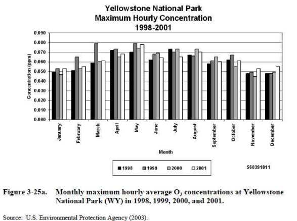
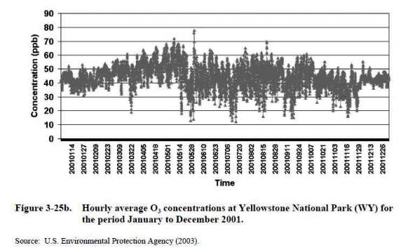
Page 3-47:
Estimates of PRB concentrations cannot be obtained solely by examining measurements of O3 obtained at RRMS [relatively remote monitoring sites] in the United States … because of the long-range transport from anthropogenic [manmade] source regions within North America. It should also be noted that it is impossible to determine sources of O3 without ancillary data that could be used as tracers of sources or to calculate photochemical production and loss rates.
Page 3-48: “Lefohn and others (2001) have argued that frequent occurrences of O3 concentrations above 50 to 60 ppbv at remote northern U.S. sites in spring are mainly stratospheric in origin.”
Page 3-51:
PRB ozone is not a directly observable quantity and must therefore be estimated from models. Simple modeling approaches, such as the use of back-trajectories at remote U.S. sites to identify background conditions, are subject to errors involving the reliability of the trajectories, chemical production along the trajectories, and the hemispheric-scale contribution of North American sources to ozone in air masses originating outside the continent. They also cannot describe the geographical variability of the ozone background or the depletion of this background during pollution episodes. Global 3-D chemical transport models such as GEOS-Chem [Goddard Earth Orbiting System atmospheric model] can provide physically-based estimates of the PRB and its variability through sensitivity simulations with North American anthropogenic sources shut off. These models are also subject to errors in the simulation of transport and chemistry, but the wealth of data that they provide on ozone and its precursors for the present-day atmosphere enables extensive testing with observations, and thus objective estimate of the errors on the PRB ozone values.
Page 4-54:
Figure 3-27. Time-series of hourly average O3 concentrations observed at five national parks: Denali (AK), Voyageur (MN), Olympic (WA), Glacier (MT), and Yellowstone (WY).
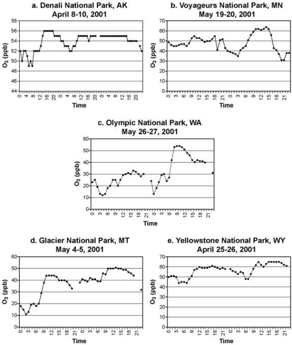
[212] Report: “Air Quality Criteria for Ozone and Related Photochemical Oxidants (Volume I of III).” U.S. Environmental Protection Agency, Office of Air Quality Planning and Standards, Health and Environmental Impacts Division, February 28, 2006. <oaspub.epa.gov>
Pages 3-77–3-78:
Policy relevant background [Policy Relevant Background] O3 [ozone] concentrations are used for assessing risks to human health associated with O3 produced from anthropogenic [manmade] sources in continental North America. Because of the nature of the definition of PRB concentrations, they cannot be directly derived from monitored concentrations, instead they must be derived from modeled estimates. Current model estimates indicate that ambient air PRB concentrations in the United States are generally 0.015 ppm to 0.035 ppm. They decline from spring to summer and are generally <0.025 ppm under conditions conducive to high O3 episodes. However, PRB concentrations can be higher, especially at elevated sites during spring, due to enhanced contributions from hemispheric pollution and stratospheric exchange.
Page 3-48:
Previous estimates of background O3 concentrations, based on different concepts of background, are given in Table 3-2. Results from global three-dimensional CTMs [chemistry transport models], where the background is estimated by zeroing anthropogenic [manmade] emissions in North America (Table 3-8) are on the low end of the 25 to 45 ppbv [parts per billion volume] range.
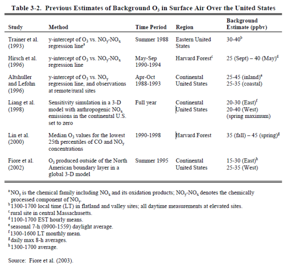
Page 3-49:
Major conclusions from the Fiore and others (2003) study … are:
• PRB O3 concentrations in U.S. surface air from 1300 to 1700 local time are generally 15 to 35 ppbv. They decline from spring to summer and are generally <25 ppbv under the conditions conducive to high-O3 episodes. …
• High PRB concentrations (40 to 50 ppbv) occur occasionally at high-elevation sites (>1.5 km) in spring due to the free-tropospheric influence, including a 4- to 12-ppbv contribution from hemispheric pollution (O3 produced from anthropogenic [manmade] emissions outside North America). These sites cannot be viewed as representative of low-elevation surface sites … where the background is lower when O3 >60 ppbv.
• The stratospheric contribution to surface O3 is of minor importance, typically well <20 ppbv. While stratospheric intrusions might occasionally elevate surface O3 at high-altitude sites, these events are rare.
[213] Calculated with data from the footnote above and the webpage: “National Ambient Air Quality Standards (NAAQS).” U.S. Environmental Protection Agency. Last updated February 10, 2021. <www.epa.gov>
“Ozone (O3) … primary and secondary … 8 hours [=] 0.070 ppm3 … Annual fourth-highest daily maximum 8-hour concentration, averaged over 3 years”
CALCULATIONS:
[214] Paper: “Urbanization Effects on Tree Growth in the Vicinity of New York City.” By Jillian W. Gregg and others. Nature, July 10, 2003. Pages 183–187. <www.nature.com>
Page 184: “Contrary to expectations, cottonwoods grew twice as large amid the high concentration of multiple pollutants in New York City compared to rural sites (Fig. 1). Greater urban plant biomass was found for all urban–rural site comparisons, two separate planting dates in the first year and two further consecutive growing seasons.”
Page 183: “[H]igher rural ozone (O3) exposures reduced growth at rural sites. Urban precursors fuel the reactions of O3 formation, but NOx [nitrogen oxides] scavenging reactions7 resulted in lower cumulative urban O3 exposures compared to agricultural and forested sites throughout the northeastern USA. Our study … shows a greater adverse effect of urban pollutant emissions beyond the urban core.”
Page 185: “Primary O3 precursors are emitted in cities, but must react in sunlight to form O3 as air masses move to rural environments20. Ozone exposures were therefore consistently higher for rural sites both to the north and the east of the city in all consecutive growing seasons….”
Page 186: “Although individual 1-hour peak concentrations are typically higher in urban centres7, our data indicate that the higher cumulative exposures at rural sites had the greatest impact.”
[215] Article: “NYC Trees Grow Larger Than Country Trees.” By Rick Callahan. Associated Press, July 9, 2003. <www.newsday.com>
Scientists studying urban pollution have discovered to their amazement that trees in New York City’s concrete jungle grow twice as large as those in the countryside, far from the billowing smokestacks and crowded streets.
The findings illustrate what scientists have only recently realized—that pollution from urban areas can have its biggest effects far from cities. …
“In the country, the trees were about up to my waist. In the city, they were almost over my head—it’s really dramatic,” said Jillian W. Gregg, the study’s lead author. …
“No matter what soil I grew them in, they always grew twice as large in New York City,” said Gregg, who was initially perplexed by the results.
[216] Paper: “Urbanization Effects on Tree Growth in the Vicinity of New York City.” By Jillian W. Gregg and others. Nature, July 10, 2003. Pages 183–187. <www.nature.com>
Page 184: “Contrary to expectations, cottonwoods grew twice as large amid the high concentration of multiple pollutants in New York City compared to rural sites…. Greater urban plant biomass was found for all urban–rural site comparisons, two separate planting dates in the first year and two further consecutive growing seasons.”
Page 183: “[H]igher rural ozone (O3) exposures reduced growth at rural sites. Urban precursors fuel the reactions of O3 formation, but NOx [nitrogen oxides] scavenging reactions7 resulted in lower cumulative urban O3 exposures compared to agricultural and forested sites throughout the northeastern USA. Our study … shows a greater adverse effect of urban pollutant emissions beyond the urban core.”
Page 185: “Primary O3 precursors are emitted in cities, but must react in sunlight to form O3 as air masses move to rural environments20. Ozone exposures were therefore consistently higher for rural sites both to the north and the east of the city in all consecutive growing seasons….”
Page 186: “Although individual 1-hour peak concentrations are typically higher in urban centres7, our data indicate that the higher cumulative exposures at rural sites had the greatest impact.”
[217] Report: “Air Quality Criteria for Ozone and Related Photochemical Oxidants (Volume I of III).” U.S. Environmental Protection Agency, Office of Air Quality Planning and Standards, Health and Environmental Impacts Division, February 28, 2006. <oaspub.epa.gov>
Page 2-25:
The formation of O3 [ozone] and associated compounds is a complex, nonlinear function of many factors, including the intensity and spectral distribution of sunlight; atmospheric mixing and other atmospheric processes; and the concentrations of the precursors in ambient air. At lower NOx [nitrogen oxides] concentrations found in most environments, ranging from remote continental areas to rural and suburban areas downwind of urban centers, the net production of O3 increases with increasing NOx. At higher concentrations found in downtown metropolitan areas, especially near busy streets and highways and in power plant plumes, there is net destruction of O3 by reaction with NO. In between these two regimes, there is a transition stage in which O3 production shows only a weak dependence on NOx concentrations. The efficiency of O3 production per NOx oxidized is generally highest in areas where NOx concentrations are lowest and decrease with increasing NOx concentration.
[218] “EPA’s Report on the Environment.” U.S. Environmental Protection Agency, 2008. <ofmpub.epa.gov>
Page 2-48: “Consistent with the other emissions indicators, the national data are organized into the following source categories: … (2) ‘Fires: prescribed burns and wildfires,’ for insights on contributions from some natural sources….”
[219] Webpage: “Prescribed Fire.” U.S. Department of Agriculture Forest Service. Accessed July 24, 2018 at <www.fs.usda.gov>
Did you know fire can be good for people and the land? After many years of fire exclusion, an ecosystem that needs periodic fire becomes unhealthy. Trees are stressed by overcrowding; fire-dependent species disappear; and flammable fuels build up and become hazardous. The right fire at the right place at the right time:
• Reduces hazardous fuels, protecting human communities from extreme fires;
• Minimizes the spread of pest insects and disease;
• Removes unwanted species that threaten species native to an ecosystem;
• Provides forage for game;
• Improves habitat for threatened and endangered species;
• Recycles nutrients back to the soil; and
• Promotes the growth of trees, wildflowers, and other plants;
The Forest Service manages prescribed fires and even some wildfires to benefit natural resources and reduce the risk of unwanted wildfires in the future. The agency also uses hand tools and machines to thin overgrown sites in preparation for the eventual return of fire.
More Prescribed Fires Mean Fewer Extreme Wildfires.
Specialists write burn plans for prescribed fires. Burn plans identify—or prescribe—the best conditions under which trees and other plants will burn to get the best results safely. Burn plans consider temperature, humidity, wind, moisture of the vegetation, and conditions for the dispersal of smoke. Prescribed fire specialists compare conditions on the ground to those outlined in burn plans before deciding whether to burn on a given day.
[220] Report: “2011 National Emissions Inventory, Version 2: Technical Support Document.” U.S. Environmental Protection Agency, August 2015. <www.epa.gov>
Page 323: “Fire sources in this section are sources of pollution caused by the inadvertent or intentional burning of biomass including forest, rangeland (e.g., grasses and shrubs), and agricultural vegetative residue.”
[221] Calculated with data from: “2020 National Emissions Inventory and Trends Report.” U.S. Environmental Protection Agency, July 23, 2023. <storymaps.arcgis.com>
a) “National Carbon Monoxide Sector Summary.” Accessed February 7, 2024 at <enviro.epa.gov>
b) “National Nitrogen Oxides Sector Summary.” Accessed February 7, 2024 at <enviro.epa.gov>
c) “National Volatile Organic Compounds Sector Summary.” Accessed February 7, 2024 at <enviro.epa.gov>
d) “PM 10 Primary Sector Summary.” Accessed February 9, 2024 at <enviro.epa.gov>
e) “PM 2.5 Primary Sector Summary.” Accessed February 8, 2024 at <enviro.epa.gov>
f) “Sulfur Dioxide Primary Sector Summary.” Accessed February 9, 2024 at <enviro.epa.gov>
NOTE: An Excel file containing the data and calculations is available upon request.
[222] Calculated with data from:
a) Dataset: “National Carbon Monoxide Emissions by Source Sector, 2008.” U.S. Environmental Protection Agency. Last updated March 18, 2012. <www.epa.gov>
b) Dataset: “National Carbon Monoxide Emissions by Source Sector, 2014.” Environmental Protection Agency. Last updated February 10, 2017. <gispub.epa.gov>
NOTE: An Excel file containing the data and calculations is available upon request.
[223] Calculated with data from:
a) Dataset: “National Volatile Organic Compounds Emissions by Source Sector, 2008.” U.S. Environmental Protection Agency. Last updated March 17, 2012. <www.epa.gov>
b) Dataset: “National Volatile Organic Compounds Emissions by Source Sector, 2014.” Environmental Protection Agency. Last updated February 10, 2017. <gispub.epa.gov>
NOTE: An Excel file containing the data and calculations is available upon request.
[224] Calculated with data from:
a) Dataset: “National PM10 Emissions by Source Sector, 2008.” U.S. Environmental Protection Agency. Last updated March 18, 2012. <www.epa.gov>
b) Dataset: “National PM10 Emissions by Source Sector, 2014.” U.S. Environmental Protection Agency. Last updated February 10, 2017.
NOTE: An Excel file containing the data and calculations is available upon request.
[225] Calculated with data from:
a) Dataset: “National PM2.5 Emissions by Source Sector, 2008.” U.S. Environmental Protection Agency. Last updated March 18, 2012. <www.epa.gov>
b) Dataset: “National PM2.5 Emissions by Source Sector, 2014.” Last updated February 10, 2017. <gispub.epa.gov>
NOTE: An Excel file containing the data and calculations is available upon request.
[226] Calculated with data from:
a) Report: “2011 National Emissions Inventory, Version 2: Technical Support Document.” U.S. Environmental Protection Agency, August 2015. <www.epa.gov>
Page 327: “2011 was a ‘worse’ fire year than 2008, as more acres were burned (about 30% more), so the emissions are expected to be higher in 2011 compared to 2008.”
b) Report: “2014 National Emissions Inventory, Version 2: Technical Support Document.” U.S. Environmental Protection Agency, July 2018. <www.epa.gov>
Page 7-16: “In general, 2014 was a ‘better’ fire year than 2011 as fewer acres were burned (about 30% less), so the emissions are expected to be lower in 2014 compared to 2011.”
CALCULATIONS:
[227] Report: “Risk and Exposure Assessment to Support the Review of the SO2 Primary National Ambient Air Quality Standards: Final Report.” U.S. Environmental Protection Agency, Office of Air Quality Planning and Standards, Health and Environmental Impacts Division, July 2009. <www3.epa.gov>
Page 13:
There is a large amount of variability in the time that individuals spend in different microenvironments, but on average people spend the majority of their time (about 87%) indoors. Most of this time is spent at home with less time spent in an office/workplace or other indoor locations (ISA [Integrated Science Assessment], Figure 2-36). In addition, people spend on average about 8% of their time outdoors and 6% of their time in vehicles.
[228] Report: “Air Quality Criteria for Ozone and Related Photochemical Oxidants (Volume I of III).” U.S. Environmental Protection Agency, Office of Air Quality Planning and Standards, Health and Environmental Impacts Division, February 28, 2006. <oaspub.epa.gov>
Page E-9:
Humans are exposed to O3 [ozone] either outdoors or in various microenvironments. Ozone in indoor environments results mainly from infiltration from outdoors. Once indoors, O3 is removed by deposition on and reaction with surfaces and reactions with other pollutants. Hence, O3 levels indoors tend to be notably lower than outdoor O3 concentrations measured at nearby monitoring sites, although the indoor and ambient O3 concentrations tend to vary together (i.e., the higher the ambient, the higher the indoor O3 levels).
Page 3-64: “To a lesser extent, O3 concentrations in microenvironments are influenced by the ambient temperature, time of day, indoor characteristics (e.g., presence of carpeting), and the presence of other pollutants in the microenvironment.”
Page 3-67:
Ozone enters the indoor environment primarily through infiltration from outdoors through building components, such as windows, doors, and ventilation systems. There are also a few indoor sources of O3 (photocopiers, facsimile machines, laser printers, and electrostatic air cleaners and precipitators) (Weschler, 2000). Generally O3 emissions from office equipment and air cleaners are low except under improper maintenance conditions.
Page 3-68:
The most important removal process for O3 in the indoor environment is deposition on, and reaction with, indoor surfaces. The rate of deposition is material-specific. The removal rate will depend on the indoor dimensions, surface coverings, and furnishings. Smaller rooms generally have larger surface-to-volume ratio (A/V) and remove O3 faster than larger rooms. Fleecy materials, such as carpets, have larger surface-to-volume ratios and remove O3 faster than smooth surfaces (Weschler, 2000). However, the rate of O3 reaction with carpet diminishes with cumulative O3 exposure (Morrison and Nazaroff, 2000, 2002). Weschler (2000) compiled the O3 removal rates for a variety of microenvironments.
Page 7-6: “In several studies focused on evaluating exposure to O3, measurements were made in a variety of indoor environments, including homes (Lee and others, 2004), schools (Linn and others, 1996), and the workplace (Liu and others, 1995). Indoor O3 concentrations were, in general, approximately one-tenth of the outdoor concentrations in these studies.”
Page 7-7:
Other complications for O3 in the relationship between personal exposures and ambient concentrations include expected strong seasonal variation of personal behaviors and building ventilation practices that can modify exposure. In addition, the relationship may be affected by temperature (e.g., high temperature may increase air conditioning use, which may reduce O3 penetration indoors), further complicating the role of temperature as a confounder of O3 health effects. It should be noted that the pattern of exposure misclassification error and influence of confounders may differ across the outcomes of interest as well as in susceptible populations. For example, those who may be suffering from chronic cardiovascular or respiratory conditions may be in a more protective environment (i.e., with less exposure to both O3 and its confounders, such as temperature and PM) than those who are healthy.
[229] Paper: “Human Exposure to Ozone in School and Office Indoor Environments.” By Heidi Salonen and others. Environment International, October 2018. Pages 503–514. <www.sciencedirect.com>
Pages 504–505:
2. Material and Methods
A Web of Science, SCOPUS, Google Scholar and PubMed search of the literature published between 1973 and 2018 (until July 2018) was performed. … The search included original peer-reviewed scientific journal articles, literature reviews, and conference articles (full papers). … From over 200 publications identified in the initial search, 141 publications were selected for inclusion in the review analysis.
Page 508:
3.3. Indoor/Outdoor Ratios
A number of studies have investigated the penetration of outdoor ozone into the indoor environment and indoor to outdoor (I/O) ozone ratios. The reported I/O ratios in school environments varied between 0 and 0.77…. The highest I/O ratio was measured in Freising, Germany (Jakobi and Fabian, 1997), and the lowest I/O ratio was measured in La Rochelle and its suburbs in France (Blondeau and others, 2005; Poupard and others, 2005). The calculated median concentration (based on the reported or calculated I/O ratios) in school settings was 0.2….
Reported I/O ratios in office environments varied between 0.02 and 0.90…. The highest I/O ratio was measured in Freising, Germany (Jakobi and Fabian, 1997), and the lowest was measured in Athens, Greece (Kalimeri and others, 2017). In the study by Jakobi and Fabian (1997), the measured I/O ratios ranged between 0.02 and 1.00, with an average of 0.5. The calculated median concentration (based on the reported or calculated I/O ratios) in office settings was 0.29 (Fig. 6a).
Romieu and others (1998) studied ozone concentrations in homes and school buildings in Mexico City and reported that the major predictors of I/O ratios were open windows in the monitoring room, the presence of carpeting, and the use of air filters. They suggested that in rooms where windows were never open between 10 am and 4 pm the I/O ratio would decrease by 36% compared to rooms where windows were usually open during the day. Other conclusions were that the I/O ratio would decrease by 43% with the presence of carpeting in the rooms and that it would decrease by 21% with the use of air filters for 8 h per day. …
Blondeau and others (2005) found that for 8 school buildings the I/O ratios of ozone varied from 0 to 0.45 and were strongly influenced by how airtight the buildings were, that is, the more airtight the building envelope, the lower the ratio.
[230] Report: “Air Quality Criteria for Lead (Volume I of II).” U.S. Environmental Protection Agency, October 2006. <oaspub.epa.gov>
Page E-6:
Given the large amount of time people spend indoors, exposure to Pb [lead] in dusts and indoor air can be significant. For children, dust ingested via hand-to-mouth activity is often a more important source of Pb exposure than inhalation. Dust can be resuspended through household activities, thereby posing an inhalation risk as well. House dust Pb can derive both from Pb-based paint and from other sources outside the home. The latter include Pb-contaminated airborne particles from currently operating industrial facilities or resuspended soil particles contaminated by deposition of airborne Pb from past emissions.
Pages 3-14–3-15:
3.1.2 Observed Concentrations – Indoor Air
Concentrations of Pb can be elevated indoors. Lead in indoor air is directly related to Pb in housedust, which poses both an inhalation and an ingestion risk and is discussed in more detail in Section 3.2. Strong correlations have been observed in a Boston study between indoor air, floor dust, and soil Pb concentrations (Rabinowitz and others, 1985a). In the National Human Exposure Assessment Survey (NHEXAS) study of six Midwestern states, Pb concentrations in personal air were significantly higher than either indoor or outdoor concentrations of air Pb (Clayton and others, 1999). The predominant sources of indoor air Pb are thought to be outdoor air and degraded Pb-based paint.
Lead concentrations tend to be somewhat elevated in houses of smokers. In a nationwide U.S. study, blood-Pb levels were 38% higher in children who exhibited high cotinine levels, which reflect high secondhand smoke exposure (Mannino and others, 2003). Lead is present both in tobacco and in tobacco smoke, although Pb concentrations in tobacco have fallen in parallel with decreases in airborne Pb concentrations (Mannino and others, 2003). …
Lead concentrations inside work places can also be elevated. Thus, inhalation of Pb during work hours is an additional route of exposure for some subpopulations. Feng and Barratt (1994) measured Pb concentrations in two office buildings in the United Kingdom (UK). In general, concentrations in the UK office buildings were higher than those in nearby houses.
Page 3-27: “Given the large amount of time people spend indoors, exposure to Pb in dusts and indoor air can be significant. For children, dust ingested via hand-to-mouth activity can be a more important source of Pb exposure than inhalation (Adgate and others, 1998; Oliver and others, 1999).”
Page 3-28:
Lead in housedust can derive from a number of different sources. Lead appears both to come from sources outside the home (Jones and others, 2000; Adgate and others, 1998) and from Pb-based paint (Hunt and others, 1993; Lanphear and others, 1996). A chemical mass balance study in Jersey City, NJ observed that crustal sources contributed almost half of the Pb in residences, Pb-based paint contributed about a third, and deposition of airborne Pb contributed the remainder (Adgate and others, 1998). Residential concentrations measured at the Bunker Hill Superfund Site in northern Idaho indicate that the Pb concentration in houses depends primarily on the neighborhood soil-Pb concentration (Von Lindern and others, 2003a, 2003b). However, factors such as household hygiene, the number of adults living in the house, and the number of hours children spend playing outside were also shown to affect Pb concentrations.
Page 3-29: “Renovation, and especially old paint removal, can greatly increase Pb levels inside the home (Laxen and others, 1987; Jacobs, 1998; Mielke and others, 2001). Removal of exterior paint via power sanding released an estimated 7.4 kg of Pb as dust, causing Pb levels inside one house to be well above safe levels (Mielke and others, 2001).”
[231] Paper: “Air Quality Criteria for Carbon Monoxide.” U.S. Environmental Protection Agency, Office of Research and Development, June 2000. <ofmpub.epa.gov>
Page 4-10:
Regardless of the study, Table 4-2 shows that the mean CO [carbon monoxide] concentrations inside vehicles always exceeded the mean ambient CO concentrations measured at fixed-site monitors. The ratio between a study’s mean in-vehicle CO concentration and its mean ambient CO concentration fell between 2 and 5 for most studies, regardless of when the study was done, but exceeded 5 for two studies done during the early 1980s. Of the more recent studies, Chan and others (1991) found that median CO concentrations were 11 ppm inside test vehicles driven on hypothetical routes in Raleigh, NC, during August and September 1988, but median ambient concentrations were only 2.8 ppm at fixed-site monitors. Fixed-site samples were collected about 30 to 100 m from the midpoint of each route. …
Like earlier studies, recent ones also have looked at effects of different routes and travel modes on CO exposure. Chan and others (1991) reported significantly different in-vehicle exposures to CO for standardized drives on three routes that varied in traffic volume and speed. The median in-vehicle CO concentration was 13 ppm for 30 samples in the downtown area of Raleigh, which had heavy traffic volumes, slow speeds, and frequent stops. The next highest concentrations (median = 11 ppm, n = 34) occurred on an interstate beltway that had moderate traffic volumes and high speeds, and the lowest concentrations (median = 4 ppm, n = 6) occurred on rural highways with low traffic volumes and moderate speeds.
Page 4-13: “Studies have quantified the effect of traffic volume and speed on in-vehicle CO exposure. Flachsbart and others (1987) reported that in-vehicle CO exposures fell by 35% when test vehicle speeds increased from 10 to 60 mph on eight commuter routes in Washington.”
[232] Paper: “Air Quality Criteria for Carbon Monoxide.” U.S. Environmental Protection Agency, Office of Research and Development, June 2000. <ofmpub.epa.gov>
Pages 4-16–4-17:
Ice skating, motocross, and tractor pulls are sporting events in which significant quantities of CO [carbon monoxide] may be emitted in short periods of time by machines in poorly ventilated indoor arenas. The CO is emitted by several sources, including ice resurfacing machines and ice edgers during skating events; gas-powered radiant heaters used to heat viewing stands; and motor vehicles at motocross, monster-truck, and tractor-pull competitions. These competitions usually involve many motor vehicles with no emission controls. Several studies of CO exposure in commercial facilities were not cited in the previous CO criteria document. First, Kwok (1981) reported episodes of CO poisoning among skaters inside four arenas in Ontario, Canada. Mean CO levels ranged from 4 to 81 ppm for periods of about 80 min. The CO levels in the spectator areas ranged from 90 to 100% of levels on the ice rinks. The ice resurfacing machines lacked catalytic emission controls. Second, both Sorensen (1986) and Miller and others (1989) reported CO concentrations greater than 100 ppm in rinks from the use of gasoline-powered resurfacing machines. High concentrations were attributed to poorly maintained machines and insufficient ventilation in one rink. …
In the United States, surveys of CO exposure were done at ice arenas in Vermont, Massachusetts, Wisconsin, and Washington. For a rink in Massachusetts, Lee and others (1993) showed that excessive CO concentrations can occur even with well-maintained equipment and fewer resurfacing operations if ventilation is inadequate. Average CO levels were less than 20 ppm over 14 h, with no significant source of outdoor CO. Ventilation systems could not disperse pollutants emitted and trapped by temperature inversions and low air circulation at ice level. In another study, Lee and others (1994) reported that CO concentrations measured inside six enclosed rinks in the Boston area during a 2-h hockey game ranged from 4 to 117 ppm, whereas outdoor levels were about 2 to 3 ppm, and the alveolar CO of hockey players increased by an average of 0.53 ppm per 1 ppm CO exposure over 2 h. Fifteen years earlier, Spengler and others (1978) found CO levels ranging from 23 to 100 ppm in eight enclosed rinks in the Boston area, which suggests that CO exposure levels in ice arenas have not improved. …
Studies also have been done in sports arenas that allow motor vehicles. Boudreau and others (1994) reported CO levels for three indoor sporting events (i.e., monster-truck competitions, tractor pulls) in Cincinnati. The CO measurements were taken before and during each event at different elevations in the public seating area of each arena with most readings obtained at the midpoint elevation where most people were seated. Average CO concentrations over 1 to 2 h ranged from 13 to 23 ppm before the event to 79 to 140 ppm during the event. Measured CO levels were lower at higher seating levels. The ventilation system was operated maximally, and ground-level entrances were completely open.
Page 4-21:
Given that the pNEM/CO exposure model accounts for the passive exposure of nonsmokers to CO concentrations from smoking, this section briefly reviews two studies of this type. In April 1992, Ott and others (1992b) took continuous readings of CO concentrations inside a passenger car for an hour-long trip through a residential neighborhood of the San Francisco Bay Area. Measurements were taken in both the front and back seats of the vehicle as a passenger smoked cigarettes. The neighborhood had low ambient CO levels, because it had little traffic and few stop signs. During the trip, the air conditioning system was operated in the recirculation mode. Concentrations in the front and rear seats were similar indicating that CO concentrations were well mixed throughout the passenger compartment. CO concentrations reached a peak of 20 ppm after the third cigarette. Using the breath measurement technique of Jones and others (1958), the breath CO level of the driver (a nonsmoker) increased from 2 ppm before the trip to 9.2 ppm at the end of the trip.
Pages 7-2–7-3:
Indoor and in-transit concentrations of CO can be significantly different from the typically low ambient CO concentrations. The CO levels in homes without combustion sources are usually lower than 5 ppm. The highest residential concentrations of CO that have been reported are associated with vehicle startup and idling in attached garages and the use of unvented gas or kerosene space heaters where peak concentrations of CO as high or higher than 50 ppm have been reported. Carbon monoxide concentrations also have exceeded 9 ppm for 8 h in several homes with gas stoves and, in one case, 35 ppm for 1 h; however, these higher CO concentrations were in homes with older gas ranges that had pilot lights that burn continuously. Newer or remodeled homes have gas ranges with electronic pilot lights. Also, the availability of other cooking appliances (e.g., microwaves, heating plates) has decreased the use of gas ranges in meal preparation.
Page 7-4:
Evaluation of human CO exposure situations indicates that occupational exposures in some workplaces, or exposures in homes with faulty or unvented combustion sources, can exceed 100 ppm CO, leading to COHb [Carboxyhemoglobin] levels of 4 to 5% with 1-h exposure and 10% or more with continued exposure for 8 h or longer (see Table 7-1). Such high exposure levels are encountered rarely by the general public under ambient conditions.
Page 7-5: “Putting the ambient CO levels into perspective, exposures to cigarette smoke or to combustion exhaust gases from small engines and recreational vehicles typically raise COHb to levels much higher than levels resulting from mean ambient CO exposures, and, for most people, exposures to indoor sources of CO often exceed controllable outdoor exposures.”
[233] Book: Energy, Powering Your World. By M.T. Westra and S. Kuyvenhoven. Foundation for Fundamental Research on Matter, Institute for Plasma Physics, Rijnhuizen (the Netherlands), 2002. <fire.pppl.gov>
Page 5:
The first energy crisis in history started in 1630, when charcoal, made from wood, started running out. Coal from coal mines could not be used for this purpose, as it contained too much water and sulphur, which made it burn at a lower temperature. Large parts of the woods in Sweden and Russia were turned into charcoal, to solve this problem. …
By this time, [around 1700] most of Europe and especially England had cut down most of their forests. As they came to rely on coal for fuel, the demand for coal grew quickly.
Page 42:
In western countries, there is not much pollution produced in homes. Most of us cook on electricity, gas or some fluid fuel, which is quite clean. However, about half of the households in the world depend on firewood and coal for cooking and heating. It is very hard to burn solid fuels in a clean way, because it is hard to mix them thoroughly with air in simple cooking stoves. In fact, only about 5–18 percent of the energy goes in the pot, the rest is wasted. What is more, incomplete burning of solid fuel produces a wide range of health-damaging pollutants, as shown in table 10.
This is no small thing. It is estimated that about two million women and children die prematurely every year because of the use of solid fuels, and that it causes about 5 to 6 percent of the national burden of illness in developing countries. Of course, the risk of pollutants is the largest when people are near. The problem is that the dirtiest fuels are used exactly at times when people are present: every day, in the kitchen and in heating stoves.
[234] Report: “Household Air Pollution and Health.” World Health Organization, September 22, 2021. <www.who.int>
Around 2.6 billion people still cook using solid fuels (such as wood, crop wastes, charcoal, coal and dung) and kerosene in open fires and inefficient stoves. Most of these people are poor, and live in low- and middle-income countries.
These cooking practices are inefficient, and use fuels and technologies that produce high levels of household air pollution with a range of health-damaging pollutants, including small soot particles that penetrate deep into the lungs. In poorly ventilated dwellings, indoor smoke can be 100 times higher than acceptable levels for fine particles. Exposure is particularly high among women and young children, who spend the most time near the domestic hearth.
[235] Article: “Greeks Raid Forests in Search of Wood to Heat Homes.” By Nektaria Stamouli and Stelios Bouras. Wall Street Journal, January 11, 2013. <online.wsj.com>
Tens of thousands of trees have disappeared from parks and woodlands this winter across Greece, authorities said, in a worsening problem that has had tragic consequences as the crisis-hit country’s impoverished residents, too broke to pay for electricity or fuel, turn to fireplaces and wood stoves for heat.
As winter temperatures bite, that trend is dealing a serious blow to the environment, as hillsides are denuded of timber and smog from fires clouds the air in Athens and other cities, posing risks to public health.
[236] Article: “Woodland Heists: Rising Energy Costs Drive Up Forest Thievery.” By Renuka Rayasam. Der Spiegel, January 17, 2013. <abcnews.go.com>
With energy costs escalating, more Germans are turning to wood burning stoves for heat. That, though, has also led to a rise in tree theft in the country’s forests.
The Germany’s Renters Association estimates the heating costs will go up 22 percent this winter alone. A side effect is an increasing number of people turning to wood-burning stoves for warmth. Germans bought 400,000 such stoves in 2011, the German magazine FOCUS reported this week. It marks the continuation of a trend: The number of Germans buying heating devices that burn wood and coal has grown steadily since 2005, according to consumer research company GfK Group.
That increase in demand has now also boosted prices for wood, leading many to fuel their fires with theft.
[237] U.S. Code, Title 42, Chapter 85, Subchapter I, Part A, Section 7412: “Hazardous Air Pollutants.” Accessed February 18, 2022 at <www.law.cornell.edu>
(b) List of Pollutants
(1) Initial List
The Congress establishes for purposes of this section a list of hazardous air pollutants as follows: …
(2) Revision of the List
The Administrator shall periodically review the list established by this subsection and publish the results thereof and, where appropriate, revise such list by rule, adding pollutants which present, or may present, through inhalation or other routes of exposure, a threat of adverse human health effects (including, but not limited to, substances which are known to be, or may reasonably be anticipated to be, carcinogenic, mutagenic, teratogenic, neurotoxic, which cause reproductive dysfunction, or which are acutely or chronically toxic) or adverse environmental effects whether through ambient concentrations, bioaccumulation, deposition, or otherwise, but not including releases subject to regulation under subsection (r) as a result of emissions to the air. …
(3) Petitions to Modify the List
(A) Beginning at any time after 6 months after November 15, 1990, any person may petition the Administrator to modify the list of hazardous air pollutants under this subsection by adding or deleting a substance or, in case of listed pollutants without CAS numbers (other than coke oven emissions, mineral fibers, or polycyclic organic matter) removing certain unique substances. Within 18 months after receipt of a petition, the Administrator shall either grant or deny the petition by publishing a written explanation of the reasons for the Administrator’s decision. Any such petition shall include a showing by the petitioner that there is adequate data on the health or environmental defects2 of the pollutant or other evidence adequate to support the petition. The Administrator may not deny a petition solely on the basis of inadequate resources or time for review. …
(d) Emission Standards
(1) In general
The Administrator shall promulgate regulations establishing emission standards for each category or subcategory of major sources and area sources of hazardous air pollutants listed for regulation pursuant to subsection (c) in accordance with the schedules provided in subsections (c) and (e).
[238] Website: “Health and Environmental Effects of Hazardous Air Pollutants.” U.S. Environmental Protection Agency. Last updated February 3, 2020. <www.epa.gov>
People exposed to toxic air pollutants at sufficient concentrations and durations may have an increased chance of getting cancer or experiencing other serious health effects. These health effects can include damage to the immune system, as well as neurological, reproductive (e.g., reduced fertility), developmental, respiratory and other health problems. In addition to exposure from breathing air toxics, some toxic air pollutants such as mercury can deposit onto soils or surface waters, where they are taken up by plants and ingested by animals and are eventually magnified up through the food chain. Like humans, animals may experience health problems if exposed to sufficient quantities of air toxics over time.
[239] “EPA’s Report on the Environment.” U.S. Environmental Protection Agency, 2008. <ofmpub.epa.gov>
Page 2-48: “Toxic air pollutants, also known as air toxics or hazardous air pollutants (HAPs), are those pollutants that are known or suspected to cause cancer or are associated with other serious health (e.g., reproductive problems, birth defects) or ecological effects.”
[240] U.S. Code, Title 42, Chapter 85, Subchapter I, Part A, Section 7412: “Hazardous Air Pollutants.” Accessed February 18, 2022 at <www.law.cornell.edu>
(d) Emission Standards …
(2) Standards and Methods
Emissions standards promulgated under this subsection and applicable to new or existing sources of hazardous air pollutants shall require the maximum degree of reduction in emissions of the hazardous air pollutants subject to this section (including a prohibition on such emissions, where achievable) that the Administrator, taking into consideration the cost of achieving such emission reduction, and any non-air quality health and environmental impacts and energy requirements, determines is achievable for new or existing sources in the category or subcategory to which such emission standard applies, through application of measures, processes, methods, systems or techniques including, but not limited to, measures which—
(A) reduce the volume of, or eliminate emissions of, such pollutants through process changes, substitution of materials or other modifications,
(B) enclose systems or processes to eliminate emissions,
(C) collect, capture or treat such pollutants when released from a process, stack, storage or fugitive emissions point,
(D) are design, equipment, work practice, or operational standards (including requirements for operator training or certification) as provided in subsection (h), or
(E) are a combination of the above.
[241] Report: “Air Quality Trends – 1994.” U.S. Environmental Protection Agency, September 1995. <nepis.epa.gov>
Page 12:
For the six principal [criteria] pollutants, a variety of control strategies are used in geographic areas where the national air quality standards have been violated. In contrast, for toxic air pollutants, EPA [U.S. Environmental Protection Agency] has focused on identifying all major sources that emit these pollutants and developing national technology-based performance standards to significantly reduce their emissions. The objective is to ensure that major sources of toxic air pollution are well controlled regardless of geographic location.
[242] Report: “Comparison of ASPEN [Assessment System for Population Exposure Nationwide] Modeling System Results to Monitored Concentrations.” U.S. Environmental Protection Agency, April 15, 2010. <archive.epa.gov>
Unlike for criteria air pollutants, there currently is no formal national air toxics monitoring network which follows standardized EPA [U.S. Environmental Protection Agency] guidelines or established national monitoring procedures. While several States and local agencies have collected some high quality HAP [hazardous air pollutants] monitoring data, some of the data have not undergone any formal quality assurance tests, and the data come from several different monitoring networks which may vary in precision and accuracy. In general, we would expect the precision and accuracy of air toxics monitoring data to be not nearly as good as the SO2 [sulfur dioxide] and particulate matter monitoring data used in the studies in the previous section. We will discuss some of the other monitoring uncertainties in more detail below.
[243] Report: “Air Toxics Risk Assessment Reference Library (Volume 1).” Prepared by ICF Consulting for the U.S. Environmental Protection Agency, Office of Air Quality Planning and Standards, Emissions Standards Division, April 2004. Chapter 2: “Clean Air Act Requirements and Programs to Regulate Air Toxics.” <nepis.epa.gov>
Page 2-1: “EPA [U.S. Environmental Protection Agency] has set National Ambient Air Quality Standards (NAAQS) for these pollutants [criteria pollutants] based on health and welfare-related criteria…. No such national ambient air quality standards currently exist for HAPs [hazardous air pollutants], although regulatory programs are in place to address emissions of HAPs.”
[244] “EPA’s Report on the Environment.” U.S. Environmental Protection Agency, 2008. <cfpub.epa.gov>
Page 2-48: “Air toxics emissions data are tracked by the National Emissions Inventory (NEI). The NEI is a composite of data from many different sources, including industry and numerous state, tribal, and local agencies. Different data sources use different data collection methods, and many of the emissions data are based on estimates rather than actual measurements.”
Page 2-49: “The emissions data are largely based on estimates. Although these estimates are generated using well-established approaches, the estimates have inherent uncertainties. The methodology for estimating emissions is continually reviewed and is subject to revision. Trend data prior to any revisions must be considered in the context of those changes.”
[245] Report: “America’s Children and the Environment (3rd edition).” U.S. Environmental Protection Agency, January 2013. Updated August 2019. <www.epa.gov>
Page: 3:
EPA’s National Air Toxics Assessment (NATA) provides estimated concentrations of 181 HAPs [hazardous air pollutants] in ambient air for the year 2014. NATA is the most comprehensive resource on potential human exposure to and risk of adverse health effects from HAPs in the United States. Monitoring data are insufficient to characterize HAP concentrations across the country because of the limited number of monitors, and because concentrations of many HAPs may vary considerably within a metropolitan area or region.
[246] Webpage: “AirToxScreen Frequent Questions.” U.S. Environmental Protection Agency. Last updated March 3, 2022. <www.epa.gov>
Q2: What is AirToxScreen?
A2: The Air Toxics Screening Assessment, or AirToxScreen, is EPA’s review of air toxics in the United States, based on modeled air quality. We developed AirToxScreen as a tool for state, local and tribal agencies, and we use its results as well. AirToxScreen helps us find out which air toxics, emission sources, and places may need further study to better understand risks.
AirToxScreen uses the best science and emissions data available to estimate possible health risks from air toxics. But because of its large, national scale, we must simplify some of AirToxScreen’s input data and analytical methods. That’s why we call AirToxScreen a “screening tool”—it helps us estimate risks and tells us where to look further. …
Q4: How should I NOT use AirToxScreen results?
A4: AirToxScreen assessments should not be used:
• to pinpoint risk or exposure values at a specific place (like a home or school);
• to characterize or compare risks or exposures at local levels (such as between neighborhoods);
• to characterize or compare risks or exposures between states,
• to examine trends from one AirToxScreen year to another,
• as the sole basis for risk reduction plans or regulations,
• to control specific sources or pollutants, or
• to quantify benefits of reduced air toxics emissions.
Please keep a few other things in mind when using AirToxScreen results. While results are reported at the census tract level, average exposure and risk estimates are far more uncertain at this level than at the county or state level. Also, AirToxScreen is a screening tool, not a refined assessment. It shouldn’t be used as the sole source of information to regulate sources or enforce existing air quality rules. …
Emissions, Modeling, and Methods Questions …
Q6: Why is EPA using computer modeling instead of actual measurements to estimate concentrations and exposure?
Right now, we can’t monitor ambient air toxics across the entire country. It would be very expensive. Instead, we only measure a subset of air toxics concentrations in a few locations. So for large-scale assessments such as AirToxScreen, we need to use computer models to estimate ambient air toxics concentrations and population exposures nationwide.
[247] Webpage: “AirToxScreen Limitations.” U.S. Environmental Protection Agency. Last updated March 2, 2022. <www.epa.gov>
We suggest you use AirToxScreen results cautiously. The uncertainty—and thus the accuracy—of the results varies by place and by pollutant. Often, more localized studies are needed to better characterize local-level risk. These studies often include air monitoring and more detailed modeling.
AirToxScreen has some limitations you should consider when looking at the results:
• Data gaps
• Pollutant concentrations used in risk calculations based on computer model simulations, not direct measurements
• Default assumptions (used routinely in any risk assessment)
• Assessment design limitations (intended to address some questions but not others)
• Regional differences in emissions data completeness
Also keep in mind that AirToxScreen’s results …
• reflect just some of the variation in background pollutant concentrations;
• may give concentrations that are too high or too low for some air toxics and in some places;
• make some assumptions when data are missing or in error;
• may not accurately capture sources that emit only at certain times (e.g., prescribed burning or facilities with short-term deviations such as startups, shutdowns, malfunctions and upsets)….
[248] Webpage: “AirToxScreen Overview.” U.S. Environmental Protection Agency. Last updated March 2, 2022. <www.epa.gov>
AirToxScreen gives a snapshot of outdoor air quality with respect to emissions of air toxics. It suggests the long-term risks to human health if air toxics emissions are steady over time. AirToxScreen estimates the cancer risks from breathing air toxics over many years. It also estimates noncancer health effects for some pollutants, including diesel particulate matter (PM). AirToxScreen calculates these air toxics concentrations and risks at the census tract level. It only includes outdoor sources of pollutants. …
AirToxScreen calculates concentration and risk estimates from a single year’s emissions data using meteorological data for that same year. The risk estimates assume a person breathes these emissions each year over a lifetime (or approximately 70 years). AirToxScreen only considers health effects from breathing these air toxics. It ignores indoor hazards, contacting or ingesting toxics, and any other ways people might be exposed.
[249] Calculated with data from the webpage: “AirToxScreen Frequent Questions.” U.S. Environmental Protection Agency. Last updated March 3, 2022. <www.epa.gov>
A cancer risk level of 1-in-1 million implies that, if 1 million people are exposed to the same concentration of a pollutant continuously (24 hours per day) over 70 years (an assumed lifetime), one person would likely contract cancer from this exposure. This risk would be in addition to any cancer risk borne by a person not exposed to these air toxics. …
The 2017 AirToxScreen estimates that, on average, one out of about every 30,000 Americans (or 30-in-1 million) could contract cancer from breathing air toxics if exposed to 2017 emission levels for 70 years. That’s a national average: In some places, the risks are higher; in others, lower. That risk is on top of any other risks to which a person might be exposed.
Note that AirToxScreen risk estimates are subject to limitations in the data, modeling and assumptions used routinely in any risk assessment. For example, AirToxScreen doesn’t consider ingestion exposures or indoor sources of pollutants. Also, AirToxScreen only estimates long-term cancer risks for air toxics for which EPA has dose-response data. Therefore, these risk estimates may represent only part of the total potential cancer risk associated with air toxics. Use caution when comparing AirToxScreen results to other estimates of risk.
CALCULATION: 1 / 30,000 = 0.00003 percentage points
[250] Dataset: “Cancer Risk From Birth Over Time, 2017–2019, by Sex, All Races, Risk of Being Diagnosed with Cancer.” U.S. Department of Health and Human Services, National Cancer Institute. Accessed May 19, 2022 at <seer.cancer.gov>
“Lifetime Risk … Both Sexes [=] 39.9% … Male [=] 40.9% … Female [=] 39.1% … Age 0–70 … Both Sexes [=] 20.1% … Male [=] 20.1% … Female [=] 20.2%”
[251] Webpage: “AirToxScreen Frequent Questions.” U.S. Environmental Protection Agency. Last updated March 3, 2022. <www.epa.gov>
Q6: Are there any risks from air toxics that aren’t covered by AirToxScreen?
A6: Yes. AirToxScreen looks at just one facet of the air toxics picture—potential health effects due to breathing air toxics from outdoor sources over many years. It also just looks at one point in time: air toxics emissions and weather data used are from a single year (in this AirToxScreen, from 2017), and it assumes that they stay the same throughout one’s lifetime. Together, these assumptions mean AirToxScreen can’t account for all risks.
Also, AirToxScreen doesn’t include:
• potential cancer risks associated with diesel particulate matter (PM), which may be large….
[252] Webpage: “AirToxScreen Frequent Questions.” U.S. Environmental Protection Agency. Last updated March 3, 2022. <www.epa.gov>
Q10: How does EPA estimate cancer risk?
EPA typically assumes a linear relationship between the level of exposure and the lifetime probability of cancer from an air toxic (unless research suggests a different relationship). We express this dose-response relationship for cancer in terms of a “unit risk estimate.” The unit risk estimate (URE) is an upper-bound estimate of a person’s chance of contracting cancer over a lifetime of exposure to a particular concentration: one microgram of the pollutant per cubic meter of air. Risks from exposures to concentrations other than one microgram per cubic meter are usually calculated by multiplying the actual concentration to which someone is exposed by the URE.
For example, EPA may determine the URE of an air toxics compound to be 1 in 10,000 per microgram per cubic meter. This means that a person who breathes air containing an average of 1 microgram per cubic meter for 70 years would have (as an upper bound) 1 chance in 10,000 (or 0.01 percent) of contracting cancer as a result.
EPA has developed UREs for many substances, and continues to re-examine and update them as knowledge improves.
[253] Report: “2017 AirToxScreen Technical Supporting Document.” U.S. Environmental Protection Agency, March 2022. <www.epa.gov>
Pages 134–135:
AirToxScreen’s cancer-risk estimates assume that the relationship between exposure and probability of cancer is linear. In other words, the probability of developing cancer is assumed proportional to the exposure (equal to the exposure multiplied by a URE [unit risk estimate]). This type of dose-response model is used routinely in regulatory risk assessment because it is believed to be conservative; that is, if the model is incorrect, it is more likely to lead to an overestimate of risks than to an underestimate. Other scientifically valid, biologically based models are available. These produce estimates of cancer risk that differ from those obtained from the linear model. Uncertainty in risk estimates is therefore introduced by the inability to justify completely the use of one model or the other (because each model has some scientific support). An essential consideration is that this uncertainty is, to some extent, one-sided. In other words, conservatism when uncertainty exists allows more confidence in the conclusion that true risks are less than predicted than in the conclusion that risks are greater than predicted.
[254] Webpage: “AirToxScreen Overview.” U.S. Environmental Protection Agency. Last updated March 2, 2022. <www.epa.gov>
AirToxScreen calculates concentration and risk estimates from a single year’s emissions data using meteorological data for that same year. The risk estimates assume a person breathes these emissions each year over a lifetime (or approximately 70 years). AirToxScreen only considers health effects from breathing these air toxics. It ignores indoor hazards, contacting or ingesting toxics, and any other ways people might be exposed.
[255] Report: “America’s Children and the Environment (3rd edition).” U.S. Environmental Protection Agency, January 2013. Updated August 2019. <www.epa.gov>
Page 2:
In addition to their presence in ambient air, many HAPs [hazardous air pollutants] also have indoor sources, and the indoor sources may frequently result in greater exposure than the presence of HAPs in ambient air. Sufficient data are not available to develop an indicator considering the combined exposure to HAPs from both indoor and outdoor sources; therefore the following indicator considers only levels of HAPs in ambient air.ii
[256] Webpage: “AirToxScreen Frequent Questions.” U.S. Environmental Protection Agency. Last updated March 3, 2022. <www.epa.gov>
“Also, AirToxScreen doesn’t include … emissions from indoor sources of air toxics. For certain air toxics and for certain indoor situations, exposure to indoor sources can influence and sometimes dominate total long-term human exposures….”
[257] Webpage: “AirToxScreen Frequent Questions.” U.S. Environmental Protection Agency. Last updated March 3, 2022. <www.epa.gov>
Q6: Are there any risks from air toxics that aren’t covered by AirToxScreen? …
AirToxScreen doesn’t include …
• individual exposure extremes. We base all risk estimates on exposure estimates for the median individual in each census tract. EPA considers this to be a “typical” exposure for that tract. Some people may have higher or lower exposures based on where they live or spend most of their time within that tract….
[258] Webpage: “AirToxScreen Frequent Questions.” U.S. Environmental Protection Agency. Last updated March 3, 2022. <www.epa.gov>
Q6: Are there any risks from air toxics that aren’t covered by AirToxScreen?
A6: Yes. AirToxScreen looks at just one facet of the air toxics picture—potential health effects due to breathing air toxics from outdoor sources over many years. It also just looks at one point in time: air toxics emissions and weather data used are from a single year (in this AirToxScreen, from 2017), and it assumes that they stay the same throughout one’s lifetime. Together, these assumptions mean AirToxScreen can’t account for all risks.
AirToxScreen doesn’t include …
• non-inhalation exposures, such as ingestion and skin exposures. These pathways are important for pollutants that stay in the environment and bioaccumulate (build up in tissues of organisms) such as mercury and polychlorinated biphenyls….
[259] Report: “America’s Children and the Environment (3rd edition).” U.S. Environmental Protection Agency, January 2013. Updated August 2019. <www.epa.gov>
Page 6:
In addition, this indicator only considers exposures to air toxics that occur by inhalation. For many air toxics, dietary exposures are also important. Air toxics that are persistent in the environment settle out of the atmosphere onto land and water, and then may accumulate in fish and other animals in the food web. For HAPs [hazardous air pollutants] that are persistent in the environment and accumulate significantly in food, exposures through food consumption typically are greater than inhalation exposures. HAPs for which food chain exposures are important include mercury, dioxins, and PCBs [polychlorinated biphenyls].40–42
[260] Webpage: “AirToxScreen Frequent Questions.” U.S. Environmental Protection Agency. Last updated March 3, 2022. <www.epa.gov>
AirToxScreen estimates ambient and exposure concentrations for 180 air toxics plus diesel particulate matter (PM), which we assess for noncancer effects only. Using the concentration estimates for the 180 air toxics plus diesel PM, AirToxScreen estimates cancer risks and noncancer hazards for 138 of these. For the other air toxics, AirToxScreen gives concentration estimates, but no health-effects data are available.
[261] Report: “America’s Children and the Environment (3rd edition).” U.S. Environmental Protection Agency, January 2013. Updated August 2019. <www.epa.gov>
Pages 1–2:
A limited number of HAPs [hazardous air pollutants] have also been studied in human populations that have been exposed in their day-to-day lives. …
For the majority of HAPs, however, there are no human epidemiological studies, or very few, and concern for health effects is based on findings from animal studies. …
Although many HAPs are of concern due to their potential to cause cancer, a substantial number of HAPs lack evidence of cancer—either because the relevant long-term studies have not been conducted, or because studies have been conducted and do not indicate carcinogenic potential.
[262] Website: “What Are Hazardous Air Pollutants?” U.S. Environmental Protection Agency. Last updated January 5, 2022. <www.epa.gov>
“Hazardous air pollutants, also known as toxic air pollutants or air toxics, are those pollutants that are known or suspected to cause cancer or other serious health effects, such as reproductive effects or birth defects, or adverse environmental effects. EPA [U.S. Environmental Protection Agency] is working with state, local, and tribal governments to reduce air emissions of 188 toxic air pollutants to the environment.”
[263] “Report on the Environment: Air Toxics Emissions.” U.S. Environmental Protection Agency. Last updated September 12, 2019. <cfpub.epa.gov>
In addition to presenting emissions data aggregated across all 187 air toxics, the indicator presents emissions trends for seven [sic†] individual air toxics. These air toxics—acetaldehyde, acrolein [sic†], benzene, 1,3-butadiene, carbon tetrachloride, formaldehyde, and tetrachloroethylene—were selected for display in this indicator because they account for a large portion of the estimated nationwide cancer risk attributed to outdoor air pollution and because they have sufficient air quality trend data (the Air Toxics Concentrations indicator). Additionally, acrolein was selected for display because it is one of the key pollutants that contribute most to overall nationwide non-cancer risk, according to EPA’s [U.S. Environmental Protection Agency] most recent National Air Toxics Assessment (U.S. EPA, 2018c). When reporting on individual air toxics, this indicator presents emissions data for the source categories most relevant to the pollutant of interest. …
Limitations
There is uncertainty associated with identifying which air toxics account for the greatest health risk nationwide. Toxicity information is not available for every compound, and emissions and exposure estimates used to characterize risk have inherent uncertainties. Additional limitations associated with the National Air Toxics Assessment are well documented (U.S. EPA, 2018c).
NOTE: † Acrolein is counted twice as both a cancer- and non-cancer health risk. According to EPA, acrolein should only be counted as having a non-cancer effect: “No information is available on its … carcinogenic effects in humans, and the existing animal cancer data are considered inadequate to make a determination that acrolein is carcinogenic to humans.” [Report: “Acrolein.” U.S. Environmental Protection Agency, August 22, 2016. <www.epa.gov>]
[264] “Report on the Environment: Air Toxics Emissions.” U.S. Environmental Protection Agency. Last updated September 12, 2019. <cfpub.epa.gov>
“1990–1993 is considered the baseline period for air toxics emissions. The baseline period spans multiple years due to the availability of emissions data for various source categories. The data presented for the baseline period are annual emissions (thousand tons per year) and are therefore comparable to the 2002, 2005, 2008, 2011, and 2014 data.”
[265] “Report on the Environment: Air Toxics Emissions.” U.S. Environmental Protection Agency. Last updated September 12, 2019. <cfpub.epa.gov>
According to NEI [National Emissions Inventory] data, estimated annual emissions for the 187 air toxics combined decreased 58 percent, from 7.2 million tons per year in the baseline period (1990–1993) to 3.0 million tons per year in 2014 (Exhibit 1). This downward trend resulted from reduced emissions from stationary and mobile on-road and nonroad sources. Some changes in NEI methods are also reflected in these reductions, though it is not possible to know how much different the reduction would be without those methods changes.
[266] Calculated with: “Report on the Environment: Air Toxics Emissions.” U.S. Environmental Protection Agency. Last updated September 12, 2019. <cfpub.epa.gov>
“Exhibit 1. Air Toxics Emissions in the U.S. by Source Category, 1990–2014”
NOTE: An Excel file containing the data and calculations is available upon request.
[267] “Report on the Environment: Air Toxics Emissions.” U.S. Environmental Protection Agency. Last updated September 12, 2019. <cfpub.epa.gov>
“1990–1993 is considered the baseline period for air toxics emissions. The baseline period spans multiple years due to the availability of emissions data for various source categories. The data presented for the baseline period are annual emissions (million tons per year) and are therefore comparable to the 2002, 2005, 2008, 2011, and 2014 data.”
[268] Calculated with data from: “Report on the Environment: Air Toxics Emissions.” U.S. Environmental Protection Agency. Last updated September 12, 2019. <cfpub.epa.gov>
“Exhibit 3. Emissions of selected air toxins in the U.S. by source category, 1990–2014.”
NOTE: An Excel file containing the data and calculations is available upon request.
[269] “Report on the Environment: Air Toxics Emissions.” U.S. Environmental Protection Agency. Last updated September 12, 2019. <cfpub.epa.gov>
Exhibit 3 shows emissions trends for seven pollutants believed to be among the pollutants that contribute to the greatest cancer and noncancer risks that are attributed to air toxics, according to an EPA [U.S. Environmental Protection Agency] assessment (U.S. EPA, 2018c). … Estimated emissions decreased between the baseline period (1990–1993) and 2014 for five of the seven air toxics with data for this time frame: acrolein (7 percent), benzene (58 percent), 1,3-butadiene (45 percent), carbon tetrachloride (98 percent), and tetrachloroethylene (97 percent). Acetaldehyde increased by 40 percent and formaldehyde emissions increased by 6 percent during this time frame, and the increased emissions of both pollutants were driven both by methodological changes and contributions from forest wildfires and prescribed burns.
[270] “EPA’s Report on the Environment: Highlights of National Trends.” U.S. Environmental Protection Agency, 2008. <cfpub.epa.gov>
Page 11: “Lakes, ponds, rivers, and streams sustain ecological systems and provide habitat for many plants and animals. They provide drinking water for people and support agriculture, industry, hydropower, recreation, and other uses. Both natural processes and human activities influence the condition of these waters.”
[271] Entry: “reservoir.” American Heritage Student Science Dictionary (2nd edition). Houghton Mifflin Harcourt, 2014. <www.thefreedictionary.com>
“A natural or artificial pond or lake used for the storage of water.”
[272] “EPA’s Report on the Environment: Highlights of National Trends.” U.S. Environmental Protection Agency, 2008. <cfpub.epa.gov>
Page 11: “Lakes, ponds, rivers, and streams sustain ecological systems and provide habitat for many plants and animals. They provide drinking water for people and support agriculture, industry, hydropower, recreation, and other uses. Both natural processes and human activities influence the condition of these waters.”
[273] “EPA’s Report on the Environment: Highlights of National Trends.” U.S. Environmental Protection Agency, 2008. <cfpub.epa.gov>
Page 13:
Wetlands—areas that are periodically saturated or covered by water—are an important ecological resource. Wetlands are like sponges, with a natural ability to store water. They act as buffers to flooding and erosion, and they improve the quality of water by filtering out contaminants. Wetlands also provide food and habitat for many plants and animals, including rare and endangered species. In addition, they support activities such as commercial fishing and recreation.
[274] “EPA’s Report on the Environment: Highlights of National Trends.” U.S. Environmental Protection Agency, 2008. <cfpub.epa.gov>
Page 14: “Coastal waters—the interface between terrestrial environments and the open ocean—encompass many unique habitats such as estuaries, coastal wetlands, seagrass meadows, coral reefs, and mangrove and kelp forests. These ecologically rich areas support waterfowl, fish, marine mammals, and many other organisms.”
[275] Report: “National Coastal Condition Report IV.” U.S. Environmental Protection Agency, Office of Research and Development, Office of Water, April 2012. <www.epa.gov>
Page 3: “Estuaries are bodies of water that receive freshwater and sediment influx from rivers and tidal influx from the oceans, thus providing transition zones between the fresh water of a river and the saline environment of the sea.”
[276] Entry: “aquifer.” American Heritage Student Science Dictionary (2nd edition). Houghton Mifflin Harcourt, 2014. <www.thefreedictionary.com>
“An underground layer of sand, gravel, or porous rock that collects water and holds it like a sponge. Much of the water we use is obtained by drilling wells into aquifers.”
[277] “EPA’s Report on the Environment: Highlights of National Trends.” U.S. Environmental Protection Agency, 2008. <cfpub.epa.gov>
Page 12:
More than 1 million cubic miles of fresh water lies underground, stored in cracks and pores below the Earth’s surface. The vast majority of the world’s fresh water available for human use is ground water, which has 30 times the volume of the world’s fresh surface waters. Many parts of the country rely heavily on ground water for important needs such as drinking water, irrigation, industry, and livestock.
Some ecological systems also depend on ground water. For example, many fish species depend on spring-fed waters for their habitat or spawning grounds. Springs occur when a body of ground water reaches the Earth’s surface. By some estimates, ground water feeds about 40 percent of total national stream flow, and the percentage could be much higher in arid areas.
[278] “Report on the Environment: Population Served by Community Water Systems with No Reported Violations of Health-Based Standards.” U.S. Environmental Protection Agency. Last updated September 12, 2019. <cfpub.epa.gov>
Community water systems (CWS) are public water systems that supply water to the same population year-round. In fiscal year (FY) 2019, more than 310 million Americans (U.S. EPA, 2020a)—roughly 94 percent of the U.S. population (U.S. Census Bureau, 2019)—got at least some of their drinking water from a CWS. This indicator presents the percentage of Americans served by CWS for which states reported no violations of EPA health-based standards for more than 90 contaminants (U.S. EPA, 2020a). …
Of the population served by CWS nationally, the percentage served by systems for which no health-based violations were reported for the entire year increased overall from 79 percent in 1993 to 92 percent in FY 2019…. Drinking water regulations have changed in recent years. This indicator is based on reported violations of the standards in effect in any given year.
Limitations
• Non-community water systems (typically small systems) that serve only transient populations such as restaurants or campgrounds, or serving those in a non-domestic setting for only part of their day (e.g., a school, hospital, or office building), are not included in population served figures.
• Domestic (home) use of drinking water supplied by private wells is not included. More than 13 million households get at least some of their drinking water from private wells (U.S. EPA, 2020d).
• Bottled water, which is regulated by standards set by the Food and Drug Administration, is not included.
• National statistics based on population served can be volatile, because a single very large system can sway the results by up to 2 to 3 percent. This effect becomes more pronounced when statistics are broken down at the regional level, and still more so for a single rule.
• Some factors may lead to overstating the extent of population served by systems that violate standards. For example, the entire population served by each system in violation is reported, even though only part of the total population served may actually receive water that is out of compliance. SDWIS [Safe Drinking Water Information System/Federal Version] data does not indicate whether any, part, or all of the population served by a system receives water in violation. Therefore, there is no way to know how many, if any, people are actually drinking water in violation. In addition, violations stated on an annual basis may suggest a longer duration of violation than may be the case, as some violations may be as brief as an hour or a day.
• Other factors may lead to understating the population served by systems that violate standards. For instance, CWS that purchase water from other CWS are not always required to sample for all contaminants themselves.
• Under-reporting and late reporting of violations by states to EPA affect the ability to accurately report the national violations total.
• Data reviews and other quality assurance analyses indicate that the most widespread data quality problem is under-reporting of monitoring violations. Even though these violations are separate from the health-based violations covered by this indicator, failures to monitor could mask violations of TTs [Treatment Techniques], MRDLs [Maximum Residual Disinfection Levels], and MCLs [Maximum Containment Levels].
[279] Webpage: “Safe Drinking Water Act (SDWA) Resources and FAQs.” U.S. Environmental Protection Agency. Last updated February 13, 2020. <echo.epa.gov>
Overall Quality of Data Compliance statistics are based on violations reported by states to the EPA Safe Drinking Water Information System (SDWIS). EPA is aware of inaccuracies and underreporting of some data in this system. We are working with the states to improve the quality of the data. Due to the known incompleteness of the data reported by states and regions, we are careful to refer to systems as having reported violations or no reported violations.
[280] Report: “Air Quality Criteria for Lead (Volume I of II).” U.S. Environmental Protection Agency, October 2006. <oaspub.epa.gov>
Page 3-33:
Lead in drinking water primarily results from corrosion from Pb [lead] pipes, Pb-based solder, or brass or bronze fixtures within a residence (Lee and others, 1989; Singley, 1994; Isaac and others, 1997). Very little Pb in drinking water comes from utility supplies. Experiments of Gulson and others (1994) have confirmed this by using isotopic Pb analysis. Tap water analyses for a public school, apartments, and free standing houses also indicate that the indoor plumbing is a greater source of Pb in drinking water than the utility, even for residences and schools serviced by Pb-pipe water mains (Moir and others, 1996). Ratios of influent Pb concentration to tap concentrations in homes in four municipalities in Massachusetts ranged between 0.17 to 0.69, providing further confirmation that in-home Pb corrosion dominates the trace quantities of Pb in municipal water supplies (Isaac and others, 1997). The information in this section addresses Pb concentrations in water intended for human consumption only. However, such water comes from the natural environment, and concentrations of Pb found in natural systems are discussed in Chapter 7.
[281] Webpage: “Basic Information About Lead in Drinking Water.” U.S. Environmental Protection Agency. Last updated February 1, 2022. <www.epa.gov>
How Lead Gets into Drinking Water
Lead can enter drinking water when plumbing materials that contain lead corrode, especially where the water has high acidity or low mineral content that corrodes pipes and fixtures. The most common sources of lead in drinking water are lead pipes, faucets, and fixtures. In homes with lead pipes that connect the home to the water main, also known as lead services lines, these pipes are typically the most significant source of lead in the water. Lead pipes are more likely to be found in older cities and homes built before 1986. Among homes without lead service lines, the most common problem is with brass or chrome-plated brass faucets and plumbing with lead solder.
The Safe Drinking Water Act (SDWA) has reduced the maximum allowable lead content—that is, content that is considered “lead-free”—to be a weighted average of 0.25 percent calculated across the wetted surfaces of pipes, pipe fittings, plumbing fittings, and fixtures and 0.2 percent for solder and flux.
[282] Report: “Quality of Water from Domestic Wells in Principal Aquifers of the United States, 1991–2004.” By Leslie A. DeSimone. U.S. Department of the Interior, U.S. Geological Survey, National Water-Quality Assessment Program, 2009. <pubs.usgs.gov>
Pages 1–2:
As part of the National Water-Quality Assessment Program of the U.S. Geological Survey (USGS), water samples were collected during 1991–2004 from domestic wells (private wells used for household drinking water) for analysis of drinking-water contaminants, where contaminants are considered, as defined by the Safe Drinking Water Act, to be all substances in water. Physical properties and the concentrations of major ions, trace elements, nutrients, radon, and organic compounds (pesticides and volatile organic compounds) were measured in as many as 2,167 wells; fecal indicator bacteria and radionuclides also were measured in some wells. The wells were located within major hydrogeologic settings of 30 regionally extensive aquifers used for water supply in the United States. One sample was collected from each well prior to any in-home treatment. Concentrations were compared to water-quality benchmarks for human health, either U.S. Environmental Protection Agency (USEPA) Maximum Contaminant Levels (MCLs) for public water supplies or USGS Health-Based Screening Levels (HBSLs).
No individual contaminant was present in concentrations greater than available health benchmarks in more than 8 percent of the sampled wells. Collectively, however, about 23 percent of wells had at least 1 contaminant present at concentrations greater than an MCL or HBSL, based on analysis of samples from 1,389 wells in which most contaminants were measured. Radon, nitrate, several trace elements, fluoride, gross alpha- and beta-particle radioactivity, and fecal indicator bacteria were found most frequently (in one or more percent of wells) at concentrations greater than benchmarks and, thus, are of potential concern for human health. Radon concentrations were greater than the lower of two proposed MCLs (300 picocuries per liter or pCi/L) in about 65 percent of the wells and greater than the higher proposed MCL (4,000 pCi/L) in about 4 percent of wells. Nitrate, arsenic, manganese, strontium, and gross alpha-particle radioactivity (uncorrected) each were present at levels greater than MCLs or HBSLs in samples from about 5 to 7 percent of the wells; boron, fluoride, uranium, and gross beta-particle radioactivity were present at levels greater than MCLs or HBSLs in about 1 to 2 percent of the wells. Total coliform and Escherichia coli bacteria were detected in about 34 and 8 percent, respectively, of sampled wells. Thus, with the exception of nitrate and fecal indicator bacteria, the contaminants that were present in the sampled wells most frequently at concentrations greater than human-health benchmarks were naturally occurring.
Anthropogenic [manmade] organic compounds were frequently detected at low concentrations … but were seldom present at concentrations greater than MCLs or HBSLs. The most frequently detected compounds included the pesticide atrazine, its degradate deethylatrazine, and the volatile organic compounds chloroform, methyl tert-butyl ether, perchloroethene, and dichlorofluoromethane. Only 7 of 168 organic compounds were present in samples at concentrations greater than MCLs or HBSLs, each in less than 1 percent of wells. These were diazinon, dibromochloroprane, dinoseb, dieldrin, ethylene dibromide, perchloroethene, and trichloroethene. Overall, concentrations of any organic compound greater than MCLs or HBSLs were present in 0.8 percent of wells, and concentrations of any organic compound greater than one-tenth of MCLs or HBSLs were present in about 3 percent of wells. …
Geographic patterns of occurrence among principal aquifers showed that several contaminants and properties may be of greater potential concern in certain locations or regions than nationally. For example, radon concentrations were greater than the proposed MCLs in 30 percent (higher proposed MCL) and 90 percent (lower proposed MCL) of wells in crystalline-rock aquifers located in the Northeast, the central and southern Appalachians, and Colorado. Nitrate was present at concentrations greater than the MCL more frequently in agricultural areas than in other land-use settings. Contaminant concentrations also were related to geochemical conditions. For example, uranium concentrations were correlated with concentrations of dissolved oxygen in addition to showing regional patterns of occurrence; relatively high iron and manganese concentrations occurred everywhere, but were inversely correlated with dissolved oxygen concentrations. …
More than 43 million people—about 15 percent of the population of the United States—rely on privately owned household wells for their drinking water (Hutson and others, 2004). The quality and safety of these water supplies, known as private or domestic wells, are not regulated under Federal or, in most cases, state law. Rather, individual homeowners are responsible for maintaining their domestic well systems and for any routine water-quality monitoring. The Safe Drinking Water Act (SDWA) governs the Federal regulation and monitoring of public water supplies. Although the SDWA does not include regulation of domestic wells, its approach to evaluating the suitability of drinking water for public supplies provides a useful approach for evaluating the quality of drinking water obtained from domestic wells. The SDWA defines terminology related to water supply and the process by which drinking-water standards, called Maximum Contaminant Levels (MCLs), are established to ensure safe levels of specific contaminants in public water systems. The SDWA defines a contaminant as “any physical, chemical, biological, or radiological substance or matter in water” (U.S. Senate, 2002), whether potentially harmful or not (see sidebar on page 3).
When the SDWA was passed in 1974, it mandated a national study of rural water systems, including domestic wells. In that study, which focused on indicator bacteria and inorganic contaminants, contaminant concentrations were found to be greater than health benchmarks, which included available MCLs, in more than 15 percent of the domestic wells in the United States (National Statistical Assessment of Rural Water Conditions, or NSA; U.S. Environmental Protection Agency, 1984). Studies of many geographic areas and contaminants since then have shown that a variety of contaminants can be present in domestic wells, although usually at concentrations that are unlikely to have adverse human-health effects.
Page 3:
A contaminant is defined by the SDWA as “any physical, chemical, biological, or radiological substance or matter in water” (U.S. Senate, 2002; 40 CFR 141.2). This broad definition of contaminant includes every substance that may be found dissolved or suspended in water—everything but the water molecule itself. Another term sometimes used to describe a substance in water is “water-quality constituent,” which has a meaning similar to the SDWA definition of contaminant.
The presence of a contaminant in water does not necessarily mean that there is a human-health concern. Whether a particular contaminant in water is potentially harmful to human health depends on its toxicity and concentration in drinking water. In fact, many contaminants are beneficial at certain concentrations. For example, many naturally occurring inorganic contaminants, such as selenium, are required in small amounts for normal physiologic function, even though higher amounts may cause adverse health effects (Eaton and Klaassen, 2001). On the other hand, anthropogenic organic contaminants, such as pesticides, are not required by humans, but may or may not have adverse effects on humans, depending on concentrations, exposure, and toxicity. As a first step toward evaluating whether a particular contaminant may adversely affect human health, its concentration measured in water can be compared to a U.S. Environmental Protection Agency (USEPA) Maximum Contaminant Level (MCL) or a U.S. Geological Survey (USGS) Health-Based Screening Level (HBSL). Concentrations greater than these water-quality benchmarks indicate the potential for health effects (see discussion in the section, “Water-Quality Benchmarks for Human Health”).
Page 9:
HBSLs [Health-Based Screening Levels], are non-enforceable benchmark concentrations that can be used in screening-level assessments to evaluate water-quality data within the context of human health…. … HBSLs are equivalent to existing USEPA [U.S. Environmental Protection Agency] Lifetime Health Advisory and Cancer Risk Concentration values (when they exist), except for unregulated compounds for which more recent toxicity information has become available….
Water-quality benchmarks, including MCLs and HBSLs, were available for 154 of the 214 contaminants measured in this study.
[283] “EPA’s Report on the Environment: Highlights of National Trends.” U.S. Environmental Protection Agency, 2008. <cfpub.epa.gov>
Page 12:
About 60 percent of shallow wells tested in agricultural areas contained pesticide compounds. Approximately 1 percent of the shallow wells tested had concentrations of pesticides above levels considered safe for human health. …
The data in this report do not provide information about the condition of deeper aquifers, which are more likely to be used for public water supplies. These data only characterize the uppermost layers of shallow aquifers typically used by private wells.
[284] Report: “The Foundation for Global Action on Persistent Organic Pollutants: A United States Perspective.” U.S. Environmental Protection Agency, Office of Research and Development, March 2002. <nepis.epa.gov>
Page 1-6:
Bioaccumulation is the phenomenon whereby a chemical reaches a greater concentration in the tissues of an organism than in the surrounding environment (water, sediment, soil, air), principally through respiratory and dietary uptake routes. … The magnitude of bioaccumulation is driven by the hydrophobicity, or water insolubility, of the chemical, principally operating through the ability of a species to eliminate the chemical from its body by excretion and/or metabolism.
[285] Fact sheet: “Mercury Update: Impact on Fish Advisories.” U.S. Environmental Protection Agency, Office of Water, June 2001. <nepis.epa.gov>
Pages 1–2:
Mercury exists in a number of inorganic and organic forms in water. Methylmercury, the most common organic form of mercury, quickly enters the aquatic food chain. In most adult fish, 90% to 100% of the mercury is methylmercury. Methylmercury is found primarily in the fish muscle (fillets) bound to proteins. Skinning and trimming the fish does not significantly reduce the mercury concentration in the fillet, nor is it removed by cooking processes. Because moisture is lost during cooking, the concentration of mercury after cooking is actually higher than it is in the fresh uncooked fish.
Once released into the environment, inorganic mercury is converted to organic mercury (methylmercury) which is the primary form that accumulates in fish and shellfish. Methylmercury biomagnifies up the food chain as it is passed from a lower food chain level to a subsequently higher food chain level through consumption of prey organisms or predators. Fish at the top of the aquatic food chain, such as pike, bass, shark and swordfish, bioaccumulate methylmercury approximately 1 to 10 million times greater than dissolved methylmercury concentrations found in surrounding waters.
[286] Webpage: “The Great Waters Program: The Great Lakes.” U.S. Environmental Protection Agency, July 22, 2011. <www3.epa.gov>
The chemicals, however, biologically accumulate (bioaccumulate) in the organism and become concentrated at levels that are much higher than in the surrounding water. Small fish and zooplankton consume vast quantities of phytoplankton. In doing so, any toxic chemicals accumulated by the phytoplankton are further concentrated in their bodies. These concentrations are increased at each level in the food chain. This process of increasing pollutant concentration through the food chain is called biomagnification. The top predators in a food chain, such as lake trout, coho and chinook salmon, and fish-eating gulls, herons, and bald eagles, may accumulate concentrations of a toxic chemical high enough to cause serious deformities or death or to impair their ability to reproduce. The concentration of some chemicals in the fatty tissues of top predators can be millions of times higher than the concentration in the surrounding water.
[287] Fact sheet: “Polychlorinated Biphenyls (PCBs) Update: Impact on Fish Advisories.” U.S. Environmental Protection Agency, Office of Water, September 1999. <nepis.epa.gov>
Page 1:
PCBs are a group of synthetic organic chemicals that contain 209 possible individual chlorinated biphenyl compounds. These chemically related compounds are called congeners and vary in their physical and chemical properties and toxicity. There are no known natural sources of PCBs. Although banned in the United States from further production in 1979, PCBs are distributed widely in the environment because of their persistence and widespread use. …
PCBs are highly lipophilic (fat soluble) and are rapidly accumulated by aquatic organisms and bioaccumulated through the aquatic food chain. Concentrations of PCBs in aquatic organisms may be 2,000 to more than a million times higher than the concentrations found in the surrounding waters, with species at the top of the food chain having the highest concentrations.
[288] Fact sheet: “Polychlorinated Dibenzo-p-dioxins and Related Compounds Update: Impact on Fish Advisories.” U.S. Environmental Protection Agency, Office of Water, September 1999. <nepis.epa.gov>
Pages 1–2:
Dioxins are a group of synthetic organic chemicals that contain 210 structurally related individual chlorinated dibenzo-p-dioxins (CDDs) and chlorinated dibenzofurans (CDFs). For the purposes of this fact sheet, the term “dioxins” will refer to the aggregate of all CDDs and CDFs. These chemically related compounds vary in their physical and chemical properties and toxicity. Dioxins have never been intentionally produced, except in small quantities for research. They are unintentionally produced as byproducts of incineration and combustion processes, chlorine bleaching in pulp and paper mills, and as contaminants in certain chlorinated organic chemicals. They are distributed widely in the environment because of their persistence. Dioxin exposure is associated with a wide array of adverse health effects in experimental animals, including death. Experimental animal studies have shown toxic effects to the liver, gastrointestinal system, blood, skin, endocrine system, immune system, nervous system, and reproductive system. In addition, developmental effects and liver cancer have been reported. …
Dioxins in surface waters and sediments are accumulated by aquatic organisms and bioaccumulated through the aquatic food chain. Concentrations of dioxins in aquatic organisms may be hundreds to thousands of times higher than the concentrations found in the surrounding waters or sediments. Bioaccumulation factors vary among the congeners and generally increase with chlorine content up through the tetra congeners and then generally decrease with higher chlorine content.
[289] Report: “National Study of Chemical Residues in Lake Fish Tissue.” By Leanne Stahl and others. U.S. Environmental Protection Agency, Office of Water, Office of Science and Technology, September 2009. <nepis.epa.gov>
Page xi:
This study is a national screening-level survey of chemical residues in fish tissue from lakes and reservoirs in the conterminous United States (lower 48 states), excluding the Laurentian Great Lakes and Great Salt Lake. It is unique among earlier fish monitoring efforts in the United States because the sampling sites were selected according to a statistical (random) design. Study results allow EPA [U.S. Environmental Protection Agency] to estimate the percentage of lakes and reservoirs in the United States with chemical concentrations in fish tissue that are above levels of potential concern for humans or for wildlife that eat fish. This survey also includes the largest set of chemicals ever studied in fish. Whole fish and fillets were analyzed for 268 persistent, bioaccumulative, and toxic (PBT) chemicals, including mercury, arsenic, dioxins and furans, the full complement of polychlorinated biphenyl (PCB) congeners, and a large number of pesticides and semivolatile organic compounds.
Page xii:
The National Lake Fish Tissue Study focused on lakes and reservoirs (hereafter referred to collectively as lakes) for two reasons: they occur in a variety of landscapes where they can receive and accumulate contaminants from several sources (including direct discharges into water, air deposition, and agricultural or urban runoff) and there is usually limited dilution of contaminants compared to flowing streams and rivers. …
This study applied a statistical or probability-based sampling approach so that results could be used to describe fish tissue contaminant concentrations in lakes on a national basis. The Nation’s lakes were divided into six size categories based on surface area. Assigning different probabilities to each category prevented small lakes from dominating the group of lakes selected for sampling. It also allowed a similar number of lakes to be selected in each size category.
For this study, a lake is defined as a permanent body of water with a permanent fish population that has a surface area of at least one hectare (2.47 acres), a depth of at least one meter (3.28 feet), and at least 1,000 square meters of open, unvegetated water. The lower 48 states contain an estimated 147,000 lakes meeting these criteria (i.e., the target population). A list of candidate lakes was randomly selected from the target population for this study. From this list, EPA identified 500 sites that were accessible and appropriate for fish collection.
Page xiv:
After a brief pilot in the fall of 1999 to test sampling logistics, EPA and its partners began full-scale fish sampling in 2000 and continued sampling annually through 2003. Each year of the study, field sampling teams collected fish from about 125 different lakes distributed across the lower 48 states. These teams applied consistent methods nationwide to collect composite samples of a predator fish species (e.g., bass or trout) and a bottom-dwelling species (e.g., carp or catfish) from each lake or reservoir. EPA identified twelve target predator species and six target bottom-dwelling species to limit the number of species included in the study.
Page xiv:
EPA analyzed different tissue fractions for predator composites (fillets) and bottom-dweller composites (whole bodies) to obtain chemical residue data for the 268 target chemicals. Analyzing fish fillets provides information for human health, while whole-body analysis produces information for ecosystem health. … Resulting fish tissue concentrations were reported on a wet weight basis.
Page xvi:
Mercury and PCBs were detected in all the fish samples collected from the 500 sampling sites. … Forty-three of the 268 target chemicals were not detected in any samples, including all nine organophosphate pesticides (e.g., chlorpyriphos and diazinon), one PCB congener (PCB-161), and 16 of the 17 polycyclic aromatic hydrocarbons (PAHs) analyzed as semivolatile organic chemicals. There were also seventeen other semivolatile organic chemicals that were not detected.
In reporting the analytical results for this study, it is important to distinguish between detection and presence of a chemical in a fish tissue sample. Estimates of fish tissue concentrations ranging from the method detection limit (MDL) to the minimum level of quantitation (ML) are reported as being present with a 99% level of confidence. However, if a chemical is reported as “not detected” at the MDL level, there is a 50% possibility that the chemical may be present. Therefore, results for chemicals not detected in the fish tissue samples are reported as less than the MDL rather than zero.
Pages xvi–xvii:
According to EPA’s 2008 Biennial National Listing of Fish Advisories, mercury, PCBs, dioxins and furans, DDT [dichlorodiphenyltrichloroethane], and chlordane accounted for 97% of the advisories in effect at the end of 2008. These five chemicals were also commonly detected in fish samples collected for the National Lake Fish Tissue Study. Since human health screening values (SVs) were readily available, they were applied to total concentrations of mercury, PCBs, dioxins and furans, DDT, and chlordane found in predator fillets. The mercury SV is the tissue-based water quality criterion published by EPA in 2001. All other SVs are risk-based consumption limits published in 2000 in EPA’s Guidance for Assessing Chemical Contaminant Data for Use in Fish Consumption Limits, 3rd Edition. Specifically, the applied SVs are the upper limit of the four-meal-per-month concentration range for the conservative consumption limit (where tissue concentrations are available for both cancer and noncancer health endpoints). If available, wildlife criteria could be applied in the same manner to interpret the whole-body data from analysis of bottom-dweller samples.
Predator results for the five commonly-detected chemicals indicate that:
• 48.8% of the sampled population of lakes had mercury tissue concentrations that exceeded the 300 ppb (0.3 ppm) human health SV for mercury, which represents a total of 36,422 lakes.
• 16.8% of the sampled population of lakes had total PCB tissue concentrations that exceeded the 12 ppb human health SV, which represents a total of 12,886 lakes.
• 7.6% of the sampled population of lakes had dioxin and furan tissue concentrations that exceeded the 0.15 ppt [toxic equivalency or TEQ] human health SV, which represents a total of 5,856 lakes.
• 1.7% of the sampled population of lakes had DDT tissue concentrations that exceeded the 69 ppb human health SV, which represents a total of 1,329 lakes.
• 0.3% of the sampled population of lakes had fish tissue concentrations that exceeded the 67 ppb human health SV for chlordane, which represents a total of 235 lakes.
Page 12: “These field teams collected the majority of the fish samples during the summer and fall of each sampling year. This schedule coincided with the peak period for recreational fishing activity and allowed sampling teams to avoid the spawning period for most target species.”
[290] Fact Sheet: “Polychlorinated Dibenzo-p-dioxins and Related Compounds Update: Impact on Fish Advisories.” U.S. Environmental Protection Agency, Office of Water, September 1999. <nepis.epa.gov>
Page 1: “Dioxins are a group of synthetic organic chemicals that contain 210 structurally related individual chlorinated dibenzo-p-dioxins (CDDs) and chlorinated dibenzofurans (CDFs). For the purposes of this fact sheet, the term ‘dioxins’ will refer to the aggregate of all CDDs and CDFs.”
Page 28: “Specifically, the report screening values are the upper limit of the four-meal-per-month concentration range for the more conservative consumption limit where tissue concentrations are available for both cancer and noncancer health endpoints.”
[291] Report: “National Coastal Condition Report IV.” U.S. Environmental Protection Agency, Office of Research and Development, Office of Water, April 2012. <www.epa.gov>
Page ES-2: “This assessment is based primarily on the EPA’s [U.S. Environmental Protection Agency] NCA [National Coastal Assessment] data collected between 2003 and 2006.”
Page ES-15: “Because this assessment is a ‘snapshot’ of the environment at the time the measurements were collected, some of the uncertainly associated with the measurements is difficult to quantify. Weather impacts such as droughts, floods, and hurricanes can affect results for weeks to months, in addition to normal sampling variability.”
Page ES-15:
Nearly 75% by area of all the coastal waters, including the bays, sounds, and estuaries in the United States, is located in Alaska, and no national report on coastal condition can be truly complete without information on the condition of the living resources and use attainment of these waters. For this report, coastal monitoring data were only available for the southeastern region of Alaska….
Page 1-9: “Southeastern Alaska’s coastal waters … represent 63% of Alaska’s total coastline….”
Page 1-22:
[F]ish sampling was conducted at all monitoring stations where this activity was feasible. At all sites where sufficient fish tissue was obtained, contaminant burdens were determined in fillet or whole-body samples. The target species typically included demersal (bottom-dwelling) and slower-moving pelagic (water column-dwelling) species (e.g., finfish, shrimp, lobster, crab, sea cucumbers…) that are representative of each of the geographic regions (Northeast Coast, Southeast Coast, Gulf Coast, West Coast, Southeastern Alaska, American Samoa, and Guam). These intermediate, trophic-level (position in the food web) species are often prey for larger predatory fish of commercial value (Harvey and others, 2008). Where available, 4 to 10 individual fish from each target species at each sampling site were analyzed by compositing fish tissues from the same species.
Although the EPA risk-based advisory guidance values were developed to evaluate the health risks of consuming market-sized fish fillets, they also may be used to assess the risk of contaminants in whole-body fish samples as a basis for estimating advisory determinations—an approach currently used by many state fish advisory programs (U.S. EPA, 2000c). Under the NCA program, EPA is also using these advisory guidance values as surrogate benchmark values for fish health in the absence of comprehensive ecological thresholds for contaminant levels in juvenile and adult fish. …
Page 1-23:
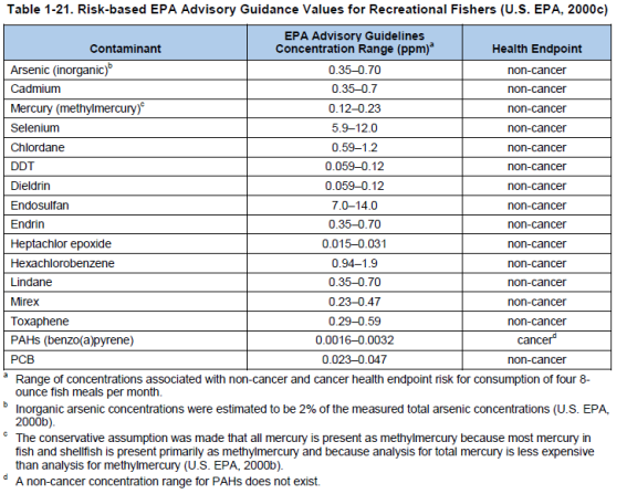
Page 123:
The rating for each site was based on the measured concentrations of these contaminants within the fish tissue samples…. The fish tissue contaminants index regional rating was based on percent of sites rather than percent area because target fish species were not caught at a large proportion of sites in each region, which invalidated the computation of percent area and associated uncertainty.
Page 1-24: “Cutpoints for Determining the Fish Tissue Contaminants Index by Station … Rating … Poor: For at least one chemical contaminant listed in Table 1-21, the measured concentrations in fish tissue exceeds the maximum value in the range of the EPA Advisory Guidance values for risk-based consumption associated with four 8-ounce meals per month.”
Page 1-37:
The NCA analyzes both juvenile and adult fish, most often as whole specimens, because this is the way fish would typically be consumed by predator species. This approach is appropriate for an ecological assessment. In contrast, most state programs assess the risk of contaminant exposure to human populations and, therefore, analyze primarily the fillet tissue (portion most commonly consumed by the general population). … The use of whole-fish samples can result in higher concentrations of those contaminants (e.g., … (DDT [dichlorodiphenyltrichloroethane]), PCBs [polychlorinated biphenyls], dioxins and other chlorinated pesticides) that are stored in fatty tissues and lower concentrations of contaminants (e.g., mercury) that accumulate primarily in the muscle tissue.
Page 2-10:
Figure 2-10 shows that 13% of all stations where fish were caught demonstrated contaminant concentrations in fish tissues above EPA Advisory Guidance values and were rated poor. The NCA examined whole-body composite samples, as well as fillets (typically 4 to 10 fish of a target species per station), for specific contaminants from 1,623 stations throughout the coastal waters of the United States (excluding Hawaii, Puerto Rico, and the U.S. Virgin Islands). Stations in poor and fair condition were dominated by samples with elevated concentrations of total PCBs, total DDT, total PAHs [polycyclic aromatic hydrocarbons], and mercury.
[292] Report: “National Coastal Condition Report IV.” U.S. Environmental Protection Agency, Office of Research and Development, Office of Water, April 2012. <www.epa.gov>
Page 3-10:
The fish tissue contaminants index for the Northeast Coast region is rated fair to poor based on concentrations of chemical contaminants found in composites of whole-body fish, lobster, and fish fillet samples. Twenty percent of the sites sampled where fish were caught were rated poor, and an additional 20% were rated fair based on comparison to EPA [U.S. Environmental Protection Agency] advisory guidance values (Figure 3-8). The poor sites were largely congregated in Great Bay, NH; Narragansett Bay, RI; Long Island Sound; NY/NJ Harbor; and the upper Delaware Estuary. Elevated concentrations of PCBs [polychlorinated biphenyls] were responsible for the impaired ratings for a large majority of sites. Moderate to high levels of DDT [dichlorodiphenyltrichloroethane] were detected in samples collected from sites located in the Hudson, Passaic, and Delaware rivers, and moderate mercury contamination was evident in samples collected from sites in Great Bay, NH; Narragansett Bay, RI; and the Hudson River.
[293] Report: “National Coastal Condition Report IV.” U.S. Environmental Protection Agency, Office of Research and Development, Office of Water, April 2012. <www.epa.gov>
Page 5-11:
The fish tissue contaminants index for the coastal waters of the Gulf Coast region is rated good, with 9% of all sites where fish were sampled rated poor for fish tissue contaminant concentrations (Figure 5-10). Contaminant concentrations exceeding EPA [U.S. Environmental Protection Agency] advisory guidance values in Gulf Coast samples were observed primarily in Atlantic croaker and hardhead catfish. Commonly observed contaminants included total PAHs [polycyclic aromatic hydrocarbons], PCBs [polychlorinated biphenyls], DDT [dichlorodiphenyltrichloroethane], mercury, and arsenic. Although many of the Gulf Coast estuarine and coastal areas do have fish consumption advisories in effect, that advice primarily concerns recreational game fish such as king mackerel, which are not sampled by the NCA [National Coastal Assessment] program.
[294] Report: “National Coastal Condition Report IV.” U.S. Environmental Protection Agency, Office of Research and Development, Office of Water, April 2012. <www.epa.gov>
Page 6-24:
Analysis of chemical contaminants in fish tissues was performed on whole-fish composites from 55 samples of four fish species collected from 50 West Coast coastal-ocean stations. Fish were collected from 21 stations in Washington, 20 in Oregon, and 9 in California. The fish species selected for analysis were Pacific sanddab (Citharichthys sordidus), speckled sanddab (Citharichthys stigmaeus), butter sole (Isopsetta isolepis), and Dover sole (Microstomus pacificus). Concentrations of a suite of metals, pesticides, and PCBs [polychlorinated biphenyls] were compared to risk-based EPA [U.S. Environmental Protection Agency] advisory guidelines for recreational fishers (U.S. EPA, 2000c).
None of the 50 stations where fish were caught would have been rated poor based on NCA [National Coastal Assessment] cutpoints. Nine stations had cadmium concentrations between the corresponding lower and upper endpoints, and one station had total PCB concentrations between these endpoints. Therefore, these 10 stations would be rated fair based on the NCA cutpoints (see Table 1-21). The remaining 40 stations had concentrations of contaminants below corresponding lower endpoints and would be rated good based on the NCA cutpoints. Based on the NCA Fish Tissue Contaminants Index (see Table 1-22) the overall offshore region would receive the same rating, good, as the West Coast coastal waters.
[295] Report: “National Coastal Condition Report IV.” U.S. Environmental Protection Agency, Office of Research and Development, Office of Water, April 2012. <www.epa.gov>
Page 8-8: “The fish tissue contaminants index for the coastal waters of Southeastern Alaska is rated good, with 6% of the stations where fish were caught rated fair and none of the stations rated poor (Figure 8-8).”
[296] Report: “National Coastal Condition Report IV.” U.S. Environmental Protection Agency, Office of Research and Development, Office of Water, April 2012. <www.epa.gov>
Page 9-5: “The fish tissue contaminants index for American Samoa is rated good based on fish tissue samples collected at 47 sites. The fish tissue contaminants index is rated poor at 4% of the sites at which fish were caught due to concentrations of PAHs [polycyclic aromatic hydrocarbons] and mercury in fish tissue (Figure 9-7).”
[297] Report: “National Coastal Condition Report IV.” U.S. Environmental Protection Agency, Office of Research and Development, Office of Water, April 2012. <www.epa.gov>
Page 9-15:
The fish tissue contaminants index for Guam is rated good, with 100% of the stations where fish were caught rated good (Figure 9-15). The fish tissue contaminant index rating is considered provisional because data are available for only 28 stations. Additionally, it is worth noting that only one sample was collected from some of the areas where contaminants have historically been present in Guam’s waters (e.g., Apra Harbor and Cocos Lagoon).
[298] Paper: “Relationships Between Microbial Indicators and Pathogens in Recreational Water Settings.” By Asja Korajkic and others. International Journal of Environmental Research and Public Health, December 13, 2018. <www.ncbi.nlm.nih.gov>
Page 1:
Fecal pollution of recreational waters can cause scenic blight and pose a threat to public health, resulting in beach advisories and closures. Fecal indicator bacteria (total and fecal coliforms, Escherichia coli, and enterococci), and alternative indicators of fecal pollution (Clostridium perfringens and bacteriophages) are routinely used in the assessment of sanitary quality of recreational waters. However, fecal indicator bacteria (FIB), and alternative indicators are found in the gastrointestinal tract of humans, and many other animals and therefore are considered general indicators of fecal pollution. … In this review, we examine 73 papers generated over 40 years that reported the relationship between at least one indicator and one pathogen group or species. Nearly half of the reports did not include statistical analysis, while the remainder were almost equally split between those that observed statistically significant relationships and those that did not. … Thus, while FIB, alternative indicators, and MST [microbial source tracking] markers continue to be suitable indicators of fecal pollution, their relationship with waterborne pathogens, particularly viruses, is tenuous at best and influenced by many different factors such as … the potential for the presence of a complex mixture of multiple sources of fecal contamination and pathogens.
Page 2:
During 2013, approximately 10% of US beach samples (out of total 116,230 samples collected) at 3485 beaches exceeded the US Environmental Protection Agency beach action value (BAV) for fecal indicator bacteria (FIB), indicating unacceptable water quality.5 Similarly, a more recent report for the European Union (EU) indicated that ~15% of beach samples failed to meet the most stringent “excellent” quality standard at nearly 22,000 coastal beaches and inland sites across EU.7
Because of a wide array of potential pathogens and typically low concentrations in environmental waters, direct monitoring of waterborne pathogens can be costly, technically challenging, and in some cases not feasible. Therefore, recreational waters are typically monitored for FIB levels instead. … Microbial source tracking (MST) has emerged in response to a need to identify the source(s) of fecal pollution to better safeguard human health and aid in remediation efforts. … Earlier technology centered on end-point PCR, which provides a binary, presence/absence result, but more recent studies estimate the concentration of a given MST genetic marker via real-time quantitative PCR (qPCR).14
The majority of waterborne disease outbreaks associated with recreational use of untreated waters (e.g., lakes and oceans) are caused by pathogenic microorganisms including bacteria, parasites, and viruses, while chemicals (including toxins) accounted for approximately 6% of outbreaks with confirmed etiology.27 … It is important to note that etiological agents in nearly 30% of outbreaks in the US alone remain unidentified,27 and that sporadic recreational waterborne illnesses not associated with outbreaks are excluded from this report.
Page 21:
8. Relationship of Indicators with Illness
To identify associations between the presence of general FIB, alternative indicators or MST markers with that of waterborne illness occurrence, various epidemiologic studies were collected from existing literature dating back to the early 1990s. For inclusion, it was required that the study measured at least one FIB, alternative indicator or MST marker (culture or molecular) in combination with an epidemiological survey of resulting illness from the recreational water exposure. In total, 17 studies met these criteria and were included in analyses.76,79,86,110–124 One study each was conducted in Europe and Africa, and fifteen studies were conducted in the US. Since some of these studies were conducted in more than one water type, this resulted in the inclusion of 20 freshwater sites and 29 brackish/marine sites. Thirteen different microbiological assays were reported including those targeting: enterococci, fecal and total coliforms, E. coli, somatic and F+ coliphage, as well as various general and human-associated MST markers (Figure 2). In addition to gastrointestinal illnesses characterized by symptoms of diarrhea, vomiting, and stomach cramps, other waterborne illnesses included skin, ear and sinus infection.76,79,86,110–113,115–122,124 For epidemiological studies, assays targeting enterococci were the most commonly recorded, with 25 instances of measurements of either culture based or molecular enterococci targets, followed by human-associated MST markers, F+ coliphage, fecal coliforms, general MST markers, total coliforms, culturable E. coli, somatic coliphage and finally E. coli qPCR signal (Figure 2).
Page 22:
Correlations between observed illness in these studies were most common with enterococci (10 studies out of 17),79,86,110,111,113,114,116,117,120,121 followed by F+ coliphage (5 studies)79,113,118,119,123 (Figure 2), suggesting that these two indicators may be better predictors of waterborne illness occurrence. Fecal coliforms, human-associated MST markers (Bsteri, BuniF2, and HF134), general MST marker (GenBac3), culturable E. coli, total coliforms, and somatic coliphage were correlated with illness less frequently (Figure 2). Twenty-seven indicator measurements across all studies were correlated with human illness, and 93% of these studies were conducted in waters with known point or non-point source contamination, contaminated surface/ground water flow or following wet weather events. Only six studies,79,86,117–119,124 all of which found relationship between indicator and illness, measured pathogens, in addition to recording illness information, and indicator organism concentrations. Only one of the six studies found a relationship between pathogens and illness or indicator concentrations. This is not surprising since, in these studies, pathogens were detected infrequently and at low concentrations. This illustrates the potential challenges of detecting relationships between indicators and pathogens in the field even when health relationships were observed with fecal indictors.
[299] Paper: “Relationships Between Microbial Indicators and Pathogens in Recreational Water Settings.” By Asja Korajkic and others. International Journal of Environmental Research and Public Health, December 13, 2018. <www.ncbi.nlm.nih.gov>
Page 2: “For example, human fecal pollution typically presents the greatest risk because of the possible presence of human viral pathogens, while cattle manure may be a close second because of the possible presence of zoonotic pathogens such as Cryptosporidium spp. and enteropathogenic E. coli.”
[300] Paper: “Performance, Design, and Analysis in Microbial Source Tracking Studies.” By Donald M. Stoeckel and Valerie J. Harwood. Applied and Environmental Microbiology, April 15, 2007. Pages 2405–2415. <journals.asm.org>
Page 2405:
Microbial source tracking (MST) includes a group of methodologies that are aimed at identifying, and in some cases quantifying, the dominant source(s) of fecal contamination in resource waters, including drinking, ground, recreational, and wildlife habitat waters. MST methods can be grouped into two major types. Library-dependent methods are culture based and rely on isolate-by-isolate typing of bacteria cultured from various fecal sources and from water samples These isolates are matched to their corresponding source categories by direct subtype matching41, 70 or by statistical means.23, 37, 40, 41, 80, 83, 102 In contrast, library-independent methods frequently are based on sample-level detection of a specific, host-associated genetic marker in a DNA extract by PCR.6, 11, 26, 88 Analyses of certain chemicals associated with sewage, including fecal sterols,29, 30, 47 optical brighteners,29, 30, 68 and host mitochondrial DNA,67 have also been utilized for what can be more broadly termed fecal source tracking; however, in this review we compare the performance of only fecal source tracking studies in which the target(s) is microbial.
Page 2411:
Quantification. As noted above, the ability of any MST method to quantitatively determine the relative contributions of fecal contamination in a water sample has not been convincingly demonstrated yet. Despite this fact, researchers continue to report quantitative results for MST methods.70 Indeed, because total maximum daily load assessments require allocation of fecal contamination loads among potential sources, it seems likely that quantitative assessments of fecal contamination in water samples will continue to be requested by resource managers. One method of providing convincing evidence of quantification would be to correctly approximate the proportional contribution of fecal contamination from multiple sources to a blinded spiked sample, as was attempted in the SCCWRP study.35 The proportional contribution could be calculated on the basis of fecal indicator bacterium concentrations for each source or on the basis of the mass (dry weight) of feces from each source.
Page 2412: “Although end users are eager for recommendations on the comparative accuracy of MST methods, the fact is that the field has not yet reached the state where any one method can be discarded or universally recommended.”
[301] Report: “Microbial Source Tracking Guide Document.” U.S. Environmental Protection Agency, Office of Research and Development, June 2005. <nepis.epa.gov>
Page 6: “While the majority of surface and ground waters in the U.S. meet regulatory standards, a significant portion of monitored surface waters contains fecal bacterial densities that exceed the levels established by state surface water quality standards.”
Page 9:
Approximately 13% of surface waters in the United States do not meet designated use criteria as determined by high densities of fecal indicator bacteria. Although some of the contamination is attributed to point sources such as confined animal feeding operation (CAFO) and wastewater treatment plant effluents, nonpoint sources are believed to contribute substantially to water pollution. Microbial source tracking (MST) methods have recently been used to help identify nonpoint sources responsible for the fecal pollution of water systems.
Page 11:
The Clean Water Act establishes that the states must adopt water quality standards that are compatible with pollution control programs to reduce pollutant discharges into waterways. In many cases the standards have been met by the significant reduction of loads from point sources under the National Pollutant Discharge Elimination System (NPDES). Point sources are defined as “any discernable, confined and discrete conveyance, including but not limited to any pipe, ditch or concentrated animal feeding operation from which pollutants are or may be discharged”. However, more than 30 years after the Clean Water Act was implemented, a significant fraction of the U.S. rivers, lakes, and estuaries continue to be classified as failing to meet their designated uses due to the high levels of fecal bacteria (USEPA [U.S. Environmental Protection Agency] 2000b). As a consequence, protection from fecal microbial contamination is one of the most important and difficult challenges facing environmental scientists trying to safeguard waters used for recreation (primary and secondary contact), public water supplies, and propagation of fish and shellfish. …
Microbiological impairment of water is assessed by monitoring concentrations of fecal-indicator bacteria such as fecal coliforms and enterococci (USEPA 2000a). These microorganisms are associated with fecal material from humans and other warm-blooded animals and their presence in water is used to indicate potential presence of enteric pathogens that could cause illness in exposed persons (Dufour, 1984). Fecally contaminated waters not only harbor pathogens and pose potential high risks to human health, but they also result in significant economic loss due to closure of shellfish harvesting areas and recreational beaches (Rabinovici and others, 2004). For effective management of fecal contamination to water systems, the sources must be identified prior to implementing remediation practices.
[302] Article: “Wildlife Waste Is Major Water Polluter, Studies Say.” By David A. Fahrenthold. Washington Post, September 29, 2006. <www.washingtonpost.com>
NOTE: Credit for bringing this article to attention belongs to Stephen F. Hayward & Amy Kaleita of the Pacific Research Institute. (Report: “Index of Leading Environmental Indicators.” (12th edition), 2007. <www.pacificresearch.org>)
[303] Report: “Microbial Source Tracking Guide Document.” U.S. Environmental Protection Agency, Office of Research and Development, June 2005. <nepis.epa.gov>
Pages 78–79:
Case 1. St. Andrews Park (Georgia)
Source of Information: Hartel, P., K. Gates, and K. Payne. 2004. Targeted sampling of St. Andrews Park on Jekyll Island to determine sources of fecal contamination …
Summary of Results and Conclusions. During calm weather, highest concentrations of enterococci were detected in the upper reaches of Beach Creek, the sediments of the creek, and the bathing area. Species composition in creek sediments and bathing area sediments were different, which was taken to indicate effects by different enterococci sources. The large proportion of E. faecalis in the upper reaches of Beach Creek was interpreted to implicate wild birds or humans as a source. The conclusion that wild birds, not humans, were a major source in the upper reaches of Beach Creek was supported by the marshy character of the area, which makes a human source unlikely at that location. Though there was no statistical correlation between turbidity and enterococci concentration, co-incidence of high enterococci concentrations and high turbidity in windy weather was taken as evidence that sediments were a source of elevated water-column numbers during windy weather.
Human-specific adhesin factor was not detected in any of 200 isolates tested. This was interpreted as evidence that human sources were not major contributors of enterococci to the test area. However, the incidence rate of the human-specific marker in enterococci colonizing the human population is unknown, and there was no mention of a positive control in marker detection by the research method used, which might limit the interpretability of this result. Human population size, local approaches to control human waste, or proximity of human residences to the affected area, factors which were certainly considered in the study, were not mentioned in the report as further corroborating data.
[304] Report: “Microbial Source Tracking Guide Document.” U.S. Environmental Protection Agency, Office of Research and Development, June 2005. <nepis.epa.gov>
Pages 80–82:
Case 2. Tampa Bay (Florida)
Source of Information: J.B. Rose, J.H. Paul, M.R. McLaughlin, V. J. Harwood, S. Farrah, M. Tamplin, J. Lukasik, M. Flanery, P. Stanek and H. Greening. 2000. …
Summary of Results and Conclusions. Perhaps one of the most striking findings of this study is the extent to which wild animals dominate as a source of fecal coliform and E. coli isolates. Over the course of the study, wild animal isolates dominated each site according to ARA [antibiotic resistance analysis]. Ribotyping results were consistent; in 74% of all samples (n=53) the majority of isolates were identified as nonhuman. However, all sites displayed some level of human fecal pollution according to the three methods used (ribotyping, ARA and enterovirus counts). The three different methods did not always coincide on their detection of the presence or absence of human contamination, however the data collected over the course of the study unambiguously documents the presence of human fecal sources.
[305] Report: “Microbial Source Tracking Guide Document.” U.S. Environmental Protection Agency, Office of Research and Development, June 2005. <nepis.epa.gov>
Pages 83–84:
Case 3. Vermillion River (Minnesota)
Source of Information: Sadowsky, M. 2004. …
Summary of Results and Conclusions. Identifications indicated that 14% of unknowns matched with geese, 12% with pigs, 12% with cats, 10% with cows, 9% with human, 9% with deer, 9% with sheep, and 9% with turkey. The remaining percentages (30%) then fall off to match with the other groups or remained unclassified. The conclusion was that geese, pigs, cats, cows, humans, deer, sheep, and turkeys were the dominant sources of fecal pollution in the watershed.
[306] Report: “Microbial Source Tracking Guide Document.” U.S. Environmental Protection Agency, Office of Research and Development, June 2005. <nepis.epa.gov>
Pages 85–86:
Case 4. Anacostia River (Maryland/District of Columbia)
Source of Information: Hagedorn, C., K. Porter, and A. H. Chapman. 2003. …
Summary of Results and Conclusions. The dominant sources over all 10 months of sampling were (using ARA [antibiotic resistance analysis]) birds (31%), wildlife (25%), and humans (24%), followed by pets (20%). Livestock detections were essentially non-existent.
[307] Report: “Microbial Source Tracking Guide Document.” U.S. Environmental Protection Agency, Office of Research and Development, June 2005. <nepis.epa.gov>
Pages 88–90:
Case 5. Accotink Creek, Blacks Run, and Christians Creek (Virginia)
Source of Information: Hyer, K. E. and D. L. Moyer. 2003. …
Outcomes
1. Summary of Results and Conclusions. Overall, about 65% of isolates could be assigned to a source in this study. Of the remaining 35%, some had no match in the library (unknown) and others matched to multiple sources (transient). Classification was made to the species level with some exceptions (for example, some bird-origin feces could be classified to species, but others could only be classified to “avian” or “poultry”). The MST [Microbial Source Tracking] results were a combination of the expected and the unanticipated. Fecal-indicator sources in Accotink Creek, the urban setting, were affected by human and pet feces, as expected, but were also strongly influenced by waterfowl. Blacks Run fecal-indicator bacteria were a mixture of human, pet, and livestock sources, as expected. Fecal-indicator concentrations in Christians Creek had a larger human and pet component than expected (about 25% of isolates), compared with livestock and poultry (about 50%). A further unexpected finding in all three watersheds was that relative contributions from each major source were about the same during both base-flow and storm-flow periods, despite the expectation that different transport pathways would dramatically change relative contributions from different sources.
[308] Article: “Wildlife Waste Is Major Water Polluter, Studies Say.” By David A. Fahrenthold. Washington Post, September 29, 2006. <www.washingtonpost.com>
In the Potomac and the Anacostia, for instance, more than half of the bacteria in the streams came from wild creatures. EPA [U.S. Environmental Protection Agency] documents show that similar problems were found in Maryland, where wildlife were more of a problem than humans and livestock combined in the Magothy River, and in Northern Virginia tributaries such as Accotink Creek, where geese were responsible for 24 percent of bacteria, as opposed to 20 percent attributable to people.
“Wildlife consistently came up as being . . . a major player,” said Peter Gold, an environmental scientist for the EPA.
NOTE: Credit for bringing this article to attention belongs to Stephen F. Hayward & Amy Kaleita of the Pacific Research Institute. (Report: “Index of Leading Environmental Indicators.” (12th edition), 2007. <www.pacificresearch.org>)
[309] Report: “Microbial Source Tracking Guide Document.” U.S. Environmental Protection Agency, Office of Research and Development, June 2005. <nepis.epa.gov>
Pages 92–93:
Case 6. Avalon Bay (California)
Source of Information: Boehm, A. B., Fuhrman, J. A., Mrse, R. D. and Grant, S. B. 2003. …
Summary of Results and Conclusions. FIB [fecal indicator bacteria] in Avalon Bay appear to be from multiple, primarily land-based, sources including bird droppings, contaminated subsurface water, leaking drains, and runoff from street wash-down activities. Multiple shoreline samples and two subsurface water samples tested positive for human-specific bacteria and enterovirus, suggesting that at least a portion of the FIB contamination is from human sewage.
[310] Report: “Microbial Source Tracking Guide Document.” U.S. Environmental Protection Agency, Office of Research and Development, June 2005. <nepis.epa.gov>
Pages 94–95:
Case 7. Holmans Creek (Virginia)
Source of Information: Noto, M., K. Hoover, E. Johnson, J. McDonough, E. Stevens, and B. A. Wiggins. 2000. …
Summary of Results and Conclusions. Human sources were dominant in five of eight sampling events, and at four of nine locations. In 53 of the 64 samples, the proportion of human was above the MDP [Minimal Detectable Percentage], and human was the dominant source in 29 of the 64 samples. Cattle was the dominant source on three of eight sampling days, and at five of nine locations. The proportion of cattle was above the MDP in 52 of 64 samples, and cattle was the dominant source in 26 of them. Poultry and geese fecal contributions were low throughout the sampling period. The conclusions were that humans and cattle are the dominant sources of fecal pollution in the watershed.
[311] Report: “Microbial Source Tracking Guide Document.” U.S. Environmental Protection Agency, Office of Research and Development, June 2005. <nepis.epa.gov>
Pages 96–120:
Case 8. Homosassa Springs (Florida)
Source of Information: Griffin, D. W., R. Stokes, J. B. Rose, and J. H. Paul III. 2000. …
Summary of Results and Conclusions. F+ specific RNA coliphage analysis indicated that fecal contamination at all sites that had F+ RNA coliphage was from animal sources (mammals and birds). These results suggest that animal (either indigenous or residents of HSSWP [Homosassa Springs State Wildlife Park]) and not human sources influenced microbial water quality in the area of Homosassa River covered by this study.
[312] Entry: “acid.” The American Heritage Student Science Dictionary (2nd edition). Houghton Mifflin Harcourt Publishing Company, 2014. <www.thefreedictionary.com>
“Any of a class of compounds that form hydrogen ions when dissolved in water. They also react, in solution, with bases and certain metals to form salts. Acids turn blue litmus paper red, have a sour taste, and have a pH of less than 7. Compare base.”
[313] Report: “Ocean Acidification: A National Strategy to Meet the Challenges of a Changing Ocean.” By the U.S. National Research Council Committee on the Development of an Integrated Science Strategy for Ocean Acidification Monitoring, Research, & Impacts Assessment. National Academies Press, September 28, 2010. <doi.org>
Page 15: “Carbon dioxide dissolved in water acts as an acid, decreasing its pH,1 and fostering a series of chemical changes.”
[314] Webpage: “pH and Water.” United States Geological Survey, October 22, 2019. <www.usgs.gov>
“pHs of less than 7 indicate acidity, whereas a pH of greater than 7 indicates a base. … Low-pH [acidic] water will corrode or dissolve metals and other substances.”
[315] Webpage: “pH and Water.” United States Geological Survey, October 22, 2019. <www.usgs.gov>
“pH is a measure of how acidic/basic water is. The range goes from 0 to 14, with 7 being neutral. pHs of less than 7 indicate acidity, whereas a pH of greater than 7 indicates a base. pH is really a measure of the relative amount of free hydrogen and hydroxyl ions in the water. Water that has more free hydrogen ions is acidic, whereas water that has more free hydroxyl ions is basic.”
[316] Article: “An Upwelling Crisis: Ocean Acidification.” By Caitlyn Kennedy. National Oceanic and Atmospheric Administration, October 30, 2009. Updated 4/19/22. <www.climate.gov>
[317] Webpage: “pH and Water.” United States Geological Survey. Accessed December 3, 2020 at <www.usgs.gov>
“Since pH can be affected by chemicals in the water, pH is an important indicator of water that is changing chemically. pH is reported in ‘logarithmic units.’ Each number represents a 10-fold change in the acidity/basicness of the water. Water with a pH of five is ten times more acidic than water having a pH of six.”
[318] Report: “Ocean Acidification: A National Strategy to Meet the Challenges of a Changing Ocean.” By the U.S. National Research Council Committee on the Development of an Integrated Science Strategy for Ocean Acidification Monitoring, Research, & Impacts Assessment. National Academies Press, September 28, 2010. <doi.org>
Page 15: “ ‘Acidification’ does not mean that the ocean has a pH below neutrality. The average pH of the ocean is still basic (8.1), but because the pH is decreasing, it is described as undergoing acidification.”
[319] Article: “Small Drop in pH Means Big Change in Acidity.” By Cherie Winner. Woods Hole Oceanographic Institution, January 20, 2010. <www.whoi.edu>
“The pH of seawater is near 8, which makes it mildly alkaline, or basic; but any decrease in the pH of a liquid is considered ‘acidification.’ ”
[320] Article: “Ocean Acidification.” By the Ocean Portal Team. Smithsonian Institution, April 2018. <ocean.si.edu>
“The ocean itself is not actually acidic in the sense of having a pH less than 7, and it won’t become acidic even with all the CO2 that is dissolving into the ocean.”
[321] Report: “Ocean Acidification: A National Strategy to Meet the Challenges of a Changing Ocean.” By the United States National Research Council Committee on the Development of an Integrated Science Strategy for Ocean Acidification Monitoring, Research, and Impacts Assessment. National Academies Press, September 28, 2010. <doi.org>
Page 15: “Carbon dioxide dissolved in water acts as an acid, decreasing its pH,1 and fostering a series of chemical changes.”
[322] Webpage: “What is Ocean Acidification?” National Oceanic and Atmospheric Administration. Last updated February 26, 2021. <oceanservice.noaa.gov>
Ocean acidification refers to a reduction in the pH of the ocean over an extended period of time, caused primarily by uptake of carbon dioxide (CO2) from the atmosphere.
For more than 200 years, or since the industrial revolution, the concentration of carbon dioxide (CO2) in the atmosphere has increased due to the burning of fossil fuels and land use change. The ocean absorbs about 30 percent of the CO2 that is released in the atmosphere, and as levels of atmospheric CO2 increase, so do the levels in the ocean.
When CO2 is absorbed by seawater, a series of chemical reactions occur resulting in the increased concentration of hydrogen ions. This increase causes the seawater to become more acidic and causes carbonate ions to be relatively less abundant.
Carbonate ions are an important building block of structures such as sea shells and coral skeletons. Decreases in carbonate ions can make building and maintaining shells and other calcium carbonate structures difficult for calcifying organisms such as oysters, clams, sea urchins, shallow water corals, deep sea corals, and calcareous plankton.
These changes in ocean chemistry can affect the behavior of non-calcifying organisms as well. Certain fish’s ability to detect predators is decreased in more acidic waters. When these organisms are at risk, the entire food web may also be at risk.
Ocean acidification is affecting the entire world’s oceans, including coastal estuaries and waterways. Many economies are dependent on fish and shellfish and people worldwide rely on food from the ocean as their primary source of protein.
[323] Book: Dictionary of Environment and Development: People, Places, Ideas and Organizations. By Andy Crump. MIT Press, 1993.
Page 42: “Carbon Dioxide A colourless, odourless, non-toxic, non-combustible gas….”
[324] Book: The Science of Air: Concepts And Applications (2nd edition). By Frank R. Spellman. CRC Press, 2009.
Page 21: “Carbon dioxide (CO2) is a colorless, odorless gas (although it is felt by some persons to have a slight pungent odor and biting taste), is slightly soluble in water and denser than air (one and half times heavier than air), and is slightly acidic. Carbon dioxide gas is relatively nonreactive and nontoxic.”
[325] Book: Carbon Dioxide Capture for Storage in Deep Geologic Formations – Results from the CO2 Capture Project, Volume 2. Edited by David C. Thomas. Elsevier, 2005.
Section 5: “Risk Assessment,” Chapter 25: “Lessons Learned from Industrial and Natural Analogs for Health, Safety and Environmental Risk Assessment for Geologic Storage of Carbon Dioxide.” By Sally M. Benson (Lawrence Berkeley National Laboratory, Division Director for Earth Sciences). Pages 1133–1142.
Page 1133: “Carbon dioxide is generally regarded as a safe and non-toxic, inert gas. … Ambient concentrations of CO2 are currently about 370 ppm [parts per million]. Humans can tolerate increased concentrations with no physiological effects for exposures up to 1% CO2 (10,000 ppm).7 For concentrations up to 3%, physiological adaption occurs without adverse consequences.”
[326] Book: Dictionary of Environment and Development: People, Places, Ideas and Organizations. By Andy Crump. MIT Press, 1993.
Page 42: “It is known that carbon dioxide contributes more than any other [manmade] gas to the greenhouse effect….”
[327] Synthesis report: “Climate Change 2007.” Based on a draft prepared by Lenny Bernstein and others. World Meteorological Organization/United Nations Environment Programme, Intergovernmental Panel on Climate Change, 2007. <www.ipcc.ch>
Page 36: “Carbon dioxide (CO2) is the most important anthropogenic GHG [greenhouse gas]. Its annual [anthropogenic] emissions have grown between 1970 and 2004 by about 80%, from 21 to 38 gigatonnes (Gt), and represented 77% of total anthropogenic GHG emissions in 2004 (Figure 2.1).”
[328] Book: Understanding Environmental Pollution (3rd edition). By Marquita K. Hill. Cambridge University Press, 2010.
Page 187: “CO2 is … vital to life. Trees, plants, phytoplankton, and photosynthetic bacteria, capture CO2 from air and through photosynthesis make carbohydrates, proteins, lipids, and other biochemicals. Almost all biochemicals found within living creatures derive directly or indirectly from atmospheric CO2.”
[329] Book: Carbon Dioxide Capture for Storage in Deep Geologic Formations – Results from the CO2 Capture Project, Volume 2. Edited by David C. Thomas. Elsevier, 2005.
Section 5: “Risk Assessment,” Chapter 25: “Lessons Learned from Industrial and Natural Analogs for Health, Safety and Environmental Risk Assessment for Geologic Storage of Carbon Dioxide.” By Sally M. Benson (Lawrence Berkeley National Laboratory, Division Director for Earth Sciences). Pages 1133–1142.
Page 1133: “Carbon dioxide is generally regarded as a safe and non-toxic, inert gas. It is an essential part of the fundamental biological processes of all living things. It does not cause cancer, affect development or suppress the immune system in humans. Carbon dioxide is a physiologically active gas that is integral to both respiration and acid-base balance in all life.”
[330] Webpage: “Greenhouse Gases.” Commonwealth of Australia, Parliamentary Library, December 24, 2008. Accessed October 30, 2017 at <www.aph.gov.au>
“At very small concentrations, carbon dioxide is a natural and essential part of the atmosphere, and is required for the photosynthesis of all plants.”
[331] Article: “Industrial Revolution.” By Margaret C. Jacob (Ph.D., Professor of History, University of California, Los Angeles). World Book Encyclopedia 2007 Deluxe Edition.
During the late 1700’s and early 1800’s, great changes took place in the lives and work of people in several parts of the Western world. These changes resulted from the development of industrialization. …
The Industrial Revolution began in Britain (a country now known as the United Kingdom) during the late 1700’s. It started spreading to other parts of Europe and to North America in the early 1800’s. By the mid-1800’s, industrialization was widespread in western Europe and the northeastern United States.
The introduction of power-driven machinery and the development of factory organization during the Industrial Revolution created an enormous increase in the production of goods. Before the revolution, manufacturing was done by hand, or by using animal power or simple machines. … The Industrial Revolution eventually took manufacturing out of the home and workshop. Power-driven machines replaced handwork, and factories developed as the most economical way of bringing together the machines and the workers to operate them.
[332] Calculated with data from:
a) Paper: “Ice Core Record of 13C/12C Ratio of Atmospheric CO2 in the Past Two Centuries.” By H. Friedli and others. Nature, November 20, 1986. Pages 237–238. <www.nature.com>
Data provided in “Trends: A Compendium of Data on Global Change.” U.S. Department of Energy, Oak Ridge National Laboratory, Carbon Dioxide Information Analysis Center. <cdiac.ornl.gov>
b) Dataset: “Monthly Atmospheric CO2 Concentrations (PPM) Derived From Flask Air Samples. South Pole: Latitude 90.0S Elevation 2810m.” University of California, Scripps Institution of Oceanography. Accessed August 6, 2021 at <scrippsco2.ucsd.edu>
NOTE: An Excel file containing the data and calculations is available upon request.
[333] Textbook: An Introduction to Navier-Stokes Equation and Oceanography. By Luc Tartar. Springer Berlin Heidelberg, August 25, 2006.
Page 11: “The atmospheric pressure (1 bar) corresponds to the weight of the atmosphere, but it is just the weight of 10 m [meters] of water; the total mass of the ocean is 270 times the total mass of the atmosphere.”
[334] Book: Chemical Exposure and Toxic Responses. Edited by Stephen K. Hall, Joana Chakraborty, and Randall J. Ruch. CRC Press, 1997.
Pages 4–5:
The relationship between the dose of a toxicant and the resulting effect is the most fundamental aspect of toxicology. Many believe, incorrectly, that some agents are toxic and others are harmless. In fact, determinations of safety and hazard must always be related to dose. This includes a consideration of the form of the toxicant, the route of exposure, and the chronicity [time] of exposure.
[335] Book: Molecular Biology and Biotechnology: A Guide for Teachers (3rd edition). By Helen Kreuzer and Adrianne Massey. ASM [American Society for Microbiology] Press, 2008.
Page 540: “Paracelsus, a Swiss physician who reformed the practice of medicine in the 16th century, said it best: ‘All substances are poisons, there is none which is not a poison. The dose differentiates a poison and a remedy.’ This is a fundamental principle in modern toxicology: the dose makes the poison.”
[336] Webpage: “Concentrations of Solutions.” By Allison Soult and others. University of Kentucky. Last updated August 13, 2020. <chem.libretexts.org>
The concentration of a solution is a measure of the amount of solute that has been dissolved in a given amount of solvent or solution. A concentrated solution is one that has a relatively large amount of dissolved solute. A dilute solution is one that has a relatively small amount of dissolved solute. …
Percent Concentration
One way to describe the concentration of a solution is by the percent of the solution that is composed of the solute. This percentage can be determined in one of three ways: (1) the mass of the solute divided by the mass of solution….
[337] Webpage: “About NOAA Research.” National Oceanic and Atmospheric Administration. Accessed March 1, 2022 at <research.noaa.gov>
Oceanic and Atmospheric Research (OAR)—or “NOAA [National Oceanic and Atmospheric Administration] Research”—provides the research foundation for understanding the complex systems that support our planet. Working in partnership with other organizational units of the National Oceanic and Atmospheric Administration, a bureau of the Department of Commerce, NOAA Research enables better forecasts, earlier warnings for natural disasters, and a greater understanding of the Earth. Our role is to provide unbiased science to better manage the environment, nationally, and globally.
[338] Calculated with data from: “World Ocean Database Select and Search.” National Centers for Environmental Information, National Oceanic and Atmospheric Administration. Accessed March 1, 2022 at <www.ncei.noaa.gov>
NOTES:
[339] Webpage: “Quality of pH Measurements in the NODC [National Ocean Data Center] Data Archives.” National Oceanic and Atmospheric Administration. Accessed March 1, 2022 at <www.pmel.noaa.gov>
The NOAA National Centers for Environmental Information (NCEI) World Ocean Database has a great deal of historical pH data (nearly 1/4 million profiles; Boyer and others, 2013—Fig. 2.11). The data collected prior to 1989 are typically not well documented and their metadata is incomplete; therefore, such data are of unknown and probably variable quality. The reasons for this are manifold (see next section). The uncertainty of these older pH measurements is rarely likely to be less than 0.03 in pH, and could easily be as large as 0.2 in pH. This data set is thus not at all well-suited to showing a change of 0.1 in pH over the last 100 years—the amount of pH change that would be expected to occur over the 100 years since the first seawater pH measurements, as a result of the documented increase in atmospheric CO2 levels and assuming that the surface ocean composition remains in approximate equilibrium with respect to the atmosphere.
It is only since the 1990s that it has been possible to discern small pH changes in the ocean with reasonable confidence. The figure in Feely (2008, updated version shown above) shows the changes in pH inferred from measured changes in the seawater carbonate system seen off Hawaii since 1988, when a regular time-series study was instituted there using the best available methods for measuring CO2 changes in seawater. A limited number of other time-series stations have shown a similar pattern (Rhein and others, 2013; Bates and others, 2014).
Issues Related to pH Measurement Technique and Data Reporting in the Pre-1990 Era
While seawater pH measurements have been made on some oceanographic expeditions starting with the first measurements that were made by Sørensen and Palitzsch (1910), most of the earlier data have proven to be problematic for a number of reasons that we will describe below. In addition, there is the added problem of data sparseness in any given year for the earlier data sets, which makes the determination of a global annual mean value for a particular time period to be quite challenging, necessarily increasing its likely uncertainty.
[340] Email from Hernan Garcia to Michael Wallace on October 23, 2018.
Michael, thank you for your email and input! It is much appreciated. I agree with you that it is too broad to characterize all the older historical pH data as questionable without the benefit of a more in depth analysis. I think that the fit for purpose and research question help determine the use of measured data and their uncertainty. Our World Ocean Team works really hard to provide the most comprehensive ocean profile data collection possible. These historical data are scientifically valuable and cannot be recreated. Thanks!
Hernan E. Garcia, Ph.D.
NOAA [2] NESDIS [National Environmental Satellite, Data, and Information Service] [3] National Centers for Environmental Information [4] World Data Service for Oceanography [5], Head US Data Manager for IODE [International Oceanographic Data and Information Exchange] [6] of IOC/UNESCO [Intergovernmental Oceanographic Commission/United Nations Educational, Scientific and Cultural Organization] [7] SSMC-3 [Silver Spring Metro Center] 4th Floor Rm 4626 1315 East-West Hwy Silver Spring, MD 20910 Desk: (301) 713-4856 E-mail: Hernan.Garcia@noaa.gov
~~~~~~~~~~~~~~~~~~~~~~~~~~~~~~~
The contents of this message are mine personally and do not reflect any position of the U.S. Government or NOAA
~~~~~~~~~~~~~~~~~~~~~~~~~~~~~~~
[341] Calculated with data from: “World Ocean Database Select and Search.” National Centers for Environmental Information, National Oceanic and Atmospheric Administration. Accessed March 1, 2022 at <www.ncei.noaa.gov>
NOTES:
[342] Webpage: “Richard A. Feely, Ph.D.” Pacific Marine Environmental Laboratory, National Oceanic and Atmospheric Administration. Accessed March 1, 2022 at <www.pmel.noaa.gov>
NOAA/PMEL Senior Scientist
PhD., Chemical Oceanography, Texas A&M University, College Station, TX, 1974. Affiliate Full Professor, Department of Oceanography, University of Washington …
Awards …
Heinz Environmental Award – 2010
Contributed to the Nobel Peace Prize (co-shared with Al Gore and other members of IPCC [Intergovernmental Panel on Climate Change]) – 2007
[343] Webpage: “Richard A. Feely, Ph.D.” Pacific Marine Environmental Laboratory, National Oceanic and Atmospheric Administration. Accessed March 1, 2022 at <www.pmel.noaa.gov>
NOAA/PMEL, Laboratory Director …
PhD, Oceanography, University of Hawaii at Manoa, Honolulu, HI, 1992.
Affiliate Full Professor, Department of Oceanography, University of Washington …
Awards …
Nobel Peace Prize (co-shared with Al Gore and other members of IPCC [Intergovernmental Panel on Climate Change]) – 2007
[344] Webpage: “The Nobel Peace Prize 2007.” Nobel Prize Outreach, October 12, 2007. <www.nobelprize.org>
“The Nobel Peace Prize 2007 was awarded jointly to Intergovernmental Panel on Climate Change (IPCC) and Albert Arnold (Al) Gore Jr. ‘for their efforts to build up and disseminate greater knowledge about man-made climate change, and to lay the foundations for the measures that are needed to counteract such change.’ ”
[345] Press release: “Teresa Heinz and the Heinz Family Foundation Announce Recipients of $1 Million Heinz Awards: 16th Annual Awards Celebrate Environmental Innovators.” Heinz Family Foundation, September 21, 2010. <www.heinzawards.org>
Pittsburgh, September 21, 2010—Teresa Heinz and the Heinz Family Foundation today announced the winners of the 16th annual Heinz Awards, honoring the contributions of 10 innovative and inspiring individuals whose work has addressed environmental challenges. Each recipient receives an unrestricted cash prize of $100,000.
Each of the awardees is distinguished not just by the impressive detail and scope of their work, but also by their courageous willingness to communicate the implications of their work, often in the face of determined opposition. This characteristic was highly prized by Senator John Heinz, and hence the award program seeks to identify and honor it.
The winners of the 16th Heinz Awards are… Richard Feely, Ph.D., National Oceanic and Atmospheric Administration, Pacific Marine Environmental Laboratory (Seattle, Wash.) For his extraordinary efforts in identifying ocean acidity as global warming’s “evil twin.”
[346] Report: “Carbon Dioxide and Our Ocean Legacy.” By Richard A. Feely, Christopher L. Sabine, and Victoria J. Fabry. National Oceanic and Atmospheric Administration, April 2006. <www.pmel.noaa.gov>
Page 1:
New scientific research shows that our oceans are beginning to face yet another threat due to global warming-related emissions—their basic chemistry is changing because of the uptake of carbon dioxide released by human activities. … Ocean acidification is a straightforward consequence of increasing carbon dioxide emissions due to human activities, and is predicted with a high degree of certainty.
About the Authors. Drs. Richard Feely and Christopher Sabine are oceanographers at the Pacific Marine Environmental Laboratory of the National Oceanic and Atmospheric Administration, where they specialize in the ocean carbon cycle. Dr. Victoria Fabry is a biologist at the California State University San Marcos, with expertise in the effects of carbon dioxide on marine life.1,2
Page 2: “At present, ocean chemistry is changing at least 100 times more rapidly than it has changed during the 650,000 years preceding our industrial era. And, if current carbon dioxide emission trends continue, computer models show that the ocean will continue to undergo acidification, to an extent and at rates that have not occurred for tens of millions of years.”
Page 3: “By the middle of this century, coral reefs may well erode faster than they can be rebuilt.6 Lab results indicate that coral reefs cannot easily adapt to this changing seawater chemistry. While long-term consequences are unknown, this could affect the geographic range of corals and the life forms that depend on the reef habitat.”
[347] Textbook: Flood Geomorphology. By Victor R. Baker and others. Wiley, April 1998.
Page ix: “[T]rue science is concerned with understanding nature no matter what the methodology. In our view, if the wrong equations are programmed because of inadequate understanding of the system, then what the computer will produce, if believed by the analyst, will constitute the opposite of science.”
[348] Report: “Carbon Dioxide and Our Ocean Legacy.” By Richard A. Feely, Christopher L. Sabine, and Victoria J. Fabry. National Oceanic and Atmospheric Administration, April 2006. <www.pmel.noaa.gov>
Page 2: “Historical & Projected pH & Dissolved CO2 … As the ocean concentration of carbon dioxide increases, so does acidity (causing pH to decline).”
[349] Calculated with data from:
a) “World Ocean Database Select and Search.” National Centers for Environmental Information, National Oceanic and Atmospheric Administration. Accessed March 1, 2022 at <www.ncei.noaa.gov>
b) Report: “Carbon Dioxide and Our Ocean Legacy.” By Richard A. Feely, Christopher L. Sabine, and Victoria J. Fabry. National Oceanic and Atmospheric Administration, April 2006. <www.pmel.noaa.gov>
NOTES:
[350] Email from Michael Wallace to Chris Sabine and Richard Feely on April 15, 2013.
“I’m looking in fact for the source references for the red curve in their plot which was labeled ‘Historical and Projected pH & Dissolved CO2.’ This plot is at the top of the second page. It covers the period of my interest. Best regards, Mike Wallace, Doctoral Student.”
[351] Webpage: “Michael Wallace.” Academia. Accessed December 14, 2020 at <independent.academia.edu>
MS Hydrology, University of Arizona. Extensive work in groundwater hydrology and groundwater chemistry, multi phase modeling, hydroclimatology. Pursued a Ph.D. in Nanoscience and Microsystems at University of New Mexico with a research focus on solar-hydroclimatologic relationships. Cycled through 3 advisors. Published a paper on solar forcing of hydroclimate in Oxford based Hydrological Sciences Journal.
[352] Email from Michael Wallace to Chris Sabine on May 19, 2013:
“As I’ve stated consistently in this email string and in a related FOIA [Freedom of Information Act request] I submitted to NOAA several weeks ago, I just want access to the source references you used for the red curve in your plot … which was labeled ‘Historical and Projected pH % Dissolved CO2’.”
[353] Email from Michael Wallace to Chris Sabine and Richard Feely on April 15, 2013.
“I’m looking in fact for the source references for the red curve in their plot which was labeled ‘Historical and Projected pH & Dissolved CO2.’ This plot is at the top of the second page. It covers the period of my interest. Best regards, Mike Wallace, Doctoral Student.”
[354] Email from Chris Sabine to Michael Wallace on May 18, 2013.
If you are looking for ocean pH measurements you should check out the following public websites that you could have easily found yourself:
All of these have measured, not modeled, a drop in ocean pH over the last couple of decades. You will also find much more data at: <cdiac.ornl.gov>
I hope you will refrain from contacting me in the future. Christopher Sabine.
[355] Email from Michael Wallace to Chris Sabine and Richard Feely on May 25, 2013.
In response to Dr. Sabine’s first email back to me about a week ago, I spent several hours searching through the links he provided. I’ve made a separate powerpoint to document that none of the links were responsive to my request for the complete 20th century ocean pH data (not modeled) for global ocean historical pH representation in their figure. That powerpoint is over 30 pages long and available upon request.
Dr. Sabine recently followed up with another email with some specific direction regarding a site in Hawaii. I followed up again and I don’t believe that this is very responsive either. That data only goes back to 1989. I believe I have been clear about my need for the previous 80 years of pH measurement data to capture 20th century time series of measured ocean pH data. I’ve attached a pdf file of my own to this message, in which I’ve added clarification regarding my request.
Having said that above, it is possible that Dr. Sabine WAS partially responsive to my request. That could only be possible however, if only data from 1989 and later was used to develop the 20th century portion of the subject curve.
Dr. Feely also emailed and described some peer-reviewed papers. I was already familiar with the Orr paper, but haven’t paid the $32 for it from Nature. I hesitate to pay for something that I suspect is also not responsive to my request. I suspect the paper is non-responsive because the NATURE abstract site does provide the figures associated with the data that apparently feeds the paper, and there is no plot or table of data that directly displays measured 20th century ocean pH data. I made a second powerpoint to document that, and again it can be provided to you if you request it. The other papers suggested by Dr. Feely appear to be non-responsive also, because they are apparently focused on forecasting future pH, not documenting past ocean 20th century pH.
Having said this immediately above, it’s possible that Dr. Feely also WAS partially responsive to my request. Yet again, this could not be possible unless the measurement data used to define 20th century ocean pH for their curve, came exclusively from 1989 and later (thereby omitting 80 previous years of ocean pH 20th century measurement data, which is the very data I’m hoping to find).
Maybe the authors could simply confirm if the italicized statements above are true. That would only take a brief email reply from either author.
[356] Email from Chris Sabine to Michael Wallace on May 25, 2013.
Your statements in italics below are essentially correct. High quality pH measurements were not routinely collected until the late 1980’s early 1990’s when the spectrophotometric pH methods were developed and used for seawater analyses. There are many pH measurements prior to that time (particularly collected by the Russians and available at NODC), but they are not of sufficient quality to be useful for this purpose. They were typically made with electrodes that were calibrated with low ionic strength NBS type buffers. These measurements are very unreliable in high ionic strength solutions, like seawater, therefore they have not been included in any of our publications.
[357] Email from Richard Feely to Michael Wallace on June 4, 2013.
Dear Mike;
Dr. Sabine is on vacation this week so I thought I would respond to your e-mail in his behalf. While there were some high-quality dissolved inorganic carbon and total alkalinity data sets in the public domain prior to 1988 that could be used used to extract pH results for the 1970s and early 1980s, they required a careful analysis and correction of systematic biases. Therefore we chose to use the modeling results of Orr et al (2005) for the earlier data sets. As I mentioned in my previous e-mail these models are consistent with the more detailed studies of Caldeira and Wickett (2005). They also agree with the newer model results of Steinacher et al (2009) and Feely et al (2009). I suggest that you review these newer papers, which have compared against the most recent observations.
A good source of new information is the recent book Ocean Acidification, J.-P. Guttuso, and L. Hansson, Eds., Oxford University Press. I suggest that you read the papers by Orr and Joos and others They will give you the proper context for your work on pH.
(Mike wrote previously) Thank you Dr. Sabine and Dr. Feely and Pew Trust Representatives.
You have a rationale below, and perhaps this is second nature to you. But I have to think that many in addition [sic] to me (who read the subject report) could not be aware of the extraordinary degree and scope of data rejection employed and the replacement of that by a simulation. Given that your figure is hosted on a NOAA page and that it is apparently the only figure available that represents as a history of 20th century global ocean pH, this is an important concern. …
Is this email string therefore the sole available documentation containing your reasons for omitting all ocean pH measurements prior to 1988 (and replacing with an undisclosed model result) in your figure?
If so, are there any plans to reissue your subject figure and report with this essential information on data and model sourcing and error evaluation methodology?
[358] Email from Richard Feely to Michael Wallace on June 4, 2013.
Dear Mike;
Dr. Sabine is on vacation this week so I thought I would respond to your e-mail in his behalf. While there were some high-quality dissolved inorganic carbon and total alkalinity data sets in the public domain prior to 1988 that could be used used to extract pH results for the 1970s and early 1980s, they required a careful analysis and correction of systematic biases. Therefore we chose to use the modeling results of Orr et al (2005) for the earlier data sets. As I mentioned in my previous e-mail these models are consistent with the more detailed studies of Caldeira and Wickett (2005). They also agree with the newer model results of Steinacher et al (2009) and Feely et al (2009). I suggest that you review these newer papers, which have compared against the most recent observations.
A good source of new information is the recent book Ocean Acidification, J.-P. Guttuso, and L. Hansson, Eds., Oxford University Press. I suggest that you read the papers by Orr and Joos and others They will give you the proper context for your work on pH.
(Mike wrote previously) Thank you Dr. Sabine and Dr. Feely and Pew Trust Representatives.
You have a rationale below, and perhaps this is second nature to you. But I have to think that many in addition [sic] to me (who read the subject report) could not be aware of the extraordinary degree and scope of data rejection employed and the replacement of that by a simulation. Given that your figure is hosted on a NOAA page and that it is apparently the only figure available that represents as a history of 20th century global ocean pH, this is an important concern. …
Is this email string therefore the sole available documentation containing your reasons for omitting all ocean pH measurements prior to 1988 (and replacing with an undisclosed model result) in your figure?
If so, are there any plans to reissue your subject figure and report with this essential information on data and model sourcing and error evaluation methodology?
[359] Handbook of Data Analysis. Edited by Melissa Hardy and Alan Bryman. Sage Publications, 2004.
Introduction: “Common Threads Among Techniques of Data Analysis.” By Melissa Hardy and Alan Bryman. Pages 1–14. <uk.sagepub.com>
Page 7:
Both Argue the Importance of Transparency
Regardless of the type of research being conducted, the methodology should not eclipse the data, but should put the data to optimal use. The techniques of analysis should be sufficiently transparent that other researchers familiar with the area can recognize how the data are being collected and tested, and can replicate the outcomes of the analysis procedure. (Journals are now requesting that authors provide copies of their data files when a paper is published so that other researchers can easily reproduce the analysis and then build on or dispute the conclusions of the paper.)
[360] Book: Quantifying Research Integrity. By Michael Seadle. Morgan & Claypool, 2017.
Page 43: “[D]ata falsification comes from an excess of creativity—creating data to produce particular results. … [A]n important goal in the social sciences is that results, and therefore the data, be reproducible. There may be legal questions about whether the process that produces a particular result has been patented and thus protected, but data in and of themselves have no legal protection in the U.S.”
Page 44: “When data are not available, researchers must either trust past published results, or they must recreate the data as best they can based on descriptions in the published works, which often turn out to be too cryptic. … Descriptions are no substitute for the data itself.”
[361] The Handbook of Social Research Ethics. Edited by Donna M. Mertens and Pauline E. Ginsberg. Sage, 2009.
Chapter 24: “Use and Misuse of Quantitative Methods: Data Collection, Calculation, and Presentation.” By Bruce L. Brown and Dawson Hedges. Pages 373–386.
Page 384:
Science is only as good as the collection, presentation, and interpretation of its data. The philosopher of science Karl Popper argues that scientific theories must be testable and precise enough to be capable of falsification (Popper, 1959). To be so, science, including social science, must be essentially a public endeavor, in which all findings should be published and exposed to scrutiny by the entire scientific community. Consistent with this view, any errors, scientific or otherwise, in the collection, analysis, and presentation of data potentially hinder the self-correcting nature of science, reducing science to a biased game of ideological and corporate hide-and-seek.
… Any hindrance to the collection, analysis, or publication of data, such as inaccessible findings from refusal to share data or not publishing a study, should also be corrected for science to fully function.
[362] Editorial: “No Raw Data, No Science: Another Possible Source of the Reproducibility Crisis.” Molecular Brain, February 21, 2020. <molecularbrain.biomedcentral.com>
Page 1:
A reproducibility crisis is a situation where many scientific studies cannot be reproduced. Inappropriate practices of science, such as HARKing, p-hacking, and selective reporting of positive results, have been suggested as causes of irreproducibility. In this editorial, I propose that a lack of raw data or data fabrication is another possible cause of irreproducibility.
As an Editor-in-Chief of Molecular Brain, I have handled 180 manuscripts since early 2017 and have made 41 editorial decisions categorized as “Revise before review,” requesting that the authors provide raw data. Surprisingly, among those 41 manuscripts, 21 were withdrawn without providing raw data, indicating that requiring raw data drove away more than half of the manuscripts. I rejected 19 out of the remaining 20 manuscripts because of insufficient raw data. Thus, more than 97% of the 41 manuscripts did not present the raw data supporting their results when requested by an editor, suggesting a possibility that the raw data did not exist from the beginning, at least in some portions of these cases.
Considering that any scientific study should be based on raw data, and that data storage space should no longer be a challenge, journals, in principle, should try to have their authors publicize raw data in a public database or journal site upon the publication of the paper to increase reproducibility of the published results and to increase public trust in science.
Page 5:
There are practical issues that need to be solved to share raw data. … For these technical issues, institutions, funding agencies, and publishers should cooperate and try to support such a move by establishing data storage infrastructure to enable the securing and sharing of raw data, based on the understanding that “no raw data, no science.”
[363] Book: Implementing Reproducible Research. Edited by Victoria Stodden and others. CRC Press, December 14, 2018.
Page vii:
Science moves forward when discoveries are replicated and reproduced. In general, the more frequently a given relationship is observed by independent scientists, the more trust we have that such a relationship truly exists in nature. Replication, the practice of independently implementing scientific experiments to validate specific findings, is the cornerstone of discovering scientific truth. Related to replication is reproducibility, which is the calculation of quantitative scientific results by independent scientists using the original datasets and methods. Reproducibility can thought of as a different standard of validity from replication because it forgoes independent data collection and uses the methods and data collected by the original investigator (Peng et 2006). Reproducibility has become an important issue for more recent research due to advances in technology and the rapid spread of computational methods across the research landscape.
[364] Webpage: “James Cook University.” Times Higher Eduction. Accessed December 12, 2020 at <www.timeshighereducation.com>
“James Cook University (JCU) is a leader in teaching and research that addresses the critical challenges facing the Tropics. … 1 James Cook Drive, Townsville City, Queensland, QLD 4811, Australia”
[365] Webpage: “The Centre of Excellence.” ARC Centre of Excellence, Coral Reef Studies. Accessed December 12, 2020 at <www.coralcoe.org.au>
The ARC Centre of Excellence for Coral Reef Studies undertakes world-best integrated research for sustainable use and management of coral reefs.
Funded in July 2005 under the Australian Research Council (ARC) Centres of Excellence program, this prestigious research centre is headquartered at James Cook University, in Townsville. The ARC Centre is a partnership of James Cook University (JCU), the Australian Institute of Marine Science (AIMS), The Australian National University (ANU), the Great Barrier Reef Marine Park Authority (GBRMPA), The University of Queensland (UQ) and The University of Western Australia (UWA).
[366] Paper: “Ocean Acidification Disrupts the Innate Ability of Fish to Detect Predator Olfactory Cues.” By Danielle L. Dixson, Philip L. Munday, and Geoffrey P. Jones. Ecology Letters, January 2010. <doi.org>
Citations: 331 … Abstract … However, when eggs and larvae were exposed to seawater simulating ocean acidification (pH 7.8 and 1000 p.p.m. CO2) settlement‐stage larvae became strongly attracted to the smell of predators and the ability to discriminate between predators and non‐predators was lost.
Danielle L. Dixson
• Corresponding Author
• ARC [Australian Research Council] Centre of Excellence for Coral Reef Studies, and School of Marine and Tropical Biology, James Cook University, Townsville, QLD 4811, Australia
Philip L. Munday
• ARC Centre of Excellence for Coral Reef Studies, and School of Marine and Tropical Biology, James Cook University, Townsville, QLD 4811, Australia
Geoffrey P. Jones
• ARC Centre of Excellence for Coral Reef Studies, and School of Marine and Tropical Biology, James Cook University, Townsville, QLD 4811, Australia
[367] Paper: “Replenishment of Fish Populations Is Threatened by Ocean Acidification.” By Philip L. Munday and others. PNAS [Proceedings of the National Academy of Sciences], July 20, 2010. <www.pnas.org>
Page 1 (of PDF):
Altered behavior of larvae was detected at 700 ppm CO2, with many individuals becoming attracted to the smell of predators. At 850 ppm CO2, the ability to sense predators was completely impaired. Larvae exposed to elevated CO2 were more active and exhibited riskier behavior in natural coral-reef habitat. As a result, they had 5–9 times higher mortality from predation than current-day controls, with mortality increasing with CO2 concentration.
Philip L. Mundaya,1, Danielle L. Dixsona , Mark I. McCormicka …
a Australian Research Council Centre of Excellence for Coral Reef Studies and School of Marine and Tropical Biology, James Cook University, Townsville, Queensland 4811, Australia….
[368] Paper: “Behavioural Impairment in Reef Fishes Caused by Ocean Acidification at CO2 Seeps.” By Philip L. Munday and others. Nature Climate Change, April 13, 2014. <www.nature.com>
Here we show that juvenile reef fishes at CO2 seeps exhibit behavioural abnormalities similar to those seen in laboratory experiments. Fish from CO2 seeps were attracted to predator odour, did not distinguish between odours of different habitats, and exhibited bolder behaviour than fish from control reefs. … [T]his could be a serious problem for fish communities in the future when ocean acidification becomes widespread as a result of continued uptake of anthropogenic CO2 emissions.
Philip L. Munday
• ARC Centre of Excellence for Coral Reef Studies, and School of Marine and Tropical Biology, James Cook University …
Jodie L. Rummer
• ARC Centre of Excellence for Coral Reef Studies, and School of Marine and Tropical Biology, James Cook University
[369] Paper: “Near-Future Carbon Dioxide Levels Alter Fish Behaviour by Interfering with Neurotransmitter Function.” By Göran E. Nilsson and others. Nature Climate Change, January 15, 2012. <www.nature.com>
Here we show that abnormal olfactory preferences and loss of behavioural lateralization exhibited by two species of larval coral reef fish exposed to high CO2 can be rapidly and effectively reversed by treatment with an antagonist of the GABA-A [γ-Aminobutyric acid type A] receptor. GABA-A is a major neurotransmitter receptor in the vertebrate brain. Thus, our results indicate that high CO2 interferes with neurotransmitter function, a hitherto unrecognized threat to marine populations and ecosystems. Given the ubiquity and conserved function of GABA-A receptors, we predict that rising CO2 levels could cause sensory and behavioural impairment in a wide range of marine species, especially those that tightly control their acid–base balance through regulatory changes in HCO3− and Cl− levels….
Danielle L. Dixson • ARC Centre of Excellence for Coral Reef Studies, and School of Marine and Tropical Biology, James Cook University …
Mark I. McCormick • ARC Centre of Excellence for Coral Reef Studies, and School of Marine and Tropical Biology, James Cook University …
Sue-Ann Watson • ARC Centre of Excellence for Coral Reef Studies, and School of Marine and Tropical Biology, James Cook University …
Philip L. Munday • ARC Centre of Excellence for Coral Reef Studies, and School of Marine and Tropical Biology, James Cook University
[370] Paper: “Effects of Elevated CO2 on Fish Behaviour Undiminished by Transgenerational Acclimation.” By Megan J. Welch and others. Nature Climate Change, October 5, 2014. <www.nature.com>
We tested for transgenerational acclimation of reef fish olfactory preferences and behavioural lateralization at moderate (656 μatm) and high (912 μatm) end-of-century CO2 projections. … juveniles lost their innate avoidance of CAC [chemical alarm cue] and even became strongly attracted to CAC when reared at elevated CO2 levels. … Behavioural lateralization was also disrupted for juveniles reared under elevated CO2, regardless of parental conditioning. Our results show minimal potential for transgenerational acclimation in this fish, suggesting that genetic adaptation will be necessary to overcome the effects of ocean acidification on behaviour. …
Megan J. Welch • ARC Centre of Excellence for Coral Reef Studies, James Cook University …
Sue-Ann Watson • ARC Centre of Excellence for Coral Reef Studies, James Cook University …
Justin Q. Welsh • School of Marine and Tropical Biology, James Cook University …
Mark I. McCormick • ARC Centre of Excellence for Coral Reef Studies, James Cook University …
Philip L. Munday • ARC Centre of Excellence for Coral Reef Studies, James Cook University
[371] Paper: “Ocean Acidification Slows Retinal Function in a Damselfish Through Interference with GABAA [γ-Aminobutyric acid type A] Receptors.” By Wen-Sung Chung and others. Journal of Experimental Biology, 2014. Pages 323–326. <jeb.biologists.org>
Page 323:
We examined the effect of CO2 levels projected to occur by the end of this century on retinal responses in a damselfish, by determining the threshold of its flicker electroretinogram (fERG). The maximal flicker frequency of the retina was reduced by continuous exposure to elevated CO2, potentially impairing the capacity of fish to react to fast events. …
Sue-Ann Watson2,3, Philip L. Munday2,3 …
2 ARC Centre of Excellence for Coral Reef Studies, James Cook University.
[372] Paper: “Ocean Acidification Does Not Impair the Behaviour of Coral Reef Fishes.” By Timothy D. Clark and others. Nature, January 8, 2020. <www.nature.com>
Page 370:
Here, we comprehensively and transparently show that—in contrast to previous studies—end-of-century ocean acidification levels have negligible effects on important behaviours of coral reef fishes…. [O]ur findings indicate that the reported effects of ocean acidification on the behaviour of coral reef fishes are not reproducible, suggesting that behavioural perturbations will not be a major consequence for coral reef fishes in high CO2 oceans.
Page 371:
Overall, we detected a modest CO2 treatment effect (no avoidance of predator cue) in one of six species in one of the two years in which that species was examined. These findings demonstrate that none of the coral reef fishes that we examined exhibited attraction to predator cues when acclimated to high CO2 levels, in contrast to previous reports on the same and other species.4,5,16,27
4 Dixson, D. L., Munday, P. L. & Jones, G. P. Ocean acidification disrupts the innate ability of fish to detect predator olfactory cues. Ecol. Lett. 13, 68–75 (2010).
5 Munday, P. L. and others Replenishment of fish populations is threatened by ocean acidification. Proc. Natl Acad. Sci. USA 107, 12930–12934 (2010).
16 Munday, P. L., Cheal, A. J., Dixson, D. L., Rummer, J. L. & Fabricius, K. E. Behavioural impairment in reef fishes caused by ocean acidification at CO2 seeps. Nat. Clim. Change 4, 487–492 (2014).
27 Munday, P. L. and others Elevated CO2 affects the behavior of an ecologically and economically important coral reef fish. Mar. Biol. 160, 2137–2144 (2013).
Page 374: “On the basis of our findings on more than 900 wild and captive reared individuals of 6 species across 3 years, we conclude that acclimation to end-of-century levels of CO2 does not meaningfully alter important behaviours of coral reef fishes.”
[373] Article: “Ex-Judge to Investigate Controversial Marine Research.” By John Ross. Times Higher Education, January 8, 2020. <www.timeshighereducation.com>
He [Munday] said he was not surprised that Dr Clark’s team had been unable to replicate his findings because it had used different methodologies. “You can hardly say you’ve repeated something if you’ve gone and done it in a different way,” he said.
Professor Munday cited differences in the species, developmental stages and environmental backgrounds of the fish used in his experiments. “Since then we’ve learned a lot about the environmental factors that might mitigate some of these effects on behaviour,” he said.
[374] Commentary: “Reply to: Methods Matter in Repeating Ocean Acidification Studies.” By Timothy D. Clark and others. Nature, October 21, 2020. <static-content.springer.com>
Page 1: “Munday and others present a list of arguments pointing out technical differences between the experiments we described in Clark and others (2020) and those described in earlier papers published by Munday and colleagues.”
Page 2:
Response to risk-cue (predator or alarm cue)
1. “Three of the key papers3–5 with which Clark and others1 compared their results tested larval and naive juvenile clownfish. Clark and others1 did not test clownfish and, therefore, did not repeat the experiments reported in these studies. At least three other studies6–8 have confirmed the previously described results in clownfish. Furthermore, in one of the studies8, feeding strikes were recorded and the data were extracted by researchers who were blind to treatment.”
Page 3:
2. “Clark and others1 did not use the same life stages and ecological histories of the fish species used in previous studies. They tested adults, sub-adults and some reef-resident juveniles. All of the previous studies considered by Clark and others1, with the exception of one study that investigated a CO2 seep9, used larvae and small juveniles, which were naive to reef-based cues and which were either collected in light traps or reared in the laboratory. The response of naive larvae and juveniles to risk cues is different to adults and to juveniles that have previously been exposed to risk cues. Indeed, it is already known that previous exposure to risk cues mitigates the magnitude of behavioural impairment in ocean acidification conditions10.”
Page 4:
4. “The ocean acidification chemical conditions in experiments at Lizard Island described in Clark and others1 did not meet the necessary standards of stability. The average (±s.d.) within-day pCO2 range of 581 μatm ± 508 in their CO2 treatment in 2016 is probably sufficient to diminish the behavioural effects7 of elevated CO2, especially in combination with the high temperatures that occurred in their experiment (Supplementary Information and Supplementary Table 2).”
[375] Commentary: “Additional Material Associated with the Matters Arising Article Published in Nature.” By Philip L. Munday and others. James Cook University, October 21, 2020. <researchonline.jcu.edu.au>
Page 2:
Contrary to Clark and others’ conclusion that “they should indeed expect that the effects of OA [ocean acidification] would apply to confamilial species of damselfish”, it is already well known that behavioural effects of OA vary greatly among confamilial species. This was clearly described by Ferrari and others (2011), who found a gradient in sensitivity to behavioural effects of OA among four closely related species of damselfishes from the genus Pomacentrus. Two species exhibited much larger behavioural changes than the others, and one species was relatively unaffected by elevated CO2. This confamilial variation in behavioural sensitivity to OA among damselfishes was further confirmed by McCormick and others (2013). Furthermore, both these studies were done with the observers blinded to the treatments. Therefore, confamilial variation in sensitivity to OA among damselfishes has been known for nearly a decade. The clownfish (Amphiprion percula) has repeatedly and consistently been shown to be sensitive to behavioural effects of OA, including in recent studies with blinded observers and video recorded trials (Munday and others 2016, McMahon and others 2018). Three of the six earlier papers criticized by Clark and others used clownfish.
[376] Paper: “Ocean Acidification Does Not Impair the Behaviour of Coral Reef Fishes.” By Timothy D. Clark and others. Nature, January 8, 2020. <www.nature.com>
Page 370:
Although the reported effects of ocean acidification on the sensory systems and behaviours of fishes are considerable, there are substantial disparities among studies and species, even when methodological approaches are similar14,15. This discrepancy is surprising given that many of the most prominent studies that describe detrimental effects of ocean acidification on fish behaviour report exceptionally low variability and large effect sizes,4,5,9,16,17 which should maximize the probability of successful replication.18 Moreover, the proposed mechanism that underlies the sensory impairments (interference with the function of the neurotransmitter GABAA (γ-aminobutyric acid) in the brain17) is reported to transcend animal phyla11 and therefore should apply to all species of fish.
Page 371:
Notably, we aimed to enhance transparency and reduce methodological biases22 by ensuring that our methods were fully documented and reproducible, and that raw data and videos of behavioural trials were publicly available and open to external review.23,24
Experiments covered a range of temperatures (Extended Data Table 1), CO2 [ocean acidification] acclimation protocols were kept consistent with previous studies (4 or more days at around 1,000 μatm)4,5,17 and four of our study species (A. polyacanthus, D. aruanus, P. amboinensis and P. moluccensis) have previously been reported to exhibit severe behavioural impairments following exposure to high CO2 levels.16,25,26 All four species of adult and sub-adult wild fishes tested in 2014 (C. atripectoralis, D. aruanus, P. amboinensis and P. moluccensis) significantly avoided the predator cue (C. cyanostigma) in both control and high CO2 groups….
Page 374:
We went to great lengths to match the species, life stages, location and season of previous studies, yet the discrepancies in findings were considerable. This was most apparent for the responses of fish to predator chemical cues, for which previous studies have reported extreme effect sizes (in which control fish spent <10% of their time in predator cues compared with >90% of time for fish under high CO2; Fig. 3a–c) with exceedingly low variability around the group means (Fig. 3d–f).
Reasonably large sample sizes and consistent results across species, locations, life stages and years suggest that the probability of false-negative results (type-II errors) in our study is low.
[377] Commentary: “Reply to: Methods Matter in Repeating Ocean Acidification Studies.” By Timothy D. Clark and others. Nature, October 21, 2020. <static-content.springer.com>
Page 2:
Munday and others suggest that the absence of clownfish in our study is a primary reason why we were unable to replicate their previous findings. They cite six papers co-authored by Munday as evidence to support their findings for clownfish. Clownfish are a subfamily (Amphiprioninae) of fishes in the damselfish (Pomacentridae) family; we included six species of the latter family in Clark and others (2020). Notably, wild caught damselfish (Pomacentrus wardi) were studied alongside clownfish (Amphiprion percula) in one of the papers cited above by Munday and others (Munday and others, 2010). The results were incredibly clear and essentially identical between these two Pomacentrid species (Fig. 1a-b of our main document, and Part B Paper 3 below). Munday and colleagues frequently argue the generality of their results across fish and even invertebrate taxa (e.g., Munday and others, 2010; Lönnstedt and others, 2013; Watson and others, 2014; Dixson and others, 2015). Based on this reasoning, they should indeed expect that the effects of OA [ocean acidification] would apply to confamilial species of damselfish, especially when reported effect sizes are so extreme and within-group variability is so low….
Page 3:
Our study included >900 individuals of six species over three years from adults, sub-adults, and reef-resident juveniles, and one species of naïve (pre-settlement) larvae caught in light traps. Four out of the six species tested in Clark and others (2020) have previously been reported by Munday and colleagues to show behavioural impairments from CO2 exposure (D. aruanus, P. moluccensis, Pomacentrus amboinensis and Acanthochromis polyacanthus (used in: Ferrari and others, 2012a; Ferrari and others, 2012b; Munday and others, 2014; Welch and others, 2014)). In fact, strong effects of CO2 on behaviour have been reported by Munday and colleagues in almost all of their papers covering a multitude of species (e.g., damselfishes, cardinalfishes, groupers, sharks, and marine snails) from both wild and captive-reared populations (Munday and others, 2010; Munday and others, 2013; Munday and others, 2014; Watson and others, 2014; Dixson and others, 2015). Of the 38 studies on coral reef fish behaviour authored by Munday and colleagues in their Supplementary Table 1, 37 of them reported an effect of elevated CO2. Thus, it is unrealistic to argue that, by chance, we selected species and individuals within a species that were behaviourally tolerant of elevated CO2 when the behavioural impairments are reported by Munday and colleagues to be extremely widespread.
Page 4:
Munday and others state that the response of adults and juveniles pre-exposed to risk cues is different to that of naïve fish. However, the strong effects of CO2 on fish behaviour reported by Munday and colleagues have included adult fishes as well as reef-resident juveniles that were pre-exposed to risk cues (e.g., Devine and others, 2012; Munday and others, 2014; Dixson and others, 2015; Heuer and others, 2016). …
To illustrate that neither species nor life stage explain why our findings contradict those of Munday and colleagues, we have provided a side-by-side comparison of data from Munday and colleagues (Fig. 1d-e of our main document) versus those presented in Clark and others (2020) (Fig. 1g-h), when standardising for species and life stage.
…
We took care to regularly measure pCO2 (i.e., direct measurements of pCO2) in our holding tanks and experimental arenas, in contrast to measuring pH with NBS-calibrated probes to calculate pCO2 (i.e., indirect measurements) as done by Munday and colleagues in many of their studies (e.g., Munday and others, 2009; Dixson and others, 2010; Ferrari and others, 2012b; Nilsson and others, 2012; Lönnstedt and others, 2013; Chivers and others, 2014a; Chung and others, 2014; Domenici and others, 2014; Dixson and others, 2015; McMahon and others, 2018). Several prominent papers describe in detail why using NBS-calibrated pH probes to calculate pCO2 in seawater is problematic (Riebesell and others, 2010; Moran, 2014; Bockmon and Dickson, 2015).
[378] Webpage: “Environmentally Relevant Concentrations of Microplastic Particles Influence Larval Fish Ecology.” Altmetric on behalf of Science. Accessed December 11, 2020 at <science.altmetric.com>
Overview of attention for article published in Science, June 2016 …
Authors Oona M. Lönnstedt, Peter Eklöv …
Mentioned by:
• 89 News Outlets
• 23 Blogs
• 423 Tweeters
• 1 Peer Review Site
• 15 Facebook Pages
• 8 Google+
• 1 Research Highlight Platform
• 1 Video Uploader
[379] Paper: “Environmentally Relevant Concentrations of Microplastic Particles Influence Larval Fish Ecology.” By Oona M. Lönnstedt and Peter Eklöv. Science, June 2016. <science.sciencemag.org>
Abstract. Here we show that exposure to environmentally relevant concentrations of microplastic polystyrene particles (90 micrometers) inhibits hatching, decreases growth rates, and alters feeding preferences and innate behaviors of European perch (Perca fluviatilis) larvae. Furthermore, individuals exposed to microplastics do not respond to olfactory threat cues, which greatly increases predator-induced mortality rates.
[380] Curriculum Vitae: “Oona Margareta Lönnstedt.” January 30, 2015. <ded8b7f1-a-62cb3a1a-s-sites.googlegroups.com>
Page 1:
November 2014—Postdoctoral Researcher
Uppsala University, Evolutionary Biology Centre, Department of Ecology and Genetics; Limnology and Mistra Council for Evidence-based Environmental Management (EviEM), Royal Swedish Academy of Sciences, Stockholm …
July 2014 Ph.D. Marine Biology at James Cook University, Australia.
Thesis title: Predator-prey interactions and the importance of sensory cues in a changing world. All five data chapters are published.
Page 2:
PhD, James Cook University 2010–2014
Over the course of 4 years I worked on my doctorates degree at James Cook University, Australia. The overall focus of my Ph.D. dissertation was to examine how the dynamic relationship between predatory fishes and their fish prey is influenced by human-induced rapid environmental change (HIREC). I used field collections, observations and experiments in conjunction with carefully controlled laboratory experiments to address research questions and have made unique contributions to our understanding of how the dynamics of tropical fish populations and communities are affected by HIREC. My five data chapters are published in internationally acclaimed, high-impact, peer-reviewed journals (see reference list below).
[381] Webpage: “Oona Lönnstedt.” ResearchGate. Accessed December 11, 2020 at <www.researchgate.net>
Oona Lönnstedt
Uppsala University | UU Department of Ecology and Genetics
PhD Marine Biology …
July 2010–December 2014
James Cook University
ARC Centre of Excellence for Coral Reef Studies Townsville, Australia
Position: post graduate student
[382] Article: “Researcher in Swedish Fraud Case Speaks Out: ‘I’m Very Disappointed by My Colleague.’ ” By Martin Enserink. Science, December 8, 2017. <www.sciencemag.org>
An investigation by UU’s [Uppsala University’s] Board for Investigation of Misconduct in Research found that postdoc Oona Lönnstedt fabricated data for the paper, purportedly collected at the Ar Research Station on Gotland, an island in the Baltic Sea. Her supervisor, Peter Eklöv, bears responsibility for the fabrication as well, the board said….
Lönnstedt did not respond to a request for an interview, but Science talked to Eklöv this morning about the affair….
Q: Didn’t it strike you as an extreme coincidence that Lönnstedt reported that the laptop was stolen from her car almost immediately after Science requested the data?
A: Yes, of course. And I also confronted her about that several times. She was devastated. She was sitting here in my office completely devastated about this computer. … We talked about it, and I thought it could have happened; I could not exclude that. But it seemed strange, of course.
[383] “Investigation Report.” By the Board for Investigation of Misconduct in Research, Uppsala University, November 24, 2017. <www.uu.se>
Page 14: “The Board is of the opinion that the experiments cannot have been conducted as described in the article. Consequently, the published results are fabricated.”
Page 16:
She [Lönnstedt] was aware that the experiments had not been conducted in the manner and to the extent reported in the article, which means that she has intentionally fabricated the information and has thereby committed misconduct in research.
…
On the basis of Uppsala University’s former guidelines on the procedure for handling alleged misconduct in research, and the definition of misconduct in the guidelines, the Board’s assessment is that the respondents, Oona Lönnstedt and Peter Eklöv, are guilty of misconduct in research.
[384] “Editorial Retraction.” By Jeremy Berg, Editor-in-Chief. Science, May 26, 2017. <science.sciencemag.org>
After an investigation, the Central Ethical Review Board in Sweden has recommended the retraction of the Report “Environmentally relevant concentrations of microplastic particles influence larval fish ecology,” by Oona M. Lönnstedt and Peter Eklöv, published in Science on 3 June 2016 (1). Science ran an Editorial Expression of Concern regarding the Report on 1 December 2016 (2). The Review Board’s report, dated 21 April 2017, cited the following reasons for their recommendation: (i) lack of ethical approval for the experiments; (ii) absence of original data for the experiments reported in the paper; (iii) widespread lack of clarity concerning how the experiments were conducted. Although the authors have told Science that they disagree with elements of the Board’s report, and although Uppsala University has not yet concluded its own investigation, the weight of evidence is that the paper should now be retracted. In light of the Board’s recommendation and a 28 April 2017 request from the authors to retract the paper, Science is retracting the paper in full.
[385] “Report of the Independent External Research Misconduct Inquiry: Dr Oona Lönnstedt.” James Cook University, 2020. <www.jcu.edu.au>
Page 1: “Panel: Emeritus Professor Alan Rix (chair), Professor Bronwyn Gillanders, The Hon. Geoff Giudice AO [Order of Australia], Emeritus Professor Tony Underwood.”
Pages 3–4:
[ES2] The Panel was established following a preliminary inquiry by JCU [James Cook University] into the PhD and associated research conducted by Dr Oona Lönnstedt between 2010 and 2013. This followed questions raised by external parties, including an academic journal, and a research misconduct finding against Dr Lönnstedt in Sweden. The Panel did not enquire further into those matters, but focussed on “potential issues” raised by the University as a result of its own internal investigation. Although no formal allegations of research misconduct were made against Dr Lönnstedt by the University, the Panel considered the issues raised, in the light of the definition of research misconduct set out in Clause 9.1 of the Research Code (see paragraph [7] of the Report).
[ES3] A hearing took place in Townsville on 28–29 January 2020 involving a number of witnesses and some statements submitted by email. The Panel also sought and received evidence from Dr Lönnstedt, her former supervisor and supervisor/head of school, some co-authors, senior JCU executives and its Graduate Research School, and staff at the Lizard Island Research Station. Additional material had already been brought together by the University or was obtained in follow-up enquiries.
…
[ES6] The Panel found that in each of the three potential issue areas highlighted by JCU [James Cook University] in its preliminary investigation (animal ethics, data mismatches and data availability), problems of research practice have been identified, but none that constitute “misconduct” as defined in the Research Code:
i. there were undoubtedly a number of breaches of the Research Code by Dr Lönnstedt arising from not properly observing the timing and conditions of animal ethics approvals. These breaches do not, of themselves, constitute misconduct;
ii. inadequate reporting of data has been identified in a number of papers, but the Panel considers that this reflects on professional standards rather than misconduct;
iii. the Research Code was also breached because Dr Lönnstedt and her supervisor did not ensure that her data was properly lodged and secured upon completion of the PhD. Separately, data for Dr Lönnstedt’s papers published from her PhD were not uploaded onto JCU’s open access Tropical Data Hub until 2018. Again, this suggests poor practice but not misconduct.
[386] Article: “Does Ocean Acidification Alter Fish Behavior? Fraud Allegations Create a Sea of Doubt.” By Martin Enserink. Science, May 6, 2021. <www.science.org>
Whistleblowers have raised questions about 22 papers, many of them lab studies about the effects of ocean acidification on fish behavior. Munday and Dixson often found unusually large effects from ocean acidification. …
… Clark and colleagues also found problems in the data for the 2014 paper in Nature Climate Change,† which showed fish behavior is altered near natural CO2 seeps off the coast of Papua New Guinea. (Munday was the first of five authors on the study, Dixson the third.) That data set also contained several blocks of identical measurements…. Ecologist Nicholas DiRienzo of the University of Arizona, who was consulted for this story, confirmed the duplications—and found additional ones that he calls “another strong indicator of fabrication.”
Munday says Dixson has recently provided him with one original data sheet for the study, which shows she made a mistake transcribing the measurements into the Excel file, explaining the largest set of duplications. “This is a simple human error, not fraud,” he says. Many other data points are similar because the methodology could yield only a limited combination of numbers, he says. Munday says he has sent Nature Climate Change an author correction but says the mistake does not affect the paper’s conclusions. …
… At about 20 places in a very large data file for another 2014 paper in Nature Climate Change,‡ the raw data do not add up to total scores that appear a few columns farther to the right. And in a 2016 paper in Conservation Physiology,§ fractions that together should add up to exactly one often do not; instead the sum varies from 0.15 to 1.8. Munday concedes that both data sets have problems as well, which he says are due to their first authors hand copying data into the Excel files. He says the files will be corrected and both journals notified.
NOTES:
[387] Paper: “Meta-Analysis Reveals an Extreme ‘Decline Effect’ in the Impacts of Ocean Acidification on Fish Behaviour.” By Jeff C. Clements and others. PLOS Biology, February 3, 2022. <journals.plos.org>
Page 1:
Ocean acidification—decreasing oceanic pH resulting from the uptake of excess atmospheric CO2—has the potential to affect marine life in the future. Among the possible consequences, a series of studies on coral reef fish suggested that the direct effects of acidification on fish behavior may be extreme and have broad ecological ramifications. Recent studies documenting a lack of effect of experimental ocean acidification on fish behavior, however, call this prediction into question. Indeed, the phenomenon of decreasing effect sizes over time is not uncommon and is typically referred to as the “decline effect.” Here, we explore the consistency and robustness of scientific evidence over the past decade regarding direct effects of ocean acidification on fish behavior. Using a systematic review and meta-analysis of 91 studies empirically testing effects of ocean acidification on fish behavior, we provide quantitative evidence that the research to date on this topic is characterized by a decline effect, where large effects in initial studies have all but disappeared in subsequent studies over a decade. The decline effect in this field cannot be explained by 3 likely biological explanations, including increasing proportions of studies examining (1) coldwater species; (2) nonolfactory-associated behaviors; and (3) nonlarval life stages. Furthermore, the vast majority of studies with large effect sizes in this field tend to be characterized by low sample sizes, yet are published in high-impact journals and have a disproportionate influence on the field in terms of citations. We contend that ocean acidification has a negligible direct impact on fish behavior, and we advocate for improved approaches to minimize the potential for a decline effect in future avenues of research.
Page 2:
Some of the most striking effects of ocean acidification are those concerning fish behaviour, whereby a series of sentinel papers in 2009 and 2010 published in prestigious journals reported large effects of laboratory-simulated ocean acidification8–10. Since their publication, these papers have remained among the most highly cited regarding acidification effects on fish behaviour. The severe negative impacts and drastic ecological consequences outlined in those studies were highly publicized in some of the world’s most prominent media outlets11–13 and were used to influence policy through a presentation at the White House14. Not only were the findings alarming, the extraordinarily clear and strong results left little doubt that the effects were real, and a multimillion-dollar international investment of research funding was initiated to quantify the broader impacts of ocean acidification on a range of behaviours. In recent years, however, an increasing number of papers have reported a lack of ocean acidification effects on fish behaviour, calling into question the reliability of initial reports. Here, we present a striking example of the decline effect over the past decade in research on the impact of ocean acidification on fish behaviour. We find that initial effects of acidification on fish behaviour have all but disappeared over the past five years, and present evidence that common biases influence reported effect sizes in this field. Ways to mitigate these biases and reduce the time it takes to reach a “true” effect size, broadly applicable to any scientific field, are discussed.
8 Munday PL, Dixson DL, Donelson JN, Jones GP, Pratchett MS, Devitsina GV, and others. Ocean acidification impairs olfactory discrimination and homing ability of a marine fish. Proc Natl Acad Sci USA. 2009.…
9 Dixson DL, Munday PL, Jones GP. Ocean acidification disrupts the innate ability of fish to detect predator olfactory cues. Ecol Lett. 2010….
10 Munday PL, Dixson DL, McCormick MI, Meekan M, Ferrari MCO, Chivers DP. Replenishment of fish populations is threatened by ocean acidification. Proc Natl Acad Sci USA. 2010….
[388] Paper: “Meta-Analysis Reveals an Extreme ‘Decline Effect’ in the Impacts of Ocean Acidification on Fish Behaviour.” By Jeff C. Clements and others. PLOS Biology, February 3, 2022. <journals.plos.org>
Page 1:
Ocean acidification—decreasing oceanic pH resulting from the uptake of excess atmospheric CO2—has the potential to affect marine life in the future. Among the possible consequences, a series of studies on coral reef fish suggested that the direct effects of acidification on fish behavior may be extreme and have broad ecological ramifications. Recent studies documenting a lack of effect of experimental ocean acidification on fish behavior, however, call this prediction into question. Indeed, the phenomenon of decreasing effect sizes over time is not uncommon and is typically referred to as the “decline effect.” Here, we explore the consistency and robustness of scientific evidence over the past decade regarding direct effects of ocean acidification on fish behavior. Using a systematic review and meta-analysis of 91 studies empirically testing effects of ocean acidification on fish behavior, we provide quantitative evidence that the research to date on this topic is characterized by a decline effect, where large effects in initial studies have all but disappeared in subsequent studies over a decade.
Page 2:
Based on a systematic literature review and meta-analysis (n = 91 studies), we found evidence for a decline effect in ocean acidification studies on fish behavior…. Generally, effect size magnitudes (absolute lnRR) in this field have decreased by an order of magnitude over the past decade, from mean effect size magnitudes >5 in 2009 to 2010 to effect size magnitudes <0.5 after 2015…. Mean effect size magnitude was disproportionately large in early studies, hovered at moderate effect sizes from 2012 to 2014, and has all but disappeared in recent years….
The large effect size magnitudes from early studies on acidification and fish behavior are not present in the majority of studies in the last 5 years….
[389] Paper: “Meta-Analysis Reveals an Extreme ‘Decline Effect’ in the Impacts of Ocean Acidification on Fish Behaviour.” By Jeff C. Clements and others. PLOS Biology, February 3, 2022. <journals.plos.org>
Page 5:
Experimental designs and protocols can introduce unwanted biases during the experiment whether or not the researchers realise it. For example, experiments with small sample sizes are more prone to statistical errors (i.e., Type I and Type II error) and studies with larger sample sizes should be trusted more than those with smaller sample sizes18. While we did not directly test it in our analysis, studies with small sample sizes are also more susceptible to statistical malpractices such as p-hacking and selective exclusion of data that do not conform to a pre-determined experimental outcome, which can contribute to inflated effects19. In our analysis, we found that almost all of the studies with the largest effect size magnitudes had mean sample sizes (per experimental treatment) below 30 fish. Indeed, 87% of the studies (13 of 15 studies) with a mean effect size magnitude >1.0 had a mean sample size below 30 fish (Fig. 3). Likewise, the number of studies reporting an effect size magnitude >0.5 sharply decreased after the mean sample size exceeded 30 fish (Fig. 3). Sample size is of course not the only attribute that describes the quality of a study, but the effects detected here certainly suggest that studies with n < 30 fish per treatment may yield spurious effects and should be weighted accordingly.
[390] Article: “Peter Ridd Awarded $1.2M in Unfair Dismissal Case Against James Cook University.” By Ben Smee. Guardian, September 6, 2019. <www.theguardian.com>
The climate change sceptic scientist Peter Ridd has been awarded $1.2m in compensation after winning an unfair dismissal case against his former employer, James Cook University. In April federal circuit court judge Salvatore Vasta found the actions of the university, including Ridd’s repeated censure and ultimate dismissal, were unlawful. Vasta handed down a penalty on Friday and ordered the university to pay Ridd more than $1.2m for lost income, lost future income and pecuniary penalties.
[391] Article: “Are Climate Sceptic Peter Ridd’s Controversial Reef Views Validated by His Unfair Dismissal Win?” By Jo Khan. ABC [Australian Broadcasting Corporation], April 22, 2019. <www.abc.net.au>
“Among JCU’s [James Cook University] grievances were that Dr Ridd had publicly criticised the work of colleagues, including telling Sky News in 2017 that ‘scientific organisations like the Australian Institute of Marine Science and the ARC Centre for Coral Reef Studies can no longer be trusted.’ ”
[392] Article: “Climate Sceptic Awarded $1.2m for Unfair Dismissal.” By Robert Bolton. Australian Financial Review, September 6, 2019. <www.afr.com>
“In 2017 Professor Ridd had questioned his colleagues’ conclusions that the Great Barrier Reef was being damaged and degraded. He was sacked from his position as head of physics at JCU [James Cook University] in May last year after a series of warnings not to breach university confidentiality.”
[393] Article: “James Cook University Wins Appeal Over Peter Ridd’s Unfair Sacking Verdict.” By Lily Nothling. ABC [Australian Broadcasting Corporation], July 22, 2020. <www.abc.net.au>
“[T]oday the full bench of the Federal Court allowed the university’s appeal and ordered the previous judgement be set aside. Dr. Ridd said he was disappointed by the verdict, but not entirely surprised. ‘This is a long fight and we’re just at the very beginning,’ he said.”
[394] Article: “Sacked JCU Scientist Peter Ridd to Take Fight to High Court.” By Stuart Layt. Brisbane Times, July 29, 2020. <www.brisbanetimes.com.au>
Sacked Queensland scientist Peter Ridd will take his wrongful dismissal claim to the High Court, after having an initial victory overturned on appeal. Dr Ridd was awarded $1.2 million in damages in the Federal Circuit Court in September 2019, after he was sacked by James Cook University in 2018 following his public criticism of colleagues’ research on the impact of global warming on the Great Barrier Reef.
[395] Article: “Peter Ridd Loses ‘All-or-Nothing’ High Court Appeal Over Sacking From James Cook University.” By Paul Karp. Guardian Australia, October 12, 2021. Updated 10/14/21. <www.theguardian.com>
Academic Peter Ridd has lost his “all or nothing” high court appeal against James Cook University, after he was sacked for breaches of the university’s code of conduct relating to public commentary about the Great Barrier Reef which the university said denigrated a colleague.
At first instance he was awarded $1.2m compensation by the federal circuit court for the dismissal but this was overturned by the federal court on appeal. …
In unanimously dismissing the appeal, the high court held that the intellectual freedom protected by the enterprise agreement was not “a general freedom of speech” and subject to code of conduct constraints.
[396] Article: “Coral Reefs.” Columbia Electronic Encyclopedia. Columbia University Press, 2013. <encyclopedia2.thefreedictionary.com>
coral reefs, limestone formations produced by living organisms, found in shallow, tropical marine waters. In most reefs, the predominant organisms are stony corals, colonial cnidarians that secrete an exoskeleton of calcium carbonate (limestone). The accumulation of skeletal material, broken and piled up by wave action, produces a massive calcareous formation that supports the living corals and a great variety of other animal and plant life.
[397] Webpage: “Coral Reefs Are Massive Structures Made of Limestone Deposited by Coral Polyps.” U.S. National Oceanic and Atmospheric Administration. Accessed January 13, 2021 at <floridakeys.noaa.gov>
“Often referred to as the ‘rainforests of the sea,’ coral reefs support approximately 25 percent of all known marine species. Reefs provide homes for more than 4,000 species of fish, 700 species of coral, and thousands of other plants and animals.”
[398] Webpage: “The Variety of Species Living on a Coral Reef Is Greater Than in Any Other Shallow-Water Marine Ecosystem, Making Reefs One of the Most Diverse Ecosystems on the Planet.” U.S. National Oceanic and Atmospheric Administration. Accessed January 13, 2021 at <floridakeys.noaa.gov>
“Covering less than one percent of the ocean floor, coral reefs support an estimated 25 percent of all known marine species. And the variety of species living on coral reefs is greater than almost anywhere else in the world. Scientists estimate that more than one million species of plants and animals are associated with coral reef ecosystems.”
[399] Entry: “coral.” The American Heritage Student Science Dictionary (2nd edition). Houghton Mifflin, 2014. <www.thefreedictionary.com>
Definition 1: “Any of numerous small, sedentary animals that often form massive colonies in shallow sea water. They secrete a cup-shaped skeleton of calcium carbonate, which they can retreat into when in danger. Corals are cnidarians and have stinging tentacles radiating around their mouth opening. The tentacles are used in catching prey.”
[400] Webpage: “What Is a Coral Reef Made of?” U.S. National Oceanic and Atmospheric Administration. Last updated 11/05/2020. <oceanservice.noaa.gov>
Stony corals (or scleractinians) are the corals primarily responsible for laying the foundations of, and building up, reef structures. Massive reef structures are formed when each individual stony coral organism—or polyp—secretes a skeleton of calcium carbonate.
Most stony corals have very small polyps, averaging one to three millimeters (0.04 to 0.12 inches) in diameter, but entire colonies can grow very large and weigh several tons. These colonies consist of millions of polyps that grow on top of the limestone remains of former colonies, eventually forming massive reefs.
In general, massive corals tend to grow slowly, increasing in size from 0.5 to two centimeters (0.2 to 0.8 inches) per year.
[401] Webpage: “Reef Builders.” Encounter Edu. Accessed January 13, 2021 at <encounteredu.com>
“Reef builders … The real reef builder is the coral polyp that grows and forms the three-dimensional structure of the reef.”
[402] Paper: “Gains and Losses of Coral Skeletal Porosity Changes with Ocean Acidification Acclimation.” By Paola Fantazzini and others. Nature Communications, July 17, 2015. <www.nature.com>
Page 2:
Near Panarea Island, off the southwestern coast of Italy, lies a series of active volcanic vents in the seabed releasing CO2 emissions that acidify the surrounding seawater, making this location an ideal natural laboratory for OA [ocean acidification] studies. The underwater CO2 emissions generate a stable pH gradient with levels matching several Intergovernmental Panel on Climate Change (IPCC) sea surface pH predictions associated with different atmospheric CO2 emission scenarios for the end of the century1.
The present study investigates the effects of environmental pH on skeletal structures and growth at multiple length scales in the solitary scleractinian coral Balanophyllia europaea living along the pH gradient. We studied 74 corals of similar age (mean age of 12 years) that had spent their lives at the CO2-pH gradient. Using a combination of scanning electron microscopy (SEM), atomic force microscopy (AFM), small-angle X-ray scattering (SAXS), micro computed tomography (mCT), nanoindentation, hydrostatic weight measurement and time-domain nuclear magnetic resonance (TD-NMR), we document the skeletal mass, bulk volume, pore volume, porosity, biomineral density, bulk density, hardness, stiffness (ratio between elastic stress and strain), biometry data, net calcification rate and linear extension rate for each coral. …
We show that in response to depressed calcification at lower pH, corals increase their skeletal porosity maintaining constant linear extension rate, which is important for reaching critical size at sexual maturity. However, higher skeletal porosity and reduced bulk density and stiffness may contribute to reduced mechanical strength, increasing damage susceptibility, which could result in increased mortality in an acidic environment.
Pages 4–5:
At the macroscale, increasing acidity was associated with a reduction in net calcification rate and a parallel increase in skeletal porosity, coupled with a decrease in skeletal bulk density. Linear extension rate and corallite shape (biometry and interseptal volume fraction) did not depend on pH, probably as a result of the compensation of reduced net calcification rate by increased skeletal porosity. At the micro/macroscale, the declining skeletal stiffness with decreasing pH could be coupled to an increased volume fraction of pores having a size comparable to the indentation area (that is, at the border between the micro and macroscales). At the nanoscale, porosity, biomineral hardness and density were not significantly affected by pH. These results, bolstered by qualitative SEM and AFM analyses, suggest that the “building blocks” produced by the biomineralization process are substantially unaffected, but the increase in skeletal porosity is both a gain and a loss for the coral. In fact, in an acidic environment, where the net calcification is depressed, enhanced macroporosity keeps linear extension rate constant, potentially meeting functional reproductive needs (for example, the ability to reach critical size at sexual maturity); however, it also reduces the mechanical strength of the skeletons, increasing damage susceptibility, which could result in increased mortality and the observed population density decline13.
While the results reported here for B. europaea may not be representative of the generalized response of all coral species to OA, they are consistent with field observations made on other reef-building scleractinians.
[403] Webpage: “Zooxanthellae … What’s That?” U.S. National Oceanic and Atmospheric Administration. Accessed January 13, 2021 at <oceanservice.noaa.gov>
Most reef-building corals contain photosynthetic algae, called zooxanthellae, that live in their tissues. The corals and algae have a mutualistic relationship. The coral provides the algae with a protected environment and compounds they need for photosynthesis. In return, the algae produce oxygen and help the coral to remove wastes. Most importantly, zooxanthellae supply the coral with glucose, glycerol, and amino acids, which are the products of photosynthesis. The coral uses these products to make proteins, fats, and carbohydrates, and produce calcium carbonate. The relationship between the algae and coral polyp … is the driving force behind the growth and productivity of coral reefs.
In addition to providing corals with essential nutrients, zooxanthellae [algae] are responsible for the unique and beautiful colors of many stony corals.
[404] Entry: “algae.” Collins English Dictionary (12th edition). HarperCollins Publishers, 2014. <www.thefreedictionary.com>
“(Biology) unicellular or multicellular organisms formerly classified as plants, occurring in fresh or salt water or moist ground, that have chlorophyll and other pigments but lack true stems, roots, and leaves. Algae, which are now regarded as protoctists, include the seaweeds, diatoms, and spirogyra.”
[405] Article: “Colorful Corals Beat Bleaching.” By Christopher Intagliata. Scientific American, May 27, 2020. <www.scientificamerican.com>
Exposed to mildly warmer waters, some corals turn neon instead of bleaching white. The dramatic colors may help coax symbiotic algae back. …
But in some cases, without the photosynthetic algae there to absorb incoming light, more of the light was bouncing around inside the coral’s tissue—and the researchers observed the corals producing neon pigments in response. The pigments seem to be a natural sunscreen. And those colorful areas appeared to attract the algae back.
[406] Paper: “Optical Feedback Loop Involving Dinoflagellate Symbiont and Scleractinian Host Drives Colorful Coral Bleaching.” By Elena Bollati and others. Current Biology, May 21, 2020. Pages 2433–2445. <www.cell.com>
Page 2433:
In some instances, bleaching renders corals vibrantly green, yellow, or purple-blue rather than white, a phenomenon which reportedly affects key reef building genera, such as Porites, Pocillopora, Montipora, and Acropora.12, 13 The green, red, and pink to purple-blue colors of scleractinian corals involved in these colorful events derive from green fluorescent protein (GFP)-like pigments found in the host tissue of many reef-building corals.10, 14, 15 This group of homologous pigments includes fluorescent proteins….
Page 2440:
Is Colorful Bleaching Biologically Relevant?
Our observation of colorful bleaching of M. foliosa demonstrates that the host pigment concentrations in the tissue of bleached corals can reach the same levels as in the healthy yet symbiont-free growth margins of this species (Figures 6, S5F, and S5G), where this pigment naturally facilitates the colonization with symbionts under ambient conditions.20, 36 Hence, the increased host pigment levels in colorfully bleached corals have clear potential to aid recovery of bleached corals by damping light fluxes in the symbiont-depleted tissue (Figures S4B, S5E, S6C, and S6F).
Page 2441:
Measurements conducted at this time point revealed that the changes in tissue absorption properties in the areas of increased levels of CP [chromoprotein]-mediated photoprotection held higher symbiont cell densities, indicative of a faster recovery of the symbiont population (Figure 7D). In line with previous light-stress experiments,20 the photosystem II maximum quantum efficiency (Fv/Fm) of the symbionts was significantly higher in areas that had a higher CP content (Figure 7D), indicating a recovery of the algal population.37, 38 We also consistently observed recovery of pink colonies of P. damicornis that had been experimentally bleached by nutrient stress (Figure S7). These findings are further underpinned by observations during natural bleaching events that report enhanced survival of coral colonies containing high levels of FPs [fluorescent proteins] and CPs.12, 14 Specifically, Porites colonies that had developed brilliant blue and green colors during the bleaching event in Panama were reported to be spared from mortality.12
[407] Webpage: “What Is Coral Bleaching?” National Oceanic and Atmospheric Administration. Last updated December 1, 2021. <oceanservice.noaa.gov>
“When water is too warm, corals will expel the algae (zooxanthellae) living in their tissues causing the coral to turn completely white. This is called coral bleaching.”
[408] Webpage: “Coral Reefs: Essential and Threatened.” U.S. National Oceanic and Atmospheric Administration, April 14, 2016. <www.noaa.gov>
“The top threats to coral reefs—global climate change, unsustainable fishing and land-based pollution—are all due to human activities. These threats, combined with others such as tropical storms, disease outbreaks, vessel damage, marine debris and invasive species, exacerbate each other.”
[409] Paper: “Coral Microbiome Diversity Reflects Mass Coral Bleaching Susceptibility During the 2016 El Niño Heat Wave.” By Stephanie G. Gardner and others. Ecology and Evolution, January 17, 2019. Pages 938–956. <onlinelibrary.wiley.com>
Page 938: “Repeat marine heat wave-induced mass coral bleaching has decimated reefs in Seychelles for 35 years…. Over 30% of all corals bleached in 2016, half of which were from Acropora sp. [sponge] and Pocillopora sp. mass bleaching that largely transitioned to mortality by 2017.”
[410] Paper: “Climate Change and Coral Reef Bleaching: an Ecological Assessment of Long-Term Impacts, Recovery Trends and Future Outlook.” By Andrew C. Baker and others. Estuarine, Coastal and Shelf Science, December 10, 2008. Pages 435–471. <doi.org>
Page 445:
In general, coral mortality is low (Harriott, 1985) and nearly all corals recover (Gates, 1990) from bleaching following mild events when temperature anomalies are minor and short-lived. Severe bleaching events may result in near 100% mortality with local extirpations of some taxa. For example, on oceanic islands in the eastern Pacific, overall coral mortality due to the 1982–83 El Niño bleaching event amounted to 90% at Cocos Island (Guzmán and Cortés, 1992) and 97% in the Galápagos Islands (Glynn and others, 1988).
[411] Webpage: “What Is Coral Bleaching?” U.S. National Oceanic and Atmospheric Administration. Last updated December 1, 2021. <oceanservice.noaa.gov>
“Can coral survive a bleaching event? If the stress-caused bleaching is not severe, coral have been known to recover. If the algae loss is prolonged and the stress continues, coral eventually dies. …When a coral bleaches, it is not dead. Corals can survive a bleaching event, but they are under more stress and are subject to mortality.”
[412] Paper: “Climate Change and Coral Reef Bleaching: an Ecological Assessment of Long-Term Impacts, Recovery Trends and Future Outlook.” By Andrew C. Baker and others. Estuarine, Coastal and Shelf Science, December 10, 2008. Pages 435–471. <doi.org>
Page 435:
Although bleaching severity and recovery have been variable across all spatial scales, some reefs have experienced relatively rapid recovery from severe bleaching impacts. There has been a significant overall recovery of coral cover in the Indian Ocean, where many reefs were devastated by a single large bleaching event in 1998. In contrast, coral cover on western Atlantic reefs has generally continued to decline in response to multiple smaller bleaching events and a diverse set of chronic secondary stressors. No clear trends are apparent in the eastern Pacific, the central-southern-western Pacific or the Arabian Gulf, where some reefs are recovering and others are not.
Page 445:
In general, coral mortality is low (Harriott, 1985) and nearly all corals recover (Gates, 1990) from bleaching following mild events when temperature anomalies are minor and short-lived. Severe bleaching events may result in near 100% mortality with local extirpations of some taxa. For example, on oceanic islands in the eastern Pacific, overall coral mortality due to the 1982–83 El Niño bleaching event amounted to 90% at Cocos Island (Guzmán and Cortés, 1992) and 97% in the Galápagos Islands (Glynn and others, 1988). …
The effects of mildly increased temperatures on corals (insufficient to cause visible bleaching) are less clear-cut. In at least two regions moderate temperature increases have been associated with neutral to positive effects on gonad development, spawning, and recruitment success. In the eastern Pacific, gonad development has proceeded normally in some coral species during mild El Niño conditions (Colley and others, 2004). In Panamá, annual coral recruitment was highest in an agariciid coral (Pavona varians) during the 1990s, when monthly maximum temperature anomalies (MMTAs) were elevated, ranging between 0.5 and 1.5 °C (Glynn and others, 2000). Recruitment failed in 1983, following the very strong 1982–83 El Niño event when MMTAs reached 1.9 °C. A high recruitment event on a Maldivian reef 21 months after the severe bleaching event of 1998 was hypothesized to be the result of a non-stressful increase in temperature that caused mass spawning (Loch and others, 2002, Schuhmacher and others, 2005). As in Panamá, post-bleaching recruitment was especially high among agariciid species with Pavona varians ranking highest. A similar shift in recruitment from previously dominant acroporid and pocilloporid species to agariciids was reported by McClanahan (2000a) and Zahir and others (2002) for other areas in the Maldives.
[413] Webpage: “Ocean Acidification Causes Bleaching and Productivity Loss in Coral Reef Builders.” Altmetric on behalf of PNAS, November 2008. <pnas.altmetric.com>
In the top 5% of all research outputs scored by Altmetric … High Attention Score compared to outputs of the same age (99th percentile).
Mentioned by:
• 9 news outlets
• 11 blogs
• 6 policy sources
• 17 tweeters
• 4 Wikipedia pages
Citations:
• 765 Dimensions
[414] Webpage: “The Centre of Excellence.” ARC Centre of Excellence, Coral Reef Studies. Accessed December 12, 2020 at <www.coralcoe.org.au>
The ARC Centre of Excellence for Coral Reef Studies undertakes world-best integrated research for sustainable use and management of coral reefs.
Funded in July 2005 under the Australian Research Council (ARC) Centres of Excellence program, this prestigious research centre is headquartered at James Cook University, in Townsville. The ARC Centre is a partnership of James Cook University (JCU), the Australian Institute of Marine Science (AIMS), The Australian National University (ANU), the Great Barrier Reef Marine Park Authority (GBRMPA), The University of Queensland (UQ) and The University of Western Australia (UWA).
[415] Calculated with data from:
a) “World Ocean Database Select and Search.” National Centers for Environmental Information, U.S. National Oceanic and Atmospheric Administration. Accessed March 1, 2022 at <www.ncei.noaa.gov>
NOTE: Credit for helping Just Facts locate and navigate this database belongs to Michael Wallace, MS.
b) Paper: “Ocean Acidification Causes Bleaching and Productivity Loss in Coral Reef Builders.” By K. R. N. Anthony and others. PNAS [Proceedings of the National Academy of Sciences], November 11, 2008. Pages 17442–17446. <www.pnas.org>
Page 17443: “High-CO2 dosing (pH 7.60–7.70) led to a further reduction in productivity to near zero (Fig. 1B).”
c) Textbook: Practice Makes Perfect Chemistry. By Heather Hattori and Marian DeWane. McGraw-Hill Education, May 31, 2011.
Page 143: “Calculating pH … pH is calculated by taking the negative logarithm of the [H+] concentration [pH = –log([H⁺])]. If the pH is known, to find the [H+] concentration, raise 10 to a power equal to the negative value of the pH [[H+] = 10–pH].”
NOTE: An Excel file containing the data and calculations is available upon request.
[416] Paper: “Ocean Acidification Causes Bleaching and Productivity Loss in Coral Reef Builders.” By K. R. N. Anthony and others. PNAS [Proceedings of the National Academy of Sciences], November 11, 2008. Pages 17442–17446. <www.pnas.org>
Page 17442:
Centre for Marine Studies and ARC [Australian Research Council] Centre of Excellence for Coral Reef Studies, the University of Queensland…
[A]cidification is likely to affect the relationship between corals and their symbiotic dinoflagellates [algae] and the productivity of this association. However, little is known about how acidification impacts on the physiology of reef builders and how acidification interacts with warming. …
The concentrations of atmospheric CO2 predicted for this century present two major challenges for coral-reef building organisms.1 Firstly, rising sea surface temperatures associated with CO2 increase will lead to an increased frequency and severity of coral bleaching events (large-scale disintegration of the critically important coral–dinoflagellate symbiosis) with negative consequences for coral survival, growth, and reproduction.2 Secondly, >30% of the CO2 emitted to the atmosphere by human activities is taken up by the ocean,3, 4 lowering the pH of surface waters to levels that will potentially compromise or prevent calcium carbonate accretion by organisms including reef corals,1, 5 calcifying algae6, 7 and a diverse range of other organisms.8
Three groups of reef builders were used, representing some of the most common and functionally important benthic organisms on coral reefs: staghorn corals (Acropora intermedia), massive corals (Porites lobata), and crustose coralline algae (Porolithon onkodes).
Page 17443:
High temperature thus amplified the bleaching responses by 10–20% in CCA [crustose coralline algae] and Acropora, and up to 50% in Porites. …
Discussion
Our results indicated that prolonged CO2 dosing (representative of CO2 stabilization categories IV and VI by the IPCC)19 causes bleaching (loss of pigmentation) in two key groups of reef-building organisms. The bleaching results indicate that future predictions of bleaching in response to global warming must also take account of the additional effect of acidification and suggests that any potential adaptation and acclimatization by coral reef organisms to thermal stress20, 21 may be offset or overridden by CO2 effects. Previous studies of CO2 enrichment and warming in corals and algae have not observed a bleaching response.22, 23 One explanation is that this study used a higher natural irradiance (average of ≈1000 umol photons m–2 s–1), which is a key bleaching agent in corals,24 thereby bringing organisms closer to their bleaching thresholds. Also, the experimental period of CO2 dosing used in this experiment was longer than that of for example the study by Reynaud and others. (2003),22 thereby allowing time for the buildup of physiological stress. The process by which high CO2 induces bleaching is unknown….
22 Reynaud S, and others. (2003) Interacting Effects of CO2 Partial Pressure and Temperature on Photosynthesis and Calcification in a Scleractinian Coral. Global Change Biol 9:1660 – 1668.
23 Schneider K, Erez J (2006) The Effect of Carbonate Chemistry on Calcification and Photosynthesis in the Hermatypic Coral Acropora eurystoma. Limnol Oceanogr 51:1284 –1293
24 Dunne RP, Brown BE (2001) The Influence of Solar Radiation on Bleaching of Shallow Water Reef Corals in the Andaman Sea, 1993–1998. Coral Reefs 20:201–210
[417] Webpage: “Field Research at Unique CO2 Seeps.” Australian Institute of Marine Science. Accessed January 13, 2021 at <www.aims.gov.au>
AIMS [Australian Institute of Marine Science] leads studies of coral reefs and seagrass meadows near shallow volcanic CO2 seeps or vents in Papua New Guinea. Bubbles of carbon dioxide rise up from cracks in the reef surface, naturally altering the chemistry of the surrounding seawater, turning it more acidic.
Ecosystems at seep sites have had hundreds of years of exposure to elevated levels of CO2. First discovered by our researchers in 2010, the seeps are a “natural laboratory” to study how tropical marine ecosystems may adapt and how organisms acclimatise after generations of exposure to high CO2. Short-term laboratory experiments cannot provide such information on changes at the level of whole ecosystems.
[418] Paper: “Natural Volcanic CO2 Seeps Reveal Future Trajectories for Host–Microbial Associations in Corals and Sponges.” By Kathleen M. Morrow and others. ISME Journal [International Society for Microbial Ecology], October 17, 2014. Pages 894–908. <www.nature.com>
[Corals] were collected on SCUBA from both the high pCO2 seep site and the ambient control site. Seawater carbonate chemistry varies in response to bubble activity and water motion at the seep; thus, corals experience a pH range of 7.91–8.09 (Avg. pCO2 346 μatm [micro-atmospheres]) at the control site and pH 7.28–8.01 (Avg. pCO2 624 μatm) at the seep site (Fabricius and others, 2014), which is within the range of future predictions for the year 2100 (Moss and others, 2010). Coral and sponge tissue samples were transported to the surface in individual plastic bags and immediately preserved in 95% ethanol within 15 ml falcon tubes and stored at −20 °C for transport back to the Australian Institute of Marine Science (AIMS).
[419] Calculated with data from:
a) “World Ocean Database Select and Search.” National Centers for Environmental Information, U.S. National Oceanic and Atmospheric Administration. Accessed March 1, 2022 at <www.ncei.noaa.gov>
NOTE: Credit for helping Just Facts locate and navigate this database belongs to Michael Wallace, MS.
b) Paper: “Natural Volcanic CO2 Seeps Reveal Future Trajectories for Host–Microbial Associations in Corals and Sponges.” By Kathleen M. Morrow and others. ISME Journal [International Society for Microbial Ecology], October 17, 2014. Pages 894–908. <www.nature.com>
Page 895: “[C]orals experience a pH range of 7.91–8.09 … at the control site and pH 7.28–8.01 … at the seep site….”
c) Textbook: Practice Makes Perfect Chemistry. By Heather Hattori and Marian DeWane. McGraw-Hill Education, May 31, 2011.
Page 143: “Calculating pH … pH is calculated by taking the negative logarithm of the [H+] concentration [pH = –log([H⁺])]. If the pH is known, to find the [H+] concentration, raise 10 to a power equal to the negative value of the pH [[H+] = 10–pH].”
NOTE: An Excel file containing the data and calculations is available upon request.
[420] Webpage: “Field Research at Unique CO2 Seeps.” Australian Institute of Marine Science. Accessed March 2, 2022 at <www.aims.gov.au>
Ecosystems at seep sites have had hundreds of years of exposure to elevated levels of CO2. First discovered by our researchers in 2010, the seeps are a “natural laboratory” to study how tropical marine ecosystems may adapt and how organisms acclimatise after generations of exposure to high CO2. Short-term laboratory experiments cannot provide such information on changes at the level of whole ecosystems.
Crustose coralline algae, which are important for coral recovery, are rare below pH 7.8. Importantly, the density of coral recruits [†] also declines with pH, and is low below a pH of 7.8, possibly because the crustose coralline algae are missing.
Our studies at the seeps have found clear winners and losers in coral reef communities under high CO2… Fewer branching corals, and less diversity … Large boulder-like corals can live under ocean acidification, while the more CO2 sensitive branching (bushy) corals are rare. Branching corals are home to many reef critters, such as small fishes, crabs, shrimps and sea stars. … More seagrass and seaweed … In contrast, seagrasses and seaweed benefit from the higher CO2, as it supports their photosynthesis. Both groups are very abundant at the seeps, providing food for algal grazing organisms but also competing for space with corals.
† NOTE: See the next footnote for an explanation of coral recruits.
[421] Webpage: “Attributes of Coral Reef Resilience.” Reef Resilience Network. Accessed March 2, 2022 at <reefresilience.org>
Recruitment is the process by which young individuals (e.g., fish and coral larvae, algae propagules) undergo larval settlement and become part of the adult population. Natural recruitment is an important indicator of reef resilience. On a healthy reef, recruitment ensures high levels of biodiversity and functional redundancy; on a damaged reef, recruitment ensures recovery. Favorable recruitment conditions are facilitated by physical oceanographic conditions such as oceanic currents and eddies between reefs, and micro-currents within reefs; larval sources which may be from within the same reef (self-recruiting) or from another reef (source reef); and suitable habitats, both in terms of space availability and type of substrates.
[422] Webpage: “Branching Coral.” U.S. National Oceanic and Atmospheric Administration. Accessed March 2, 2022 at <oceanservice.noaa.gov>
“Branching corals are characterized by having numerous branches, usually with secondary branches.”
[423] Webpage: “NOAA, Partners Launch Groundbreaking Florida Keys Coral Reef Restoration Effort.” U.S. National Oceanic and Atmospheric Administration, December 9, 2019. <www.noaa.gov>
“Coral cover is a measure of the proportion of reef surface covered by live stony coral rather than sponges, algae, or other organisms that make up the reef system. In general, 25 percent coral cover is considered necessary to support a healthy ecosystem and protect reef structure.”
[424] Paper: “Regional Decline of Coral Cover in the Indo-Pacific: Timing, Extent, and Subregional Comparisons.” By John F. Bruno and Elizabeth R. Selig. PLoS One, August 8, 2007. <doi.org>
Page 1: “Because corals facilitate so many reef inhabitants,5, 6, 27 living coral cover is a key measure of reef habitat quality and quantity, analogous to the coverage of trees as a measure of tropical forest loss.”
[425] Paper: “Rates of Decline and Recovery of Coral Cover on Reefs Impacted by, Recovering From and Unaffected by Crown-of-Thorns Starfish Acanthaster Planci: A Regional Perspective of the Great Barrier Reef.” By Martin J. Lourey, Daniel A. J. Ryan, and Ian R. Miller. Marine Ecology Progress Series, April 18, 2000. Pages 179–186. <www.int-res.com>
Page 179: “Disturbance is common on coral reefs and there is a corresponding capacity for recovery and recolonisation (Hughes and others, 1992). Estimates of the time required for hard coral cover to return to pre-outbreak levels on the GBR [Great Barrier Reef] range from 10 yr (Moran and others, 1985) to over 50 yr (Done 1988).”
Page 184:
Coral Growth and Recovery on GBR Reefs
Estimated median rates of recovery based upon reefs where coral cover was increasing ranged from approximately 10 to 25 yr. These estimates agree with other estimates from the GBR: 10 to 15 yr (Moran and others, 1985); 10 to 20 yr (Pearson 1974); 20 to 40 yr (Endean 1973); at least 50 yr (Done 1988); and elsewhere: Guarn, 20 to 31 yr (Randall 1973); Guam, 11 yr (Colgan 1981); Hawaii, 3 yr (substantial recolonisation) (Branham 1973). Recovery periods should be compared with caution as estimates depend on the definition of recovery and may be optimistic if they concentrate on cover alone and ignore species diversity or colony size-structure.
[426] Paper: “Regional Decline of Coral Cover in the Indo-Pacific: Timing, Extent, and Subregional Comparisons.” By John F. Bruno and Elizabeth R. Selig. PLoS One, August 8, 2007. <doi.org>
Pages 5–6:
Despite the well-documented effects of several causes of mass coral mortality, there is substantial evidence that coral communities remain resilient, often recovering in ten to thirty years after major disturbances.15, 47, 20, 39, 59 However, such “recovery,” loosely defined as a return to pre-disturbance coral cover, often does not mean a return to original coral species composition because the recovery of slow-growing species can take centuries.
[427] Webpage: “Long-Term Datasets.” Marine Biological Association. Accessed March 2, 2021 at <www.mba.ac.uk>
[428] Report: “Strategies for Monitoring Terrestrial Animals and Habitats.” By Richard Holthausen and others. U.S. Department of Agriculture Forest Service, Rocky Mountain Research Station, September 2005. <www.fs.fed.us>
Page iii: “Much of the GTR [General Technical Report] focuses on the Forest Service’s organization and programs. However, the concepts described for making critical choices in monitoring programs and efficiently combining different forms of monitoring should be broadly applicable within other organizations.”
Page 18:
Reasonable Expectations of Monitoring Programs
A key consideration in the development of monitoring programs is recognition of limitations of any monitoring effort. Monitoring programs are designed to provide meaningful information, but our knowledge will always be imperfect due to the inherent variability and complexity of ecosystems, the rarity and low detectability of many species, the speed at which lost opportunities become irretrievable, funding constraints, and the inherent limits in our knowledge of ecosystems. Understanding these limitations will help us develop reasonable expectations regarding the information that a monitoring program can provide, and the reliability of that information.
Variability Over Time
The inherent variability in ecosystems makes it difficult to distinguish annual fluctuations in species abundance from meaningful trends. Most species alter one or more aspects of life history in response to variations in temperature, precipitation, or other climatic factors. Not only does this change the population dynamics of the individual species, but it also affects the relationship of that species to other species that act as competitors, predators, or prey. The level of variability in populations, even for species of long-lived vertebrates, can be surprisingly high. According to Pimm (1991, as cited in Lande 2002), the abundance of unexploited populations of vertebrates can vary 20 to 80% or more through time. This level of variation makes the results of short-term monitoring programs questionable and significantly influences the interpretation of early results from long-term monitoring programs.
Variability that takes the form of cyclic patterns can also confound our ability to observe trends. As an example, consider snowshoe hares that undergo a stable 10-year population cycle. While an increase or decrease in hares could be detected across a fairly short period of time, it would take at least 20 years to see the 10-year oscillation, several more decades to determine that the dynamics were, in fact, cyclic, and several more yet to determine whether anything unusual was occurring outside the expected range of oscillation. Thus, it should be anticipated that perhaps 50 years might pass before trends were understood in a way that allowed legitimate evaluation of current dynamics.
Development of causal understandings along with status and trend information will likely decrease the amount of time necessary for evaluation of monitoring data. However, the parameters involved in causal relationships may also be subject to intrinsic variability and non-linear patterns. So, development of causal relationships may also require a substantial period of monitoring.
[429] Paper: “Variability and Trends in England and Wales Precipitation.” By Johannes de Leeuw, John Methven, and Mike Blackburn. International Journal of Climatology, September 30, 2015. Pages 2823– 2836. <rmets.onlinelibrary.wiley.com>
Page 2823: “The intensity of daily precipitation for each calendar season is investigated by partitioning all observations into eight intensity categories contributing equally to the total precipitation in the dataset. Contrary to previous results based on shorter periods, no significant trends of the most intense categories are found between 1931 and 2014.”
[430] Paper: “Changes in Annual Precipitation Over the Earth’s Land Mass Excluding Antarctica From the 18th Century to 2013.” By W.A. van Wijngaarden and A. Syed. Journal of Hydrology, December 2015. Pages 1020–1027. <www.sciencedirect.com>
Highlights: “No significant precipitation change from 1850 to present.”
Pages 1020–1021:
Three large studies have examined global precipitation records for decades in the last part of the 20th century (Li and others, 2014). The Climate Prediction Center produced 17 years of monthly analysis (Climate Merged Analysis of Precipitation or CMAP) based on precipitation observations using rain gauges, satellite estimates and numerical model outputs (Xie and Arkin, 1997). A second dataset obtained using similar methods was found by the Global Precipitation Climatology Project (GPCP) for the period 1979–2005 (Adler and others, 2003; Huffman and others, 2009). A third data reanalysis has been developed by the National Center for Environmental Prediction and the National Center for Atmospheric Research (NCEP/NCAR) (Kistler and others, 2001). The three datasets generate time series having significant differences (Li and others, 2014; Gu and others, 2007). For the period 1979–2008, the CMAP model shows a decreasing trend of – 1 mm/year. In contrast, the GPCP trend shows a nearly flat trend of 0.1 mm/year while the NCEP/NCAR model shows an increasing trend of 3.5 mm/year.
These differences are not entirely surprising given that precipitation varies considerably over time scales of decades (van Wijngaarden, 2013). Hence, the resulting trends frequently are not statistically significant. This study examined monthly precipitation measurements taken at over 1,000 stations, each having a record of at least 100 years of observations to detect long term changes in precipitation. Data for some stations was recorded in the 1700s. This enables examination of possible precipitation changes occurring over much longer time scales than was considered by the previous studies. This is important as it facilitates detection of a long term trend due to anthropogenic climate change as opposed to natural decadal variations.
Page 1026:
There are year to year as well as decadal fluctuations of precipitation that are undoubtedly influenced by effects such as the El Nino Southern Oscillation (ENSO) (Davey and others, 2014) and the North Atlantic Oscillation (NAO) (Lopez-Moreno and others, 2011). However, most trends over a prolonged period of a century or longer are consistent with little precipitation change. Similarly, data plotted for a number of countries and or regions thereof that each have a substantial number of stations, show few statistically significant trends. The number of statistically significant trends is likely to be even less if the time series slope is found using methods that are less influenced by outliers points (Sen, 1968). …
Stations experiencing low, moderate and heavy annual precipitation did not show very different precipitation trends. This indicates deserts/jungles are neither expanding nor shrinking due to changes in precipitation patterns. It is therefore reasonable to conclude that some caution is warranted about claiming that large changes to global precipitation have occurred during the last 150 years.
[431] Report: “Climate Change 2001: The Scientific Basis.” Edited by J.T. Houghton and others. World Meteorological Organization/United Nations Environment Programme, Intergovernmental Panel on Climate Change, 2001. <webpages.icav.up.pt>
Chapter 2: “Observed Climate Variability and Change.” By C.K. Folland and others. Pages 99–182.
Page 130:
To determine whether 20th century warming is unusual, it is essential to place it in the context of longer-term climate variability. Owing to the sparseness of instrumental climate records prior to the 20th century (especially prior to the mid-19th century), estimates of global climate variability during past centuries must often rely upon indirect “proxy’’ indicators—natural or human documentary archives that record past climate variations, but must be calibrated against instrumental data for a meaningful climate interpretation (Bradley, 1999, gives a review).
[432] Report: “Climate Change: The IPCC Scientific Assessment.” Edited by J.T. Houghton and others. World Meteorological Organization/United Nations Environment Programme, Intergovernmental Panel on Climate Change. Cambridge University Press, 1990.
Chapter 7: “Observed Climate Variations and Change.” By C.K. Folland, T.R. Karl, and K.Y.A. Vinnikove. Pages 199–238. <www.ipcc.ch>
Pages 201–203:
Even greater difficulties arise with the proxy data (natural records of climate sensitive phenomena, mainly pollen remains, lake varves and ocean sediments, insect and animal remains, glacier termini) which must be used to deduce the characteristics of climate before the modern instrumental period began. So special attention is given to a critical discussion of the quality of the data on climate change and variability and our confidence in making deductions from these data. Note that we have not made much use of several kinds of proxy data, for example tree ring data, that can provide information on climate change over the last millennium. We recognize that these data have an increasing potential however their indications are not yet sufficiently easy to assess nor sufficiently integrated with indications from other data to be used in this report. …
The late tenth to early thirteenth centuries (about AD 950–1250) appear to have been exceptionally warm in western Europe, Iceland and Greenland (Alexandre 1987, Lamb, 1988). This period is known as the Medieval Climatic Optimum. China was, however, cold at this time (mainly in winter) but South Japan was warm (Yoshino, 1978). This period of widespread warmth is notable in that there is no evidence that it was accompanied by an increase of greenhouse gases.
Cooler episodes have been associated with glacial advances in alpine regions of the world, such neo-glacial episodes have been increasingly common in the last few thousand years. Of particular interest is the most recent cold event, the Little Ice Age, which resulted in extensive glacial advances in almost all alpine regions of the world between 150 and 450 years ago (Grove, 1988) so that glaciers were more extensive 100–200 years ago than now nearly everywhere (Figure 7 2). Although not a period of continuously cold climate, the Little Ice Age was probably the coolest and most globally extensive cool period since the Younger Dryas. In a few regions, alpine glaciers advanced down-valley even further than during the last glaciation (for example, Miller, 1976). Some have argued that an increase in explosive volcanism was responsible for the coolness (for example Hammer, 1977, Porter, 1986), others claim a connection between glacier advances and reductions in solar activity (Wigley and Kelly, 1989) such as the Maunder and Sporer solar activity minima (Eddy, 1976), but see also Pittock (1983) At present, there is no agreed explanation for these recurrent cooler episodes. The Little Ice Age came to an end only in the nineteenth century. Thus some of the global warming since 1850 could be a recovery from the Little Ice Age rather than a direct result of human activities. So it is important to recognise that natural variations of climate are appreciable and will modulate any future changes induced by man.
[433] Report: “Climate Change 1995: The Science of Climate Change.” Edited by J.T. Houghton and others. World Meteorological Organization/United Nations Environment Programme, Intergovernmental Panel on Climate Change. Cambridge University Press, 1996. <www.ipcc.ch>
Chapter 3: “Observed Climate Variability and Change.” By N. Nicholls and others. Pages 133–192.
Pages 138–139: “Northern Hemisphere summer temperatures in recent decades appear to be the warmest since at least about 1400 AD, based on a variety of proxy records. The warming over the past century began during one of the colder periods of the last 600 years. Data prior to 1400 are too sparse to allow the reliable estimation of global mean temperature.”
[434] The following is a record of Just Facts’ correspondence with IPCC scientists regarding coral reefs:
a) Email from Just Facts to the Intergovernmental Panel on Climate Change (IPCC) on February 5, 2021: “If you’d be so kind, can you direct me to the longest-term historical global dataset that provides a direct quantitative measure of coral reef health? If none is available, can you direct me to the longest-term regional dataset?”
b) Email from the IPCC Secretariat to Just Facts on February 8, 2021: “I suggest that you contact our experts on issues related to coral reefs. Please contact Prof. Jean-Pierre Gattuso (gattuso@obs-vlfr.fr) or Prof. Ove Hoegh-Guldberg (oveh@uq.edu.au) or Prof. Hans-Otto Pörtner (Hans.Poertner@awi.de).”
NOTE: Just Facts then sent the original message above to the three scientists recommended by the IPCC Secretariat.
c) Email from Professor Jean-Pierre Gattuso to Just Facts on February 9, 2021: “I led the cross-chapter box on coral reefs (2014, AR5 report, attached) although I am no longer engaged full time in coral reef research. The sources of the data used in the report are always cited and fully referenced in the text (see the ‘References’ sections). Concerning the box mentioned above, the data shown in panels CR-1e and CR-1f is cited in the text: De’ath and others (2012).”
NOTE: The attachment referenced in this email is the report: “Climate Change 2014: Impacts, Adaptation, and Vulnerability.” Part A: “Global and Sectoral Aspects. Contribution of Working Group II to the Fifth Assessment Report of the Intergovernmental Panel on Climate Change.” Pages 97–100: “Cross-Chapter Box on Coral Reefs.” By Jean-Pierre Gattuso (France), Ove Hoegh-Guldberg (Australia), and Hans-Otto Pörtner (Germany). <epic.awi.de>
Page 99: “The abundance of reef building corals is in rapid decline in many Pacific and Southeast Asian regions (very high confidence, 1 to 2% per year for 1968–2004; Bruno and Selig, 2007).”
Page 100: “Bruno, J.F. and E.R. Selig, 2007: Regional decline of coral cover in the Indo-Pacific: timing, extent, and subregional comparisons. PLoS ONE, 2(8), e711. doi: 10.1371/ journal.pone.0000711.”
d) Email from Professor Hans-Otto Pörtner to Just Facts on February 8, 2021: “[T]hanks much for asking. I am enclosing colleagues who may be able to help you. We have a new group called TG Data where handling of such data is coordinated. Elvira and Ove have also been leading the assessment of coral reef data during AR5.”
e) Email from Professor Ove Hoegh-Guldberg to Just Facts on February 18, 2021: “Some of the longest and most rigorous datasets have been collected and analysed (since 1983) by AIMS on the Great Barrier Reef. … Other data sets exist in other regions – another source being the GCRMN for data sets. You might want to look into their archives.”
[435] Webpage: “The Sixth Status of Corals of the World: 2020 Report.” Global Coral Reef Monitoring Network (GCRMN). Accessed March 29, 2022 at <gcrmn.net>
The flagship product of the GCRMN is the Status of Coral Reefs of the World report that describes the status and trends of coral reefs worldwide. This sixth edition of the GCRMN Status of Coral Reefs of the World report is the first since 2008, and the first based on the quantitative analysis of a global dataset compiled from raw monitoring data contributed by more than 300 members of the network. The global dataset spanned more than 40 years from 1978 to 2019, and consisted of almost 2 million observations from more than 12,000 sites in 73 reef-bearing countries around the world.
[436] Report: “Status of Coral Reefs of the World: 2020.” Edited by David Souter and others. International Coral Reef Initiative and Global Coral Reef Monitoring Network, October 5, 2021. <gcrmn.net>
Page 3:
Trends in the estimated annual global average cover of hard coral between 1978, when the earliest data contributed to this report were collected, and 2019 are presented in figure 4.1. Between 1978 and 1997, the global average cover of hard coral was high and stable, ranging between 32.1% and 32.5%. However, because data were scarce and regional representation within the global dataset was poor in these early years, there is comparatively high uncertainty associated with these estimates.
Figure 2.1. Estimated global average cover of hard coral (solid blue line) and associated 80% (darker shade) and 95% (lighter shade) credible intervals, which represent levels of uncertainty.
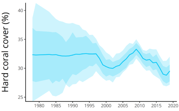
NOTE: When Just Facts asked the International Coral Reef Initiative for the raw data underpinning this chart, they responded that they “are not able to share the raw data” due to a “data sharing agreement.”
Page 4:
Since 2009, the overwhelming trend in global average hard coral cover has been downward. Between 2009 and 2018, global average hard coral cover declined from 33.3% to 28.8%, which represents a loss of 13.5% of the world’s hard coral. To put this into context, this equates to about 11,700 km2 of coral, which is approximately the equivalent of losing all the hard coral currently living on Australia’s coral reefs. Although fewer data were available for 2019, global average coral cover showed the first signs of recovering, with an increase of 0.7%.
Page 18:
Further, while the SST [sea surface temperature] anomaly has progressively increased since the 1970s (Fig. 2.8), global average coral cover has only declined during periods when the SST anomaly has rapidly increased or exceeded 0.45 (Fig. 2.8). However, in 2019, global average coral cover increased despite the SST anomaly being at historically high levels. This suggests that world’s coral reefs still retain their ability to recover from disturbances, despite the unfavourable climate conditions, and that potentially, corals are demonstrating some capacity for acclimation and adaptation. However, the limits to such adaptive capacity is as yet, unknown, and anecdotal evidence suggests that adaptive capacity is not equal among all coral species, resulting in shifts in community composition.
[437] Paper: “Regional Decline of Coral Cover in the Indo-Pacific: Timing, Extent, and Subregional Comparisons.” By John F. Bruno and Elizabeth R. Selig. PLoS One, August 8, 2007. <doi.org>
Page 1:
Yet there is little published empirical information on regional and global patterns of coral loss12 or the current state of reefs in the Indo-Pacific (Fig. 1).13 This region encompasses approximately 75% of the world’s coral reefs (Text S1) and includes the center of global marine diversity for several major taxa including corals, fish, and crustaceans. …
Here we describe a comprehensive analysis of the timing, rate, and geographic extent of the loss of coral cover across the Indo- Pacific (Fig. 1). For the purposes of this study, the Indo-Pacific region is defined by the Indonesian island of Sumatra in the west (95ºE) and by French Polynesia in the east (145.5ºW) (Fig. 1).
Page 4:
We may never know the precise Indo-Pacific coral cover baseline, but we now know that regionally, cover is currently at least 20% below the best historical reference points. Our results suggest that average Indo-Pacific coral cover declined from 42.5% during the early 1980s (95% CI: 39.3, 45.6, n = 154 reefs surveyed between 1980 and 1982) to 22.1% by 2003 (Fig. 3A); an average annual cover loss of approximately 1% or 1,500 km2. However, coral cover fluctuated somewhat throughout the 1980s and the regional average was still 36.1% in 1995 (95% CI: 34.2, 38.0, n = 487), subsequently declining by 14% in just seven years (or 3,168 km2 year−1). We used repeated measures regression analysis based on the individual trajectories of subregions or reefs (for the analysis of the reef monitoring data) to quantitatively estimate the absolute net decline of coral cover. Estimates based on subregional means and the reef monitoring data (a subset of the entire database) for similar periods were nearly identical (Table 1) and were slightly lower than estimates based on annual pooling (described above).
[438] Paper: “Regional Decline of Coral Cover in the Indo-Pacific: Timing, Extent, and Subregional Comparisons.” By John F. Bruno and Elizabeth R. Selig. PLoS One, August 8, 2007. <doi.org>
Page 1:
We compiled and analyzed a coral cover database of 6,001 quantitative surveys of 2,667 Indo-Pacific coral reefs performed between 1968 and 2004. Surveys conducted during 2003 indicated that coral cover averaged only 22.1% (95% CI: 20.7, 23.4) and just 7 of 390 reefs surveyed that year had coral cover >60%. Estimated yearly coral cover loss based on annually pooled survey data was approximately 1% over the last twenty years and 2% between 1997 and 2003 (or 3,168 km2 per year). The annual loss based on repeated measures regression analysis of a subset of reefs that were monitored for multiple years from 1997 to 2004 was 0.72% (n = 476 reefs, 95% CI: 0.36, 1.08).
Page 2:
We were unable to perform a formal meta-analysis because several critical components (e.g., variance estimates, sample size, repeated sampling of each reef, etc.) were not available for all data sets. We used Stata (version 9.1, STATA Corp.) and performed two sets of analyses: (1) on the annual subregional means based on all 6,001 surveys, and (2) on the data from the 651 monitoring sites. In both analyses, time (year) and coral cover were treated as continuous variables. Because locations were repeatedly sampled over time, coral cover estimates of a given subregion or reef in different years were not independent. This longitudinal structure was incorporated into the statistical model by using repeated measures of subregions or reefs. Thus, statistical estimates of the absolute net decline in coral cover were based on the individual trajectories of subregions or reefs and were not derived by pooling all the data for each year. For these and all other analyses, data were transformed when necessary to meet basic statistical assumptions.
In the subregion analysis, we used the mean cover in each subregion for each year as the dependent variable, rather than the individual reef means, in part because the sample size varied greatly among years, periods, and subregions. Performing this analysis on yearly subregional averages equalizes the influence of each subregion and prevents the results from being driven primarily by especially well-sampled subregions like the GBR and the Philippines (Table S3). However, this procedure did not remove the influence of either intentionally or unintentionally biased sampling within subregions that could have caused the estimated coral cover means to differ from the true subregional population means.
Page 3:
Estimates of the rate of coral loss could be influenced by year-to-year and period-to-period changes in the location of reef surveys. For example, if surveys initially focused on high cover reefs or subregions and then shifted focus to low cover reefs, the estimated rate of regional or subregional coral loss could be exaggerated. Alternatively, an initial overrepresentation of low cover reefs or subregions could underestimate the true rate of net coral loss. This problem is diminished in the monitoring sites analysis because individual reefs are monitored through time and reef identity is far less variable. Nevertheless, the identity of monitored reefs did change over time (e.g., when new reefs and subregions were added), so this potential source of bias was not entirely eliminated. A second potential bias in the analyses is the overrepresentation of the best-sampled subregions, mainly the Philippines and the GBR. Therefore, the regression results are not necessarily representative of all ten subregions, especially those that were not well monitored.
[439] Paper: “The 27-Year Decline of Coral Cover on the Great Barrier Reef and Its Causes.” By Glenn De’ath and others. Proceedings of the National Academy of Sciences, October 30, 2012. Pages 17995–17999. <www.pnas.org>
Page 17995: “Based on the world’s most extensive time series data on reef condition (2,258 surveys of 214 reefs over 1985–2012), we show a major decline in coral cover from 28.0% to 13.8% (0.53% y−1), a loss of 50.7% of initial coral cover.”
[440] Webpage: “What Is the Great Barrier Reef?” National Oceanic and Atmospheric Administration. Last updated April 28, 2022. <oceanservice.noaa.gov>
“The Great Barrier Reef is the largest living structure on Earth. … Stretching for 1,429 miles over an area of approximately 133,000 square miles, the Great Barrier Reef is the largest coral reef system in the world. The reef is located off the coast of Queensland, Australia, in the Coral Sea.”
[441] Paper: “The 27-Year Decline of Coral Cover on the Great Barrier Reef and Its Causes.” By Glenn De’ath and others. Proceedings of the National Academy of Sciences, October 30, 2012. Pages 17995–17999. <www.pnas.org>
Page 17995:
Based on the world’s most extensive time series data on reef condition (2,258 surveys of 214 reefs over 1985–2012), we show a major decline in coral cover from 28.0% to 13.8% (0.53% y−1), a loss of 50.7% of initial coral cover. Tropical cyclones, coral predation by crown-of-thorns starfish (COTS), and coral bleaching accounted for 48%, 42%, and 10% of the respective estimated losses, amounting to 3.38% y−1 mortality rate. Importantly, the relatively pristine northern region showed no overall decline. The estimated rate of increase in coral cover in the absence of cyclones, COTS, and bleaching was 2.85% y−1, demonstrating substantial capacity for recovery of reefs. In the absence of COTS, coral cover would increase at 0.89% y−1, despite ongoing losses due to cyclones and bleaching. …
Page 17997:
Given the estimated rate of decline of 0.53% y−1 for 1985–2012, the estimated net growth of coral cover was 2.85% y−1 for coral cover of 20%, and indicates the potential for recovery, given that disturbances can be reduced. This estimate can be interpreted as a lower bound of the growth of coral cover because this rate of decline does not take into account any losses due to other agents (e.g., reduced calcification due to thermal stress and ocean acidification, diseases).
Page 17998:
Mitigation of global warming and ocean acidification is essential for the future of the GBR. Given that such mitigation is unlikely in the short term, there is a strong case for direct action to reduce COTS populations and further loss of corals. …
Materials and Methods
Coral cover and densities of COTS were surveyed around the perimeter of entire reefs with the manta-tow technique… The final data consisted of 2,258 reef surveys from 214 different reefs, comprehensively covering the GBR. …
Logistic regression models were used for all analyses. The response for all models was reef-averaged proportional coral cover, p, and all analyses were weighted by the number of tows per reef. In addition to the fixed predictors, random effects of reefs and continuous autoregressive errors were included. The latter better captured the relationships of observations across time within reefs compared with other options, such as random smooth or linear temporal effects for each reef. All model estimates are expressed as percentages of coral cover rather than proportions for ease of interpretation. These estimates involve rates of change of coral cover with covariates, such as time or environmental drivers. For the logistic model, these rates vary as dp/ dx ∝ p(1 − p), where x denotes the covariate. Thus, on the observed scale, effect sizes are largest when P = 0.5 and shrink as p → 0 or p → 1. In all cases, effect sizes are estimated at 20% coral cover (close to the overall mean observed coral cover) unless otherwise stated. …
In conclusion, coral cover on the GBR is consistently declining, and without intervention, it will likely fall to 5–10% within the next 10 y. Mitigation of global warming and ocean acidification is essential for the future of the GBR. Given that such mitigation is unlikely in the short term, there is a strong case for direct action to reduce COTS [crown-of-thorns starfish] populations and further loss of corals. Without intervention, the GBR may lose the biodiversity and ecological integrity for which it was listed as a World Heritage Area.
[442] “Annual Summary Report on Coral Reef Condition for 2020/21.” Australian Institute of Marine Science, July 19, 2021. <www.aims.gov.au>
Page 2 (of PDF):
• Over the 35 years of monitoring by AIMS [Australian Institute of Marine Science], the reefs of the GBR [Great Barrier Reef] have shown an ability to recover after disturbances.
• In 2021, widespread recovery was underway, largely due to increases in fast growing Acropora corals.
• On the Northern GBR, region-wide hard coral cover was moderate and had continued to increase to 27% from the most recent low point in 2017.
• On the Central GBR region-wide hard coral cover was moderate and had increased to 26% in 2021.
• Region-wide hard coral cover on reefs in the Southern GBR was high and had increased to 39% in 2021.
[443] Report: “Strategies for Monitoring Terrestrial Animals and Habitats.” By Richard Holthausen and others. U.S. Department of Agriculture Forest Service, Rocky Mountain Research Station, September 2005. <www.fs.fed.us>
Page 2 (of PDF): “This General Technical Report (GTR) addresses monitoring strategies for terrestrial animals and habitats.”
Page iii: Much of the GTR focuses on the Forest Service’s organization and programs. However, the concepts described for making critical choices in monitoring programs and efficiently combining different forms of monitoring should be broadly applicable within other organizations.”
Page 18:
Timeframe of Inference
The complexity of ecosystems limits our interpretation of the population status and trend data that monitoring provides. We can document changes that happened during the years the data were collected, but we cannot predict changes that might occur in the future. Projection may be reliable for short periods of time, but the reliability rapidly degrades as we push the projection further into the future. Furthermore, the shorter the period of monitoring, the less reliable the projection that is made from the resulting data. When data are only available from a short period of monitoring, the only possible projection is linear. When data are collected over a longer period, the functional form of the pattern may become apparent and its reliability across space and time evaluated.
[444] “Climate Change 2014: Synthesis Report.” By Rajendra K. Pachauri and others. Intergovernmental Panel on Climate Change, 2015. <archive.ipcc.ch>
Page 4: “The ocean has absorbed about 30% of the emitted anthropogenic CO2, causing ocean acidification.”
Page 51: “Some impacts of ocean acidification on marine organisms have been attributed to human influence, from the thinning of pteropod and foraminiferan shells (medium confidence) to the declining growth rates of corals (low confidence).”
[445] Webpage: “Background & History.” International Union for Conservation of Nature Red List. Accessed March 25, 2021 at <www.iucnredlist.org>
Established in 1964, the International Union for Conservation of Nature’s Red List of Threatened Species has evolved to become the world’s most comprehensive information source on the global extinction risk status of animal, fungus and plant species. …
The IUCN Red List is used by government agencies, wildlife departments, conservation-related non-governmental organisations (NGOs), natural resource planners, educational organisations, students, and the business community.
[446] “Guidelines for Using the IUCN Red List Categories and Criteria.” IUCN Red List, January 2022. <nc.iucnredlist.org>
Page 14:
There are five quantitative criteria that are used to determine whether a taxon is threatened or not, and if threatened, which category of threat it belongs in (Critically Endangered, Endangered or Vulnerable) (Table 2.1). …
The five criteria are:
A. Population size reduction (past, present and/or projected)
B. Geographic range size, and fragmentation, few locations, decline or fluctuations
C. Small and declining population size and fragmentation, fluctuations, or few subpopulations
D. Very small population or very restricted distribution
E. Quantitative analysis of extinction risk (e.g., Population Viability Analysis)
To list a particular taxon in any of the categories of threat, only one of the criteria, A, B, C, D, or E needs to be met. However, a taxon should be assessed against as many criteria as available data permit, and the listing should be annotated by as many criteria as are applicable for a specific category of threat.
Page 15:
Table 2.1. Summary of the five criteria (A–E) used to evaluate if a taxon belongs in a threatened category (Critically Endangered, Endangered or Vulnerable). …
A. Population size reduction. Population reduction (measured over the longer of 10 years or 3 generations) based on any of A1 to A4 … Vulnerable … ≥ 30% …
A3 Population reduction projected, inferred, or suspected to be met in the future (up to a maximum of 100 years) ([direct observation] cannot be used for A3).”
Page 17: “[T]he highest threshold for criterion A is set at 90% because if it were set any closer to 100% reduction, the taxon may go extinct before it can be classified as CR [critically endangered]. The lowest threshold is set at 30%; it was increased from 20% in the previous version of the criteria (ver. 2.3; IUCN 1994) better to differentiate fluctuations from reductions.”
Page 19:
3. Data Quality
3.1 Data availability, inference, suspicion and projection
[447] Paper: “One-Third of Reef-Building Corals Face Elevated Extinction Risk From Climate Change and Local Impacts.” By Kent E. Carpenter and others. Science, July 25, 2008. Pages 560–563. <science.sciencemag.org>
Page 560:
The conservation status of 845 zooxanthellate reef-building coral species was assessed by using International Union for Conservation of Nature Red List Criteria. Of the 704 species that could be assigned conservation status, 32.8% are in categories with elevated risk of extinction. Declines in abundance are associated with bleaching and diseases driven by elevated sea surface temperatures, with extinction risk further exacerbated by local-scale anthropogenic disturbances. The proportion of corals threatened with extinction has increased dramatically in recent decades and exceeds that of most terrestrial groups. …
In view of this ecosystem-level decline, we used International Union for Conservation of Nature (IUCN) Red List Categories and Criteria to determine the extinction risk of reef-building coral species. These criteria have been widely used and rely primarily on population size reduction and geographic range information to classify, in an objective framework, the extinction risk of a broad range of species.10
Page 561:
Nearly all extinction risk assessments were made with the IUCN criterion that uses measures of population reduction over time.10 Most reef-building corals do not have sufficient long-term species-specific monitoring data to calculate actual population trends; consequently we used widely cited and independently corroborated estimates of reef area lost2, 10 as surrogates for population reduction. These estimates suffer from lack of standardized quantitative methodology, and so we interpreted them conservatively and weighted declines both regionally and by species-specific life history traits, including susceptibility to the threats causing reef area declines.10 Therefore, rates of population decline for each species have their basis in the rate of habitat loss within its range adjusted by an assessment of the species-specific response to habitat loss (so more-resilient species have slower rates of decline).10
[448] Webpage: “One-Third of Reef-Building Corals Face Elevated Extinction Risk From Climate Change and Local Impacts.” Altmetric on behalf of Science. Accessed March 29, 2021 at <science.altmetric.com>
“About this Attention Score [126] … In the top 5% of all research outputs scored by Altmetric … High Attention Score compared to outputs of the same age (99th percentile) … High Attention Score compared to outputs of the same age and source (94th percentile) … Citations [=] 841.”
[449] Webpage: “Background & History.” International Union for Conservation of Nature] Red List. Accessed March 29, 2022 at <www.iucnredlist.org>
“Currently, there are more than 142,500 species on The IUCN Red List, with more than 40,000 species threatened with extinction, including 41% of amphibians, 37% of sharks and rays, 34% of conifers, 33% of reef building corals, 26% of mammals and 13% of birds.”
[450] Report: “Reef-Building Corals Red List Assessments.” International Union for Conservation of Nature, September 2008. <www.iucnredlist.org>
Pages 1–2:
The text below is extracted from the supplemental information for Carpenter and others, 2008. Full reference: Carpenter, K.E. [and others] 2008. “One-Third of Reef-Building Corals Face Elevated Extinction Risk from Climate Change and Local Impacts.” Science. 25 July 2008: 560-563.
IUCN Red List Criteria
The IUCN Red List Categories and Criteria were applied to 845 reef-building coral species, comprised of 827 zooxanthellate coral species (Order Scleractinia), and 18 species from the families Helioporidae, Tubiporidae and Milleporidae. The vast majority of coral species were assessed under Criterion A, which is based on population reduction. …
Application of Criterion A …
Species-specific population trend data are not available for the vast majority of coral species across their distribution ranges. Only, five species had sufficient species-specific population trend data (Hughes and Tanner 2000, Patterson and others 2002, Sutherland and others 2004, Koenig and others 2005) and were therefore assessed under sub-Criterion A2, which is based on rates of population decline measured in the past. For the majority of species, loss of coral cover within a species distribution in combination with life history traits were used as a surrogate for population reduction using sub-Criterion A4. Sub-Criterion A4 allows for population reduction to be estimated or inferred from decline in extent of occurrence or habitat quality over a period of two generation lengths in the past and one projected into the future. The underlying assumption is that current stressors contributing to coral cover loss and population reduction (such as climate change, coastal development, disease, bleaching, predation, extraction, etc) have not ceased, and future rates are conservatively assumed to be the same as past rates.
[451] Paper: “The Population Sizes and Global Extinction Risk of Reef-Building Coral Species at Biogeographic Scales.” By Andreas Dietzel and others. Nature Ecology & Evolution, March 1, 2021. Pages 663–669. <www.nature.com>
Page 663:
Knowledge of a species’ abundance is critically important for assessing its risk of extinction, but for the vast majority of wild animal and plant species such data are scarce at biogeographic scales. Here, we estimate the total number of reef-building corals and the population sizes of more than 300 individual species on reefs spanning the Pacific Ocean biodiversity gradient, from Indonesia to French Polynesia. Our analysis suggests that approximately half a trillion corals (0.3 × 10¹²–0.8 × 10¹²) inhabit these coral reefs, similar to the number of trees in the Amazon. Two-thirds of the examined species have population sizes exceeding 100 million colonies, and one-fifth of the species even have population sizes greater than 1 billion colonies. Our findings suggest that, while local depletions pose imminent threats that can have ecologically devastating impacts to coral reefs, the global extinction risk of most coral species is lower than previously estimated.
While some regional trends in overall coral cover are relatively well understood,7, 8 we currently know little about the numerical abundance of reef-building corals and, in particular, of individual coral species at biogeographic scales. Consequently, recent assessments of the global extinction risk of coral species have relied on expert opinion and on regional trends in overall coral cover, rather than data on the abundance of individual species.9 For other ecologically important taxa (Table 1), global estimates of species-level abundances have helped to fill critical gaps in our understanding of their extinction risk….
Because coral cover and species abundance data were collected between 1997 and 2006, our estimates constitute turn-of-the-century baselines rather than estimates of contemporary population sizes. Approximately 70% of the global shallow-water coral reef area and more than 600 of the estimated 800 hard coral species of the world occur in our study domain.
Results and Discussion
We estimate that approximately half a trillion (95% Bayesian credible interval: 0.3 × 10¹²–0.8 × 10¹²) coral colonies inhabit the shallow-water coral reefs in the marine provinces extending between Indonesia and French Polynesia, comparable in magnitude to the estimated number of trees in the Amazon rainforest,15 or to the estimated number of birds in the world16 (Table 1).
The estimated population sizes of individual coral species differed by five orders of magnitude (Fig. 3). While the population sizes of each of the eight most common coral species exceed the global human population size of 7.8 billion, the six rarest species each have population sizes below 1 million. The majority (65%) of the examined species, however, number in excess of 100 million colonies, with one out of every five species exceeding 1 billion colonies. …
9 Carpenter, K. E. and others. “One-third of reef-building corals face elevated extinction risk from climate change and local impacts.” Science 321, 560–563 (2008).
Page 665:
Extinction Risk
Our estimates of population size provide a new perspective on the extinction risk of Indo-Pacific coral species. Currently, one-third of the world’s reef-building coral species and about one-quarter of the 318 species examined here are listed by the IUCN as either vulnerable to extinction, endangered or critically endangered.9
Remarkably, of the 80 species in our analysis that are considered by the IUCN to have an elevated extinction risk (listed as vulnerable, endangered or critically endangered), 12 have estimated population sizes exceeding 1 billion colonies. For instance, Porites nigrescens, ranked among the 10 most abundant species we examined, is not considered to be highly susceptible to coral bleaching,9 and yet is currently listed by the IUCN as vulnerable to global extinction. Conversely, one-third of the rarest species in our analysis that comprised the bottom 10% of species abundances are listed by the IUCN as of least concern.
Our population size estimates inform and refine earlier estimates of extinction risk in Indo-Pacific corals, which relied heavily on qualitative expert opinion.9 In particular, our findings call into question earlier inferences that a considerable proportion (one-quarter) of the examined Indo-Pacific coral species could go globally extinct within the next few decades. … A major revision of current Red List classifications of corals9 is urgently needed, based on an adaptation of Red List criteria that better reflect the life histories and population sizes of invertebrates25, 26 such as corals.
[452] Article: “Half a Trillion Corals: World-First Coral Count Prompts Rethink of Extinction Risks.” James Cook University, March 2, 2021. <www.jcu.edu.au>
For the first time, scientists have assessed how many corals there are in the Pacific Ocean—and evaluated their risk of extinction.
While the answer to “how many coral species are there?” is ‘Googleable’, until now scientists didn’t know how many individual coral colonies there are in the world.
“In the Pacific, we estimate there are roughly half a trillion corals,” said the study lead author, Dr. Andy Dietzel from the ARC Centre of Excellence for Coral Reef Studies at James Cook University (Coral CoE at JCU).
“This is about the same number of trees in the Amazon, or birds in the world.”
[453] Webpage: “Wastes, Non-Hazardous Waste, Municipal Solid Waste.” U.S. Environmental Protection Agency, April 3, 2012. <www3.epa.gov>
“Municipal Solid Waste (MSW)—more commonly known as trash or garbage—consists of everyday items we use and then throw away, such as product packaging, grass clippings, furniture, clothing, bottles, food scraps, newspapers, appliances, paint, and batteries. This comes from our homes, schools, hospitals, and businesses.”
[454] Webpage: “Glossary of Recycling & Solid Waste Terms, Abbreviations and Acronyms.” Connecticut Department of Energy and Environmental Protection, November 18, 2009. <www.ct.gov>
“Municipal Solid Waste (MSW) – Solid waste from residential, commercial and industrial sources, excluding solid waste consisting of significant quantities of hazardous waste as defined in section 22a-115, land-clearing debris, demolition debris, biomedical waste, sewage sludge and scrap metal.”
[455] EPA’s Report on the Environment: Municipal Solid Waste.” U.S. Environmental Protection Agency, February 25, 2020. <cfpub.epa.gov>
Page 1 (of PDF): “The Environmental Protection Agency’s (EPA) definition of MSW [municipal solid waste] does not include industrial, hazardous or construction and demolition (C&D) waste.”
[456] Report: “Advancing Sustainable Materials Management: 2018 Fact Sheet.” U.S. Environmental Protection Agency, December 2020. <www.epa.gov>
Page 8: “Figure 4. Total MSW [municipal solid waste] Generation (by material), 2018 … Paper and paperboard 23.1%, Glass 4.2%, Metals 8.8%, Plastics 12.2%, Rubber, leather & textiles 8.9%, Wood 6.2%, Yard trimmings 12.1%, Food 21.6%, Other 2.9%”
[457] Report: “Municipal Solid Waste Generation, Recycling, and Disposal in the United States: Facts and Figures for 2010.” U.S. Environmental Protection Agency, Office of Solid Waste and Emergency Response, December 2011. <archive.epa.gov>
Page 4: “We estimated residential waste (including waste from apartment houses) to be 55 to 65 percent of total MSW [municipal solid waste] generation. Waste from commercial and institutional locations, such as businesses, schools, and hospitals amounted to 35 to 45 percent.”
[458] Report: “Advancing Sustainable Materials Management: 2018 Fact Sheet.” U.S. Environmental Protection Agency, December 2020. <www.epa.gov>
Page 2: “In 2018, in the United States, approximately 292 million tons (U.S. short tons unless specified) of MSW [municipal solid waste] were generated…. Of the MSW generated, approximately 69 million tons were recycled and 25 million tons were composted. Together, about 94 million tons were recycled or composted, equivalent to a 32.1 percent recycling and composting rate….”
Page 5: “Over the last few decades, the generation, recycling, composting, combustion with energy recovery and landfilling of MSW has changed substantially. Solid waste generation peaked at 4.74 pounds per person per day in 2000 and 2005, falling to 4.51 pounds per person per day in 2017. The higher rate of 4.91 pounds per person per day in 2018 reflects the change in food waste measurement methodology (See Figure 1 and text box)….”
[459] Report: “Advancing Sustainable Materials Management: 2018 Fact Sheet.” U.S. Environmental Protection Agency, December 2020. <www.epa.gov>
Page 4:
Table 1. Generation, Recycling, Composting, Other Food Management Pathways, Combustion with Energy Recovery and Landfilling of Materials in MSW [municipal solid waste], 2018* (in millions of tons and percent of generation of each material) … Total municipal solid waste … Recycling as Percent of Generation [=] 23.6% … Composting as Percent of Generation [=] 8.5% … Other Food Management Pathways as Percent of Generation [=] 6.1% … Combustion as Percent of Generation [=] 11.8% … Landfilling as Percent of Generation [=] 50.0% … * Includes waste from residential, commercial and institutional sources.
[460] Paper: “Municipal Solid Waste Recycling Issues.” By Lester B. Lave and others. Journal of Environmental Engineering, October 1999. Pages 944–949. <pdfs.semanticscholar.org>
Page 944:
The almost universal aversion to landfills comes from the history of city dumps that smelled, looked terrible, were infested with rats and other pests, and posed risks to health. Sanitary engineers responded by designing modern landfills that pose few of these problems. Modern landfills have a minimum odor nuisance, do not have pests, and pose few problems after they are closed. With rules mandating daily cover, clay and rubber liners, clay caps, and leachate collection systems, modern landfills are a tribute to sanitary engineering.
[461] Paper: “Comparative LCAs [Life Cycle Assessments] for Curbside Recycling Versus Either Landfilling or Incineration with Energy Recovery.” By Jeffrey Morris. International Journal of Life Cycle Assessment, 2005. Pages 273–284. <search.proquest.com>
Page 276: “[R]efuse deposited in a landfill with a LFG [landfill gas] collection system will anaerobically decompose over time, and … the LFG collection system captures methane and other volatile gases released during that decomposition process.”
Page 277:
Estimated greenhouse gas offsets for energy generated from landfill gases collected at SLO’s [San Luis Obispo County, Washington] landfill in 2002 are shown as the negative portion of the Garbage Impacts stacked bar. These reductions in greenhouse gases that would otherwise have been generated at coal fired power plants to produce the energy generated by SLO’s collected landfill gas were substantial enough, given the greater than 75% capture efficiency assumed for the landfill’s gas collection system, to more than offset the greenhouse effect of methane emissions from gases that escape the landfill’s gas collection system and carbon dioxide emissions from diesel fuels consumed in collecting refuse, hauling it to the landfill, and compacting it in place at the landfill.
Page 282:
Fig. 10 shows the amount of greenhouse gas emissions prevented each month by curbside recycling in WA State’s four regions. Here even the waste management systems for three of the regions show a reduction in greenhouse gas emissions for recycling. This is because, unlike SLO County, collected LFG is not used to generate energy but is simply flared. As a result the uncollected landfill methane has more global warming impact than the energy used to collect, process and market materials collected in each region’s curbside recycling programs.
[462] Webpage: “Landfills.” U.S. Environmental Protection Agency. Last updated March 29, 2016. <archive.epa.gov>
Modern landfills are well-engineered facilities that are located, designed, operated, and monitored to ensure compliance with federal regulations. Solid waste landfills must be designed to protect the environment from contaminants which may be present in the solid waste stream. The landfill siting plan—which prevents the siting of landfills in environmentally-sensitive areas—as well as on-site environmental monitoring systems—which monitor for any sign of groundwater contamination and for landfill gas—provide additional safeguards. In addition, many new landfills collect potentially harmful landfill gas emissions and convert the gas into energy. …
Municipal solid waste landfills (MSWLFs) receive household waste. MSWLFs can also receive non-hazardous sludge, industrial solid waste, and construction and demolition debris. All MSWLFs must comply with the federal regulations in 40 CFR [U.S. Code of Federal Regulations] Part 258 (Subtitle D of RCRA [Resource Conservation and Recovery Act]), or equivalent state regulations. Federal MSWLF standards include:
• Location restrictions—ensure that landfills are built in suitable geological areas away from faults, wetlands, flood plains, or other restricted areas.
• Composite liners requirements—include a flexible membrane (geomembrane) overlaying two feet of compacted clay soil lining the bottom and sides of the landfill, protect groundwater and the underlying soil from leachate releases.
• Leachate collection and removal systems—sit on top of the composite liner and removes leachate from the landfill for treatment and disposal.
• Operating practices—include compacting and covering waste frequently with several inches of soil help reduce odor; control litter, insects, and rodents; and protect public health.
• Groundwater monitoring requirements—requires testing groundwater wells to determine whether waste materials have escaped from the landfill.
• Closure and postclosure care requirements—include covering landfills and providing long-term care of closed landfills.
• Corrective action provisions—control and clean up landfill releases and achieves groundwater protection standards.
• Financial assurance—provides funding for environmental protection during and after landfill closure (i.e., closure and postclosure care).
Some materials may be banned from disposal in municipal solid waste landfills including common household items such as paints, cleaners/chemicals, motor oil, batteries, and pesticides. Leftover portions of these products are called household hazardous waste. These products, if mishandled, can be dangerous to your health and the environment. Many municipal landfills have a household hazardous waste drop-off station for these materials.
[463] “EPA’s Report on the Environment: Highlights of National Trends.” U.S. Environmental Protection Agency, 2008. <cfpub.epa.gov>
Page 23: “Except for spills and natural events, most land contamination is the result of historical activities that are no longer practiced.”
[464] Report: “How Landfills Work.” South Carolina Department of Health and Environmental Control, Office of Solid Waste Reduction and Recycling, April 5, 2012. <www.scdhec.gov>
A Class 3 landfill is a scientifically engineered facility built into or on the ground that is designed to hold and isolate waste from the environment. Federal and state regulations strictly govern the location, design, operation and closure of Class 3 landfills in order to protect human health and the environment.
Class 3 landfills are the most common places for waste disposal and are an important part of an integrated waste management system. …
The life of a landfill depends on the size of the facility, the disposal rate and the compaction rate. All Class 3 landfills are permitted by the S.C. Department of Health and Environmental Control to accept a specific amount (tons) of waste each year—this amount cannot be exceeded. As mentioned earlier, Class 3 landfill operators strive for the maximum compaction rate possible in order to save space. Given these considerations, the average life expectancy could be anywhere from 30 to 50 years. Class 3 landfills must be monitored for 30 years after closure.
[465] “Fresh Perspectives: Freshkills Park Newsletter.” New York City Department of Parks and Recreation, Winter/Spring 2012. <www.nycgovparks.org>
Page 1:
“It is a common misperception that a landfill is closed when it stops receiving waste,” said New York City Department of Sanitation (DSNY) engineer, Richard Napolitano, who managed the day-to-day operations of the closure of East Mound. Closing a landfill requires consideration of its future uses, making engineering design adjustments, and installing a multi-tiered final cover system, or cap, that connects to and safeguards the integrity of the other environmental systems.
[466] Presentation: “Post-Closure Use of Capped Landfills – Opportunities and Limitations.” By Bruce Haskell. Camp Dresser & McKee Inc., October 26, 2006. <www.hartfordinfo.org>
Page 5:
Reuse alternatives commonly evaluated include
• Nature and habitat area
• Park and sports field
• Golf driving ranges
• Golf course
• Commercial Development
Page 6:
Nationwide reuse examples also include
• Ski or sledding slopes
• Sculpture or botanical garden
• Public works or other municipal facilities
• Amphitheater
• Cemetery
NOTE: See pages 7–22 for examples of reused landfills along with before-and-after pictures.
[467] Article: “Once an Urban Landfill, Now a Rowing Paradise.” By Juliet Macur. New York Times, May 7, 2012. <www.nytimes.com>
Near the junction of the New Jersey Turnpike and Interstate 80, not far from the conga line of traffic grinding toward New York City, lies a body of water that was once a garbage dump.
It was a murky soup of reeking refuse, home to a flotilla of plastic bottles, tires and even refrigerators. The land around it was good for only two things, some longtime residents say, and that was illegal dumping and trapping muskrat.
But after a recent renaissance, that body of water, Overpeck Creek, and the new park abutting it have become a destination for a much more refined hobby. The creek, nearly all 134 acres of it in the upper region of the Meadowlands, has become the newest hot spot for rowing in the New York metropolitan area.
[468] Report: “Returning Some of the Nation’s Worst Hazardous Waste Sites to Safe and Productive Uses.” U.S. Environmental Protection Agency, Office of Superfund Remediation and Technology Innovation, 2011. <www3.epa.gov>
Page 2:
Superfund is the federal program to clean up the nation’s abandoned hazardous waste sites. The program was created by law in 1980 in the wake of the discovery of toxic waste dumps such as Love Canal and Times Beach. It allows EPA [U.S. Environmental Protection Agency] to clean up sites and to compel those responsible for contamination to perform cleanups or reimburse the government for cleanups. Since Superfund’s creation, remedies have been completed at 1,060 sites, and work is underway at an additional 423 sites. EPA has also identified and assessed thousands of sites. …
Reuse refers to the productive use of a site after cleanup. Over the past ten years, EPA has identified several types of reuse options. Communities have reused sites for industrial and commercial uses, such as factories and shopping malls. Sites have been used for housing and public works facilities, such as transit stations. Many communities have created new recreational amenities, like ball fields, parks and golf courses. Sites have also been reused to support ecological resources, including wildlife preserves and wetlands, as well as agricultural land.
NOTE: Pages 4 and 6 provide examples of reused landfills along with before-and-after pictures.
[469] Report: “Fresh Kills: Landfill to Landscape.” New York City Department of City Planning, 2001. <www1.nyc.gov>
Page 1: “Fresh Kills Landfill is located on the western shore of Staten Island. Approximately half the 2,200-acre landfill is composed of four mounds, or sections, identified as 1/9, 2/8, 3/4 and 6/7 which range in height from 90 feet to approximately 225 feet. These mounds are the result of more than 50 years of landfilling, primarily household waste.”
Page 2: “Fresh Kills Landfill received its last barge of garbage on March 22, 2001, marking the beginning of a new era for the landfill.”†
Page 3: “The city’s five boroughs [are] Staten Island, Brooklyn, Manhattan, Queens and the Bronx….”
Page 6: “After the Second World War, population began to grow slowly. However, the central western shoreline of Staten Island remained rural. This would become the site for Fresh Kills Landfill, occupying nearly 3,000 acres. It started receiving waste in 1948 and this program was greatly accelerated in 1951.”
NOTE: † This was supposed to be the last barge, but the remains of the World Trade Center were later interred at this site.
[470] Webpage: “Freshkills Park.” New York City Department of Parks and Recreation. Accessed March 30, 2022 at <www.nycgovparks.org>
At 2,200 acres, Freshkills Park will be almost three times the size of Central Park and the largest park developed in New York City in over 100 years. Formerly the world’s largest landfill, this enormous park will one day hold a variety of public spaces and facilities, including playgrounds, athletic fields, kayak launches, horseback riding trails, large-scale art installations, and much more. The park is being built, and is scheduled to be opened in phases, through 2036. …
Visit
Several parts of the park are now open to the public. You can visit those locations below, or get a preview of the site through tours and events, including kayaking and birding. …
Progress
Schmul Park
This perimeter park has handball and basketball courts as well as a colorful playground with plenty of climbing equipment. It opened in September 2012. …
Owl Hollow Fields, located on Arthur Kill Road, opened in May 2013. The fields consist of four soccer fields, a pathway, parking, and lawn space. A Park House will be added as part of an ongoing construction project.
New Springville Greenway. This 3.3 mile bike path winds along the eastern edge of Freshkills Park, paralleling Richmond Avenue. The greenway opened in August 2015. …
North Park, now in the first phase of development, will be a 21-acre swath of land connecting visitors to views of Main Creek and the William T. Davis Wildlife Refuge via divided walking and high speed paths that lead past seven acres of native seed plots. You can follow the development progress of North Park using the NYC Parks Capital Project Tracker.
[471] “Fresh Perspectives: Freshkills Park Newsletter.” New York City Department of Parks and Recreation, Winter/Spring 2012. <www.nycgovparks.org>
Page 1:
As development of Schmul Park and the Owl Hollow Fields wraps up at the perimeter of Freshkills Park, the largest recently-completed construction project on site might not be as noticeable. But that massive, grassy hill along the site’s eastern border is no natural wonder; it is the product of a five-year-long closure process that concluded in November 2011. …
The 305-acre East Mound of Fresh Kills Landfill, the second largest of the four mounds with approximately 32 million tons of waste enclosed within, will ultimately become the East Park section of Freshkills Park.
[472] Webpage: “Fresh Kills.” The Municipal Arts Society of New York. Accessed December 19, 2015 at <www.mas.org>
“Construction on the first phases of the project will be completed in 2010 and the park is scheduled to be completed in 2035.”
[473] Calculated with data from:
a) Dataset: “Monthly Population Estimates for the United States: April 1, 2010 to December 1, 2020.” U.S. Census Bureau, Population Division, December 2019. <www2.census.gov>
Resident Population, July 1, 2019 = 328,239,523
Resident Population, July 1, 2020 = 329,877,505
b) Paper: “Estimating Method and Use of Landfill Settlement.” By Michael L. Leonard and Kenneth J. Floom. American Society of Civil Engineers, Proceedings of Sessions of Geo-Denver, 2000. <ascelibrary.org>
Pages 3–4: “Table 1 – Landfill Densities … Long-Term Density [metric tons/m3 (lb/yd3)] … Landfilling … Defined as weight of refuse divided by total air space consumed by refuse, cover soil and other operations soil.”
c) Report: “Advancing Sustainable Materials Management: 2018 Fact Sheet.” U.S. Environmental Protection Agency, December 2020. <www.epa.gov>
Page 6: “Table 3. Generation, Recycling, Composting, Other Food Management Pathways, Combustion with Energy Recovery and Landfilling of MSW, 1960 to 2018 (in pounds per person per day)” … Generation [=] 4.9 … Landfilling and other disposal [=] 2.4”
d) Webpage: “State Area Measurements and Internal Point Coordinates.” U.S. Census Bureau. Last revised December 16, 2021. <www.census.gov>
“State and other areas2 … Total3 … Land Area1 … Sq. Mi. [=] 3,535,932”
NOTES:
[474] Article: “Garbage Crisis: Landfills Are Nearly Out of Space.” By Edward Hudson. New York Times, April 4, 1986. <www.nytimes.com>
With many landfills in New York, New Jersey and Connecticut nearing capacity or already closed for environmental reasons, more and more communities are facing a garbage crisis, state and municipal officials say.
In the short term, they say, many municipalities are scrambling to find landfill space beyond their borders, a process that threatens to fill most of the remaining landfill capacity within several years. …
“I think we’re in a crisis situation because these plants take three years to put up,” said John W. Anderson, Connecticut’s Deputy Commissioner of Environmental Protection, referring to five garbage-to-energy plants that are planned in the state.
Michael DeBonis, assistant director of New Jersey’s Division of Waste Management, said New Jersey was down to fewer than 100 landfills, compared with several hundred about a decade ago.
A dozen major landfills are now handling 90 percent of the state’s waste, he said, and most of the landfills have “relatively little capacity remaining.” New Jersey has less than two years of landfill capacity left, he estimated.
Norman H. Nosenchuck, solid wastes director of the New York State Department of Environmental Conservation, said many of New York’s 367 landfills do not comply with state environmental regulations and are expected to be closed.
[475] Article: “The U.S. Is Rapidly Running Out of Landfill Space: There Are a Few Ways to Avoid a Catastrophe.” By Joe McCarthy. Global Citizen, May 14, 2018. <www.globalcitizen.org>
It looks like the 2,000 active landfills in the US that hold the bulk of this trash are reaching their capacity, according to a new report by the Solid Waste Environmental Excellence Protocol (SWEEP).
The US generates more than 258 million tons of municipal solid waste each year—that’s all the packaging, clothing, bottles, food scraps, newspapers, batteries, and everything else that gets thrown into garbage cans and hauled onto sidewalks for weekly pick-up.
Around 34.6% of that waste gets recycled, some gets burned for energy, and the rest gets sent to landfills.
In fact, the US is on pace to run out of room in landfills within 18 years, potentially creating an environmental disaster, the report argues. The Northeast is running out of landfills the fastest, while Western states have the most remaining space, according to the report.
[476] Webpage: “Frequently Asked Questions.” Solid Waste Environmental Excellence Protocol. Accessed March 24, 2020 at <www.nrrarecycles.org>
SWEEP (Solid Waste Environmental Excellence Protocol) is a market transformation standard targeting municipalities & waste management service providers that will identify and reward leaders in Sustainable Materials Management. SWEEP also defines a roadmap to evaluate comprehensive policies and calculate achievement metrics, as well as provides performance benchmarks for sustainable waste collection, recovery and disposal practices and technologies. …
SWEEP Vision
“A world without waste where materials are valued and continually utilized for their highest and best purpose, without causing harm to human health and the environment.”
SWEEP Mission
“To promote continuous improvement toward a zero waste society that is environmentally restorative, economically productive, socially just, and to recognize and reward municipal and industry leadership in sustainable materials management.”
[477] Video: “Wasteland: The Future of Trash in a Post Landfill World.” NBC News, July 24, 2019. <youtu.be>
Time marker 1:46: “But with our landfills set to reach max capacity by 2030, scientists are racing against time to find new ways to hack them for the future.”
[478] Article: “Rumors of a Shortage of Dump Space Were Greatly Exaggerated.” By Jeff Bailey. New York Times, August 12, 2005. <www.nytimes.com>
The productivity leap is the second major economic surprise from the trash business in the last 20 years. First, it became clear in the early 1990’s that there was a glut of disposal space, not the widely believed shortage that had drawn headlines in the 1980’s. Although many town dumps had closed, they were replaced by fewer, but huge, regional ones. …
A well-run dump, tightly packed and using minimal dirt as cover, can hold 30 percent or so more trash than a poorly run site, said Thomas M. Yanoschak, a senior project manager at Camp Dresser & McKee, an engineering firm that advises waste sites. “Operators are much better now,” he said. …
The change is shown in the published disposal records of the three largest waste haulers—Waste Management, Allied Waste Industries and Republic Services–which combined handle more than half the nation’s trash. …
Smaller companies and municipalities possess huge capacity, too. Taken together, the oversupply is a damper on prices. The nation’s average gate rate, the price dumps post publicly, has lagged inflation, rising just 21 percent from 1992, when the original disposal glut first became widely known, to last year, climbing to $35 a ton from $29, according to Solid Waste Digest. …
Dennis Pantano, chief operating officer at Regus Industries, a regional waste company based in West Seneca, N.Y., and a former executive at a national waste company, said he had expected “at least $45 to $50” by now. Instead, he said, “In Ohio we’re still beating our heads against each other to get $18, $20 a ton—$25 in western New York. It really hasn’t gone up in 10 years. That’s obviously because of capacity.”
[479] Article: “Scientific Survey Shows Voters Widely Accept Misinformation Spread By the Media.” By James D. Agresti. Just Facts, January 2, 2020. <www.justfacts.com>
The findings are from a nationally representative annual survey commissioned by Just Facts, a non-profit research and educational institute. The survey was conducted by Triton Polling & Research, an academic research firm that used sound methodologies to assess U.S. residents who regularly vote. …
The survey was conducted by Triton Polling & Research, an academic research firm that serves scholars, corporations, and political campaigns. The responses were obtained through live telephone surveys of 700 likely voters across the U.S. during December 2–11, 2019. This sample size is large enough to accurately represent the U.S. population. Likely voters are people who say they vote “every time there is an opportunity” or in “most” elections.
The margin of sampling error for the total pool of respondents is ±4% with at least 95% confidence. The margins of error for the subsets are 6% for Democrat voters, 6% for Trump voters, 5% for males, 5% for females, 12% for 18 to 34 year olds, 5% for 35 to 64 year olds, and 6% for 65+ year olds.
The survey results presented in this article are slightly weighted to match the ages and genders of likely voters. The political parties and geographic locations of the survey respondents almost precisely match the population of likely voters. Thus, there is no need for weighting based upon these variables.
NOTE: For facts about what constitutes a scientific survey and the factors that impact their accuracy, visit Just Facts’ research on Deconstructing Polls & Surveys.
[480] Dataset: “Just Facts’ 2019 U.S. Nationwide Survey.” Just Facts, January 2020. <www.justfacts.com>
Page 4:
Q15. If the U.S. stopped recycling and buried all of its municipal trash for the next 100 years in a single landfill that was 30 feet high, how much of the nation’s land area would you think this landfill would cover?
Less than 1% [=] 7.3%
1% to less than 5% [=] 20.0%
More than 5% [=] 66.1%
Unsure [=] 6.5%
[481] For facts about how surveys work and why some are accurate while others are not, click here.
[482] Calculated with data from:
a) Dataset: “Monthly Population Estimates for the United States: April 1, 2010 to December 1, 2020.” U.S. Census Bureau, Population Division, December 2019. <www2.census.gov>
Resident Population, July 1, 2019 = 328,239,523
Resident Population, July 1, 2020 = 329,877,505
b) Paper: “Estimating Method and Use of Landfill Settlement.” By Michael L. Leonard and Kenneth J. Floom. American Society of Civil Engineers, Proceedings of Sessions of Geo-Denver, 2000. <ascelibrary.org>
Pages 3–4: “Table 1 – Landfill Densities … Long-Term Density [metric tons/m3 (lb/yd3)] … Landfilling … Defined as weight of refuse divided by total air space consumed by refuse, cover soil and other operations soil.”
c) Report: “Advancing Sustainable Materials Management: 2018 Fact Sheet.” U.S. Environmental Protection Agency, December 2020. <www.epa.gov>
Page 6: “Table 3. Generation, Recycling, Composting, Other Food Management Pathways, Combustion with Energy Recovery and Landfilling of MSW, 1960 to 2018 (in pounds per person per day)” … Generation [=] 4.9 … Landfilling and other disposal [=] 2.4”
d) Webpage: “State Area Measurements and Internal Point Coordinates.” U.S. Census Bureau. Last revised December 16, 2021. <www.census.gov>
“State and other areas2 … Total3 … Land Area1 … Sq. Mi.” [=] 3,535,932”
NOTES:
[483] Report: “Advancing Sustainable Materials Management: 2018 Fact Sheet.” U.S. Environmental Protection Agency, December 2020. <www.epa.gov>
Page 6: “Table 3. Generation, Recycling, Composting, Other Food Management Pathways, Combustion with Energy Recovery and Landfilling of MSW [municipal solid waste], 1960 to 2018 (in pounds per person per day) … Recycling … 2018 [=] 1.2”
Page 13: “Table 4. Generation, Recycling, Composting, Other Food Management Pathways, Combustion with Energy Recovery and Landfilling of Products in MSW, 2018* (in millions of tons and percent of generation of each product) … Total Municipal Solid Waste … Weight Recycled … 69.09 … Recycling as Percent of Generation … 23.6% … * Includes waste from residential, commercial and institutional sources.”
[484] Report: “Advancing Sustainable Materials Management: 2018 Fact Sheet.” U.S. Environmental Protection Agency, December 2020. <www.epa.gov>
Figure 9. Selected Products with High Recycling Rates, 2018* … Recycling Rates (Percent) … Lead-Acid Batteries [=] 99 … Corrugated Boxes [=] 96.4 … Steel Cans [=] 70.9 … Aluminum Beer & Soda Cans [=] 50.4 … Tires [=] 40.0 … Selected Consumer Electronics [=] 38.5 … Glass Containers [=] 31.3 … HDPE [high-density polyethylene] Natural (White Translucent) Bottles [=] 29.3 …PET Bottles [polyethylene terephthalate] & Jars [=] 29.1 … * Does not include combustion with energy recovery.
[485] Paper: “Municipal Solid Waste Recycling Issues.” By Lester B. Lave and others. Journal of Environmental Engineering, October 1999. Pages 944–949. <pdfs.semanticscholar.org>
Page 946:
Separate collection of recyclables is particularly expensive, because each residence is visited twice (Lave and others 1994). A collection truck that can carry regular MSW [municipal solid waste] and recyclables is preferable, because each residence gets a single pickup. … Because the truck will be collecting trash and recyclables in different compartments, one compartment will fill first requiring the truck to go to the recycling site and landfill even though the other compartment(s) is partially empty.
Page 947: “A full analysis of the environmental effects would also include the environmental effects associated with collection, sorting, and processing of recycled materials. These processes require capital equipment (particularly trucks) and the use of energy (for truck operation and sorting).”
[486] Paper: “Comparative LCAs [Life Cycle Assessments] for Curbside Recycling Versus Either Landfilling or Incineration with Energy Recovery.” By Jeffrey Morris. International Journal of Life Cycle Assessment, 2005. Pages 273–284. <search.proquest.com>
Page 273: “[A]dditional energy and environmental burdens [are] imposed by curbside collection trucks, recycled material processing facilities, and transportation of processed recyclables to end-use markets.”
Page 275: “Fig. 1 also shows estimated energy used in 2002 for … manufacturing processed recyclables into new products.”
[487] Article: “In Cheyenne, Glass Pile Shows Recycling Challenges.” By Mead Gruver. Associated Press, September 27, 2009. <www.denverpost.com>
Used glass must be sorted by color and cleaned before it can be crushed into cullet that is suitable for recycling into new containers. That contributes to much of the cost of recycling glass, said Joe Cattaneo, president of the Glass Packaging Institute in Alexandria, Va.
“It’s not just a glass company buying it from your municipal waste company, or recycling company,” Cattaneo said. “Some entity has to clean it so it meets the specifications of mixing it with sand, soda ash and limestone.”
Another cost is transportation. The farther away a community is from glass processors and container manufacturers, he said, the more expensive it is to recycle it.
[488] Article: “Recycling Is Garbage.” By John Tierney. New York Times Magazine, June 30, 1996. <www.nytimes.com>
Collecting a ton of recyclable items is three times more expensive than collecting a ton of garbage because the crews pick up less material at each stop. For every ton of glass, plastic and metal that the truck delivers to a private recycler, the city currently spends $200 more than it would spend to bury the material in a landfill. …
The recycling program has been costing $50 million to $100 million annually, and that’s just the money coming directly out of the municipal budget. There’s also the labor involved: the garbage-sorting that millions of New Yorkers do at home every week. How much would the city have to spend if it couldn’t rely on forced labor? …
I tried to estimate the value of New Yorkers’ garbage-sorting by financing an experiment by a neutral observer (a Columbia University student with no strong feelings about recycling). He kept a record of the work he did during one week complying with New York’s recycling laws. It took him eight minutes during the week to sort, rinse and deliver four pounds of cans and bottles to the basement of his building. If the city paid for that work at a typical janitorial wage ($12 per hour), it would pay $792 in home labor costs for each ton of cans and bottles collected. And what about the extra space occupied by that recycling receptacle in the kitchen? It must take up at least a square foot, which in New York costs at least $4 a week to rent. If the city had to pay for this space, the cost per ton of recyclables would be about $2,000.
… Less virgin pulp means less pollution at paper mills in timber country, but recycling operations create pollution in areas where more people are affected: fumes and noise from collection trucks, solid waste and sludge from the mills that remove ink and turn the paper into pulp.
[489] Paper: “Municipal Solid Waste Recycling Issues.” By Lester B. Lave and others. Journal of Environmental Engineering, October 1999. Pages 944–949. <pdfs.semanticscholar.org>
Page 944: “In particular, recycling is a good policy only if environmental impacts and the resources used to collect, sort, and recycle a material are less than the environmental impacts and resources needed to provide equivalent virgin material plus the resources needed to dispose of the postconsumer material safely.”
[490] Paper: “Comparative LCAs [Life Cycle Assessments] for Curbside Recycling Versus Either Landfilling or Incineration with Energy Recovery.” By Jeffrey Morris. International Journal of Life Cycle Assessment, 2005. Pages 273–284. <search.proquest.com>
Page 275: “Fig. 1 also shows estimated energy used in 2002 for operating the landfill….”
Page 277: “[There are] emissions from diesel fuels consumed in collecting refuse, hauling it to the landfill, and compacting it in place at the landfill.”
[491] Report: “Facing America’s Trash: What Next for Municipal Solid Waste?” U.S. Congress, Office of Technology Assessment, October 1989. <ota.fas.org>
Page 191: “In the mid-1970s, EPA concluded that recycling of waste materials generally resulted in less pollution than did manufacturing from virgin materials251.”
Page 212: “251 U.S. Environmental Protection Agency, Office of Solid Waste Management Programs, First Report to Congress, Resource Recovery and Source Reduction, Report SW-1 18, 3rd ed. (Washington, D.C.: 1974).”
NOTE: Credit for bringing this report to attention belongs to Daniel K. Benjamin (Report: “Recycling Myths Revisited.” Property and Environment Research Center, 2010. <www.perc.org>)
[492] Report: “Facing America’s Trash: What Next for Municipal Solid Waste?” U.S. Congress, Office of Technology Assessment, October 1989. <ota.fas.org>
Pages 190–194:
Proponents of recycling have made many claims about the relative levels of pollution generated by primary and secondary manufacturing processes, often arguing that recycling reduces pollution. In general, recycling may result in fewer pollutants when the entire MSW [municipal solid waste] system is considered. In particular, if recycled products replace products made from virgin materials, potential pollution savings may result from the dual avoidance of pollution from manufacturing and from subsequent disposal of replacement products made from virgin materials.
However, it is usually not clear whether secondary manufacturing produces less pollution per ton of material processed than primary manufacturing. Such an analysis, which is beyond the scope of this report, would have to examine all the pollutants produced during each step in production, as well as pollution generated while providing energy to the process itself and for transporting materials. It would also be necessary to account for the effects of water and raw materials use on ecological systems. Definitive research has not been conducted, however, on all the relevant primary and secondary materials processes. To provide a starting point, this section reviews some comparisons of manufacturing using recycled versus virgin materials. Box 5-G briefly illustrates some of the pollutants generated in secondary manufacturing processes.
Numerous publications have documented pollutants emitted from manufacturing processes that use virgin materials (e.g., 131). In the mid-1970s, EPA concluded that recycling of waste materials generally resulted in less pollution than did manufacturing from virgin materials251. [251 U.S. Environmental Protection Agency, Office of Solid Waste Management Programs, First Report to Congress, Resource Recovery and Source Reduction, Report SW-1 18, 3rd ed. (Washington, D.C.: 1974).]
This generalization does not necessarily hold true in all cases. Using EPA data on paper production processes, for example, one researcher found no clear difference in measurements of chemical and biological oxygen demand and of total suspended solids in water effluents from recycling and virgin materials processes262. The EPA data also indicated that 5 toxic substances “of concern” were found only in virgin processes and 8 were found only in recycling processes; of 12 pollutants found in both processes, 11 were present in higher levels in the recycling processes.
This researcher also noted that EPA’s analyses of pollutants from virgin materials processing did not account for pollution from mining, timbering, and transportation262. He concluded that “there are clear materials and energy conservation benefits to recycling, [but] the picture regarding environmental benefits and risks is complex, especially when specific hazardous pollutants are taken into account.”
Paper
Virgin pulp processes generate various liquid and gas residues, depending on the type of paper, type of pulping process, and extent of bleaching131. In general, large amounts of mill effluent are generated and this contains suspended solids, dissolved organic solids, various chemicals, and high BOD [biochemical oxygen demand]. Wastewater generated in the bleaching stage can contain dioxins, chlorine dioxide, hypochlorite, and other bleaching chemicals and byproducts. Spent liquor generated in the pulping process can contain a wide variety of chemicals; the liquors often are burned in a recovery furnace or fluidized bed. Other byproducts from the virgin paper process also can be used to generate energy. Gas emissions include chlorine, chlorine dioxide, sulfur dioxide, particulate, and hydrogen sulfide. Metals from de-inking are present in sludge residues; the concentration of lead in these sludges appears to be in the same range as in sludges from mills that use secondary fibers64.
Aluminum
At primary aluminum smelters, one major concern is with the “potliners”—pots lined with carbon that serves as the cathode and that contain compounds of aluminum, fluorine, and sodium. The potliners are replaced every 4 or 5 years, and disagreement has arisen over whether used potliners should be listed as a hazardous waste under RCRA [Resource Conservation and Recovery Act]. As of August 1988, EPA has been required to list potliners as hazardous waste. The aluminum industry claims, however, that potliners can be used to fire cement kilns, among other things, and therefore should not be considered a “waste.” The designation of potliners as hazardous waste discourages this recycling. Most aluminum smelters in 1989 are disposing of spent potliners in hazardous waste landfills.
Steel
Various residues are generated during the steps necessary to produce steel (e.g., coking, sintering, ironmaking, steelmaking, rolling, and finishing steps)131. Air emissions from coke ovens, for example, contain particulate and sulfur dioxide. Wastewater from steelmaking contains suspended and dissolved solids, oxygen-demanding substances, oil, phenols, and ammonia. Solid waste residues also are common, particularly from open hearth and oxygen furnaces. One study131 modeled production processes and estimated that using less scrap and more ore would result in increased generation of phenols, ammonia, oxygen-demanding substances, sulfur dioxide, and particulate, and decreased generation of suspended solids.
Plastics
Once a resin is produced, the environmental risks associated with fabricating products from the resins are the same whether the resin is produced from virgin or secondary materials. However, primary production processes generate air emissions, wastewater, and solid waste. The types and amounts of these wastes vary with different processes and types of plastics, and some are managed as hazardous waste. According to one analysis, five of the six chemicals whose production generates the most hazardous waste in the United States are chemicals commonly used by the plastics industry268.
In general, air emissions are highest during the initial processing and recovery steps for monomers, solvents, catalysts, and additives. Wastewater associated with the primary production process can contain suspended monomers, co-monomers, polymers, additives, filler particulate, soluble constituents, and solvents that are washed or leached from the plastic. Solid waste is produced at various points, mostly from spillage, routine cleaning, particulate collection (from feeding, handling, grinding, and trimming processes), but also from production errors and a few production process byproducts. It can contain mostly polymers and small quantities of plasticizers, fillers, and other additives.
Some emissions are associated with the reprocessing of secondary plastic materials. For example, volatile air emissions can be generated during the heating of plastics, and residues can be contained in the rinse water used to cool the remelted resins.
Pages 192–193:
Box 5-G-Pollutants Generated in Secondary Manufacturing Processes [Recycling]
Heavy Metals
Iron and Steel Recycling—Solid wastes produced by iron and steel foundries that primarily use ferrous scrap can contain lead, cadmium, and chromium; these wastes may be classified as hazardous181. Sludges from core-making processes and baghouse dusts also are hazardous in some cases, depending on emission controls and the quality of incoming metal. Oman181 cited one study indicating that 9 out of 21 foundries generated emission control residuals which would be considered as a hazardous waste on the basis of EP [extraction procedure] toxicity for lead. Air emissions also are common. Electric arc furnaces, which normally operate on 100 percent scrap, avoid some air emission problems because they do not use coke oven gases as a heat source; however, they can emit high levels of particulate if they use scrap with high concentrations of dirt, organic matter, and alloys131.
Aluminum Recycling—When aluminum scrap is melted, associated substances (e.g., painted labels, plastic, and oil and grease) are burned off. The resulting air emissions can contain particulate matter in the form of metallic chlorides and oxides, as well as acid gases and chlorine gas261. Similar types of emissions are likely from plants that smelt other scrap metals.
Paper Recycling—Printing inks often contain pigments that contain heavy metals such as lead and cadmium261. These and other metals can be present in wastewater and de-inking sludge from paper recycling; for example, de-inking sludges have been reported with lead concentrations ranging from 3 to 294 ppm (dry weight)64.
Materials Recycling Facilities (MRFs)—Very little testing has been conducted at MRFs to determine levels of pollutants. Even the results of testing that has been done at one facility that handles sorted paper, glass, and metals are ambiguous. At that facility, air withdrawn from within the building (i.e., prior to emissions controls) exhibited relatively low emission rates (in terms of pounds per hour) for cadmium, chromium, lead, mercury, and nickel117, 262. However, actual concentrations of the metals in the emissions were high. No data were available about emissions after air pollution controls or on heavy metal concentrations in dust that settled in or around the plant.
Comporting—Concentrations of heavy metals tend to be higher in compost from mixed MSW comporting facilities than from compost made from separately collected organic wastes, primarily because mechanical separation cannot remove all metals. Compost from MSW that is co-composted with sewage sludge also tends to have high metal concentrations. Sewage treatment processes remove metals from effluent and concentrate them in sludge, and this emphasizes the role industrial pretreatment programs can play in reducing the metals entering treatment plants240. The concentrations of metals in mixed MSW compost and co-compost samples vary from site to site161. In some cases, zinc and lead exceeded State limits26, while in other cases lead levels were lower than the limits. Problems also have been noted with heavy metals in mixed MSW compost in Europe23, 92, 101, 115, 132, 149, 156. In one West German study, average concentrations of seven heavy metals were almost always lower in compost made from source-separated organic waste; in some cases they were essentially the same as soil concentrations77, 78. More research is needed on the composition of leachate from compost products under different conditions.
Dioxins—Dioxins can be produced at paper mills, as a byproduct of pulp bleaching, and can be present in the effluent or sludge241. Limited testing by EPA has shown that concentrations of 2,3,7,8-TCDD [tetrachlorodibenzo-p-dioxin] in sludges from two mills that use waste paper are relatively low, ranging from 2 to 37 parts per trillion17.
Dioxins also have been detected in post-pollution control emissions from certain secondary metals smelting facilities. For example, dioxins have been reported in post-control emissions from127:
• steel drum reclamation;
• scrap wire reclamation (combustion to remove wire insulation, with afterburner);1 and
• metals recovery from electronic
Other Organic Chemicals
Paper—Inks that need to be removed during recycling also contain acrylics, plastics, resins, varnishes, defoamers, and alcohols, some of which are discharged in wastewater. Paper recycling processes, particularly those with a bleaching step involving chlorine, also are known to discharge effluents that contain various chlorine-based compounds, including carbon tetrachloride, dichloroethane, methylene chloride, and trichloroethylene261. In addition, the dispersing agents used in the de-inking processes (e.g., detergents and emulsifiers) end up in the sludge.
Plastics—Residues from the recycling of plastics are difficult to assess without knowing the specific details of proprietary systems used to wash materials and remove contaminants. Wash water and air emissions may be contaminated by residues from other products associated with recycled plastic, such as food or pesticides. At least one PET [polyethylene terephthalate] reclamation system planned to operate at a scale of 25,000 tons per year by 1990 will use 1,1,1-trichloroethane to remove residues. This toxic solvent is a well-known groundwater contaminant239. However, according to Dow, the developer of the technology, the solvent is used in a closed system that will not result in release to the environment165.
Compost—Few data are available on organic chemicals in compost. Compost from the Delaware facility has been found to contain PCBs [polychlorinated biphenyls] in concentrations up to 5 parts per million42, which is below the allowable limit of 10 parts per million set in Delaware’s regulations. Questions have been raised about chemicals in grass clippings, particularly nitrogen from fertilizers and organic chemicals from pesticides228. Many of these chemicals are insoluble and may bind to particles instead of being leached into groundwater, but there is little data to evaluate this. It also is unclear whether they could be taken up in food crops grown on compost containing the chemicals228.
Chlorine and Sulfur
Chlorine and sulfur are common components in many products and chlorine is used in some recycling processes, so it is not surprising that both elements are found in residues at recycling facilities. For example, Visalli262 calculated that uncontrolled emissions from one secondary aluminum smelter contained 1.7 pounds of hydrogen chloride and 1.8 pounds of SO2 [sulfur dioxide] per hour.
1 It is likely that dioxins and furans are produced from burning plastic wire coating. Wire scrap makes up a small percentage of total metal scrap processed.
NOTE: Credit for bringing this report to attention belongs to Daniel K. Benjamin (Report: “Recycling Myths Revisited.” Property and Environment Research Center, 2010. <www.perc.org>)
[493] Paper: “Municipal Solid Waste Recycling Issues.” By Lester B. Lave and others. Journal of Environmental Engineering, October 1999. Pages 944–949. <pdfs.semanticscholar.org>
Page 944:
From a review of the existing economic experience with recycling and an analysis of the environmental benefits (including estimation of external social costs), we find that, for most communities, curbside recycling is only justifiable for some postconsumer waste, such as aluminum and other metals. …
Similar to Haith (1998), we emphasize that some recycling improves environmental quality and sustainability, whereas other recycling has the opposite effect.
Pages 946–947:
Table 2 gives a direct indication of the environmental benefits of avoided production due to recycling of different commodities. This table summarizes electricity use, fuel use, energy (including electricity and fuels), industrial water intake, some conventional pollutant emissions, global warming potential, toxic air releases, and hazardous waste generation for 1,000 metric tons of different commodity productions. … These calculations show an upper bound on savings from recycling by avoiding this primary production; the figures are an upper bound because the resource costs of recycling are not included.
The final row in Table 2 represents a rough estimate of the external environmental costs of this production. … Included in these costs are the estimated health effects related to ozone, particulate, and other conventional or “criteria pollutants.” The estimates are reported in thousands of social cost dollars, and so a metric ton of primary aluminum is estimated to have an external environmental cost due to air emissions of $220 (Table 2). Comparing this number to the estimated cost of collection ($142/ton), aluminum appears to be a good candidate for recycling, even without counting the economic costs of producing a ton of aluminum.
Page 948: “Curbside recycling of postconsumer metals can save money and improve environmental quality if the collection, sorting, and recovery processes are efficient. Curbside collection of glass and paper is unlikely to help the environment and sustainability save in special circumstances.”
[494] Paper: “Comparative LCAs [Life Cycle Assessments] for Curbside Recycling Versus Either Landfilling or Incineration with Energy Recovery.” By Jeffrey Morris. International Journal of Life Cycle Assessment, 2005. Pages 273–284. <search.proquest.com>
Page 273:
Recycling of newspaper, cardboard, mixed paper, glass bottles and jars, aluminum cans, tin-plated steel cans, plastic bottles, and other conventionally recoverable materials found in household and business municipal solid wastes consumes less energy and imposes lower environmental burdens than disposal of solid waste materials via landfilling or incineration, even after accounting for energy that may be recovered from waste materials at either type disposal facility. This result holds for a variety of environmental impacts, including global warming, acidification, eutrophication, disability adjusted life year (DALY) losses from emission of criteria air pollutants, human toxicity and ecological toxicity. The basic reason for this conclusion is that energy conservation and pollution prevention engendered by using recycled rather than virgin materials as feedstocks for manufacturing new products tends to be an order of magnitude greater than the additional energy and environmental burdens imposed by curbside collection trucks, recycled material processing facilities, and transportation of processed recyclables to end-use markets.
Page 283:
Results from the two studies described in this article show that recycling has substantial benefits compared with disposal in terms of reducing energy consumption and environmental burdens imposed by methods used for managing solid wastes. Specifically, recycling compared with disposal reduces potential impacts of solid waste management activities on all public health and environmental impact categories examined—global warming, acidification, eutrophication, human health effects from criteria air pollutants, human toxicity, and ecological toxicity. This conclusion holds regardless of whether disposal is via landfill without LFG [landfill gas] collection, landfill with LFG collection and flaring, landfill with LFG collection and energy recovery, incineration without energy recovery, or WTE [waste-to-energy] incineration. For several environmental impact categories the net environmental benefits of recycling are reduced by WTE incineration as compared with landfilling, but the conclusion remains the same—recycling is environmentally preferable to disposal by a substantial margin.
[495] Paper: “Municipal Solid Waste Recycling Issues.” By Lester B. Lave and others. Journal of Environmental Engineering, October 1999. Pages 944–949. <pdfs.semanticscholar.org>
Page 944: “MSW [municipal solid waste] recycling has been found to be costly for most municipalities compared to landfill disposal.”
Page 946:
At one time, advocates claimed that recycling of MSW would be profitable for municipalities. Recycling programs were expected to more than pay for themselves. A few categories of postconsumer wastes can be recycled or reused profitably; aluminum cans and automobiles are common examples. … However, at current price levels, curbside collection programs for most recyclable materials cost more than landfilling and must be justified on environmental grounds. …
Table 1. Average Annual Curbside Recycling Costs in the United States … Net cost [compared to disposal] after sale of recyclables … Per household (dollars) [=] 21 … Per ton (dollars) [=] 97”
Page 947: “Recycling aluminum is generally profitable because of the high price for this scrap.”
[496] Paper: “Comparative LCAs [Life Cycle Assessments] for Curbside Recycling Versus Either Landfilling or Incineration with Energy Recovery.” By Jeffrey Morris. International Journal of Life Cycle Assessment, 2005. Pages 273–284. <search.proquest.com>
Page 284:
Estimates of the economic value for recycling’s pollution prevention and resource conservation benefits suggest that the societal value of these benefits outweighs the additional economic cost that is often incurred for waste management when systems for handling solid wastes add recycling trucks and processing facilities to their existing fleet of garbage collection vehicles and existing transfer and disposal facilities. This may be small recompense for the local waste management agency that is hard-pressed for cash to pay its waste management costs, especially in jurisdictions that have neither convenient methods for imposing quantity-based fees on waste generators—with those fees structured to cover the costs of recycling as well as garbage management programs—nor political support for doing the right thing environmentally.
However, ongoing developments in the trading of credits for emissions reductions, such as already exists for sulfur dioxide emissions through EPA’s emissions permits trading program developed under the Clean Air Act and is under consideration through various experiments for greenhouse gases and other pollutants, do offer hope for the future. For example, a greenhouse gas credit of just $9 a ton would by itself offset the net costs of the average recycling program in the Urban West region of Washington State.
[497] Article: “In Cheyenne, Glass Pile Shows Recycling Challenges.” By Mead Gruver. Associated Press, September 28, 2009. <www.denverpost.com>
Cheyenne hasn’t recycled the glass it collects—9 tons a week—for years. …
The economics of glass recycling have been marginal for some time. …
In northern Idaho, Kootenai County gave up collecting glass last year. In Oregon, which was the first of 11 states to adopt a bottle deposit law in 1971, Deschutes County stockpiled 1,000 tons of glass at its landfill before finally finding a use for it a couple years ago—as fill beneath an area for collecting compost.
Glass also has piled up at the landfill serving Albuquerque, N.M., where officials this year announced that a manufacturer of water-absorbing horticultural stones would eventually use up their stockpiles. New York City gave up glass recycling from 2002 to 2004 because officials decided it was too costly.
In a sense, glass ought to be the perfect commodity to recycle. It can be recycled an infinite number of times. Melting down one glass bottle and making another isn’t particularly complicated or especially costly.
The challenge is that the main ingredient in glass, sand, is plentiful and cheap—often cheaper than cullet, which is glass that has been prepared for recycling.
[498] Article: “Report Calls Recycling Costlier Than Dumping.” By Eric Lipton. New York Times, February 2, 2004. <www.nytimes.com>
Recycling metal, plastic, paper and glass in New York is more expensive than simply sending all the refuse to landfills and incinerators, even if city residents resume the habit of separating a sizable share of those kinds of waste, according to an analysis by the New York City Independent Budget Office that is set to be released today. …
Yet the Independent Budget Office’s conclusion—that recycling cost the city about $35 million more in 2002 than conventional disposal would have—is so controversial that even before the new report was set to be released today, advocates of the recycling program condemned the analysis.
[499] Article: “Recycling Is Garbage.” By John Tierney. New York Times Magazine, June 30, 1996. <www.nytimes.com>
“State and city officials enacted laws mandating recycling and setting arbitrary goals even higher than the E.P.A.’s. Most states set rigid quotas, typically requiring that at least 40 percent of trash be recycled, often even more—50 percent in New York and California, 60 percent in New Jersey, 70 percent in Rhode Island.”
[500] Article: “New Recycling Law to Promote Better Habits.” WRAL, June 2, 2009. <www.wral.com>
“Raleigh, N.C.—Starting in October, it will be against state law to throw plastic bottles in your trash.”
[501] Report: “Wasting Resources to Reduce Waste: Recycling in New Jersey.” By Grant W. Schaumburg Jr. and Katherine T. Doyle. Cato Institute, January 26, 1994. <www.cato.org>
The quantity of goods recycled as a result of New Jersey’s Mandatory Recycling Act amounts to approximately 0.5million ton per year. …
Each of New Jersey’s 21 counties is given some flexibility in its application of state mandates. Nine counties require municipalities to collect and market recyclables independently, six offer to market materials collected by the municipalities, and six coordinate both the collection and the marketing of recycled materials. All counties require households to recycle glass, aluminum, and newsprint. Some have also mandated the recycling of plastic beverage containers, all plastic containers, tin food containers, corrugated cardboard, grass clippings, junk mail, or magazines.2 The commercial sector is required by all counties to recycle office paper and corrugated cardboard as well as the materials designated for household recycling.
To help finance the massive recycling effort, the Mandatory Recycling Act increased the tax on landfilled solid waste almost fourfold (from $0.12 per cubic yard to $1.50 per ton, or approximately $0.45 per cubic yard). The tax currently yields approximately $15 million annually for the State Recycling Fund, which is allocated as follows: 40 percent to municipalities and counties as tonnage grants; 35 percent for low-interest loans and loan guarantees to recycling businesses and industries and for research on collection, market stimulation, reuse techniques, and market studies; 10 percent for a public information and education campaign; 8 percent for county program grants; and 7 percent for state administrative costs.
[502] Article: “Few Towns Ready for Connecticut Recycling Law.” By Nick Ravo. New York Times, January 22, 1991. <www.nytimes.com>
“Three weeks past Connecticut’s self-imposed deadline for its communities to begin mandatory recycling, most are still scrambling to start their programs. … The law mandated that each of Connecticut’s 169 towns and cities had until Jan. 1 to appoint a recycling coordinator and adopt a proper recycling ordinance.”
[503] Article: “City’s Recycling Effort Ratchets Up.” By Elizabeth M. Gillespie. Associated Press, February 6, 2005. <www.seattletimes.com>
Seattle is trying to boost recycling, already popular here, by making it mandatory. …
Banned from trash: For houses, apartments and condos, banned are cardboard, glass, plastic bottles, jars, aluminum and tin cans, all types of paper (unless soiled), and yard debris, which has been banned from residential garbage since 1989. For businesses, it’s just paper, cardboard and yard debris.
The threshold: Trash cannot contain “significant amounts” of recyclables, which the city defines as more than 10 percent by volume, as determined by a garbage inspector.
[504] Article: “S.F. OKs Toughest Recycling Law in U.S.” By John Coté. San Francisco Chronicle, June 10, 2009. <www.sfgate.com>
“Throwing orange peels, coffee grounds and grease-stained pizza boxes in the trash will be against the law in San Francisco, and could even lead to a fine.”
[505] Webpage: “NYC Recycling Law.” New York City Department of Sanitation. Accessed May 11, 2012 at <www1.nyc.gov>
“This Law mandates recycling in NYC by residents, agencies, institutions, and businesses, including the designation of what materials are to be considered recyclable, the recovery of those materials, tonnages of recyclable materials that must be recycled annually, and responsibilities of each relevant party.”
[506] Webpage: “Is It the Law in Massachusetts to Recycle?” MassRecycle. Accessed May 11, 2012 at <www.massrecycle.org>
Although there is not a statewide recycling law, many communities have passed their own recycling laws. Of the 351 Massachusetts communities, 168 of them have voluntarily adopted mandatory recycling ordinances, bylaws, or regulations. Most of these local requirements regulate single-family residences or those served by the municipal collection programs. A growing number of municipalities are also regulating multi-family properties and businesses.
[507] Webpage: “Reduce, Reuse, Recycle: Recycling Laws and Regulations.” Monroe County Government. Accessed May 10, 2012. <www.monroecounty.gov>
Recycling has been mandatory in Monroe County for residents and businesses/institutions since 1992. …
The law states, in general, that residents must recycle the following food, drink and household product containers: steel, aluminum, glass bottles, jugs and jars, plastics (#s 1 and 2). …
According to law, residents must also recycle newspapers, magazines and corrugated cardboard.
[508] Article: “China Bans Free Plastic Shopping Bags.” New York Times, January 9, 2008. <www.nytimes.com>
China will ban shops from giving out free plastic bags and has called on consumers to use baskets and cloth sacks instead to reduce environmental pollution. …
The production, sale and use of ultra-thin plastic bags—those less than 0.025 millimeters, or 0.00098 inches, thick—were also banned, according to the State Council notice. Dated Dec. 31 and posted on a government Web site Tuesday, it called for “a return to cloth bags and shopping baskets.”
[509] Report: “Effect of Plastic Bag Taxes and Bans On Garbage Bag Sales.” By Paul Frisman. Connecticut General Assembly, December 17, 2008. <www.cga.ct.gov>
“Ireland imposed a 15 cent tax (the equivalent of about 24 U. S. cents) on plastic shopping bags on March 4, 2002. Revenues from the tax are used for waste management, recycling, and other environmental initiatives.”
[510] Report: “Effect of Plastic Bag Taxes and Bans on Garbage Bag Sales.” By Paul Frisman. Connecticut General Assembly, December 17, 2008. <www.cga.ct.gov>
San Francisco, California, and Westport, Connecticut have banned the distribution of plastic bags. Westport’s ban will start in March 2009. …
The Seattle city council voted July 28, 2008 to approve a 20-cent “green fee” on disposable shopping bags that grocery, drug, and convenience stores provide to customers starting January 1, 2009. The proposal exempts bags used for (1) bulk items, such as fruit, vegetables, nuts, candy, or hardware; (2) potentially wet items, such as frozen foods, meat, flowers, and plants; (3) prepared foods or bakery goods; (4) prescription drugs; (5) laundry dry cleaning; and (6) newspapers. It also exempts bags sold in packages that are intended for garbage, pet waste, or yard waste disposal. Seattle estimates the fee would cause disposable bag use to decrease by 70% at stores required to impose the fee (50% overall) and that it will generate about $10 million annually.
[511] Article: “Nickel Bag Tax Dissuades D.C. Shoppers: Revenue Shortfall $1.5 Million.” Associated Press, January 5, 2011. <www.washingtontimes.com>
District of Columbia shoppers have spent approximately $2 million on paper and plastic bags in the past year, one nickel at a time.
The city’s 5-cent tax on bags began in January of last year, but consumers spent much less pocket change than predicted to pay for bags from grocery, liquor and convenience stores.
City officials had guessed the fee would raise $3.5 million to clean up the city’s Anacostia River before the end of 2010. The tax brought in a total of $1.9 million in the first ten months of 2010, according to the city’s latest data.
[512] Article: “Whole Foods Sacks Plastic Bags.” By Bruce Horovitz. USA Today, January 22, 2008 (updated). <usatoday30.usatoday.com>
Tuesday, Whole Foods (WFMI) will announce plans to stop offering disposable, plastic grocery bags in all 270 stores in the USA, Canada and United Kingdom by Earth Day—April 22. That means roughly 100 million plastic bags will be kept out of the environment between that date and the end of 2008, the company says.
“This is something our customers want us to do,” says A.C. Gallo, Whole Foods co-president. “It’s central to our core values of caring for communities and the environment.”
[513] Article: “State Plastic Bag Legislation.” National Conference of State Legislatures, April 30, 2019. Updated 2/8/21. <www.ncsl.org>
Eight states—California, Connecticut, Delaware, Hawaii, Maine, New York, Oregon and Vermont—have banned single-use plastic bags.
In August 2014, California became the first state to enact legislation imposing a statewide ban on single-use plastic bags at large retail stores. … The ban was set to take effect on July 1, 2015, but a referendum forced the issue onto the ballot in the November 2016 election. Proposition 67 passed with 52 percent of the vote, meaning the plastic bag ban approved by the Legislature remains the law. …
Hawaii has a de facto statewide ban as all of its most populous counties prohibit non-biodegradable plastic bags at checkout, as well as paper bags containing less than 40 percent recycled material. …
New York became the third state to ban plastic bags in 2019 with passage of Senate Bill 1508. The law, which goes into effect March 2020, will apply to most single-use plastic bags provided by grocery stores and other retailers. …
Five other states enacted legislation in 2019—Connecticut, Delaware, Maine, Oregon and Vermont. In addition to plastic bags, Vermont’s SB 113 also placed restrictions on single-use straws and polystrene containers.
In 2009, the District of Columbia enacted legislation requiring all businesses that sell food or alcohol to charge 5 cents for each carryout paper or plastic bag. …
State lawmakers have introduced at least 95 bills in 2019 related to plastic bags. Most of these bills would ban or place a fee on plastic bags. Others would preempt local government action or improve bag recycling programs.
[514] Report: “Life Cycle Assessment: Principles and Practice.” By Mary Ann Curran. U.S. Environmental Protection Agency, National Risk Management Research Laboratory, Office of Research and Development, May 2006. <nepis.epa.gov>
Page 1:
Life cycle assessment is a “cradle-to-grave” approach for assessing industrial systems. “Cradle-to-grave” begins with the gathering of raw materials from the earth to create the product and ends at the point when all materials are returned to the earth. LCA [life cycle assessment] evaluates all stages of a product’s life from the perspective that they are interdependent, meaning that one operation leads to the next. LCA enables the estimation of the cumulative environmental impacts resulting from all stages in the product life cycle, often including impacts not considered in more traditional analyses (e.g., raw material extraction, material transportation, ultimate product disposal, etc.). By including the impacts throughout the product life cycle, LCA provides a comprehensive view of the environmental aspects of the product or process and a more accurate picture of the true environmental trade-offs in product and process selection.
The term “life cycle” refers to the major activities in the course of the product’s life-span from its manufacture, use, and maintenance, to its final disposal, including the raw material acquisition required to manufacture the product. Exhibit 1-1 illustrates the possible life cycle stages that can be considered in an LCA and the typical inputs/outputs measured.
[515] Report: “Life Cycle Assessment of Supermarket Carrier Bags.” U.K. Environment Agency, February 2011. <www.gov.uk>
Page 11: “Life Cycle Assessment (LCA) is a standard method for comparing the environmental impacts of providing, using and disposing of a product or providing a service throughout its life cycle (ISO 2006). In other words, LCA identifies the material and energy usage, emissions and waste flows of a product, process or service over its entire life cycle to determine its environmental performance.”
Pages 12–13:
Conventional High-Density Polyethylene (HDPE) Bags
This is the lightweight, plastic, carrier bag used in almost all UK [United Kingdom] supermarkets and often provided free of charge. It is a vest-shaped bag and has the advantage of being thin-gauged and lightweight. It has been termed “disposable” and “single use.”
High-Density Polyethylene (HDPE) Bags with a Prodegradant Additive
This type of lightweight, plastic, carrier bag is made from HDPE with a prodegradant additive that accelerates the degradation process. These polymers undergo accelerated oxidative degradation initiated by natural daylight, heat and/or mechanical stress, and embrittle in the environment and erode under the influence of weathering. The bag looks like the conventional HDPE bag being vest-shaped and thin-gauged.
Low-Density Polyethylene (LDPE) Bags
These are thick-gauged or heavy duty plastic bags, commonly known as “bags-for-life”, and are available in most UK supermarkets. The initial bag must be purchased from the retailer but can be replaced free of charge when returned. The old bags are recycled by the retailer. [NOTE: LDPE bags are like the plastic bags used in mall clothing stores. The study (pages 80–81) found that LDPE bags have an average weight capacity of 19 kilograms, and standard disposable plastic (HDPE) bags have a capacity of 18.22 kilograms, which amounts to a difference of less than 5%.]
Non-Woven Polypropylene (PP) Bags
This type of bag is made from spunbonded non-woven polypropylene. The non-woven PP bag is stronger and more durable than a bag for life and is intended to be reused many times. To provide stability to the base of the bag, the bag comes with a semi-rigid insert.
Cotton Bags
This type of bag is woven from cotton, often calico, an unbleached cotton with less processing, and is designed to be reused many times.
Paper Bags
These are generally no longer used in UK supermarkets, although they are available from other retail shops. The paper bag was in effect the first “disposable” carrier bag, but was superseded in the 1970s by plastic carrier bags which were seen as the perfect alternative, as they did not tear when wet.
Biopolymer Bags
Biopolymer carrier bags are a relatively recent development. They are only available in a few UK supermarkets. The biopolymers are usually composed of either polylactic acid (PLA), made from the polymerisation of lactic acids derived from plant-based starch, or starch polyester blends, which combine starch made from renewable sources such as corn, potato, tapioca or wheat with polyesters manufactured from hydrocarbons (Murphy et al 2008). These biodegradable polymers decompose to carbon dioxide, methane, water, inorganic compounds or biomass (Nolan-ITU 2003).
Pages 18–19:
The study is a “cradle to grave” life cycle assessment. Therefore, the carrier bag systems investigated include all significant life cycle stages from raw material extraction, through manufacture, distribution use and reuse to the final management of the carrier bag as waste. … [T]he study quantifies all energy and materials used, traced back to the extraction of resources, and the emissions from each life cycle stage, including waste management.
Page 55:
Each type of carrier bag is designed for a different number of uses. Those intended to last longer need more resources in their production. To make the comparison fair, the environmental impacts of the carriers bags were considered in relation to carrying the same amount of shopping over a period based on studies of their volumes and the number of items consumers put into them. Resource use, primary and secondary reuse and end-of-life recovery play a pivotal role in the environmental performance of the carrier bags studied. The analysis showed that the environmental impacts of each type are significantly affected by the number of times a carrier is used.
Page 55: “All the reports agree that the extraction and production of raw materials has the greatest effect on the environmental performance of the carrier bags studied.”
Page 57: “The manufacturing of the bags is normally the most significant stage of the life cycle, due to both the material and energy requirements. The impact of the energy used is often exacerbated by their manufacture in countries where the electricity is produced from coal-fired power stations.”
[516] Report: “Life Cycle Assessment of Supermarket Carrier Bags.” U.K. Environment Agency, February 2011. <www.gov.uk>
Page 60: “The environmental impact of carrier bags is dominated by resource use and production. Transport, secondary packaging and end-of-life processing generally have a minimal influence on their environmental performance.”
[517] Report: “Life Cycle Assessment of Supermarket Carrier Bags.” U.K. Environment Agency, February 2011. <www.gov.uk>
Page 57:
The manufacturing of the bags is normally the most significant stage of the life cycle, due
to both the material and energy requirements. The impact of the energy used is often
exacerbated by their manufacture in countries where the electricity is produced from
coal-fired power stations. Generally, bags that are designed to be used many times are
heavier and contain more raw materials and require more energy in their production than
lightweight carrier bags.
[518] Report: “Life Cycle Assessment of Supermarket Carrier Bags.” U.K. Environment Agency, February 2011. <www.gov.uk>
Pages 12–13:
Conventional High-Density Polyethylene (HDPE) Bags
This is the lightweight, plastic, carrier bag used in almost all UK supermarkets and often provided free of charge. It is a vest-shaped bag and has the advantage of being thin-gauged and lightweight. It has been termed “disposable” and “single use.”
High-Density Polyethylene (HDPE) Bags with a Prodegradant Additive
This type of lightweight, plastic, carrier bag is made from HDPE with a prodegradant additive that accelerates the degradation process. These polymers undergo accelerated oxidative degradation initiated by natural daylight, heat and/or mechanical stress, and embrittle in the environment and erode under the influence of weathering. The bag looks like the conventional HDPE bag being vest-shaped and thin-gauged. …
Paper Bags
These are generally no longer used in UK supermarkets, although they are available from other retail shops. The paper bag was in effect the first “disposable” carrier bag, but was superseded in the 1970s by plastic carrier bags which were seen as the perfect alternative, as they did not tear when wet.
Page 36: “Table 5.1 The environmental impact of the HDPE [standard plastic] bag”
Page 40: “Table 5.4 The environmental impact of the paper bag.”
Page 59: “The HDPE prodegradant bag had a larger impact than the HDPE bag in all categories considered. Although the bags were very similar, the prodegradant bag weighed slightly more and therefore used more energy during production and distribution.”
[519] Report: “Life Cycle Assessment of Supermarket Carrier Bags.” U.K. Environment Agency, February 2011. <www.gov.uk>
Page 60:
The environmental impact of carrier bags is dominated by resource use and production. Transport, secondary packaging and end-of-life processing generally have a minimal influence on their environmental performance. …
Reusing lightweight [plastic] carrier bags as bin liners [trash bags] produces greater benefits than recycling bags due to the benefits of avoiding the production of the bin liners they replace.
[520] Report: “Life Cycle Assessment of Supermarket Carrier Bags.” U.K. Environment Agency, February 2011. <www.gov.uk>
Page 103:
Abiotic Depletion
What is it? This impact category refers to the depletion of non-living (abiotic) resources such as fossil fuels, minerals, clay and peat.
How is it measured? Abiotic depletion is measured in kilograms of Antimony (Sb) equivalents.
Global Warming Potential
What is it? Global warming potential is a measure of how much of a given mass of a green house gas (for example, CO2 [carbon dioxide], methane, nitrous oxide) is estimated to contribute to global warming. Global warming occurs due to an increase in the atmospheric concentration of greenhouse gases which changes the absorption of infra red radiation in the atmosphere, known as radiative forcing leading to changes in climatic patterns and higher global average temperatures.
How is it measured? Global warming potential is measured in terms of CO2 equivalents.
Photochemical Oxidation
What is it? The formation of photochemical oxidant smog is the result of complex reactions between NOx [nitrogen oxides] and VOCs [volatile organic compounds] under the action of sunlight (UV radiation) which leads to the formation of ozone in the troposphere. The smog phenomenon is very dependent on meteorological conditions and the background concentrations of pollutants.
How is it measured? It is measured using photo-oxidant creation potential (POCP) which is normally expressed in ethylene equivalents.
Eutrophication
What is it? This is caused by the addition of nutrients to a soil or water system which leads to an increase in biomass, damaging other lifeforms. Nitrogen and phosphorus are the two nutrients most implicated in eutrophication.
How is it measured? Eutrophication is measured in terms of phosphate (PO4 3-) equivalents.
Acidification
What is it? This results from the deposition of acids which leads to a decrease in the pH, a decrease in the mineral content of soil and increased concentrations of potentially toxic elements in the soil solution. The major acidifying pollutants are SO2 [sulfur dioxide], NOx, HCL [hydrochloric acid] and NH3 [ammonia].
How is it measured? Acidification is measured in terms of SO2 equivalents.
Toxicity
What is it? Toxicity is the degree to which something is able to produce illness or damage to an exposed organism. There are 4 different types of toxicity; human toxicity, terrestrial ecotoxicity, marine aquatic ecotoxicity and fresh water aquatic ecotoxicity.
How is it measured? Toxicity is measured in terms of dichlorobenzene equivalents.
[521] Calculated with data from the report: “Life Cycle Assessment of Supermarket Carrier Bags.” U.K. Environment Agency, February 2011. <www.gov.uk>
Page 32: “All results and charts shown refer to the functional unit, i.e. the carrier bags required to carry one month’s shopping (483 items) from the supermarket to the home in the UK in 2006/07.”
Page 36: “Table 5.1 The environmental impact of the HDPE [standard disposable plastic] bag”
Page 43: “Table 5.6 The environmental impact of the non-woven PP [polypropylene] bag”
Page 44: “Table 5.9 The environmental impact of the cotton bag (used 173 times)”
Page 72: “Table A.4.1 The carrier bags included in the study with specification and major assumptions … Expected life … PP (polypropylene) fibre = 104 uses … Calico cotton = 52 uses”
NOTE: An Excel file containing the data and calculations is available upon request.
[522] Article: “Assessment of the Potential for Cross-Contamination of Food Products by Reusable Shopping Bags.” By David L. Williams and others. Food Protection Trends, August 2011. Pages 508–513. <lluh.org>
Page 508:
The purpose of this study was to assess the potential for cross-contamination of food products by reusable bags used to carry groceries. Reusable bags were collected at random from consumers as they entered grocery stores in California and Arizona. In interviews, it was found that reusable bags are seldom if ever washed and often used for multiple purposes. Large numbers of bacteria were found in almost all bags and coliform bacteria in half. Escherichia coli were identified in 8% of the bags, as well as a wide range of enteric bacteria, including several opportunistic pathogens. When meat juices were added to bags and stored in the trunks of cars for two hours, the number of bacteria increased 10-fold, indicating the potential for bacterial growth in the bags. Hand or machine washing was found to reduce the bacteria in bags by > 99.9%. These results indicate that reusable bags, if not properly washed on a regular basis, can play a role in the cross-contamination of foods. It is recommended that the public be educated about the proper care of reusable bags by means of printed instructions on the bags or through public service announcements.
[523] Paper: “Grocery Bag Bans and Foodborne Illness.” By Jonathan Klick and Joshua D. Wright. University of Pennsylvania Law School, Institute for Law and Economics, November 2, 2012. <blogs.berkeley.edu>
Page 1:
Recently, many jurisdictions have implemented bans or imposed taxes upon plastic grocery bags on environmental grounds. San Francisco County was the first major US jurisdiction to enact such a regulation, implementing a ban in 2007. There is evidence, however, that reusable grocery bags, a common substitute for plastic bags, contain potentially harmful bacteria. We examine emergency room admissions related to these bacteria in the wake of the San Francisco ban. We find that ER visits spiked when the ban went into effect. Relative to other counties, ER admissions increase by at least one fourth, and deaths exhibit a similar increase.
[524] Report: “Life Cycle Assessment of Grocery Carrier Bags.” Edited by Valentina Bisinella and others. Ministry of Environment and Food of Denmark, Environmental Protection Agency, February 2018. <www2.mst.dk>
Pages 13–15:
This study provides the life cycle environmental impacts of the production, use and disposal (“cradle-to-grave”) of grocery carrier bags available for purchase in Danish supermarkets in 2017. The study was carried out by DTU [Technical University of Denmark] Environment in the period October–December 2017. Currently, Danish supermarkets provide multiple-use carrier bags of different materials (such as recyclable and non-recyclable plastic, paper and cotton) designed for a multiple number of uses. In order to compensate the environmental impacts arising from their manufacturing phase, these multiple-use carrier bags need to be reused a number of times. This study was commissioned by the Danish Environmental Protection Agency (Miljøstyrelsen) with the aim to identify the grocery carrier bag with the best environmental performance to be provided in Danish supermarkets. …
The following types of carrier bags were studied:
• Low-density polyethylene (LDPE), 4 types: an LDPE carrier bag with average characteristics, an LDPE carrier bag with soft handle, an LDPE carrier bag with rigid handle and a recycled LDPE carrier bag;
• Polypropylene (PP), 2 types: non-woven and woven;
• Recycled polyethylene terephthalate (PET);
• Polyester (of virgin PET polymers);
• Starch-complexed biopolymer;
• Paper, 2 types: unbleached and bleached;
• Cotton, 2 types: organic and conventional;
• Composite (jute, PP, cotton).† …
The environmental assessment of each carrier bag was carried out taking into consideration different end-of-life options: incineration (EOL1), recycling (EOL2), and reuse as waste bin bag (EOL3) before being incinerated. For all carrier bag alternatives, the assessment took into account impacts arising from production of the carrier and its packaging (assumed to occur in Europe), transportation to Denmark, use, and disposal (which could occur in Denmark or within Europe). … The environmental assessment was carried out for a range of recommended environmental impacts (European Commission, 2010): climate change, ozone depletion, human toxicity cancer and non-cancer effects, photochemical ozone formation, ionizing radiation, particulate matter, terrestrial acidification, terrestrial eutrophication, marine eutrophication, freshwater eutrophication, ecosystem toxicity, resource depletion, fossil and abiotic, and depletion of water resource.
NOTE: † Pages 25–28 of the report provide pictures of each type of bag.
Pages 23–24:
The aim of this study is to identify the multiple-use carrier bag alternative with the best environmental performance to be provided in Danish supermarkets. In order to do so, the study aims to assess the environmental impacts associated with production, distribution, use and disposal of the multiple-use carrier bags available for purchase in Danish supermarkets in 2017, for a range of environmental impacts. Three end-of-life options were taken into account for the disposal. …
The environmental assessment of the carrier bag alternatives is carried out with Life Cycle Assessment (LCA), a standardized methodology for quantifying environmental impacts of providing, using and disposing of a product or providing a service throughout its life cycle (ISO, 2006). LCA takes into account the potential environmental impacts associated with resources necessary to produce, use and dispose the product, and also the potential emissions that may occur during its disposal. When material and energy resources are recovered, the system is credited with the avoided potential emissions that would have been necessary in order to produce these resources.
[525] Report: “Life Cycle Assessment of Grocery Carrier Bags.” Edited by Valentina Bisinella and others. Ministry of Environment and Food of Denmark, Environmental Protection Agency, February 2018. <www2.mst.dk>
Page 16:
In general with regards to production and disposal, LDPE carrier bags, which are the bags that are always available for purchase in Danish supermarkets, are the carriers providing the overall lowest environmental impacts for most environmental indicators (Table III). In particular, LDPE carrier bags with rigid handle provided in general the lowest environmental impacts in the majority of the impact categories included in this LCA study.
Page 22:
Key Definitions …
Single-use carrier bag Lightweight carrier bags intended to be used for one shopping trip from the supermarkets to the homes. …
Lightweight plastic carrier bags Single-use plastic carriers, commonly made of low-density or high-density polyethylene plastic (LDPE or HDPE) with thickness below 50 microns (European Commission, 1994).
[526] Report: “Life Cycle Assessment of Grocery Carrier Bags.” Edited by Valentina Bisinella and others. Ministry of Environment and Food of Denmark, Environmental Protection Agency, February 2018. <www2.mst.dk>
Page 13:
The following types of carrier bags were studied:
• Low-density polyethylene (LDPE), 4 types: an LDPE carrier bag with average characteristics, an LDPE carrier bag with soft handle, an LDPE carrier bag with rigid handle and a recycled LDPE carrier bag;
• Polypropylene (PP), 2 types: non-woven and woven;
• Recycled polyethylene terephthalate (PET);
• Polyester (of virgin PET polymers);
• Starch-complexed biopolymer;
• Paper, 2 types: unbleached and bleached;
• Cotton, 2 types: organic and conventional;
• Composite (jute, PP, cotton).†
NOTE: † Pages 25–28 of the report provide pictures of each type of bag.
Page 92:
The study focused on identifying the number of reuse times based on the environmental performance of the carrier bags, rather than considering the actual realistic lifetime for different bag types considering their material type, production, and functionality. … While the calculated number of reuse times might be compliant with the functional lifetime of PP, PET and polyester carrier bags, it might surpass the lifetime of bleached paper, composite and cotton carriers, especially considering all environmental indicators. In addition it should be kept in mind that the reuse times calculated are held up against a use of a reference bag a single time. If the reference bag is reused, it would mean that the reuse time of the other bags would increase proportionally.
[527] Report: “Life Cycle Assessment of Grocery Carrier Bags.” Edited by Valentina Bisinella and others. Ministry of Environment and Food of Denmark, Environmental Protection Agency, February 2018. <www2.mst.dk>
Page 13:
The following types of carrier bags were studied:
• Low-density polyethylene (LDPE), 4 types: an LDPE carrier bag with average characteristics, an LDPE carrier bag with soft handle, an LDPE carrier bag with rigid handle and a recycled LDPE carrier bag;
• Polypropylene (PP), 2 types: non-woven and woven;
• Recycled polyethylene terephthalate (PET);
• Polyester (of virgin PET polymers);
• Starch-complexed biopolymer;
• Paper, 2 types: unbleached and bleached;
• Cotton, 2 types: organic and conventional;
• Composite (jute, PP, cotton).† …
The environmental assessment of each carrier bag was carried out taking into consideration different end-of-life options: incineration (EOL1), recycling (EOL2), and reuse as waste bin bag (EOL3) before being incinerated. For all carrier bag alternatives, the assessment took into account impacts arising from production of the carrier and its packaging (assumed to occur in Europe), transportation to Denmark, use, and disposal (which could occur in Denmark or within Europe). … The environmental assessment was carried out for a range of recommended environmental impacts (European Commission, 2010): climate change, ozone depletion, human toxicity cancer and non-cancer effects, photochemical ozone formation, ionizing radiation, particulate matter, terrestrial acidification, terrestrial eutrophication, marine eutrophication, freshwater eutrophication, ecosystem toxicity, resource depletion, fossil and abiotic, and depletion of water resource.
NOTE: † Pages 25–28 of the report provide pictures of each type of bag.
Pages 17–18:
Table IV. Calculated number of primary reuse times for the carrier bags in the rows, for their most preferable disposal option, necessary to provide the same environmental performance of the average LDPE carrier bag, reused as a waste bin bag before incineration … All indicators …
LDPE rigid handle, reused as waste bag [=] 0 …
Recycled LDPE, reused as waste bag [=] 2 …
PP, non-woven, recycled [=] 52 …
PP, woven, recycled [=] 45 …
Recycled PET, recycled [=] 84 …
Polyester PET, recycled [=] 35 …
Biopolymer, reused as waste bag or incinerated [=] 42 …
Unbleached paper, reused as waste bag or incinerated [=] 43 …
Organic cotton, reused as waste bag or incinerated [=] 20,000 …
Conventional cotton, reused as waste bag or incinerated [=] 7,100 …
Composite, reused as waste bag or incinerated [=] 870
Pages 14–15:
In order to compare the carrier bags, we took into account how many of the different types were necessary in order to fulfil the function provided by an LDPE [low-density polyethylene] carrier bag with average characteristics, which was:
Carrying one time grocery shopping with an average volume of 22 litres and with an average weight of 12 kilograms from Danish supermarkets to homes in 2017 with a (newly-purchased) carrier bag. The carrier bag is produced in Europe and distributed to Danish supermarkets. After use, the carrier bag is collected by the Danish waste management system. …
As shown in Table I, two bags were necessary to fulfil the function in the case of simple LDPE, recycled LDPE, biopolymer, paper, and organic cotton bags. For these bags, either the volume or weight holding capacity required was not fulfilled. …
The number of primary reuse times for each carrier bag, end-of-life scenario and impact category was calculated assuming that a reuse X times of a carrier bag allowed avoiding the corresponding use X times of the reference LDPE carrier bag with average characteristics, or more simply, for every time a bag is reused it avoids the full life cycle of the reference bag.
Page 45:
The reference flow was calculated assuming that two bags were required when one carrier bag could not provide for the same volume and weight capacity of an average LDPE carrier bag, which was taken as a reference. The study assumes that the customers of Danish supermarkets would need to buy another bag of the same type in order to provide for the same functionality (rounding). For some carrier bags this assumption could result in a large overcapacity.
Pages 84–85:
Sensitivity Analysis: Critical Assumptions …
The choice of calculating the reference flow by rounding to two carrier bags when one was not sufficient to comply with the functional unit was tested by calculating the required number of bags with fractions. This sensitivity analysis is based on the fact that the rounding to two bags might provide a large overcapacity with respect to the functional unit. We also wanted to test the effect on the results on “optimizing” the carrying capacity of the bags instead of just assuming that another bag of the same type would be bought by the customers. …
… In general, LDPE carrier bags still resulted as the carrier alternative providing the overall best performance in the highest number of impact categories, with LDPEs now providing the overall best performance within virgin LDPE carrier bags.
[528] Article: “Assessment of the Potential for Cross-Contamination of Food Products by Reusable Shopping Bags.” By David L. Williams and others. Food Protection Trends, August 2011. Pages 508–513. <lluh.org>
Page 508:
The purpose of this study was to assess the potential for cross-contamination of food products by reusable bags used to carry groceries. Reusable bags were collected at random from consumers as they entered grocery stores in California and Arizona. In interviews, it was found that reusable bags are seldom if ever washed and often used for multiple purposes. Large numbers of bacteria were found in almost all bags and coliform bacteria in half. Escherichia coli were identified in 8% of the bags, as well as a wide range of enteric bacteria, including several opportunistic pathogens. When meat juices were added to bags and stored in the trunks of cars for two hours, the number of bacteria increased 10-fold, indicating the potential for bacterial growth in the bags. Hand or machine washing was found to reduce the bacteria in bags by > 99.9%. These results indicate that reusable bags, if not properly washed on a regular basis, can play a role in the cross-contamination of foods. It is recommended that the public be educated about the proper care of reusable bags by means of printed instructions on the bags or through public service announcements.
[529] Paper: “Grocery Bag Bans and Foodborne Illness.” By Jonathan Klick and Joshua D. Wright. University of Pennsylvania Law School, Institute for Law and Economics, November 2, 2012. <blogs.berkeley.edu>
Page 1:
Recently, many jurisdictions have implemented bans or imposed taxes upon plastic grocery bags on environmental grounds. San Francisco County was the first major US jurisdiction to enact such a regulation, implementing a ban in 2007. There is evidence, however, that reusable grocery bags, a common substitute for plastic bags, contain potentially harmful bacteria. We examine emergency room admissions related to these bacteria in the wake of the San Francisco ban. We find that ER visits spiked when the ban went into effect. Relative to other counties, ER admissions increase by at least one fourth, and deaths exhibit a similar increase.